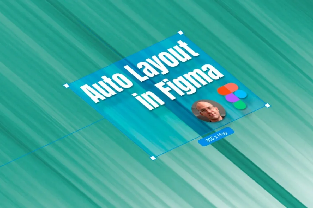
A Step-By-Step Guide to Figma Auto Layout

Daniel Scott
@dan
Figma fans or newcomers, professional creators or students, this post is for all of you. Figma’s Auto Layout is the ultimate tool for prototyping responsive UI layouts, while thinking like both a designer and a developer. Investing time into mastering these skills will completely upgrade your Figma game to Superhero level.
We’ll start with the basics, step-by-step, so you can follow along and try it for yourself on Figma.
This post is based on my Figma Advanced course here on Bring Your Own Laptop. When you become a BYOL member, you will gain access to this course as well as my 30+ additional courses on Photoshop, Illustrator, Lightroom, Premiere Pro, Webflow, and more. As a BYOL member you will also enjoy personalized support, earn certificates, and tackle exciting community challenges. Get started here.
Auto Layout 101
Let’s begin with some concepts and understand how Auto Layout works before we move into some practical sweet stuff. It’s worth it, trust me!
Rule #1 – You can only add Auto Layout to frames and components. You can’t do it to Groups.
How do we do it?
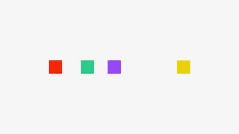
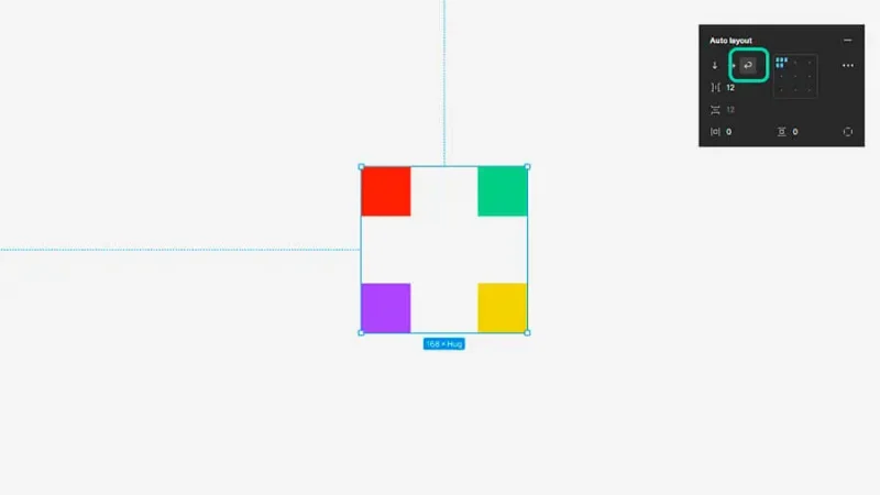
Basic frame with four components ungrouped.
We have four basic shapes inside this frame and we are going to select them all and place them inside an Auto Layout Frame. We can do it by:
Using the shortcut Shift + A on our keyboards.
Clicking on the “+” icon on the Properties Panel’s Auto Layout section.
Right-clicking over the selection and selecting “Add auto layout”.
Pick the one most comfortable to you and we are on our way!
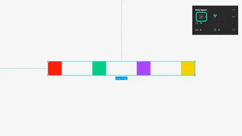
All components are now placed inside an Auto Layout frame, aligned and equally spaced.
We now have an Auto Layout Frame ready to go! There is a lot we can do with it, let’s have a look at the essentials.
As you can see in the image above, we have our elements set on a Horizontal Layout. You can arrange the elements’ order by selecting one of them and using your keyboard arrow keys to swap their positions or simply drag with your mouse and see them move around. Easy!
Let’s say this is a top navigation bar and we want to make it a side navigation menu to better fit our design. One click on the Vertical Layout icon (the down arrow) and… there you have it!
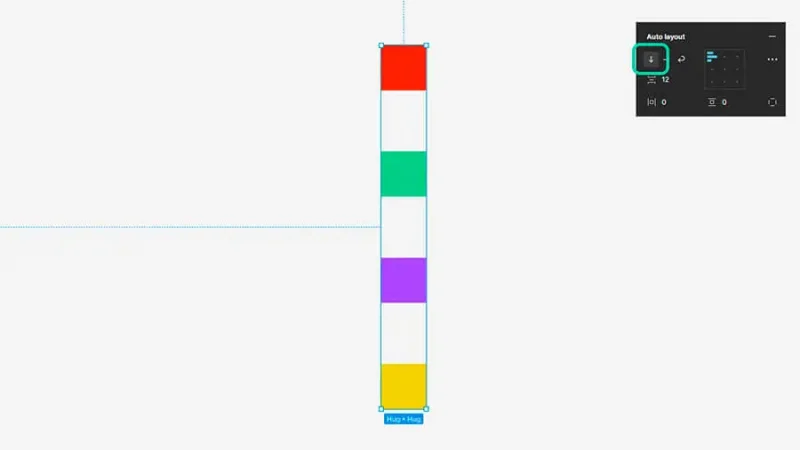
By selecting Vertical layout, all components align vertically inside the frame, with spacing unchanged.
All nice and balanced, Auto Layout really helps keep your design clean and consistent from start to finish!
Figma’s update in 2023 added the Wrap feature on Auto Layout. Let’s have a look at what it does. If you click on the Wrap icon (the curved arrow), you’ll have a whole new advantage: the elements inside your Auto Layout frame will expand beyond just a single row, something that you were limited to on both Horizontal and Vertical options.
Wrap feature breaks the components in two rows, adding responsive flexibility to the design.
You can now adjust other features, like spacing and alignment between elements, or padding and constraints, and set up incredible responsive components for your designs. We’ll have a closer look at those as we move into the practical application of Auto layout.
Timeout #1
Prototyping brings to life (and real usability!) your early sketches or brainstorm ideas on projects you are involved in. Understanding responsive layouts is fundamental for your work as a designer or developer because you will be creating solutions for multiple platforms, screens, and users.
Creating a Responsive Navigation Bar using Auto Layout
Step 1 – Create a frame for your prototype and place some icons.
Let’s start from zero. Starting a new prototype for mobile displays – for this brief I picked the iPhone 14 and iPhone 14 Plus frames, you can go ahead and choose the ones you will be designing for.
Pro tip: Download the Figma app from the Google Play or App Store to test your mockups on your phone, it’s fantastic for testing your wireframes or hi-fi prototypes in real time, as you design and change them.
Open a new Figma file and use the shortcut “F” on your keyboard – or click on the Frame tool icon – to create your first frame. Under “Phone” pick your choices, making sure that one of the frames is larger so you can test responsive behavior.
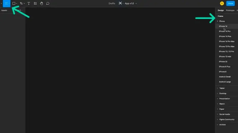
The Frame tool is active on the toolbar, and you can select your new frame dimensions on the right panel.
Now let’s bring in some icons to start shaping our Navigation Bar. We can design our own icons (Figma has some cool drawing tools), place them on the frame from your local drive or use a plugin like Iconify. I’m using icons stored on my drive, you can use the ones you like best – or you can sign up for my Figma Advanced Course and find them on the exclusive Exercise Files download!
To bring them from your drive, use the shortcut Command + Shift + K on Mac or Control + Shift + K on PC, select the icons you need from your folder (you can import multiple files) and click “Open”. To place the icons, you can click once (you’ll get the original size for each one) or click and drag (you’ll define the size you need) to place them one by one or simply go to the top toolbar and select “Place All”.
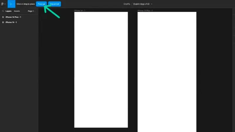
By selecting “Place all” the icons selected for import, will be placed at the same time.
Resize your icons to the size that better fits your mobile phone frames. Use the Scale tool, shortcut “K” on your keyboard or select it on the Toolbar (it’s there under the Move icon). Shortcuts are great, add them to your practice whenever you can, after a while you won’t be able to live without them! Select all the icons, and scale it by adjusting proportions (0.75, 0.5…) or manually by typing your preferred Width and Height. I’ve set it to a 36 x 32 size, I can always edit this later, when I’m testing the prototype.
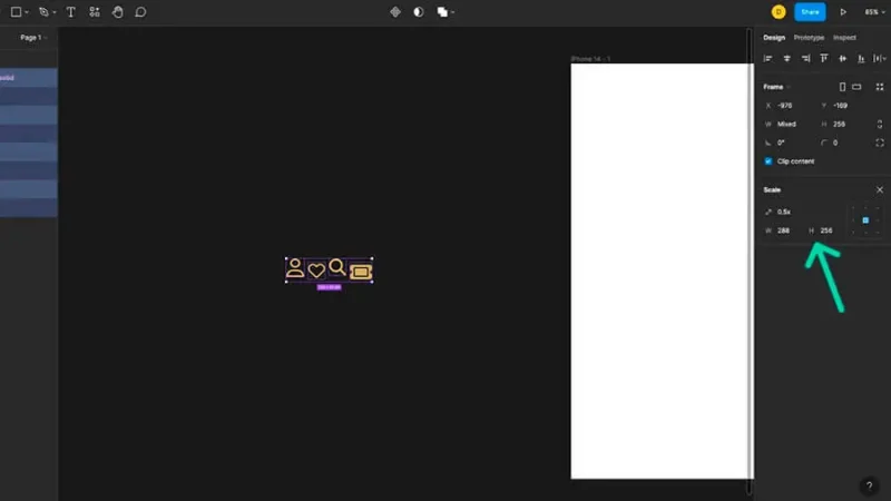
You can define the tool settings on the Scale panel on the right.
After that, we turn them into components. We can do it one by one, but let’s do it pro-style and convert them all at once! We do it by clicking on the “Component” icon on the top bar and select “Create multiple components”. You can’t use the shortcut Command + Alt + K (or Control + Alt + K on a PC), because you would create one single component for all icons and you wouldn’t be able to manipulate them individually as we will see in a bit.
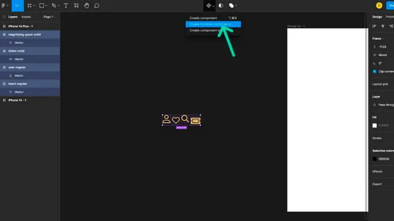
The Create Multiple Components is active on the top toolbar.
Step 2 – Auto Layout time!
Yes! It’s time to tell our icons that they belong together inside their own frame and check out all the amazing stuff we can do with Auto Layout!
Make sure you have all your icons selected and use the shortcut that will want to marry and have children with: Shift + A. Your icons are now placed inside an Auto Layout frame, horizontally organized and all set to get responsive!
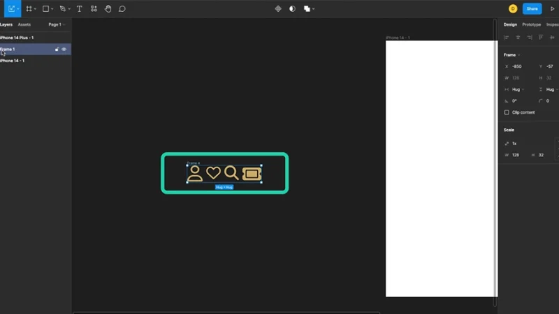
Icons are now inside an Auto Layout frame, with default spacing and order.
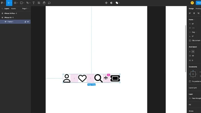
You will remember from our basics that we can switch between horizontal and vertical layouts. We will keep it horizontal because we are building a lower navigation menu.
Step 3 – Adjusting your Auto Layout elements.
Auto layout allows us to adjust things like order or spacing between the elements. Let’s drag our Auto Layout frame into our prototype and do that.
Let’s begin with spacing. We moved our icons into their mobile phone frame and changed their color to, let’s say, black for higher contrast. You can now go to the Auto Layout panel on the right and type the number of pixels you need between each element on the field next to the Spacing icon. You can also hover over it with your mouse, click and drag left or right to set the spacing you need. One other way is to select your Auto Layout frame, click and drag the pink markers between each icon.
Spacing can be adjusted by clicking and dragging the markers inside the frame.
As we’ve seen before, we can change the order of our icons simply by selecting one of them and using our keyboard arrow keys to swap them. You can also drag them with your mouse, either way is good.
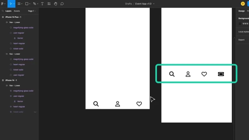
Another cool thing that auto layout can do for us: we can hide one or more icons without deleting them! Let’s make the ticket icon disappear. To do this, we double click on the ticket icon, head to the Layers panel, and click on the eye icon next to its label name and lock icon.
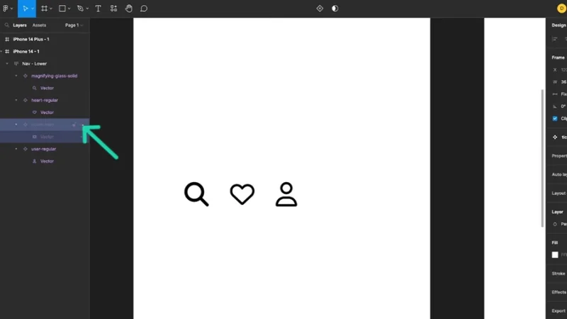
You can hide a component without deleting it. The remaining will adjust their positions to the new configuration.
It’s gone but it’s still there to magically reappear when, let’s say, our user is logged in and this option must be available! This is brilliant workflow assistance! And look at how this is so responsive – the remaining icons adjust their spacing at once, so you can keep your navigation menu balanced and usable.
Step 4 – Alignment inside the frame
More Auto Layout magic! Let’s move on with our lower navigation design and make the whole thing ready for multiple screen sizes.
Let’s drag our Auto Layout frame to the bottom of our mobile phone screen, right into the lower left corner. Next, we click and drag the frame to expand it all the way across to the right margin. We can now begin to imagine how our lower navigation will look like!
The Auto Layout frame’s default alignment is top and left.
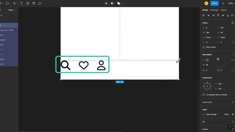
Now we must align our icons inside the frame. To do this we use the alignment settings on the Auto Layout panel. By default, it is aligned to the top left of the frame. We can test the different options there, but for this brief we will go with the center option.
Components inside the Auto Layout frame are aligned at the center.
Step 5 – Auto Spacing and Padding
Time to keep things flowing inside our Auto Layout frame, by adding another task to our icons: whenever the frame size changes, your spacing must follow. Resilience and responsiveness!
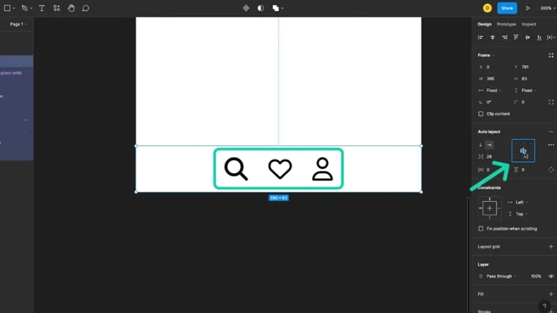
To keep our icons balanced while switching between different frame sizes, we must set up Auto Spacing. It’s easy! With your frame selected, go to the Auto Layout panel, click on the drop-down button, and change the value to “Auto”.
Auto spacing can be set on the Auto layout panel on the right.
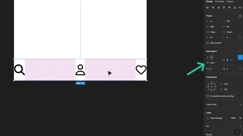
See how they stretched all the way to the edges? This means we must add some Padding into our frame. Now we’re talking like developers!
Timeout #2
Your prototype is now ready for development and it’s time to celebrate! But first. Did the developers participate in the early stages of your design process, did you share your decisions with them? A close relationship between designers and developers brings great benefits to both teams, displays solid cooperation for clients and stakeholders, and delivers a more efficient product for your users.
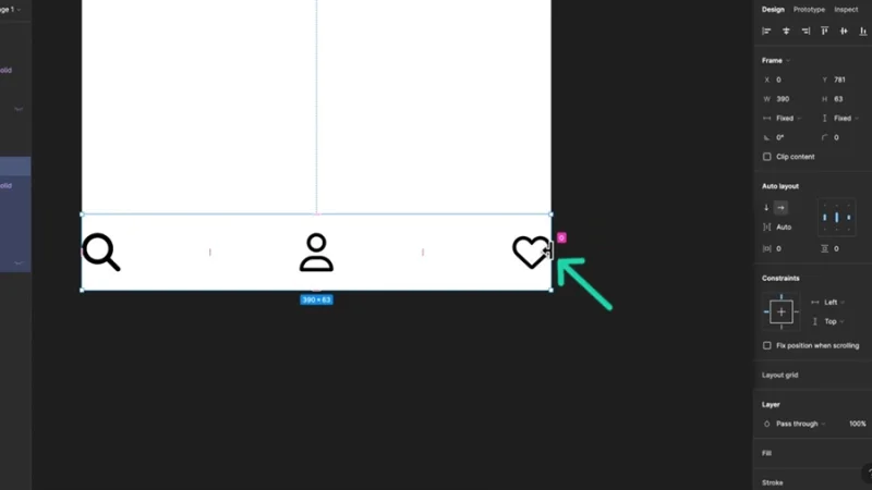
Padding is the space between the content (in this case, our icons) and the border of an element (our wonderful Auto Layout frame).
To set the padding for our frame, we can click and drag from the frame’s edge once the “border and arrow” icon becomes visible. To change both sides at the same time, press Alt on your keyboard while dragging. Another way to do it: type your padding values on the horizontal and vertical padding fields on your Auto Layout panel to the right.
The spacing between icons will respond to the added padding and adjust itself automatically.
With Auto Spacing, icons stretch to fit the frame, so padding is required to set a distance from the frame’s edges.
Step 6 – Duplicate the Auto Layout frame and test responsiveness.
On this final step we make sure that our work pays off and that our icons adjust themselves without further instruction to a new frame size.
Now we duplicate and place our lower navigation on the second screen, a bit larger than the first, remember? Let’s drag our Auto Layout to fit the new frame’s dimensions with Auto Spacing and Padding defined, our icons will fit into their new environment with responsive greatness and we can even bring the (not forgotten, right?) Ticket icon and complete our navigation with all the pieces fitting together! Amazing!
Displayed with new dimensions, the Auto Layout frame shows proper responsive behavior.
Bonus: New Wrap feature in Action
Figma Auto Layout now includes the Wrap feature, next to Horizontal and Vertical layouts. As you know, Wrap allows for your components to break free from one single line and adjust themselves in multiple rows as the frame size is adjusted. This is amazing for responsive design, when you want to use elements that were placed in a horizontal layout inside a desktop sized prototype and duplicate them into a mobile phone frame.
Cards inside an Auto Layout frame are displayed horizontally in a Desktop sized frame.
All we need to do is duplicate the Auto Layout Frame and drag it into the mobile phone frame. Then click and drag on the edge to resize it and you’ll see that the components will break into two rows and fit the new screen display dimensions. Super awesome!
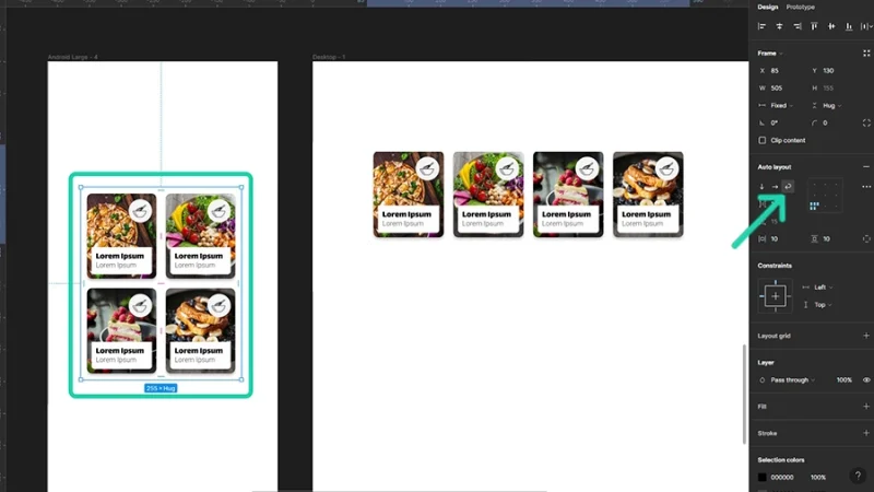
Wrap breaks the contents in two rows, adapting the Auto Layout frame to a mobile phone size.
And that’s it!
With these skills you can now prototype complex pages in less time and with huge responsive flexibility! Have a look at website homepages like YouTube or Amazon, both on desktop and on your mobile phone and try to understand how Auto Layout and components make all responsive adjustments possible. Do you think you can redesign them on Figma and give them new responsive superpowers? Do it! Share your designs with our BYOL community. I’d love to see them!
What’s Next?
Go farther with Figma in my Figma Essentials course where you will discover advanced design strategies, streamline work flows, and unleash your creativity like never before.
When you become a BYOL member, you gain access to this course as well as my 30+ additional courses on Photoshop, Illustrator, After Effects, Lightroom, Premiere Pro, Webflow, and more. As a BYOL member you will also enjoy personalized support, earn certificates, and tackle exciting community challenges. Get started here.
Popular posts

Adobe MAX 2025 - File Download
Daniel Scott
-1750161634.webp)
Modeling Shortcuts in Blender
Daniel Scott

Plugins in Illustrator
Daniel Scott
-1748277302.webp)
How to Straighten the Horizon in Photoshop
Daniel Scott
Go from zero to design hero with our awesome courses!


- Powered by Marvin
- Terms of use
- Privacy policy
- Cookie policy
-
- © Bring your Own Laptop Ltd 2026