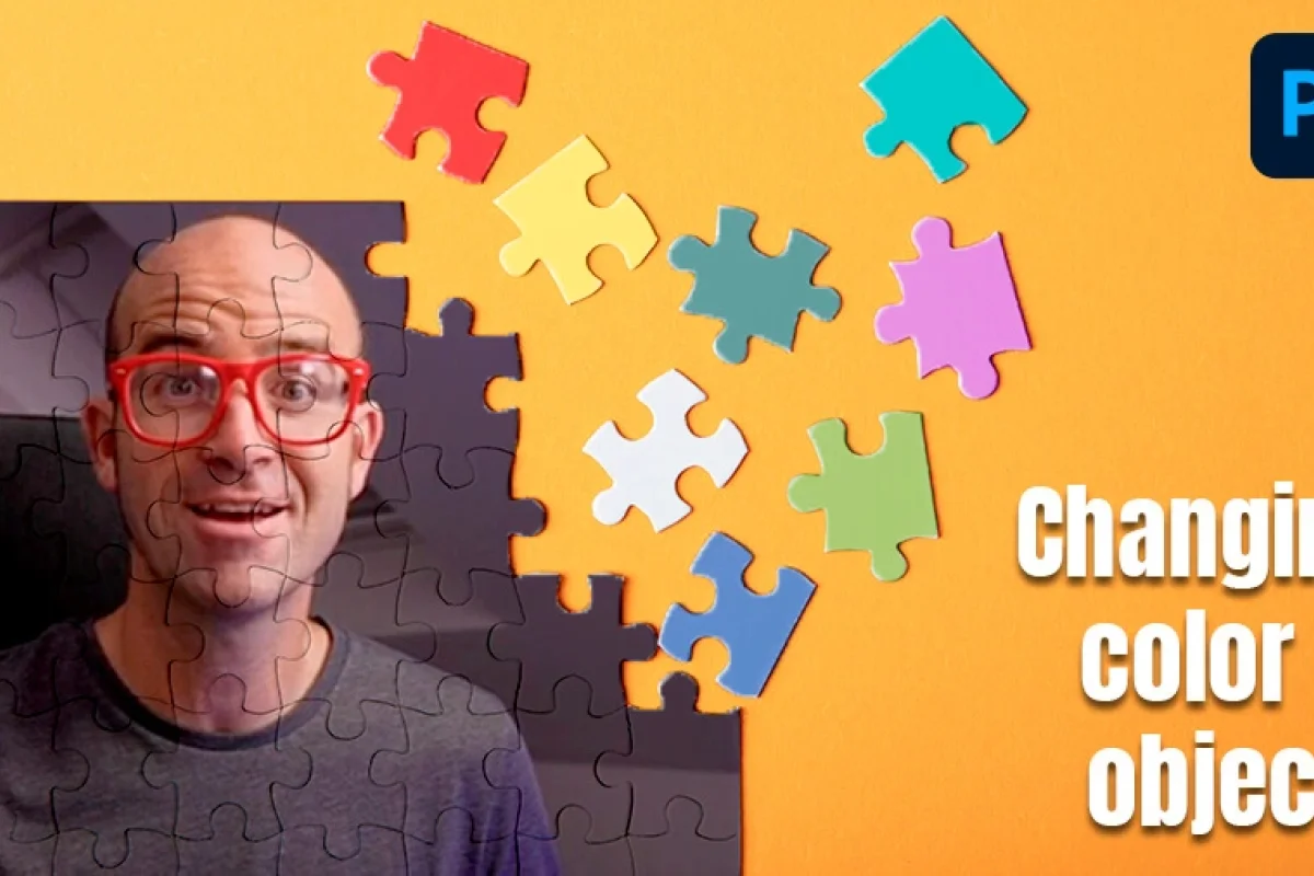
How to Change The Color of an Object in Photoshop

Daniel Scott
@dan
Hi, everyone!
In this post we will take a look at colors and how to change them in Photoshop. Changing the color of an object is part of any designer’s daily work, and it’s so easy and fun that you won’t believe it’s part of your job!
With these simple techniques, you’ll add meaning and context to any object you place inside of a composition, by harmonizing it with brand color, image background and other elements, or simply by giving it a color that will have extra impact on your users’ attention and emotions. You can even apply these skills to mockups - from one single original photo, you can create endless color variations of the object on display.
The skills I cover in this blog post are taken from my Photoshop Essentials Training Course where I also dive into skills including adding gradient to an image, creating text, filters, layer styles, cropping, and more! To access this course and 30+ additional courses on topics including Figma, Illustrator, Lightroom, Premiere Pro, join the BYOL community here. As a BYOL member you will also enjoy personalized support, earn certificates, and tackle exciting community challenges.
Ok! Let’s jump into it by starting with a brief brush stroke on color theory, so you can understand what is behind the magic you’ll be performing in Photoshop!
What is Hue?
Many people, including designers and artists, often assume color and hue are the same. For the purposes of this post, I’ll put it this way:
Color is the result of the interaction between Hue and Shades.
Hue is the foundation for every color our brain can identify – one of the Primary and Secondary colors, in its purest form, unaffected by shades. As an example, digital displays have red, green, and blue as their primary hues.
Black and white are not colors, they are Shades. White lightens the color (producing a Tint) and Black darkens it (producing a Shade).
Gray, the shade between white and black, balances the color’s intensity (Tone), from rich and vibrant to fully desaturated, what we commonly understand as “black and white”.
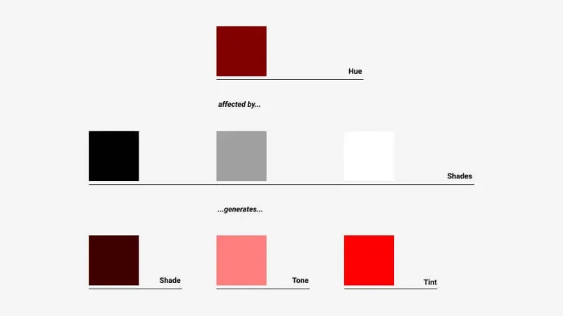
How hues are affected by Shades
Why is this important?
These basic points will help you better understand and therefore give you additional control over exactly what you are editing in Photoshop. To begin, we will explore the Hue and Saturation Adjustment tool!
Timeout #1
Smart color choices have a direct influence on the way your users perceive and react to your message or call to response. Color choice is not all about aesthetics or being “louder”on a store shelf, there are also mental and emotional triggers color and saturation influence.
Let’s jump right to it!
Level: EASY – Adjust a Hue
Step 1 – Pick your object and think of Adjustments.
Remember mockups and variations? Let’s say we are working for an online shoe store and updating their product catalog. They have a running shoe model that comes in twelve colors but they’ve only sent us one image of the green ones. Where will we get the other eleven colors?
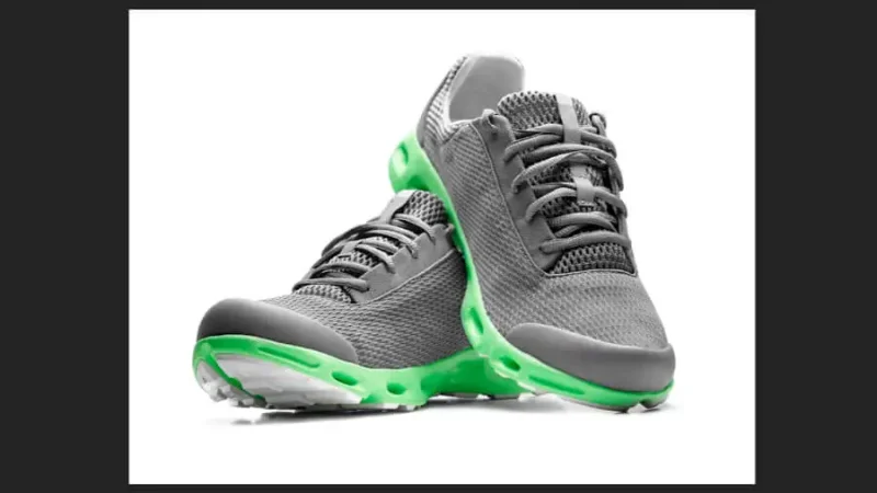
Running shoes with green highlights
We start with the image, lovely running shoes with a green highlight (that probably shines in the dark, I don’t know). The highlight comes in twelve different colors and we want to change it in a quick and easy way - let’s go for two of them, if you can try the whole lot, go for it!
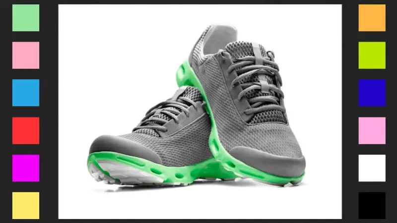
Brand’s color palette for their running shoes. We’ll try the pink and blue swatches on the left as an example.
Let’s look at the right of our workspace and activate the Adjustments panel tab. Click on the Hue/Saturation tool from the available options.
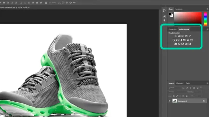
The Adjustments panel displays a number of different tools for image editing. We will use Hue/Saturation.
Step 2 – Adjust Hue, Saturation, and Lightness levels.
This is where the fun stuff starts! Let’s make our changes and match them exactly to the product guidelines.
By simply clicking and dragging the slider on the Hue bar we see the colors changing, like instant magic!
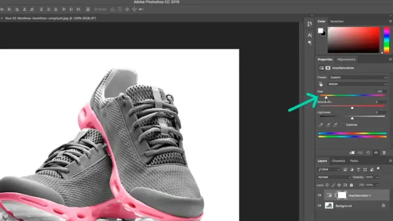
By adjusting the Hue setting we directly impact the image’s highlight.
To fine tune and make the color match exactly, you can make further adjustments by clicking and dragging the slider under the Saturation and Lightness bars. Saturation works with gray to set different Tones to your color and Lightness will use Black or White to set different Shades or Tints.
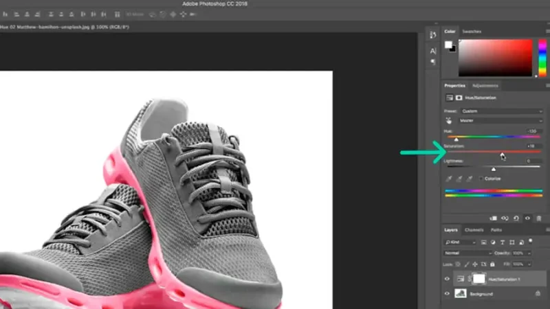
You can fine tune for color matching with adjustments on Saturation and Lightness settings.
Save your work when your color is matched and that’s it, well done! You can now apply the same steps for the remaining variations of your client’s product.
This is just a simple example; we will do some more advanced editing in the following steps.

Running shoes are now displayed in a new color highlight.
Timeout #2
Companies empower their brands' perception through their choice of colors that communicate effectively - and often without words - with their users. Designers need to understand how brands influence behavior with their color palettes to deliver better products and seamless experiences.
Level: EASY WITH A TWIST – Select and Adjust one Hue among many
Step 1 – Pick your composition and think what needs to be changed.
We will now look at a different challenge. We have an awesome photo of a sunglass collection from last summer. This year, your client informs you that the model displayed is no longer manufactured in yellow but he wants to keep the photograph for his website homepage, so the yellow on the shoe and sunglasses must go away. Do we have to do it all over again and take a new photograph?
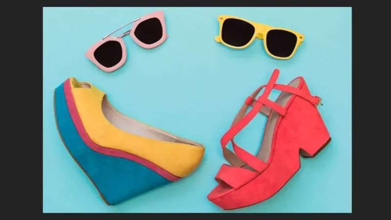
This image has many different colored elements. Can we change just one of them?
You already know that cool designers offer cool solutions for these problems, so let’s see what you can do it in just a few clicks and absolutely steal the show!
We know we want to change the yellow on this image. Like we did before, let’s open the Adjustments panel and click on Hue and Saturation. If we repeat the steps from level Easy, they will lead us to a mind-boggling result like the one below.
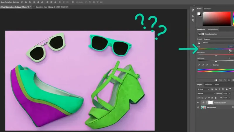
In this example, simply adjusting the Hue setting will bring unwanted results. We must be more precise.
So how do we do it? Level Easy with a twist is still easy, don’t worry.
Step 2 – Adjust Preset.
Before changing the hue, we must tell Photoshop which hue we need to adjust.
Right above the Hue adjustment bar, you’ll find a dropdown labeled “Preset:” Click on it to see the available settings. The Master preset tells Photoshop to adjust all colors at once.
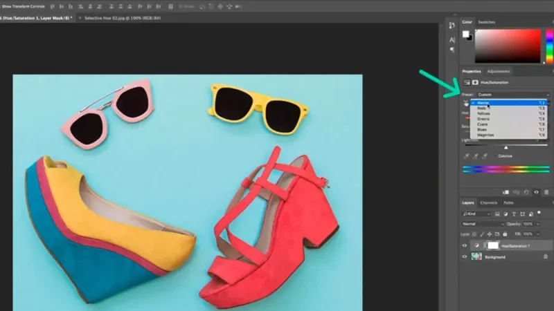
From the Preset option, we can define which hue is going to be changed.
Note: On the first example, it was an adequate preset because gray is not a color and we only needed to change that highlight, the only element on the image with color. Moving on!
For this example, we know the manufacturer no longer needs the yellow on those items, so we will pick Yellow from the Preset list and that’s the only hue that will be adjusted.
Step 3 – Repeat magic.
Go back to the Hue bar, click on the slider, and drag it until you find the new color you’re looking for. Remember that you can also adjust Saturation and Lightness to match the product’s original color. In this example, a stylish pink!
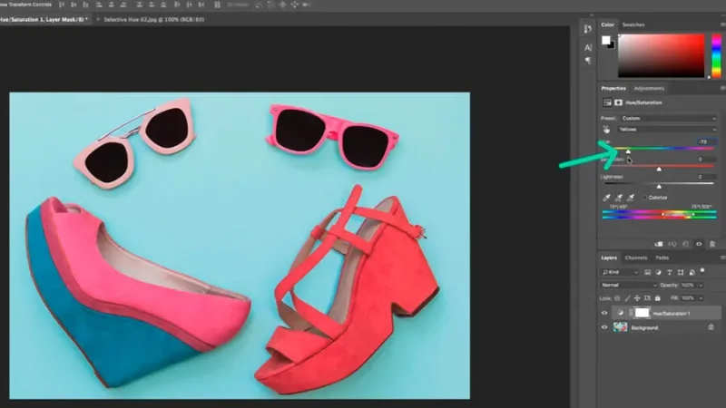
Now that the yellow hue is defined on Preset, Hue, Saturation and Lightness will create the new color.
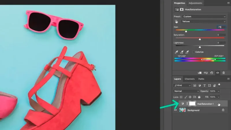
Step 4 – Going back and editing.
When you adjust your Hue, Photoshop always takes the non-destructive road and you’ll find a mask over the image’s layer. To edit your changes, make sure the mask is selected and go back to the Hue/Saturation adjustments panel.

Layer masks allow for non-destructive editing, keeping your original image untouched.
And that’s it!
You should now have a better understanding of what colors and hues are and how they can be changed to improve your designs. Assisted by the Adjustment Hue and Saturation tool, you are able to speed up your workflow and release your imagination – and your user’s heart and mind – to a whole new dimension of visual communication.
Here’s an example of how a small change in color can trigger a completely different set of emotions on the receiver.
There is psychology to colors and the ways we react to them.
What’s Next?
Go even further with Photoshop in my Photoshop Essentials course which will teach you everything you need to know about getting started with Photoshop.
When you become a BYOL member, you gain access to this course as well as my 30+ additional courses on Figma, Photoshop, Illustrator, Lightroom, Premiere Pro, Webflow, and more. As a BYOL member you will also enjoy personalized support, earn certificates, and tackle exciting community challenges. Get started here.
See you in class! - Dan
Popular posts
Adobe MAX 2025 - File Download
Daniel Scott
-1750161634.webp)
Modeling Shortcuts in Blender
Daniel Scott
Plugins in Illustrator
Daniel Scott
-1748277302.webp)
How to Straighten the Horizon in Photoshop
Daniel Scott
Go from zero to design hero with our awesome courses!


- Powered by Marvin
- Terms of use
- Privacy policy
- Cookie policy
-
- © Bring your Own Laptop Ltd 2026