How to Create a Color Palette in Figma

Daniel Scott
@dan
Hi, everyone!
In this post, we'll dive into some amazing color palettes, learn how to create them in a flash in Figma, and by the end you will understand why they are key to help you improve as a UI/UX designer.
Color palettes help speed up your workflow: having easy access to a set of colors can help you plan your work, simplify your choices, hold aesthetic consistency throughout design and development stages, and ensure you stay aligned with the project or client's brand guidelines.
Follow along to learn how to create color palette in figma, set up some incredible color variations, and how to use blacks and whites. Plus some other cool tips and tricks to add an extra layer of awesome to your projects.
To go even further with Figma, I encourage you to check out my Figma UI UX Design Essentials Course. As a BYOL member, you will gain access to this course as well as my 30+ additional courses on Figma, Photoshop, Illustrator, Lightroom, Premiere Pro, Webflow, and more. BYOL members also enjoy personalized support, earn certificates, and tackle exciting community challenges. Head here to join the BYOL community!
Step 1 - Using Primary, Secondary and Accent Colors
Let's use the Rectangle tool and Eyedropper tool to set up our color palette's first level - the one that sets your project's identity and tone.
Pro Tip: Before creating your color palette in Figma, it's helpful to gather inspiration from photos, videos, and other designer's work. Consider creating a mood board from these images and examples like the one below. If you're working for a specific client or brand, you can utilize their existing brand colors when creating your palette, so it's easy to access throughout your design process.
New to moodboards? Not sure where to begin? In my and be sure to check out the section on Moodboards in my Figma Essentials course where I walk you through the process and there's even a Class Project to help you get started.
Ready for more? Become a BYOL member!
Explore 30+ Essentials and Advanced courses in Figma, Photoshop, Illustrator, Lightroom, Premiere Pro, Webflow, and more. Enjoy personalized support, earn certificates, connect with other creators and tackle exciting community challenges.
START YOUR LEARNING JOURNEY
Unlimited access to ALL content
Instant access to all of our courses and exclusive content while you're a member.
Priority advice and support
Ask us anything! Our amazing Teaching Assistants are here to support you
Certificates of achievement!
Celebrate and share the milestones in your learning journey

Moodboards are awesome for inspiration and color planning.
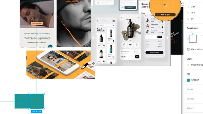
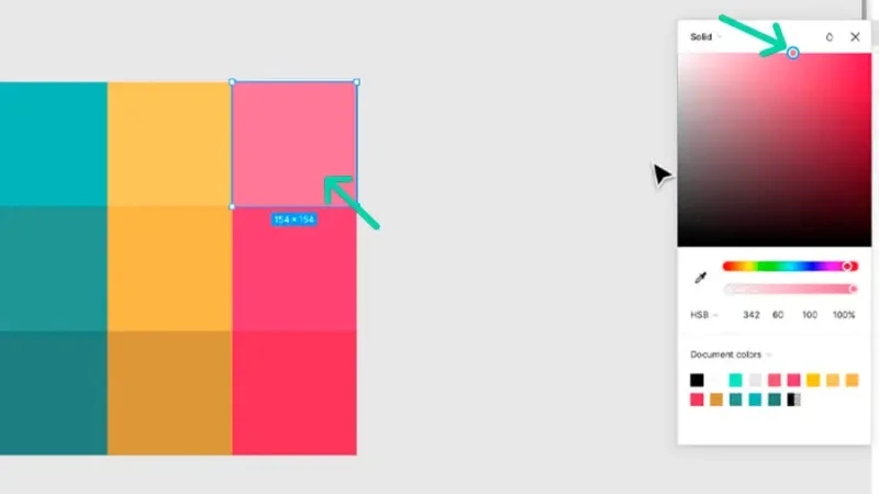
Click on the Rectangle tool and draw your shape next to your moodboard (use Shift on Mac or PC for a perfect square). With that shape selected, go to Fill on your Design panel to the right, click on the Hue (or color) square and then click on the eyedropper icon. If you hover the eyedropper over your moodboard you can pick your primary color just by clicking on it. And there it is - your square is now filled with your design's most powerful color.
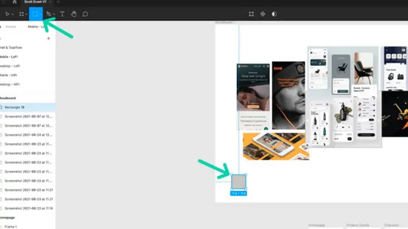
Create a rectangle over your moodboard and use the Eyedropper to give it your first palette color.
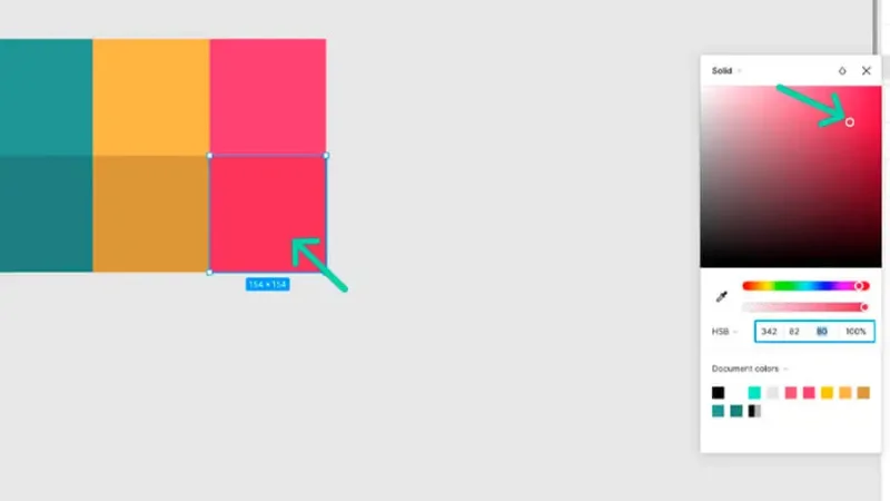
Draw a new shape with the Rectangle tool or simply duplicate the first by clicking on it with the Move tool and dragging while pressing the Alt key on Mac or PC. Use the Eyedropper tool to select your secondary color (the one that will complement your primary) and repeat this step to choose your accent color (the one that will call your user to act, decide or simply alert him/her for an important message).
Duplicating shapes can speed up your workflow.
Step 2 - Variations of Color in Figma
You can take your color palette further by creating brighter and darker variations of your original palette.
Select your color shapes by clicking and dragging the Move tool over them. You can also press and hold Shift and click them one by one. Duplicate by pressing and holding your Alt key and dragging down - these will display your darker variations.
Select your primary color, go to Fill, click on the Hue square and you'll see your Hue marked on the color map. Click and drag that marker into a darker area on the map or change the display mode below to HSB (Hue, Saturation, Brightness) and adjust the brightness value down until you find what you're looking for. You can also change the hue or saturation values but remember to keep consistency throughout the process. Do the same for your secondary and accent colors, adjust what you need in all of them until you are satisfied with your results.
Set dark variations by adjusting Hue, Brightness and Saturation levels.
Go back to your initial color shapes. Duplicate and place them above - these will be your brighter variations.
Select your primary color, go to Fill, click on the Hue square, click and drag up the marker on your color map or adjust the brightness value up to find the variation you need. You should also adjust the saturation level up a bit to make the hue richer - or click and drag the marker a bit to the right on your color map. Do the same for your secondary and accent colors and feel free to make all the adjustments you need until it's all nice and balanced.
Setting up lighter colors for your palette helps for smoother designs.
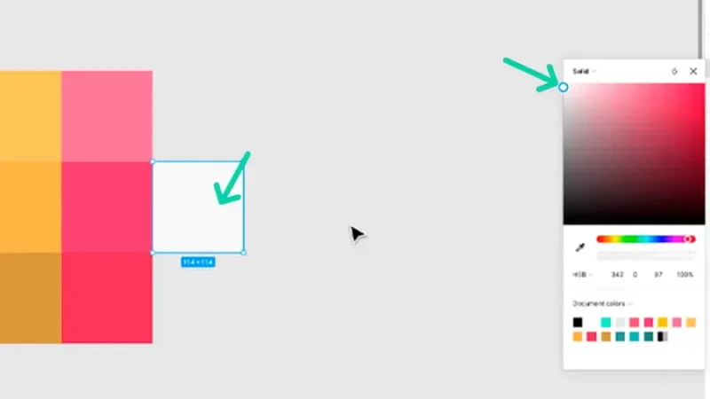
Step 3 - Using Whites and Blacks in Figma
Let's finish our color palette with white and black variations. These will be great for strokes, backgrounds, text, and other elements on your project.
Right next to your first color level, duplicate or create a new Rectangle - remember the Shift key to make it a perfect square - and let's fill with an off-white hue.
Timeout #1
Why not full-white? If you fill an element (a panel, a button…) with a slightly off-white color, it will stand out from a full-white background, making it easier to view and navigate. It's important to keep user accessibility in mind when designing and selecting colors.
Your next step should be defining your black and white shades.
Select your shape, go to Fill, and click on the Hue square. Drag the marker all the way to the top left corner of the color map and then drag it just a little bit down to remove a hint of brightness from it. You can also adjust the brightness values on the HSB mode. Duplicate your off-white shape four times, align them all and let's set up the rich-black color on the last one.
Timeout #2
Why not a full black? The same reason, opposite side of the spectrum: a rich-black filled element will stand out from a full black background and will add to your design that professional look that will impress your stakeholders or users. You can learn more about the science behind color here.
Rick black works better than full black because it holds the brand’s color identity.
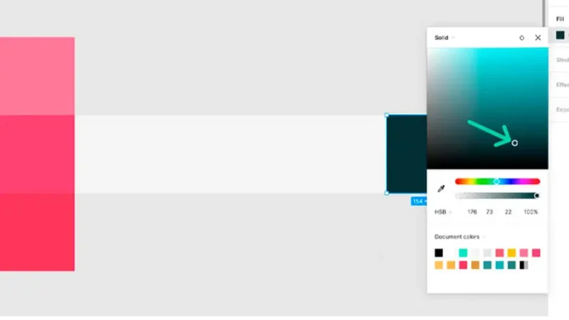
To easily set your rich black, select your shape and fill it with your primary color using the eyedropper tool. Go to Fill, click on the square, drag the marker on the color map down and to the right, increasing the saturation and lowering the brightness levels until you have a result close to black but keeping a hint of your primary color.
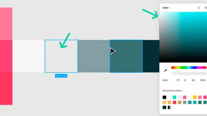
Next, we move through the shapes from right to left. Let's select and fill the fourth square with your rich black, go back to your color map and drag the marker up and to the left, or by adding brightness and lowering the saturation levels until you have a gray hue with that precious hint of your primary color.
Select your third square from the left, fill it with the gray from the fourth. Go to your color map, drag your marker once again up and to the left, or by adding more brightness and lowering saturation levels, until you have a lighter gray with a hint of primary color in it.
Having a full rich black to rich white palette truly upgrades your UI work.
Select your second square, fill it with the previous color and, once again, go to your color map and drag the marker closer to the top left, or set the saturation levels close to zero and brightness close to around 90, until you have a light and desaturated gray that complements your off-white.
Feel free to adjust all your choices until you are entirely happy with your results.
Final Color Palette in Figma
As you can see, it's so easy to create your own color palettes in Figma and use them to achieve richer and more professional designs.
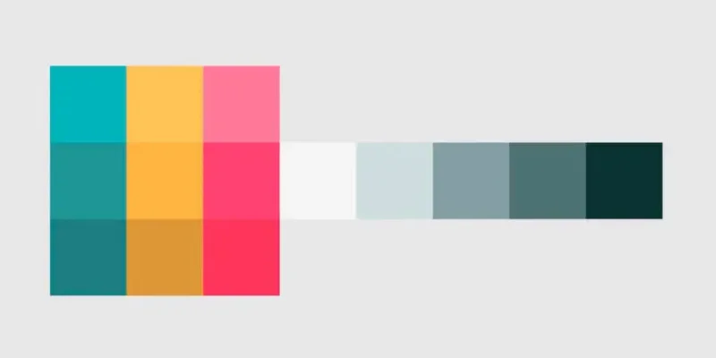
An example for a brand color palette displaying strong and smooth variations and rich black to rich white shades.
Go farther with Figma in my Figma Essentials course which will teach you how to create wireframes, implement colors and images in your designs, as well as create icons, buttons, and other UI components.
When you become a BYOL member, you gain access to this course as well as my 30+ additional courses on Figma, Photoshop, Illustrator, Lightroom, Premiere Pro, Webflow, and more. As a BYOL member you will also enjoy personalized support, earn certificates, and tackle exciting community challenges. Get started here.
See you in class! - Dan
Ready for more? Become a BYOL member!
Explore 30+ Essentials and Advanced courses in Figma, Photoshop, Illustrator, Lightroom, Premiere Pro, Webflow, and more. Enjoy personalized support, earn certificates, connect with other creators and tackle exciting community challenges.
START YOUR LEARNING JOURNEY
Unlimited access to ALL content
Instant access to all of our courses and exclusive content while you're a member.
Priority advice and support
Ask us anything! Our amazing Teaching Assistants are here to support you
Certificates of achievement!
Celebrate and share the milestones in your learning journey
Popular posts

Adobe MAX 2025 - File Download
Daniel Scott
-1750161634.webp)
Modeling Shortcuts in Blender
Daniel Scott
Plugins in Illustrator
Daniel Scott
-1748277302.webp)
How to Straighten the Horizon in Photoshop
Daniel Scott
Go from zero to design hero with our awesome courses!


- Powered by Marvin
- Terms of use
- Privacy policy
- Cookie policy
-
- © Bring your Own Laptop Ltd 2026