This course has been archived because the content is no longer up-to-date or relevant to most students
You can watch the new, up-to-date course by clicking here.

Note: If you have a different UI than in the course, you can change it back by clicking the '?' in the bottom right corner of Figma and select 'Go back to previous UI'. Happy Figma'ing!

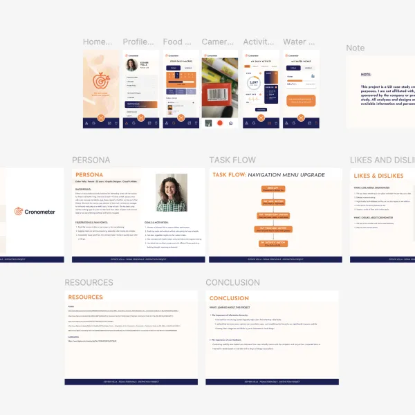
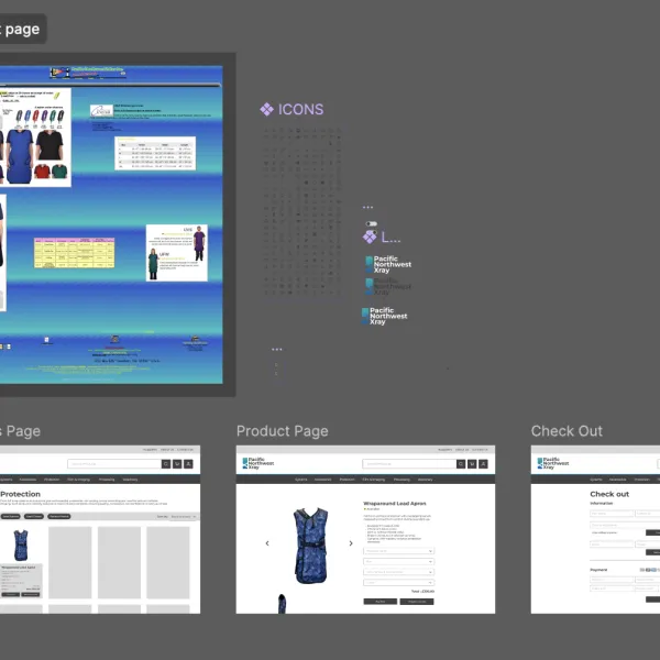
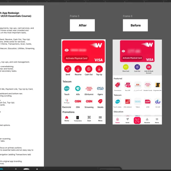
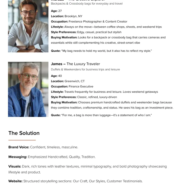
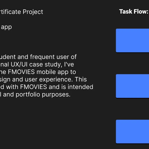
Distinction Certificate Project

This lesson is exclusive to members

Course contents
SECTION: 14
Working with Illustrator 4:16
SECTION: 19
Saving & History 5:42
SECTION: 24
Teams & Projects 5:19
SECTION: 27
Thumbnail update 4:10

Questions

1
You are not following this thread
0
You are not following this thread
1
You are not following this thread
1
You are not following this thread
1
You are not following this thread
1
You are not following this thread
0
You are not following this thread

Student class projects

Avatar

Marwa Serrieh

@marwaSerrieh

UX Case Study – Whish App Redesign (Unsolicited Redesign for Figma UI/UX Essentials Course) Brief Whish is a Lebanese digital wallet app offering payments, top-ups, card services, and money transfers. While feature-rich, the original home screen was crowded and inconsistent, making it harder for users to focus on the most important tasks. The redesign focuses on: Clarity & Hierarchy → Only 4 quick actions (Send, Receive, Cash Out, Top-Up). Consistency → Red buttons for primary actions, white cards for services. Simplified Navigation → Updated bottom bar (Home, Transactions, Scan, Cards, Menu). Service Grouping → Organized categories (Telecom, Education, Utilities, Streaming, Promotions). Persona (Me as User) Name: Marwa Age: 27 Habits: Uses Whish daily for quick payments, top-ups, and card management. Frustrations: Too many options made the home screen overwhelming. Repeated actions (Send/Receive both in nav and home). No clear hierarchy between important and secondary tasks. Goals: Finish core tasks in 1–2 taps. Always know where to find services. See transaction history quickly. Task Flow (Before vs After) Before: Home screen filled with many buttons (Whish Me, Payment Link, Top-Up by Card, etc.). Quick actions were duplicated in both the dashboard and bottom nav. Categories buried under main buttons, requiring scrolling. After (Redesign): Top Card: Balance + Visa card always visible. Quick Actions: 4 buttons (Send, Receive, Cash Out, Top-Up). Categories: Grouped services in neat white cards. New Bottom Nav: Home → Dashboard Transactions → Payment & top-up history Scan → QR payments Menu → Profile, settings, promotions Before & After Before: Overloaded dashboard with many scattered options. Navigation duplicated and inconsistent. Services lacked hierarchy. After: Clear and minimal layout. Core tasks in one tap. Services grouped into categories for faster scanning. Navigation bar simplified to 5 meaningful tabs. Learnings Less is more: removing options helps users focus on primary actions. Hierarchy matters: users need quick access to essential tasks and an easy way to find the rest. Financial apps need trust: transparency in navigation (adding Transactions tab) improves confidence. Credits Redesign created in Figma, inspired by Whish’s original app branding. Icons adapted from Figma community resources.

0
Avatar

Khadeejah Ismaeil

@khadeejahIsmaeil

UX Case Study: KFH Currency Converter Redesign Project Brief The currency converter on the Kuwait Finance House (KFH) website helps users check exchange rates. However, the tool feels outdated, especially on mobile. It lacks a clear "Convert" button, has a boxy layout, poor spacing, and provides no feedback to confirm that a conversion has happened. As a UI/UX designer who regularly uses this tool to calculate how much money to transfer to family outside Kuwait, I often find myself questioning whether the conversion was triggered at all. My goal is to redesign the tool to be more modern, visually clear, and mobile-friendly - making the conversion process feel smooth, trustworthy, and efficient. Persona: Name: Khadeejah Age: 24 Occupation: UI/UX Designer Background: Frequently uses the KFH currency converter before transferring money abroad. She values speed, clarity, and modern design. Pain Points: - No confirmation when converting amounts - The current layout feels outdated and crowded - Confusing UI with poor spacing and unclear interactions Before - Key Issues (based on screenshot) - No "Convert" action: The user is unsure if anything is happening - Poor layout: Boxy and tightly stacked, especially on mobile - No user feedback: No message, animation, or indication of conversion - No visual hierarchy: All components blend together - Unfriendly mobile UI: Dropdowns are cramped, spacing is inconsistent UX/UI Improvements Visual & Structural: - Add a "Convert" CTA with a smooth confirmation (e.g., toast or animation) - Use rounded containers and consistent spacing to reduce clutter - Modernize typography and buttons for visual clarity - Group related fields (e.g., amount + currency together) - Add flags or icons to currency selectors Interaction & Feedback: UX Case Study: KFH Currency Converter Redesign - Provide clear success message or animation after conversion - Include timestamp of rate for trustworthiness - Allow users to flip currencies with a swap icon - Add copy/share button for convenience - Highlight any errors or incomplete inputs

0

Course info

114 lessons / 12 hours 29 quiz questions 22 projects Certificate of achievement

Overview

Hi there - my name is Dan Scott & welcome to Figma Essentials.

Together - you and me - are going to learn everything you need to get started working as a UX Designer using Figma.

You can try Figma for free by clicking here.

We’ll use this UI UX design tool to create beautiful User Interfaces and engaging prototypes. Most importantly... we'll cover the client expectations of you as a new UX designer. 

This course is aimed at people new to design, new to User Experience design. Even if you’re not totally sure what UX really means, don’t worry. We’ll start right at the beginning and work our way through step by step. 

First we’ll describe the brief & how to work with a UX persona.  

Then you’ll learn how to create simple wireframes.  

From there we’ll look at how to implement colours & images properly in your designs.

You’ll learn the do’s & don’ts around choosing fonts for web & mobile apps. 

You’ll learn how to create your own icons, buttons & other UI components. 

You’ll learn some pretty scary terms such as Components, Constraints & Multi Dimensional Variants. They are all really easy to understand once you know how. 

We’ll also make our lives easier by using free UI kits & plugins for Figma which will speed up our workflow dramatically!

We’ll build a simple Style Guide ready for client handoff. 

You’ll understand how to make both simple & advanced micro interactions, page transitions & animations 

Before the end of this course you will have made fully interactive prototypes 

You will take a project all the way through -  collaborating with other team members and exporting the right files ready to hand off to your developer or software engineer. 

We’ll be focusing on the software Figma but I’ll make sure to explain the techniques & terms used in the UX and how real world projects are run. You will develop a great understanding of the industry and will be able to manage your own UX projects.

I will be setting assignments through the course which will help develop your skills and enable you to create something special and unique for your own portfolio. 

Alright - it's time to upgrade yourself & go from Figma Zero to Figma Hero.

Daniel Scott

Daniel Scott

Founder of Bring Your Own Laptop & Chief Instructor

instructor

I discovered the world of design as an art student when I stumbled upon a lab full of green & blue iMac G3’s. My initial curiosity around using the computer to create ‘art’ developed into a full-blown passion, eventually leading me to become a digital designer and founder of Bring Your Own Laptop.

Sharing and teaching are a huge part of who I am. As a certified Adobe instructor, I've had the honor of winning multiple Adobe teaching awards at their annual MAX conference. I see Bring Your Own Laptop as the supportive community I wished for when I was first starting out and intimidated by design. Through teaching, I hope to bring others along for the ride and empower my students to bring their stories, labors of love, and art into the world.
True to my Kiwi roots, I've lived in many places, and currently, I reside in Ireland with my wife and kids.

Downloads & Exercise files

  • Powered by Marvin
  • Terms of use
  • Privacy policy
  • Cookie policy
  • © Bring your Own Laptop Ltd 2026