How to add shadows to text & boxes in Bootstrap 4
Questions
Student Gallery
Course info
Overview
- a simple but elegant restaurant website.
- a bike repair website.
- a responsive portfolio website.
- a Bootstrap website.
You will...
- Learn how to work with responsive images and icons. and stunning full screen background images and probably one too many gradients.
- Learn how to create forms and to choose great fonts for your website.
- Learn how to work with Bootstrap 4 to easily add carousels, cards and complex looking menus.
- Setup a domain name with hosting so that your website is live on the internet for others to see.
There are fun class projects for you to work on which will enable you to practice what you learn. By the end of this course you’ll have a great understanding of important web design topics like HTML5, CSS3, Flex box, Responsive design and Bootstrap.
Course duration 16 hours 42 mins

Daniel Walter Scott
Founder of Bring Your Own Laptop & Chief Instructor
I discovered the world of design as an art student when I stumbled upon a lab full of green & blue iMac G3’s. My initial curiosity around using the computer to create ‘art’ developed into a full-blown passion, eventually leading me to become a digital designer and founder of Bring Your Own Laptop.
Sharing and teaching are a huge part of who I am. As a certified Adobe instructor, I've had the honor of winning multiple Adobe teaching awards at their annual MAX conference. I see Bring Your Own Laptop as the supportive community I wished for when I was first starting out and intimidated by design. Through teaching, I hope to bring others along for the ride and empower my students to bring their stories, labors of love, and art into the world.
True to my Kiwi roots, I've lived in many places, and currently, I reside in Ireland with my wife and kids.
Certificates
We’re awarding certificates for this course!
Check out the How to earn your certificate video for instructions on how to earn yours and click the available certificate levels below for more information.
Downloads & Exercise files
Can Bootstrap add a drop shadow to text?
Not directly with its standard shadow utility classes. Bootstrap shadows apply to an element’s box, so an h1 gets a rectangular shadow rather than letters with a shadow. The clean fix is to keep Bootstrap for the basics and add one reusable custom CSS class for text-shadow.
How to Add Text Shadows in Bootstrap When the Framework Does Not Do Exactly What You Need
Key takeaways
How to check Bootstrap documentation before writing custom CSS.
Why Bootstrap’s shadow utilities are not suitable for text shadows.
How to create a reusable text shadow class with text-shadow.
How to inspect an existing Bootstrap class, such as lead, before extending it.
What <hr class="my-4"> means and how to remove unwanted spacing and content.
Bootstrap Is Fast, But It Is Not the Whole Design
Bootstrap is brilliant for getting a site moving quickly. It gives you layout, spacing, typography, buttons, utility classes, and loads of sensible defaults without having to reinvent all the boring bits.
But sooner or later, the mock-up asks for something Bootstrap does not provide exactly. That is not Bootstrap failing. It is simply the point where your pre-Bootstrap CSS skills become properly useful again.
A typical example is a hero heading that needs a subtle shadow behind the letters. The goal is not a giant, muddy special effect. It is just enough shadow to lift white type from a busy green background and make it feel closer to the design.

The hero has the right basic Bootstrap structure, but the heading still needs the subtle detail from the mock-up.
First, Check Whether Bootstrap Already Has It
Do not rush straight into custom CSS. First, see whether Bootstrap has already solved the problem. Head to the Bootstrap documentation, use the search, and search for the effect you need.
For shadows, Bootstrap provides the familiar utility classes:
shadow-sm for a small box shadow
shadow for the standard box shadow
shadow-lg for a larger box shadow
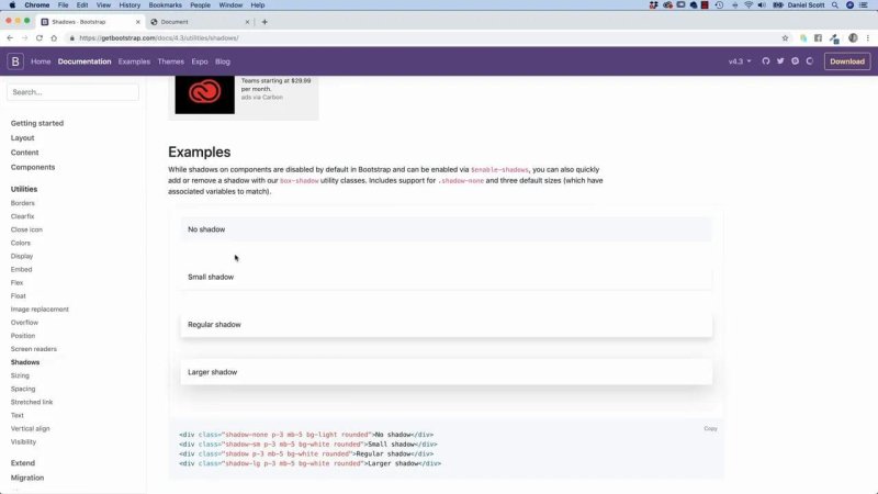
Bootstrap supplies ready-made shadows for boxes, with small, regular, and large variants.
That looks promising, so try it. Add shadow-lg to the heading and refresh the page. The result is a shadow around the entire rectangular h1 element.
That is technically a shadow, but it is not the effect we want. We want the shadow around the actual letters, not a floating rectangle around the heading block.
Know When to Stop Searching
It is easy to lose time thinking there must be a hidden Bootstrap class somewhere. Search the documentation, try sensible terms, and do a quick wider search if needed. But when the framework does not offer the feature in the form you need, it is time to make your own.
This is the useful dividing line:
Use Bootstrap when its utilities produce the result you need.
Extend Bootstrap with custom CSS when the utility is close, but not quite right.
Create a reusable custom class when the same design treatment could be useful elsewhere on the site.
A custom class does not mean you are abandoning Bootstrap. It means Bootstrap gets you most of the way there, and your own CSS handles the specific visual detail.
Create a Reusable Text Shadow Class
Rather than writing an inline style directly on one heading, create a class called drop-shadow. It does not clash with the Bootstrap classes being used here, and it makes the effect reusable wherever it is needed.

The text-shadow values follow a simple order:
0 is the horizontal, or X, offset. The shadow does not move left or right.
2px is the vertical, or Y, offset. The shadow sits just below the text.
2px is the blur amount. It keeps the effect soft rather than harsh.
rgba(0, 0, 0, 0.15) is a black shadow at 15 percent opacity.
The small offset, soft blur, and low opacity are what make it subtle. A text shadow can get ugly very quickly, so keep it restrained.
Then apply the class to the heading alongside any existing Bootstrap classes:

Now the heading has a proper letter-level drop shadow. Bootstrap is still handling the page structure and utility work, while one tiny custom rule supplies the missing design detail.
Inspect Bootstrap Classes Before You Override Them
The next job is the lead paragraph. Bootstrap’s lead class already makes introductory copy larger, which is a good start, but the mock-up calls for white text and a more substantial size.
Before changing anything, inspect the paragraph in the browser’s developer tools. Right-click the element, choose Inspect, and check which class is doing the work. In this case, it is lead.
Next, search the Bootstrap documentation for “lead”. The typography documentation explains what the class is intended to do. If there is no built-in variation that provides the exact colour and size, extend the existing class in your own stylesheet.

This approach keeps the existing Bootstrap behaviour and adds only the parts the design needs. The lead text becomes white, larger, and wide enough to feel like a strong supporting line beneath the main heading.
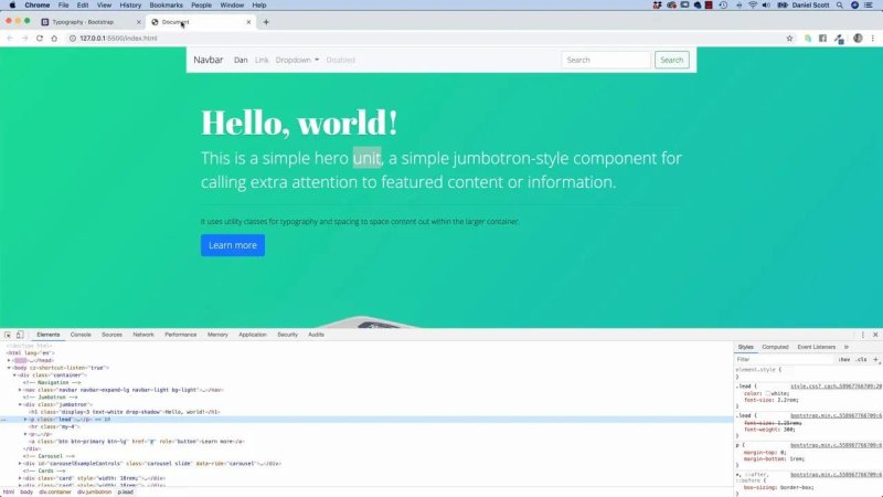
Inspecting the element identifies the existing lead class before its colour and font size are extended.
Replace Placeholder Copy With the Actual Hero Message
Once the styling is right, replace the placeholder content. A hero section is much easier to judge when it contains the real message rather than “Hello, world!” and a default paragraph.
For this design, the heading becomes Thick & Creamy, followed by the supporting line With real meat chunks. It is a slightly ridiculous yoghurt concept, especially for a vegetarian, but that is the course project you are stuck with. The point is that the real text now matches the intended layout and visual hierarchy.
As you remove the old paragraph copy, be careful not to delete structural HTML by accident. Remove the content you do not need, but make sure all opening and closing tags remain balanced.
Remove the Horizontal Rule and Its Spacing
The button needs to move up in the hero. The reason it sits lower is not mysterious. There is an hr element and a Bootstrap spacing utility creating room around it.

Here is what that means:
hr is a horizontal rule, a line that spans across the available width.
m means margin.
y means the vertical axis, so top and bottom margin.
4 is Bootstrap’s spacing size for that vertical margin.
Bootstrap uses horizontal rules more than modern semantic design often calls for, and that is fine when the line helps. Here, the mock-up has no divider line and no need for the extra vertical space. Remove both the hr and its my-4 spacing by deleting the element entirely.
Leave the button, then change its label from “Learn more” to Pricing. With the unwanted rule and filler text gone, the call to action sits closer to the message where it belongs.
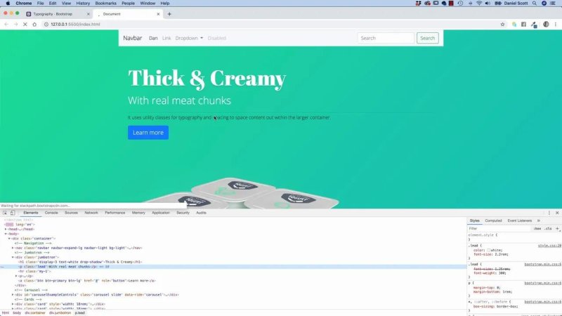
The finished hero combines Bootstrap’s layout with custom text styling, simplified content, and a tighter call to action.
The Practical Bootstrap Workflow
This is the process worth keeping, because it applies to far more than drop shadows:
Start with the design goal, not a random class name.
Search the Bootstrap documentation for an existing utility or component.
Try the built-in option and judge the actual visual result.
Inspect the element to understand which Bootstrap classes are already applied.
If Bootstrap gets close but not all the way there, add a small custom CSS rule.
Name the rule clearly so it can be reused.
Remove any default HTML or Bootstrap spacing that no longer serves the design.
Adding classes is no longer a big deal. Creating a modest custom class is not a big deal either. That is where Bootstrap becomes much more powerful: not as a constraint, but as a fast foundation you can confidently build on.
Key Terms
Bootstrap utility class
A small, ready-made class that applies one focused style, such as a shadow, margin, colour, or display property. Utilities help build interfaces quickly without writing every CSS rule from scratch.
Text shadow
A CSS effect that places a shadow behind the glyphs of text. Unlike a box shadow, it follows the letterforms rather than the element’s rectangular boundary.
rem
A relative CSS unit based on the root font size. Using rem for typography helps sizes scale more consistently across a site.
Developer tools
Built-in browser tools used to inspect HTML and CSS on a page. They are particularly handy for identifying which framework classes are affecting an element.
Margin utility
A Bootstrap class that controls space outside an element. In my-4, the y applies margin above and below the element.
FAQs
Why does Bootstrap shadow a heading as a box instead of shadowing the letters?
Bootstrap’s shadow, shadow-sm, and shadow-lg utilities use CSS box shadows. An h1 is a block element, so the shadow is applied to its rectangular box rather than its individual characters.
What CSS property creates a shadow behind text?
Use the text-shadow property. A subtle example is text-shadow: 0 2px 2px rgba(0, 0, 0, 0.15);, which moves the shadow slightly downward, blurs it, and keeps its opacity low.
Should I override a Bootstrap class or make a new custom class?
Override an existing class when you want to adjust its established role, such as making the Bootstrap lead text white and larger. Create a new class when the effect is a separate, reusable treatment, such as drop-shadow.
What does my-4 mean in Bootstrap?
It means margin on the vertical axis at Bootstrap spacing size four. The m stands for margin, y means top and bottom, and 4 selects the spacing amount.
Written by Daniel Walter Scott — Founder of Bring Your Own Laptop & Chief Instructor
