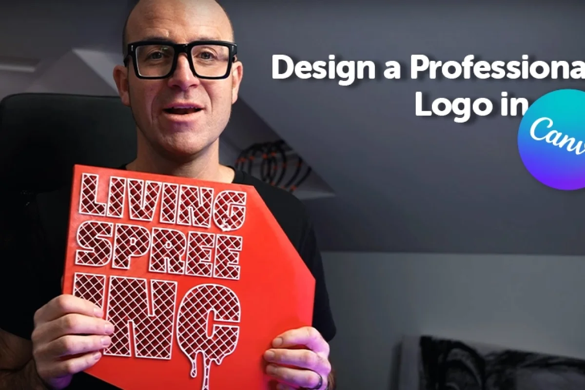
Design a Professional Logo in Canva

Daniel Scott
@dan
Creating a memorable brand identity starts with a strong logo design, but it doesn't stop there. A great brand identity tells a story, communicates your values, and resonates with your target audience. In this post, I'll walk you through the process I follow when designing a logo and building a brand identity, from the initial concept to adding color, refining the design, and applying it to real-world materials.
This post is based on my Canva Essentials course. When you become a BYOL member, you gain access to this course as well as my 30+ additional courses on Illustrator, Photoshop, Lightroom, InDesign, Figma, and more. As a BYOL member you will also enjoy personalized support, earn certificates, and tackle exciting community challenges. Head here to sign-up!
Step 1: The Story Behind the Logo
One of the most crucial parts of creating a logo is having a story behind it. This isn’t just about choosing the right design elements—it's about crafting a narrative that connects with both you and your audience. For example, when I designed my logo, I wanted it to represent the balance of danger and care. I added ink drips, symbolizing the risks of working with tools and the deeper meaning of the creative process.
This story becomes key in selling the design to clients because it gives the logo more depth. When explaining the logo, I can say, "This represents my personal experience, where creativity and caution meet."
Logotypes are vital for successful user and customer engagement. Give them depth, personality, and meaning.
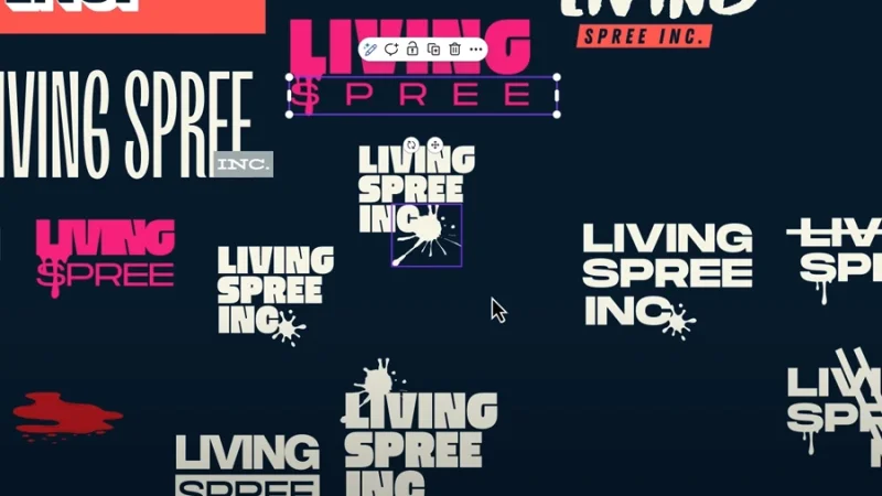
Step 2: Choosing the Right Font and Adding Flair
Once you have the story, it's time to choose the right font. I opted for a simple sans-serif font, something clean and professional. But I didn’t stop there. To make it unique, I added a flair—some subtle drips. This small detail enhances the logo's personality and ties back to the story.
It’s essential to choose a font that fits with your brand's tone. In my case, the clean lines of a sans-serif font worked well with the edgy design elements, creating a harmonious contrast.
Design unique and eye-catching details to take your typography designs to a whole new level.
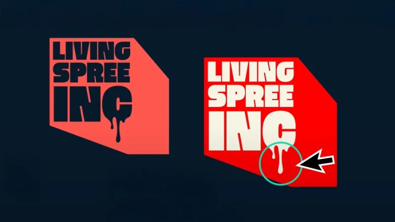
Step 3: The Power of Color
Now it’s time to think about color. Color plays a huge role in branding, influencing how people perceive your brand. For instance, I noticed that many competitors in my industry use red as their primary color. Red often signifies energy and urgency, but I didn’t want to blend in; I wanted to stand out.
To make this decision, I analyzed industry trends, then looked at the color wheel to find complementary colors. After some trial and error, I settled on a red that felt unique but still resonated with the overall vibe I wanted to create. I also selected a secondary color to balance out the palette, giving me flexibility when applying the brand to different materials like websites or presentations.
It’s not real magic: there’s a lot of trial and error in professional design. Cool designs take time and hard work.
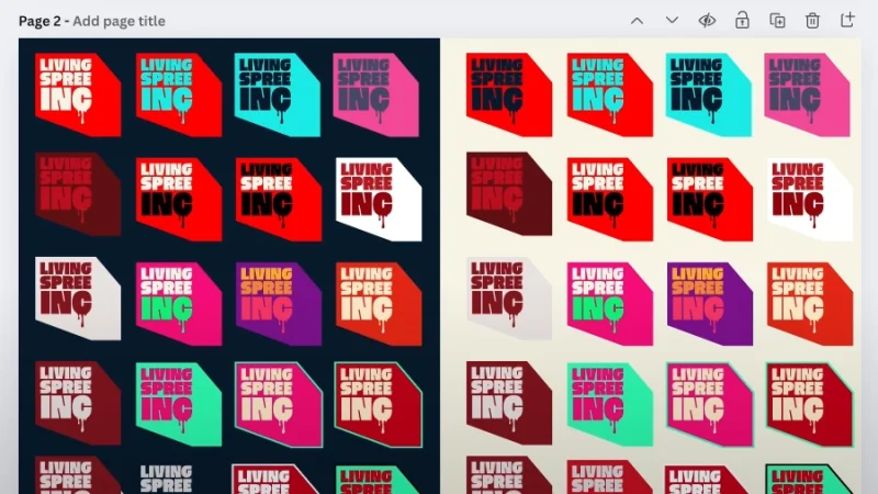
Step 4: Creating a Brand Kit
After settling on a color palette, I created a brand kit. This is where I input my colors and fonts into a design tool like Canva, which allows me to keep everything organized and easily accessible for future projects. I also uploaded my logo in different formats (e.g., PNG) so I could use it for mockups and other branding materials.
A brand kit ensures consistency across all your branding materials and helps you present a unified look, whether you're designing a business card, a website, or social media posts.
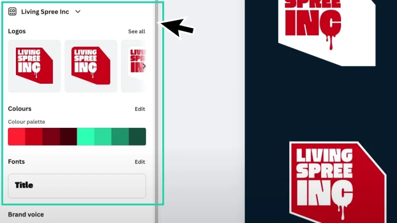
Brand Kit, although only available in the Pro version, is probably the most incredible workflow tool available in Canva!
Step 5: Mocking Up Your Logo
Once the logo is designed and the color palette is finalized, it’s time to see how it looks in the real world. Mockups are a powerful tool for visualizing how your logo will appear on physical products or promotional materials.
In Canva, you can easily find mockup templates for things like mugs, t-shirts, and business cards. I love seeing my logo on a mug or a sticker because it helps me visualize the brand in a tangible way. Often, seeing the logo in real life helps me decide whether it's the right fit or if I need to make adjustments.
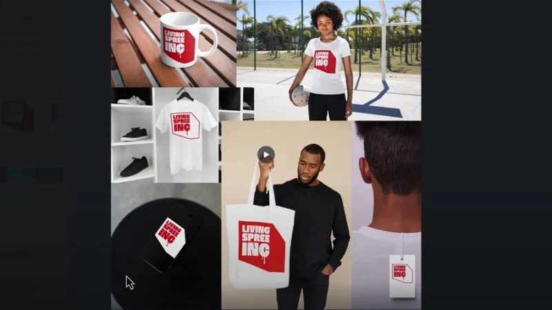
Testing your logos on mockups as you design them gives you additional layers of perception and information.
Step 6: Bringing Your Brand to Life
After refining the logo and getting feedback, I like to start applying it to real-world materials. For example, I often make stickers as a fun and easy way to showcase my brand. I export my logo design in SVG format, load it into my Cricut machine, and then spend some time trimming and weeding the stickers.
Seeing my brand on physical objects, like the back of my car or my laptop, reinforces the identity I’ve built. It makes it feel official and adds a sense of pride to the work I've done.
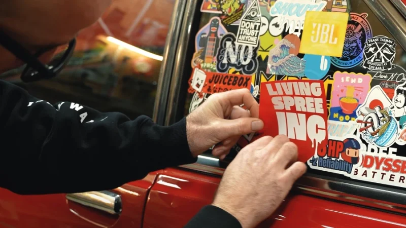
Testing on real-world material is the last Pro step for achieving logo design awesomeness.
Conclusion
Building a brand identity takes time and effort, but it’s worth it when you see everything come together. By following this process—starting with a strong concept, refining the design with the right fonts and colors, and testing it with mockups—you can create a brand that resonates with your audience and tells a compelling story.
Whether you're designing for yourself or a client, always remember that branding is about more than just aesthetics—it's about telling a story that connects with people and makes your brand unforgettable.
What 's Next?
Join BYOL and grow your design skills in my Canva course. When you become a BYOL member, you gain access to this course as well as my 30+ additional courses on Illustrator, Photoshop, Lightroom, InDesign, Figma, and more. As a BYOL member you will also enjoy personalized support, earn certificates, and tackle exciting community challenges. Head here to sign-up!
See you in class! – Dan
Popular posts
Adobe MAX 2025 - File Download
Daniel Scott
-1750161634.webp)
Modeling Shortcuts in Blender
Daniel Scott
Plugins in Illustrator
Daniel Scott
-1748277302.webp)
How to Straighten the Horizon in Photoshop
Daniel Scott
Go from zero to design hero with our awesome courses!


- Powered by Marvin
- Terms of use
- Privacy policy
- Cookie policy
-
- © Bring your Own Laptop Ltd 2026