How To Make A Button In Figma

Daniel Scott
@dan
In this post, we will learn how to make one of the most popular objects in User Interface (UI) Design: buttons! Buttons are key for human interaction with digital products, from logging in to purchasing a product and signing out of accounts. People love buttons, tapping and clicking on them, and seeing where they lead to. Figma is a fantastic tool for designing buttons and making them irresistible to any user.
I’ll take you through a step-by-step tutorial covering the basics so you can build up your confidence and create the professional level prototypes you’ve been dreaming of.
This post is based on my Figma Essentials course. Make sure to join BYOL right now and start building up your skills as a gifted UI designer!
Ready for more? Become a BYOL member!
Explore 30+ Essentials and Advanced courses in Figma, Photoshop, Illustrator, Lightroom, Premiere Pro, Webflow, and more. Enjoy personalized support, earn certificates, connect with other creators and tackle exciting community challenges.
START YOUR LEARNING JOURNEY
Unlimited access to ALL content
Instant access to all of our courses and exclusive content while you're a member.
Priority advice and support
Ask us anything! Our amazing Teaching Assistants are here to support you
Certificates of achievement!
Celebrate and share the milestones in your learning journey
Buttons – why do we love them?
Let’s understand why buttons are so important in UI design and why designers invest much time and energy on these elements.
Buttons are the primary choice for user interaction. People use them to open menus, submit information, and activate countless features within most apps or websites.
Buttons are also used for navigation. Buttons guide users through the flow of an app or website, connecting different screens and sections.
Buttons catch a user’s attention and call for decision making and quick action.
Don’t consider buttons just simple triggers. They are essential for an app or website’s usability. Buttons determine if your product is easy for users to understand and navigate through.
Buttons can also contribute to making your app or website enjoyable from an aesthetic point of view by combining beauty and functionality.
Make sure you design buttons to be intuitive, appealing, and accessible. It’s all about your users’ needs and emotions!
Let 's move on!
1. Typing a label
Let’s start with a button’s label. This is the instruction or message we want to send to our user when they see the button. One or two words that share “this is what you should do to move on to the next screen or fulfill your goal.”
With the Type tool selected (shortcut key T on both Mac and PC), we click anywhere inside the frame and type our text label. I’ll begin with “Sign Up”.
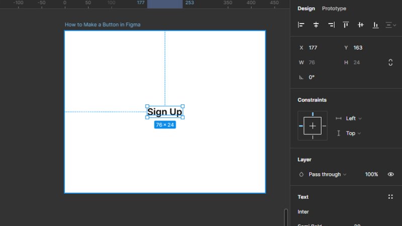
Use the Type tool to set your button’s label.
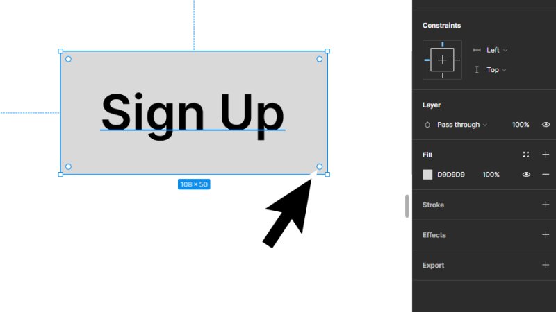
2. Designing a button’s shape.
Let’s add our button’s shape or clickable area. With the Rectangle tool selected (Shortcut key R on both Mac and PC), we place our mouse cursor inside the frame and click and drag to draw a new rectangle over the text, making sure it has the adequate dimensions for holding the text we’ve just typed.
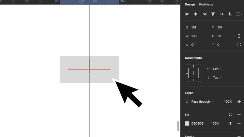
Start from a regular rectangle and shape it into a work of art!
Remember that Figma works with overlapping layers. Let’s move the rectangle behind the text so we can see both shape and label. We can do this by clicking the Figma icon on the top left of our workspace to open the Main Menu. Next, we choose Object and then Send to back.
We can also use the right bracket (]) shortcut key to place objects on top of all other layers or the left bracket key ([) to place objects behind all other layers.
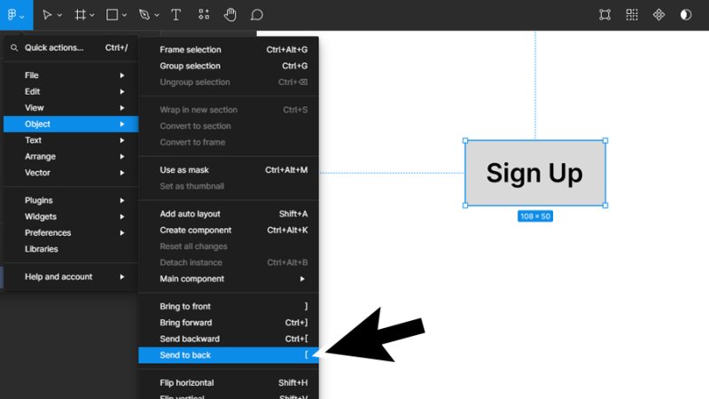
Click on “send to back” to place the rectangle behind the text label.
Now we have our button’s wireframe version in view. Nice work! Let’s step up a notch.
Timeout #1
Dive into the world of button styles and best practices in this article about UI design.
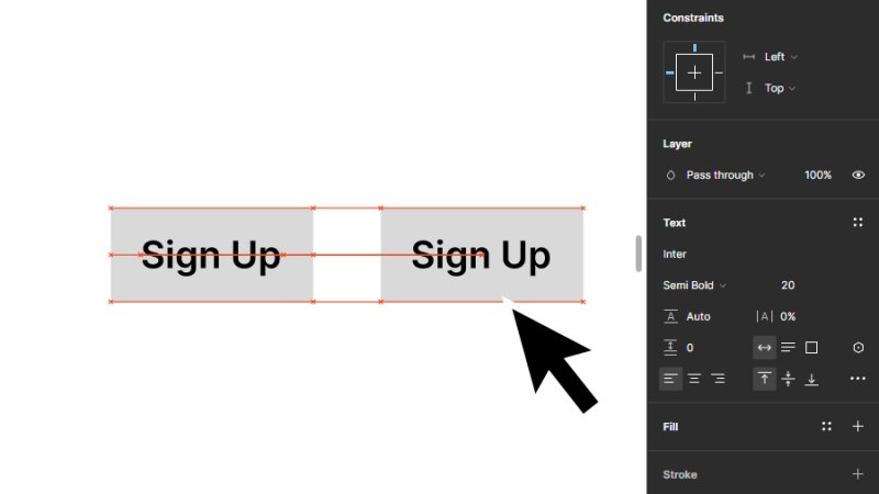
3. Duplicating a button’s shape and label
This is easy! Select both text and rectangle. How do we do it? Select the Move tool (shortcut key V on both Mac and PC), click and drag over both elements and it’s done, they are both active. We could copy and paste them inside our frame, but there’s also a cool shortcut for this: hold down the Option key on a Mac or Alt on a PC, click and drag the duplicate to the side. Easy!
Duplicating objects with a shortcut key feels very professional!
You can repeat this process as many times as you need to, but you can also use Components and Instances that will simplify this process, speed up your workflow, and keep your design consistent across screens. Make sure to check out my Figma Essentials and Advanced courses to master these features!
4. Rounding shape corners
Now we’ll make our button feel natural to our users’ perception. Research suggests that people respond better to rounded and organic shapes as opposed to sharp and angled ones. Why? Round shapes are interpreted by our mind as comfortable and safe. Angled or sharp shapes suggest stress and danger. It’s good to study how people observe and react to shapes and colors to better understand UI design.
Let’s learn how we can round corners in just a few seconds.
With the Move tool selected, we hover our mouse cursor over the rectangle. We should see the radius handles inside, those round dots next to each corner. If they are not visible, check if the Move tool is active or try zooming in on the object.
Use the radius handles to round your rectangle shapes’ corners.
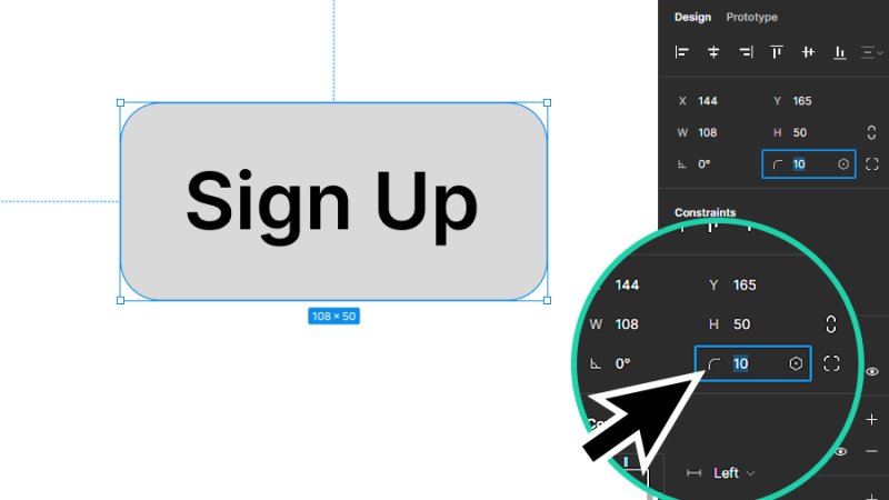
Let’s click and drag one of the radius handles to round our rectangle. As we can see below, by moving one of the handles, we are applying a curve to the four corners at the same time. For this shape’s proportions, I’ll choose a value of 10.
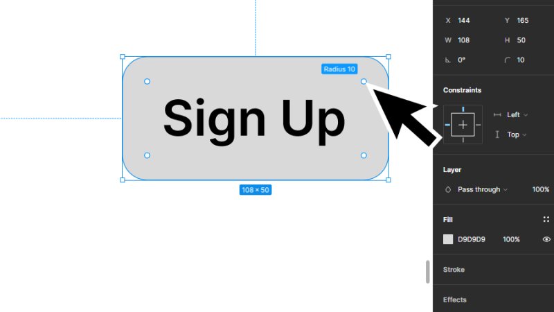
By default, dragging one of the radius handles will affect the other three.
Another way to do it is moving up our cursor to the Properties panel and inserting a value in the Corner Radius field. I’ll type 10 so we can observe the same result.
Use the corner radius field to insert a specific value and accurately edit the rectangle’s corners.
5. Customizing individual corners
Our button is already looking great! Let’s learn how to adjust individual corner radius values and give our button a surprising visual style.
There are two ways to do it, once again in just a few seconds. Still using our Move tool, we hold the Option key on a Mac, Alt key on a PC while clicking and dragging one of the radius handles.
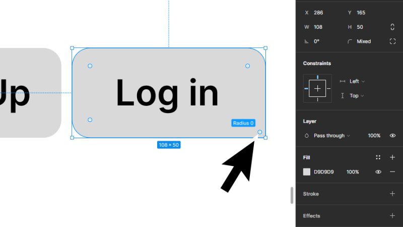
Use the shortcut key Option on a Mac or Alt on a PC to individually edit each corner.
We’ve changed only the button’s bottom right corner. Awesome, huh? We can also change this corner’s radius value by clicking on the Independent corners button in the Properties panel and then typing a value on each corner’s field. Combine all these values to create truly unique shapes – but always keep accessibility and usability in mind!
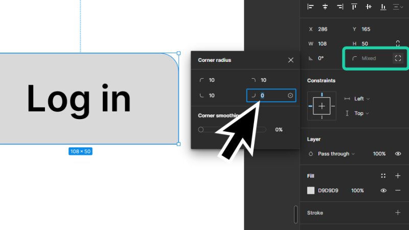
You can define different radius values to each corner inside the Corner radius settings panel.
6. Adding colors and effects
Let’s take a peek at prototype visual design. We’ll stylize two buttons, “Sign Up” and “Log In”, and use color for extra contrast and to help users identify both available actions.
First, we select the rectangle object from the “Sign Up” button. Then, we move our cursor to Fill on the Properties panel and choose an accent color with the color picker. This can relate to brand identity or serve any other visual goal we are aiming for.
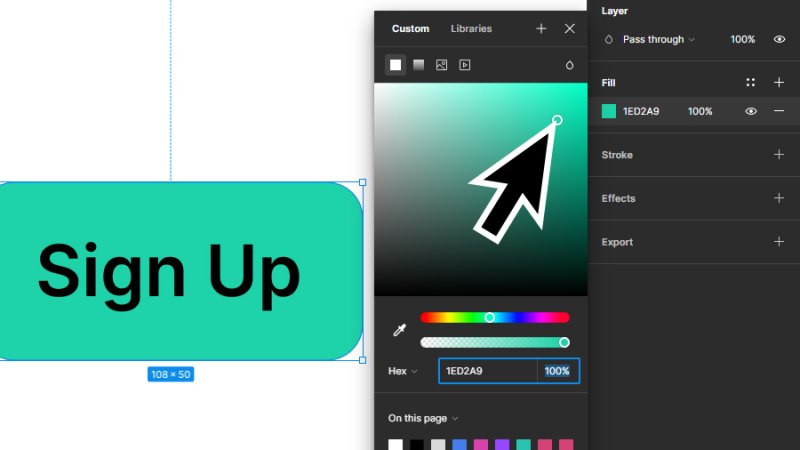
Pick a color for the button’s background from the Fill settings panel.
Next, we select the button’s text objects, click on Fill, and pick a color with a high contrast effect to enhance user readability.
Pro Tip: When creating a dark contrast to another object’s color, don’t always go for full black. You can keep the color transition smooth and professional by picking a darker shade of the accent color.
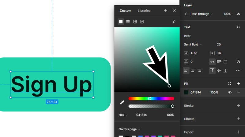
Pick a dark shade of your accent color to keep your design visually consistent.
Moving on to the second button, we can simply switch accent and type colors to create a strong visual contrast with the first. Users will now understand that they are looking at two different entry points to the app or website’s user flow.
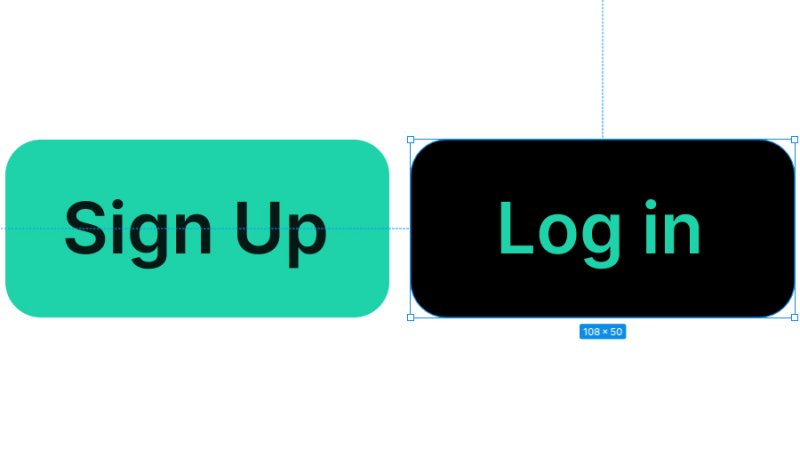
High contrast in both shapes and font color are accessibility standards that you must follow in your designs.
Timeout #2
To become a better UX and UI designer, you need a strong understanding of the seven ground rules for human-centered design.
Finally, let’s add depth to our buttons by casting a subtle shadow behind them. By keeping shadows smooth and nearly visible, we will achieve a more natural and relaxing look.
We move the cursor to the Effects option in the Properties panel and click the Add Effect button, the one with a + icon.
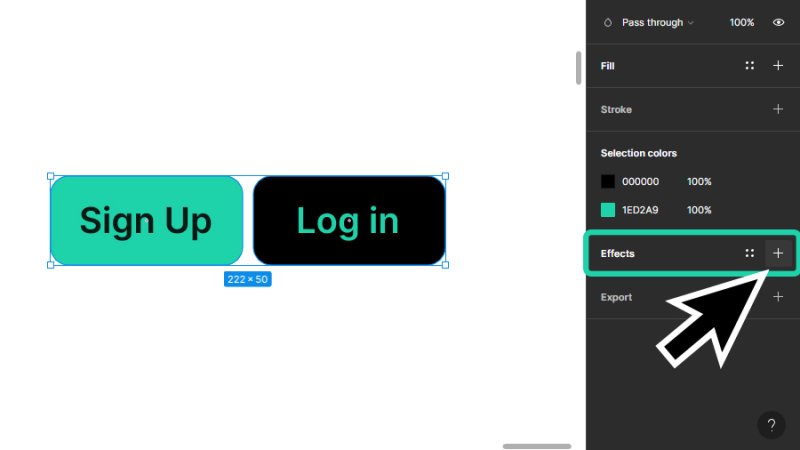
Include effects like drop shadow to bring depth and personality to your UI design.
By default, Figma adds a Drop Shadow to the selected object. We’ll be keeping that one for this example but remember that there are other options available. We can customize this Drop Shadow by clicking on the Effect settings button and adjusting the direction, intensity, color, and opacity settings. I’ll go for the subtle look, you can try your own settings, it makes for great practice!
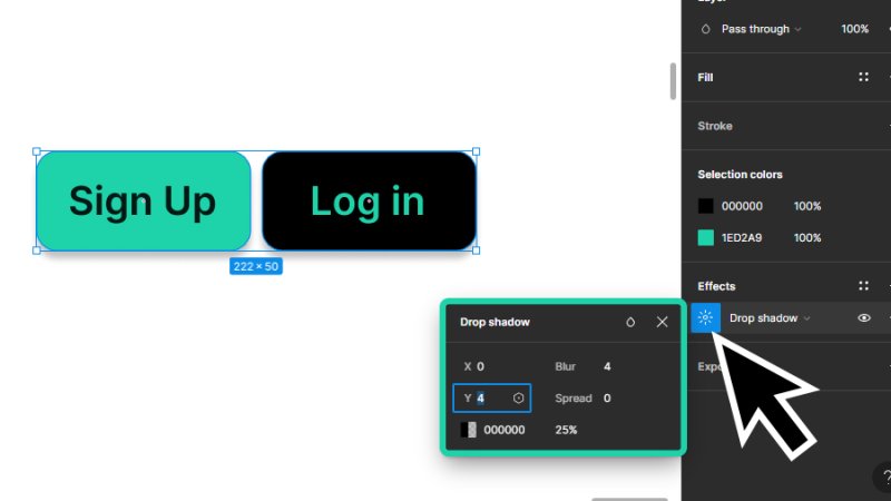
You can edit your Drop Shadow settings anytime by clicking the Effects settings button.
To have a clear view of how these buttons may look inside an UI layout, I’ve placed them over a smooth abstract background. Spend a few seconds looking at this example and see what works for you and what could be changed to make it better, more accessible, and fun!
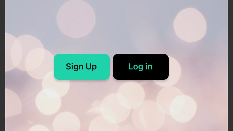
Observe your designs from the user’s point of view and reflect on improvements for user experience..
And there we have it!
If you have just finished designing your very first buttons in Figma, congratulations! You have begun an incredible journey into the world of UI Design! You have learned how to draw and stylize a set of buttons in Figma, and how to approach the planning and design of buttons to ensure a better user experience. You are now ready to start your own wireframes and prototypes in Figma! Alright!
What 's Next?
Dive deeper into Figma at Bring Your Own Laptop. When you become a BYOL member, you will gain access to my Figma courses as well as my 30+ additional courses on Photoshop, Illustrator, Lightroom, Premiere Pro, Webflow, and more. As a BYOL member you will also enjoy personalized support, earn certificates, and tackle exciting community challenges. Head here to sign-up!
See you in class! – Dan
Popular posts
Adobe MAX 2025 - File Download
Daniel Scott
-1750161634.webp)
Modeling Shortcuts in Blender
Daniel Scott
Plugins in Illustrator
Daniel Scott
-1748277302.webp)
How to Straighten the Horizon in Photoshop
Daniel Scott
Go from zero to design hero with our awesome courses!


- Powered by Marvin
- Terms of use
- Privacy policy
- Cookie policy
-
- © Bring your Own Laptop Ltd 2026