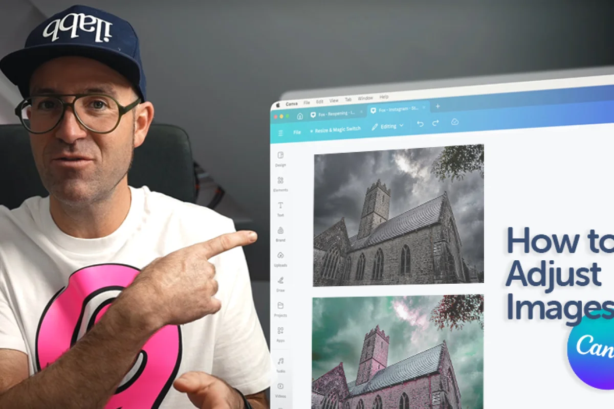
How to Adjust Images in Canva

Daniel Scott
@dan
If you have ever talked with people about wanting to learn Canva, or designing with Canva, you may have heard comments like “it’s good, but it’s no Photoshop!” Well, I’m here to tell you that Canva is good and has powerful built-in image editing resources that can get the job done! I’ll show you how you can edit and transform your photos – and how quick and easy it is to do so – and let you decide when it’s better to use Canva or more industry standard apps like Photoshop.
This post is based on my Canva Essentials course! I’m excited to share it with you and help you get started with this awesome design tool! When you become a BYOL member, you gain access to this course as well as my 30+ additional courses on Illustrator, Photoshop, Lightroom, InDesign, Figma, and more. As a BYOL member you will also enjoy personalized support, earn certificates, and tackle exciting community challenges. Head here to sign-up!
Alright, image editors of the world, fire up your laptops and let’s go!
How to upload a new image to Canva
Let’s start by bringing your photos to Canva for editing and use in a new design. From the Canva Homepage, pick Create a Design. There is a vast selection of projects you can work on including social media posts, prints, videos, presentations, and more. Choose the one you want to try out and tag along!
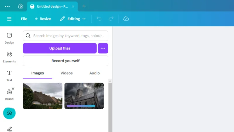
Once inside our new project page, we select Uploads from the left toolbar. Next, we click the Upload files button, browse our hard drive folders and select the photos we need. If we click the additional options button to the right, we can find other sources like Google Drive, social media platforms, Dropbox, etc.
When the upload begins, we should see preview thumbnails and a loading status bar displaying the upload progress.
Uploads keep your personal resources stored and easily accessible.
When this process is finished, all we need to do is click one of the photos to place it on our new project’s page. We can also click, hold, and drag photos from the Uploads panel to the page.
These photos were taken by yours truly, Dan Scott, and they are included in the Canva Essentials course exercise files, exclusively available for BYOL students. If you’re still missing out on all the amazing courses and resources we have for you, sign up here.
I’ll add the same photo twice and set each as ‘before’ and ‘after’ so we can easily follow the changes we are making to the original. You don’t have to do it on your end, it’s totally optional.
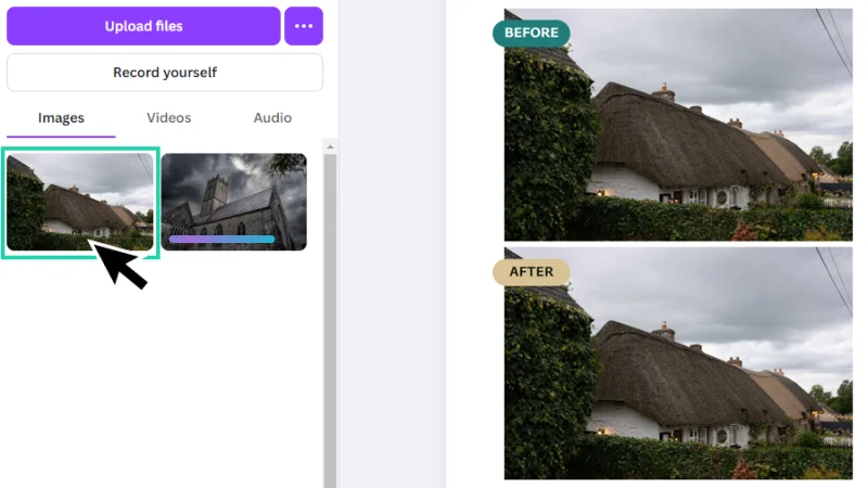
These are the most adorable cottages! Can’t forget to remove those power lines, though…
How to Edit a Photo in Canva
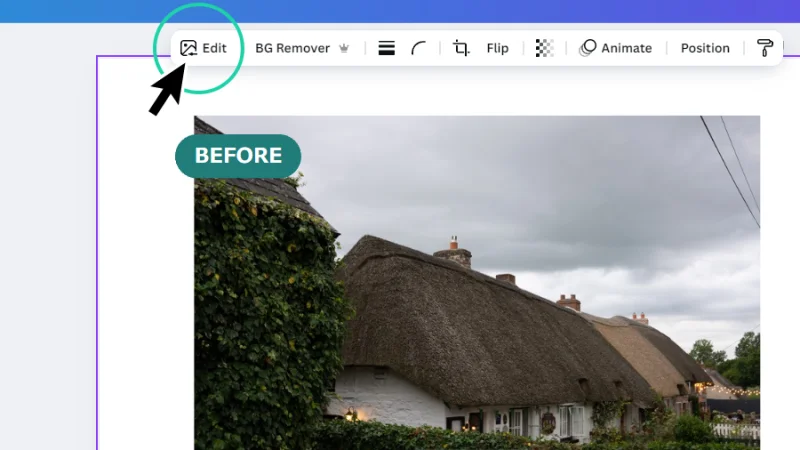
Let’s keep the Before photo as it is and select the After version. Next, we move our mouse to the contextual toolbar over at the top of the page and click the Edit button.
Get started! I can’t wait to see how amazing our edited photo will look!
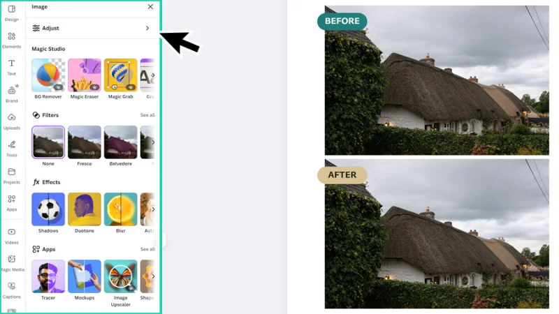
Now we are looking at the Image panel. This is where the magic happens!
There are five editing options in the Image panel:
Adjust – straight from photographers and image editors’ handbooks, we can manually adjust image settings like temperature, brightness, contrast, vibrance, and others.
Magic Studio – these are the next-level, generative AI-based tools for image editing and manipulation.
Filters – another gem for photographers and image editors who want to quickly fix a photo, while bringing a whole new look and mood in just a few clicks.
Effects – add unique effects to photos, like shadows, duotones and blur effects to enhance style and personality.
Apps – a collection of Canva and third-party developed plug-in to assist us across the different stages of image editing.
Let’s focus on manual adjustments for now. I’ll show you Filters and Effects later down the road. We’ll take this path because I believe this is the best way to learn photo editing and retouching: hands-on and observation. As we play around with each adjustment, we get a clearer understanding of how each setting impacts all the elements in a photo composition, from background, to subject or foreground.
it’s not Photoshop but, hey, it’s a really good start to get there!
Manual Adjustments
We all have different methods to start and finish editing a photo, it doesn’t matter if you are working with Lightroom, Photoshop, or Canva.
I usually start with cropping the image to optimize the composition, and then move to brightness and contrast, and so on. Funny thing about Canva: we can get some quick and interesting results (especially if we are working with those tight deadlines) if we start our editing with Texture on the last section of the Adjust panel. Considering a photo like the one we are now editing, with all that foliage and roof textures, adjusting Sharpness and Clarity will give it, in seconds, a sense of higher definition and visual intensity. Have a look at the image below. There is a sharper look to the After version, right? This is cool, but let’s go all in!
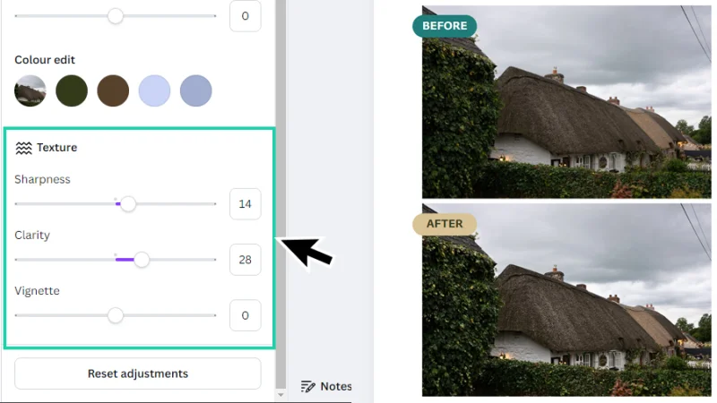
Sharpness and Clarity are efficient options for photos with lots of texture to bring up!
But let’s bring the Adjust panel back to the top and have a look at all the settings Canva has much to offer its brave editors. I’ll break it down below (without diving too much into photo theory):
White Balance
Just a hint of photo theory, sorry. In a photo, if white doesn’t look white, none of the other colors will look good. Shooting under different light sources (sunlight, candles, fluorescent lights), weather conditions, or hours of the day, will have an impact on how colors will look in the photo. Some of these will cast warm orange and yellow tones into the image, others will feel colder, in blue tones. In Canva, we use Temperature and Tint to remove these odd colors and make the white areas of the photo a solid reference for all the next editing steps.
Temperature – think ‘warm’ and ‘cold’, ‘yellow/orange’ and ‘blue’. If your image looks too blue-ish, raise the temperature, push the slider to the right or zero. If your image looks too orangey, just lower the thermostat! Bring the slider to the left of zero, down to negative numbers.
Tint – Tint is slightly different. Think green and magenta/purple tones. As we adjust Temperature settings, we can end up not clearing some other odd tones in our photo. We don’t use Tint much, but it is good to fine tune the white areas, so always keep adjustments subtle – you don’t want to end up with a green colored sky with purple clouds! Or maybe you do!
Summing it up: while adjusting Temperature and Tint focus on the areas you know are supposed to be white. You are not fixing colors yet! Get those white details right and all the other colors will look great in the end!
Light
Getting the best light across all the elements in your photo will hardly be reduced to adjusting one setting, only. It’s up to some teamwork! Let’s see how each option will bring up the ultimate finish.
Brightness – This is not a scalpel. It’s a blunt instrument. Brightness balances the overall light level in the photo. It makes everything brighter or darker. This is the setting you want to adjust carefully, or you will lose detail.
Contrast – Balances the difference between light and dark areas. High contrasting light adds drama, low contrast makes the image softer. How you adjust contrast will depend on the mood you are looking for.
Highlights – Adjusts the brightest parts of a photo – think about clouds, shiny surfaces, light reflections. This setting is vital if these parts are overexposed, and we need to recover some detail.
Shadows – The other side of the coin. This setting adjusts the darker parts of a photo – think about shades, dark clothes, corners, low lit scenes.
Whites – The setting to fine tune the editing after applying Highlights, to make sure the bright details don’t look too bright or too dull.
Blacks – Use this after adjusting Shadows, to add some more drama or keep the overall mood a bit lighter.
For the image we are working on, I’ll make some subtle adjustments, as you can see in the image below. I just wanted to make it look a little warmer, to make the whites in the photo less gray (a cloudy sky on a rainy day makes everything feel a bit dull), so we can add some more excitement to the finished image.
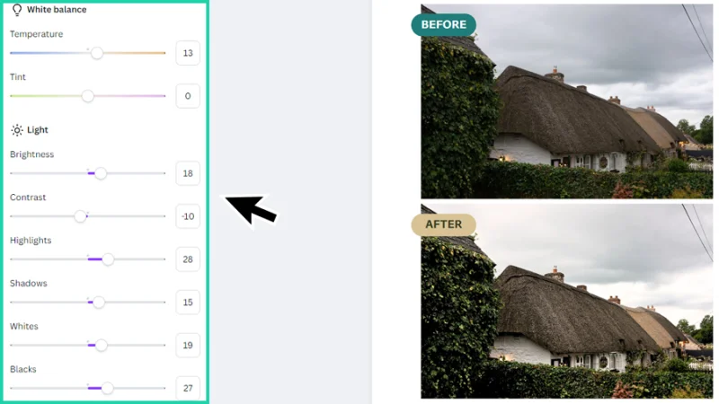
White balance and Light settings are the foundation for the overall image editing work.
Let’s move on to color!
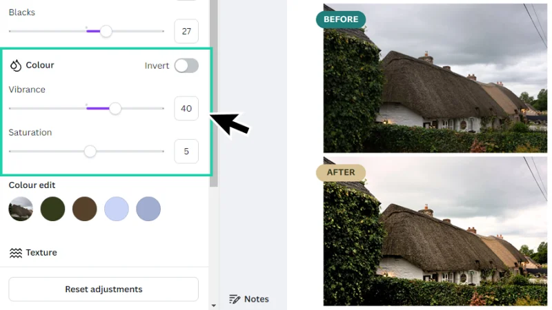
Color
Color is life! If we want to bring up a strong emotional response, we must dedicate some time to colors! We can summon a sense of joy and excitement, if we make our colors intense, or peacefulness and nostalgia by making colors soft and muted. To balance this in Canva, we can adjust Vibrance and Saturation levels.
Vibrance – My tool of choice for quick color adjustment. Vibrance can make soft colors more vivid, protecting the ones that already look intense. This prevents us from overcooking our image, making it look too ‘loud’ and, even worse, poorly edited. Remember, the goal of image editing is making sure that the photo won’t feel like it was edited at all. Tip: vibrance works better than saturation on skin tones.
Saturation – Again, a blunt instrument. Saturation pulls up or lowers down all the colors in a photo at once. Too much will make colors look too intense, too low will bring colors down to almost black and white. Tip: saturation is a good resource for product shots and travel photography.
For our beloved cottage photo, I’ll adjust vibrance up to 40 to make the colors slightly more intense without breaking the cloudy day mood, but making the composition look more alive. Raising saturation to 5 is more of a psychological thing, this value barely affects the image. I won’t play around with Color edit to keep things at an essential level.
photo, light gives us clarity and definition, colors and emotions.
Color Edit
Color edit reads the image and identifies the dominant color palette, allowing us to manipulate each color individually. We can only adjust Hue, Saturation, and Brightness levels but it is still an interesting option. A subtle use of Color Edit can help us boost a single color to set a specific mood to the composition or, with a pinch of creativity, make all those leaves purple! Awesome, huh?
Texture
We’ve seen Sharpness and Clarity in action right at the start of this section, but let’s elaborate just a bit more. Texture settings don’t change color or lighting, they make the image sharper or softer, and more focused.
Sharpness – Enhances edge definition. High value settings make fine details, like hair or fabric, look sharper. Low values make the details softer, slightly blurry.
Clarity – Influences contrast in midtones, the areas in the image with balanced lighting (not too bright and not too dark). This effect makes textures stand out – or go dreamy soft – without changing overall brightness levels.
Vignette – Vignettes are subtle dark frames that add an artistic mood to the photo and direct the eye to the subject of the composition.
This is the finished result of our first image editing, displaying only the changes I listed above. I could make some more changes, but I guess these are good enough to illustrate Canva’s potential to transform dull images into detailed, rich photographs!
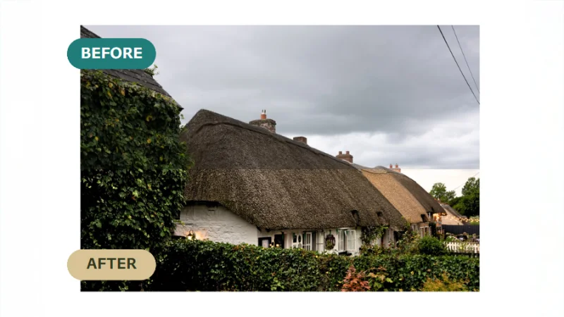
Can you spot the differences? I bet you can! It’s not Photoshop, but Canva delivers!
How to Apply Filters to a Photo in Canva
Filters are a quick and easy way to fix a photo or give it a whole new look. Let’s have a look at how Canva helps us with this transformation.
I’ll be working on another photo taken by the award-winning, landmark photographer, Dan Scott. You can use any other photo if you still don’t have access to BYOL Exercise Files resources.
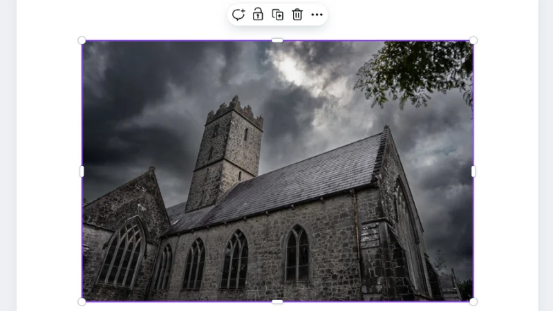
I know what you are thinking. Is it always this cloudy in Ireland?
Before jumping into Effects, let me just show you another cool Premium feature in Canva: the Background Remover. With our image selected, we move up to the contextual toolbar and click the BG Remover button. Canva reads the image, identifies foreground, subject, and background elements, and automatically removes the background from the photo. I’ve tried this feature with many different photos and settings and the results are quite impressive. Canva’s AI technology is great!
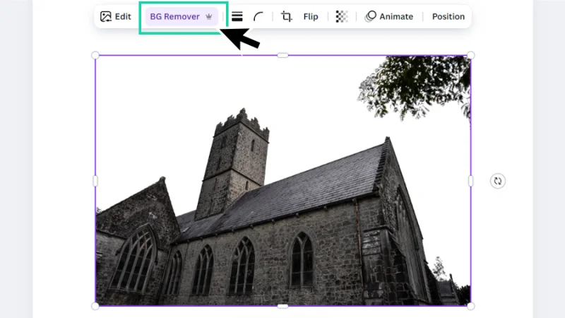
And the cloudy sky is gone! I wish I could do this in real time, we’d have summer blue skies all the time!
If you are curious about the potential of the Background Remover, check out this detailed blog post on the background remover!
Moving on to Filters!
We’ve covered the first steps. With your image selected, click Edit in the contextual toolbar above your project page. In the Image panel, we find the Effects section. Click See all to open the Filter Gallery.
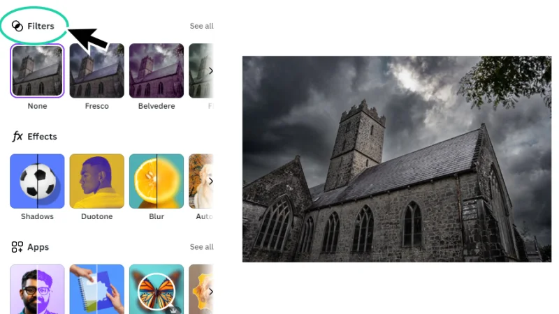
Photographers often use lens filters to add a special look to their photos. Canva has a collection of digital filters for you to do the same!
There are a diverse number of filter types to explore, divided into categories:
Natural
Warm
Cool
Vivid
Soft
Vintage
Mono(chromatic)
Color Pop
Filters are basically preset adjustments that help us transform our images with just one click. Unlike the manual adjustments we’ve seen earlier, and even though you can adjust the Intensity of the filter you are applying, the result is pretty much ‘what you see is what you get’. I’ll apply a Warm filter to my photo, to contrast with the cold original look. Some filters will require reducing Intensity to make the changes feel more natural. I’ll leave it slightly overcooked for you to clearly see the differences.
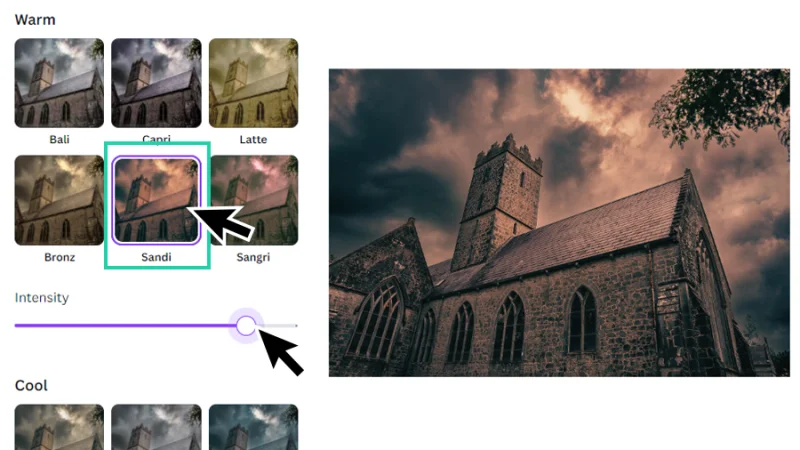
Only one click to jump from cold and gloomy to… well, warm and gloomy. But it’s a start!
Take your time to explore all the available filters, use different photos, light settings, themes, and subjects and take some notes. Which filters work best for your projects – or don’t work, this is all helpful to learn. Have fun with it!
How to Apply Effects to a Photo in Canva
Let’s wrap up this blog post with Effects. Canva doesn’t include many built-in Effects for us to work with but there are some plug-ins (Canva calls them Apps, remember?) that add some extra resources for this purpose, but it’s still a work in progress.
Take some time to explore effects and Apps in Canva. I’ll show you how to apply a Duotone effect to a photo.
The Effects section can be found in the Image panel, just below Filters. We can access the Image panel by clicking Edit in the contextual toolbar.
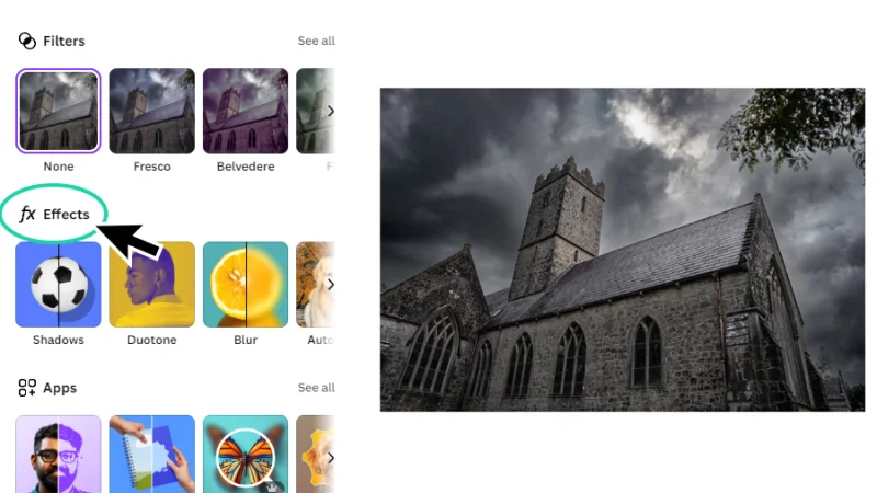
Effects need improvement, but I’m sure Canva will surprise us with some cool updates soon.
Click the Duotone button to open the gallery and browse through the options. I’ll pick ‘Mint Choc’ because it keeps the photo’s details clear enough and both green and dark brown colors have strong contrast.
One cool thing about the Duotone effect: we can adjust its Intensity (like we did with Filters) and we can also customize it, by clicking each color swatch and using the Color Picker window to choose a new set of tones. I’ll try a bright yellow and dark purple combination and see what happens.
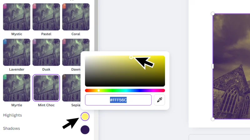
Customizable duotones are awesome! Go subtle or go nuts!
And There We Have It!
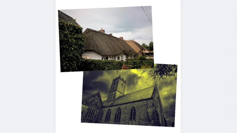
Look at those, all edited and good-looking! I can’t wait to see what you did on your side!
Alright! I hope you enjoyed this read and that you are now aware of all the image editing potential that Canva has to offer, along with all its other amazing features! We’ve covered manual adjustments to bring out the professional photographer in you, one-click filters and effects, all made quick and easy, so you can work free of stress, with some cool music in the background, and have the best time as a graphic designer! Thank you for reading this blog post, come back soon!
What’s Next?
Join BYOL and have fun learning Canva or go beyond and access my Illustrator Essentials and Advanced courses as well as my 30+ additional courses on Figma, Photoshop, Lightroom, Premiere Pro, Webflow, and more. As a BYOL member you will also enjoy personalized support, earn certificates, and tackle exciting community challenges. Get started here.
See you in class! – Dan
Popular posts
Adobe MAX 2025 - File Download
Daniel Scott
-1750161634.webp)
Modeling Shortcuts in Blender
Daniel Scott
Plugins in Illustrator
Daniel Scott
-1748277302.webp)
How to Straighten the Horizon in Photoshop
Daniel Scott
Go from zero to design hero with our awesome courses!


- Powered by Marvin
- Terms of use
- Privacy policy
- Cookie policy
-
- © Bring your Own Laptop Ltd 2026