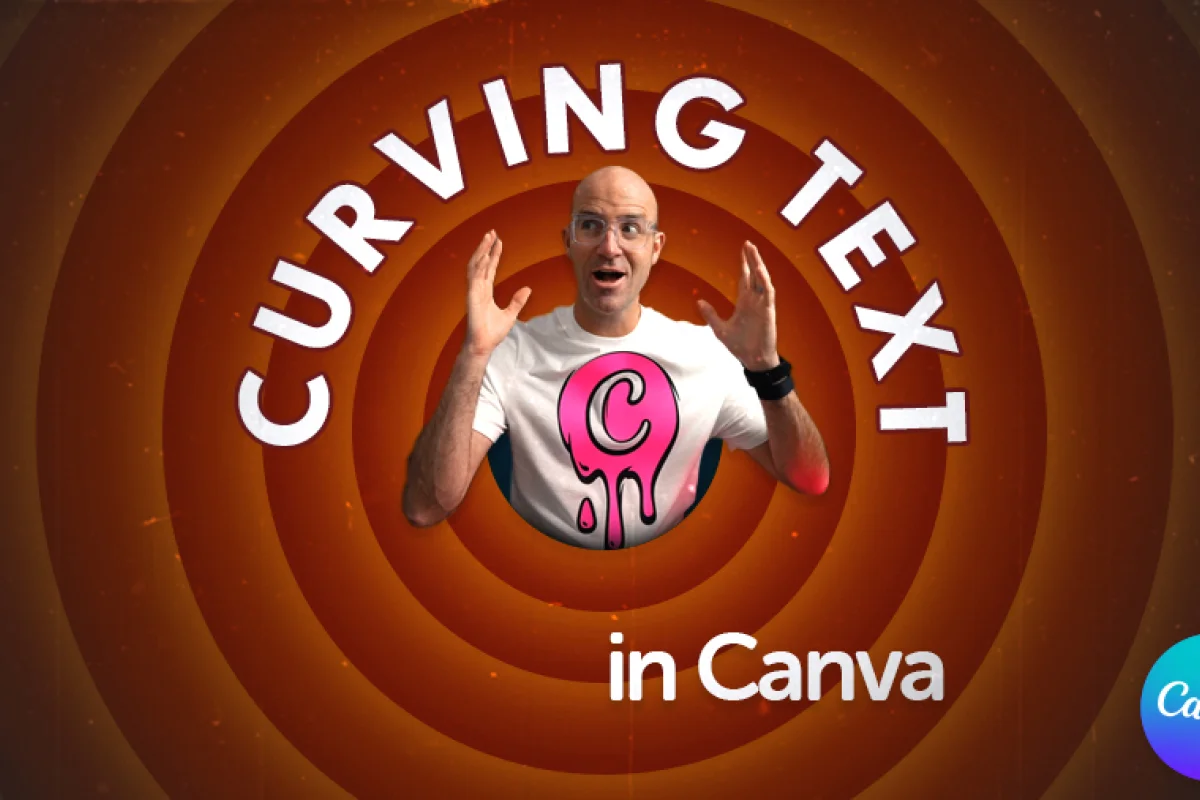
How to Curve Text in Canva

Daniel Scott
@dan
In this post we are exploring typography, one of the most vital graphic design principles. We’ll have a look at how we can add an extra wow-factor in Canva by curving text around a photo’s subject, adding new layers of depth and significance to the composition. They say an image is worth one thousand words. It’s true, but an image with cool typography is worth a million views! Follow along and have fun!
This post is based on my Canva Essentials course! When you become a BYOL member, you gain access to this course as well as my 30+ additional courses on Illustrator, Photoshop, Lightroom, InDesign, Figma, and more. As a BYOL member you will also enjoy personalized support, earn certificates, and tackle exciting community challenges. Head here to sign-up!
Motivational poster designers, gather around and let’s begin!
How to Curve Text in Canva
Following the focus of my new Canva Course, we’ll be designing an Instagram post using an inspirational photo and some awesome curved text to make it stand out on your friends and followers’ feeds.
From Canva’s Homepage, we click on Create a design. Inside the Create a design panel, we select Social Media, and then Instagram Post (Square).
I’ve started with an image I picked from Canva’s Elements resources. I also looked up a cool quote that complements the photo’s mood, we will get to it a bit later. You can use any other Elements image you prefer or upload your own image to Canva. Once you place the photo on the page, right-click it and select Set image as background and we are ready to add text. Let’s go!
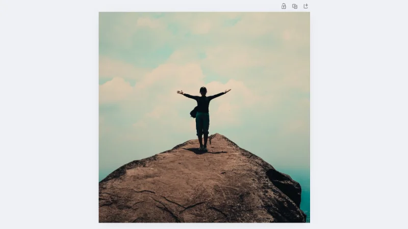
This image is the foundation for our Instagram post. Let’s make it more appealing!
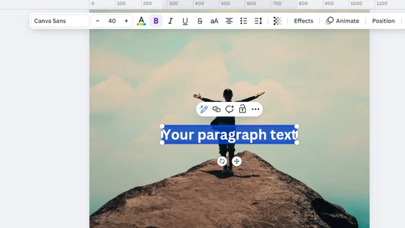
We’ll start by placing a new text box on our Instagram Post’s page. We can click Text on the left toolbar and then Add a text box or simply hit the shortcut key T on our keyboards. As we can see in the image below, the new textbox is placed on the center of the page and the contextual task bar above the page dynamically changes into a word processing settings mode.
From this point, we can edit settings like:
Typeface or Font
Font size, color, and style
Alignment
Spacing
There are also Transparency settings, Effects, Animation and Layer options that can be adjusted to fully customize the text we are bringing into the composition. Cool, huh?
It’s not just a text box, it’s a world of possibilities! Fun!
We will be dividing our quote in two. Let’s type the quote’s first half on the text box we’ve just created and align it to the center of the page. Next, let’s push it above the subject in the photo so that when we curve the text it seems to surround her.
While we drag the elements across the page, Canva displays guides to help us with these adjustments and keep layouts balanced and consistent.
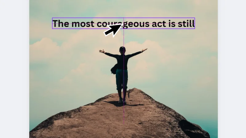
Take time to plan your text box placement within the composition.
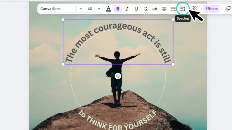
Let’s add the second half of the quote inside a new text box, drag it over to the mountain floor and, once again, align this element with the subject in the photo, so the text will seem to wrap around her when we start curving it. Now, let’s give our text elements some color. With the text box selected, click on the Text colour button up on the contextual task bar. The Colour panel pops up on the left. We can customize colors, use default solid color options (we still can’t apply gradients to text in Canva), or sample colors from the background image, under the Photo colors option!
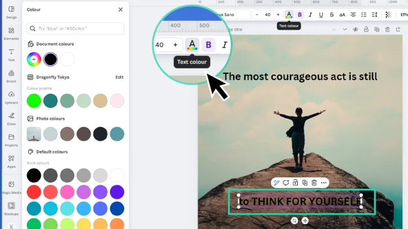
This text needs a brighter color to stand out from the background and enhance readability.
Now that we have our text ready to shine, let’s start bending it around our subject and see if it looks good. I bet it will! Let’s go back to the first half of our inspirational quote, select it, and click on Effects from the top contextual task bar.
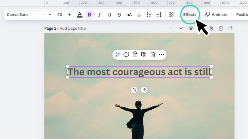
We can find the Curve option under text Effects.
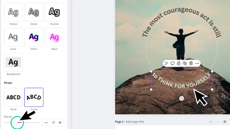
Inside the Effects panel, let’s move our mouse to Shape and click the Curve option. This curvature can be adjusted by moving the Curve slider to the left and right, typing a value on the field next to it, or clicking on the + and – buttons to fine tune the curvature. Depending on the image and text you are working on, this fine adjustment can help you with precision and balance, as we will find out in the next steps.
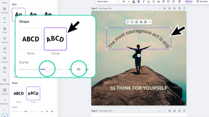
Nice! Our text is already making a lovely curve, as if the woman’s arms had influence over the text.
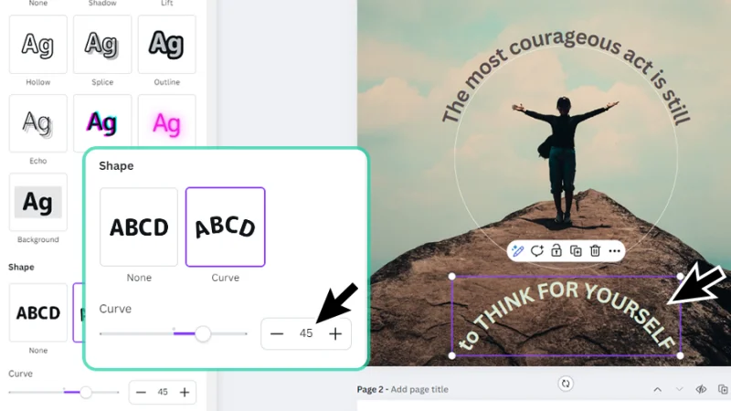
Pro tip (or cheat tip, not sure): do you want to make sure that you get the right amount of curvature to create the effect you are looking for? Here’s a way to guide our settings adjustments into a perfect result. First, we add a circle to the page using Elements and Shapes. Then, we remove the circle’s color and add a thin border, with a light color to keep it subtle. Remember, it’s just a guide. Next, we align the circle with the photo’s subject and resize it to approximately match the curved text position in the composition.
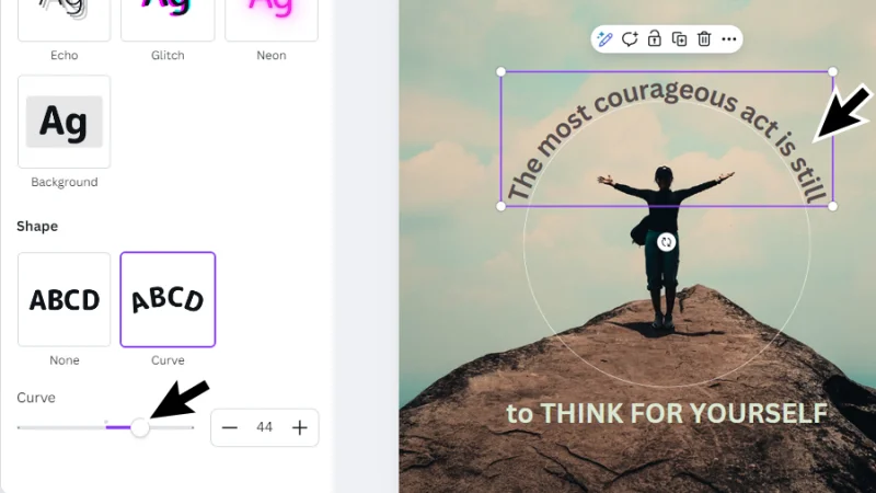
Let’s go back to Effects, Shape, and Curve and adjust the curve slider or field value until the curved text matches the circle we’ve just placed on the page. Additional retouches will be required if we make changes to text font, size, or spacing, but early precision makes future edits a lot easier.
Using a shape to help you as you bend your text saves precious time!
Let’s memorize (or write down) the curvature value we have set for the quote’s first half and move on to the second. Select the second text box, adjust any text settings you may feel necessary, realign it with the subject and circle and let’s curve it, too!
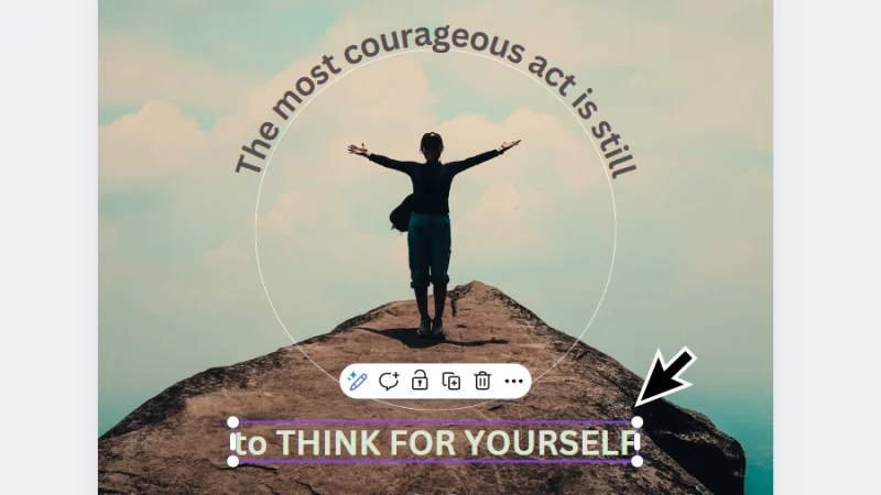
Time to wrap this second line of text around our subject.
Once again, let’s jump back to Effects, Shape, and Curve. Remember the curve value from the first text box? 44, that’s right. I may have retouched it a bit after the screen capture, so let’s round it up to 45 and it’s a deal!
What happens if we type 45 in the curve value field? Do we end up with an equal curvature around the photo’s subject?
So, how do we quickly flip this curve?
Oops. No, we don’t. Canva is pretty good but it still can’t guess everything we want to do with our composition’s elements. Setting the same value creates the same style of curve. We want to flip it, so how do we do it in a quick step? Easy! Let’s set this to a negative value: -45. This generates the same bend intensity but moving in the opposite direction. Will this work?
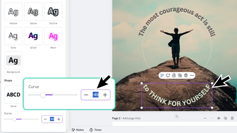
Alright, typing a negative number gets us a consistent curvature on the second half of our quote.
Yes, it works! Now all we need to do is align the text box with the circle and we are close to the finish line.
Or are we?
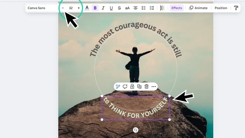
Oh, no! Our client wants the second line’s font slightly smaller; will this affect the way the text box aligns with the circle? Let’s see what happens! We move the mouse up to the contextual task bar and resize the font so the text doesn’t overflow from the mountain floor in the background.
Timeout #1
Once you learn all there is to know about curving text in Canva, get inspired with this collection of picture quotes. How many can you reproduce in Canva for cool practice?
As we adjust the text settings, we may have to go back to Effects and readjust curve values.
And yes, as the text gets smaller, the alignment gets a bit lost, so we will have to go back to the curve value slider or field or do some fine tuning. We may need more than one adjustment until we have the right size, curvature, and alignment, but it’s worth it – and that circle will save you some time, believe me!
If you are using a mouse, touch pad, or working on a phone screen, the slider can get a bit tricky to use.
Another hypothetical issue: if we keep font size but change letter spacing, does it affect the text curvature and alignment to the subject? Let’s give it a shot. Click on the Spacing button up on the contextual task bar to open the letter and line spacing panel.
The circle around the woman gave me an idea…
Let’s go for a really high number and set a value that expands the curved text until it almost closes the white space gap around our guide circle. This should create some contrast with the second line, break symmetry, and even improve readability. Let’s see if this happens as planned. Fingers crossed!
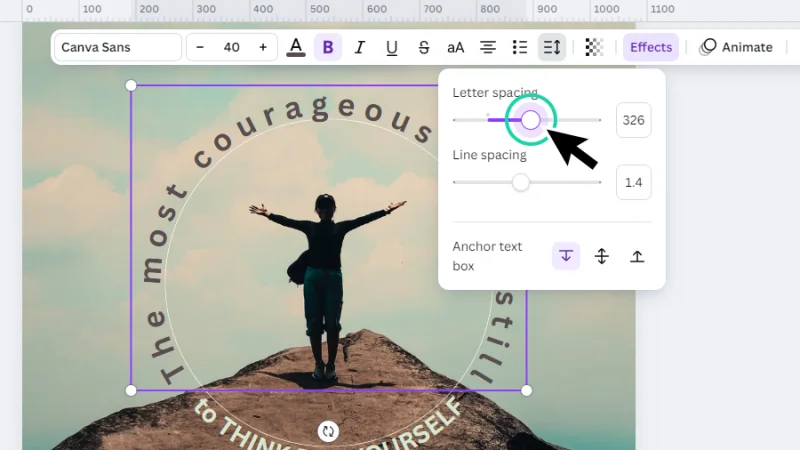
Looking good! Can you see as the “flying” text is expanded and the “rock” text feels more compact?
Awesome! Spacing didn’t change the alignment so there is no need to further adjust the text curvature. As I said before, if we start with some precision, we save extra time near the finish line. Love it!
I’ve grown so fond of the guide circle that I decided not to remove it from this composition and kept it for an added expansion effect. What do you think?
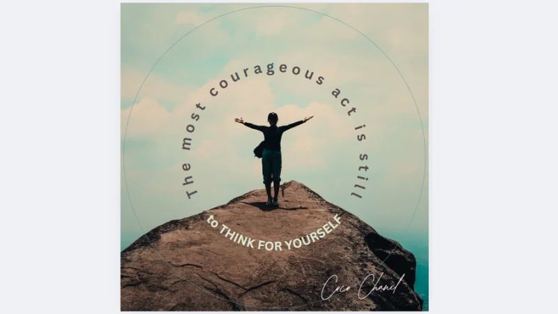
Everything looks better with a pink signature, don’t you think?
Timeout #2
Need a little pick-me-up or a dose of motivation? Check out this cool collection of motivational posters all designed in Canva. An inspiration and a breath of fresh air! Enjoy!
And There We Have It!
Awesome! This is how we type and curve text to create a unique Instagram post that will make everyone stop scrolling! Hope you had fun with this quick and easy step-by-step tutorial.
What 's Next?
Join BYOL and get started learning Canva. When you become a BYOL member, you gain access to this course as well as my 30+ additional courses on Illustrator, Photoshop, Lightroom, InDesign, Figma, and more. As a BYOL member you will also enjoy personalized support, earn certificates, and tackle exciting community challenges. Head here to sign-up!
See you in class! – Dan
Popular posts
Adobe MAX 2025 - File Download
Daniel Scott
-1750161634.webp)
Modeling Shortcuts in Blender
Daniel Scott
Plugins in Illustrator
Daniel Scott
-1748277302.webp)
How to Straighten the Horizon in Photoshop
Daniel Scott
Go from zero to design hero with our awesome courses!


- Powered by Marvin
- Terms of use
- Privacy policy
- Cookie policy
-
- © Bring your Own Laptop Ltd 2026