
How to Create Rounded Corners in Figma

Daniel Scott
@dan
In this post we are going to dive into how to create rounded corners and shapes in Figma. I’ll share tips on why these smooth cornered elements are vital for a modern and smart app or website and show you, step-by-step, how to create cool frames and buttons applying these principles.
This post is based on my Figma Essentials course. When you become a BYOL member, you gain access to this course as well as my Figma Advanced course and my 30+ additional courses on After Effects, Photoshop, Illustrator, Lightroom, and more. As a BYOL member you will also enjoy personalized support, earn certificates, and tackle exciting community challenges. Head here to sign-up!
Bring your laptops, and let’s go!
Why are rounded corners and shapes important in UI design?
Check your computer, tablet, or phone screen for the apps you usually use. You will likely see that rounded corners and shapes are everywhere. From labels and icons to buttons and image frames, these soft angles make your user experience much more enjoyable. Here’s Spotify’s well-known interface that perfectly demonstrates this idea.
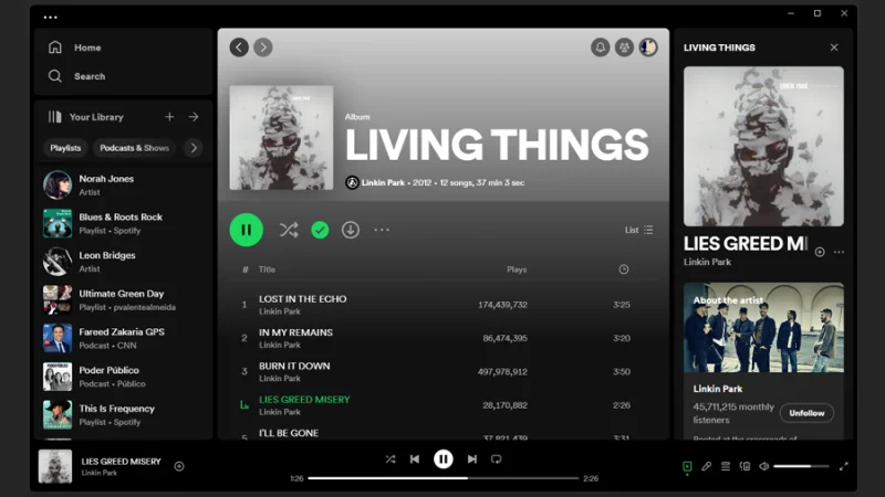
As you can see in Spotify’s user interface, round corners and shapes are everywhere.
Can you find many sharp angles in this user interface? Why do you think this is? Let’s take a closer look!
From a very young age, we develop a sense that sharp corners are dangerous and round edges are safer. Instinctively, we associate these insights to the way we look at objects out in the world.
Yes, it’s true that Nature has many sharp and edgy angled things, but all things that we find beautiful, organic, and (once again) trustworthy are delicately round. From human and animal anatomy, fruits and flowers, and even the sun and our own planet Earth. All round and soft edged. We feel relaxed when we think about them, right?
Rounded UI elements are easier for both the eyes and brain to process. If you need to design a pop-up warning, make it sharp cornered and red! If you need your user to comfortably find and tap on a call-to-action button, rounded corners are your secret weapon.
Finally, there is an interesting principle - the perception principle – rounded corners help you focus on the content inside the object rather than the object itself, because those smooth curves are inward-pointing and draw your eyes towards the center. Cool, huh?
How to Create Rounded Corner Objects in Figma?
How do we quickly and easily design these precious UI elements? Follow me and prepare to be amazed!
Start with a Rectangle
In this post, we are working on an app’s wireframe in Figma. I’ll show you how to create a frame for a placeholder image and a couple of call-to-action buttons for the app’s homepage. Nothing fancy, remember this is wireframing, so we will keep it simple and focused on functionality. Aesthetics come later, when you reach the prototyping stage.
Let’s begin with our frame. We click on the Shape Tools drop-down arrow icon and select Rectangle from the menu. We can also use the express shortcut key R (Mac and PC).
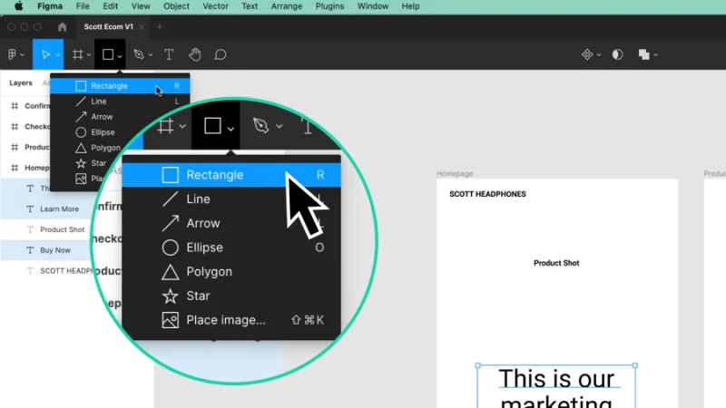
Select the Rectangle tool inside the Shape Tools drop-down or use the shortcut key R.
To draw our rectangle, all we need to do is move to our Homepage wireframe, click and hold the left mouse button and drag until we have the size we are looking for. If we hold the Shift key, for both Mac and PC, while dragging the mouse, we will draw a perfect square. We don’t have to do it for this guide, but that’s a cool pro tip for you to memorize or write on your notes. You’re welcome.
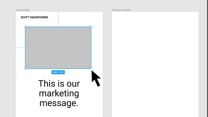
Click and drag to create a new rectangle inside your frame. It’s that easy!
If you are asking, by now: “Hey, the “Product Shot” text is gone! Did we lose it?” That means you have an eye for detail. Well done!
Don’t worry, the text is still there but the Rectangle was placed over it. How do we fix this? Let’s check our Layers!
As you can see below, the rectangle is the top layer inside the Homepage frame. This means it will cover any object that stands directly below it.
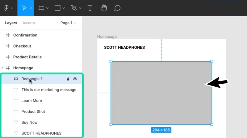
The Layers panel displays how elements are hierarchically placed inside the Homepage frame.
How do we fix this? Easy! There are a couple of ways to adjust layer order.
First one: with the rectangle selected, right-click our mouse and pick Send to Back from the menu. This will send the rectangle’s layer to the bottom of the Homepage frame’s layer group.
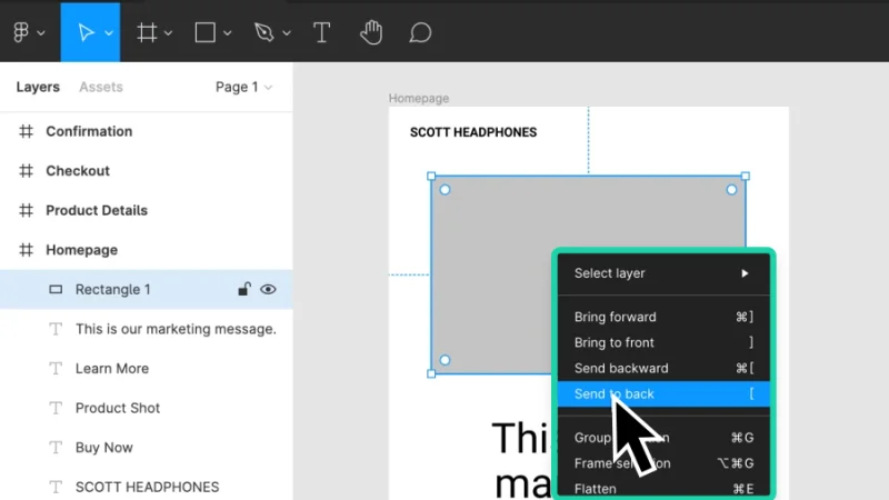
We need to, literally, send this rectangle to the back of the frame…
We can also move to the Layers panel, click and hold the mouse left button over the Rectangle’s layer and drag it manually to the bottom of the layer group.
And yes, there are some wonderful shortcuts for this action:
Bring to Front of the layer group: right square bracket ]
Send to Back of the layer group: left square bracket [
Bring to front one step: Command + right square bracket ] (Mac) or Control + right square bracket ] (PC)
Send to back one step: Command + left square bracket [ (Mac) or Control + left square bracket [ (PC)
To fix our wireframe, let’s move the rectangle to the back and bring our “Product Shot” text back to the surface.
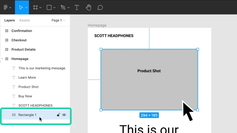
We did it! The rectangle is now placed behind all other elements of the Homepage frame.
Let’s follow the same steps for our call-to-action buttons.
First, we hit the shortcut key R to activate the Rectangle Tool. Then we draw our rectangle and adjust its position in the Layer panel.
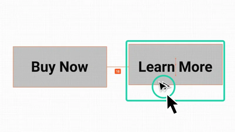
After we have the first button ready, we can duplicate it and save some precious time. Quick and easy way to do it: we hold Option on a Mac or Alt on a PC, click and hold the left button over the rectangle we’ve just made and drag it to the right button’s position on the Homepage. Our mouse cursor changes into a duplicated Move or Select icon while we take this action so we know we are doing it right.
Hold the Option or Alt key on your keyboard to duplicate an object in Figma.
Rounding corners in Figma
We have our placeholder image frame and call-to-action buttons ready to be edited. Let’s push on and see how it’s done in Figma!
We use the Move tool (shortcut V) to select the “Buy Now” button’s rectangle. Once the shape is selected, the corner handles will be visible.
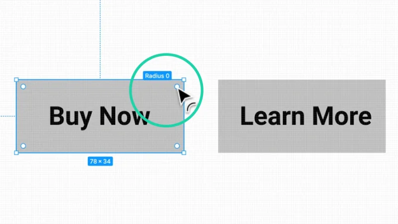
There are four corner handles in a rectangular shape, one for each corner.
If you can’t see the corner handles, you must zoom in a bit more on the object. I’ll zoom out a step so you can have a clear image of what happened.
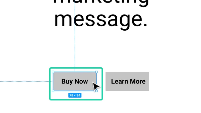
At this zoom level and relative object’s size, the corner handles disappear.
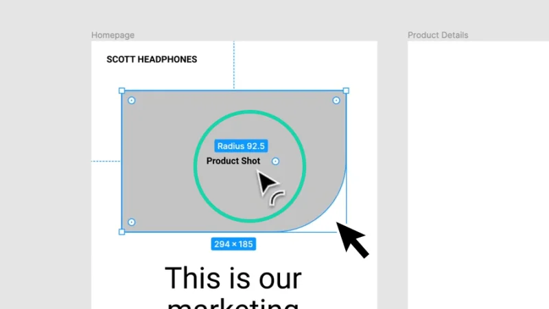
Once we zoom in, the corner handles will pop up and we can adjust them and round our corners. We use the Move tool to manipulate the corner handles. Let’s click and hold the left mouse button over any of them. When we drag inward, all four corners will adapt to a new radius value at the same time. Awesome!
The corner handles are connected together, by default. If you drag one, the others will follow.
While we are on the subject, here are three ways to zoom in and out in Figma::
Use the shortcuts Command and + sign (Mac) or Control and + sign (PC) to zoom in and Command and – sign (Mac) or Control and – (PC) sign to zoom out.
Hold the Z key to activate the Zoom tool and click the left mouse button to zoom in or hold Z + Option on a Mac or Z + Alt on a PC and click the left mouse button to zoom out.
Click on the Zoom/View drop-down on the top right corner of the workspace and select the option you need from the menu.
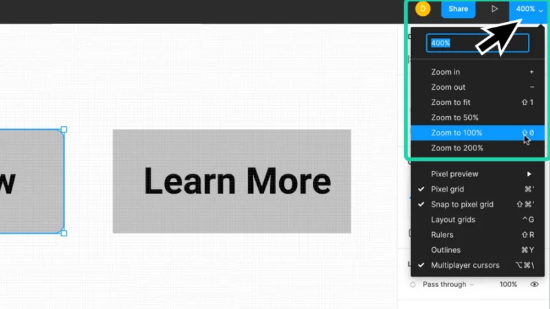
Zoom in and out to smoothly navigate your design and check all the details.
Timeout #1
Learn more about round vs sharp corners in UI Design in this helpful article.
Manually adjusting Corner Radius values in Figma
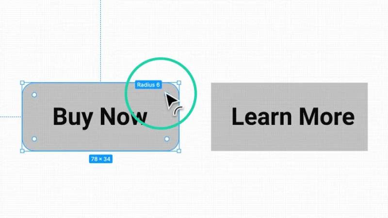
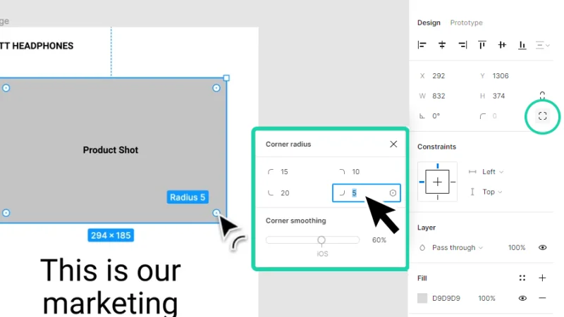
We can assign specific radius values to shape corners in Figma. Here’s how we do it. With the rectangle selected, we move to the Properties panel and look for the Corner Radius settings. Then we click inside the field and type in the value we need for our rectangle’s corners. I’ll keep a low value for this example, let’s say around 5, to make the corners only slightly rounded. You can try some different settings and see how the corners behave, it’s fun!
Low corner radius values will keep corners slightly rounded.
Adjusting Individual Corner Radius values in Figma
So far, we’ve covered how to create rectangles for objects like frames and buttons, how to round their corners all at once by clicking and dragging or manually adjusting their radius value. Next, we’ll see how to adjust radius values individually.
Once again, there’s more than one way to do this:
If we hold the Option key (Mac) or Alt key (PC) while we click and drag from one of the corner handles only that particular corner is affected. Awesome! We can repeat this step across the other corner handles, until we find the shape proportions we are looking for. Designers don’t do it often, but if we assign different values to each corner, we end up with some unusual shapes! Could be cool, depending on the project you are working on! Try all the possibilities and have fun while learning!
Create some awesome shapes by adjusting corners individually.
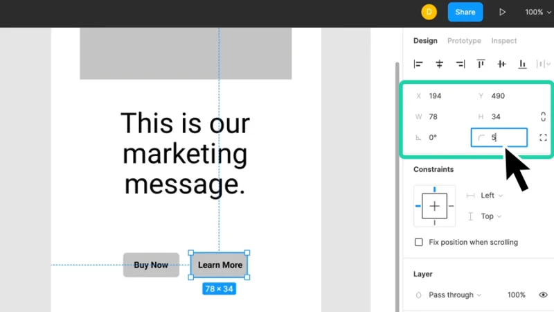
The alternative to clicking and dragging corners lies within the Properties panel. We click on the Independent Corners button next to the Corner Radius option and type a specific value to each corner. Just as easy, just as fun!
By using specific values, we ensure consistency across the entire project.
Creating Round Shapes in Figma
Fancy title for drawing ellipses (or circles) but I’ve saved a fun little extra just a few paragraphs down, so keep on reading!
Drawing circles is just as easy as rectangles. Inside the Shape Tools menu, select Ellipse or use the shortcut key O. To draw the ellipse, we click and hold the left mouse button and drag until we have the size we need. If we hold Shift on both Mac and PC while dragging, we will draw a perfect circle.
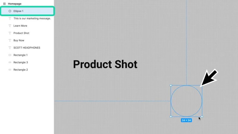
Use the Shift key to draw a circle with perfect proportions.
Let’s make a basic Add Item to Cart button from this ellipse, by adding a basic “+” icon to the layout. Quick and easy (I never get tired of saying this!), we’ll use the Text tool. We can pick it from the top toolbar or by tapping the shortcut key T on our keyboards. Next, we just have to type the plus sign and there we have it!
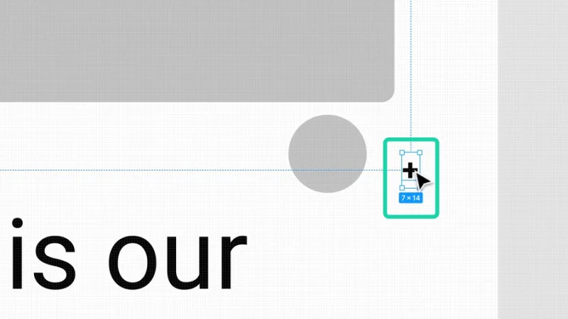
Faster than searching and downloading a preset icon, just type “+” and it’s ready!
We can edit our plus sign in the Properties panel, under Text, to make it larger or smaller, pick a font type that matches our brand guidelines, or a style to make it more unique, it’s all up to you and your creativity!
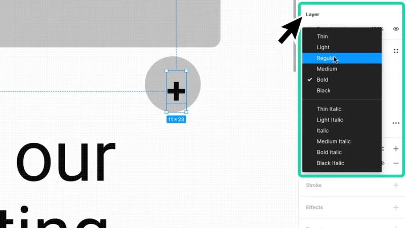
Use the Text options in the Properties Panel to further edit your plus icon.
To wrap things up, align both the ellipse and plus sign and you are all set. Your wireframe is looking so cool and professional with all those rounded shapes, so easy on the eye and accessible! Are you having fun?
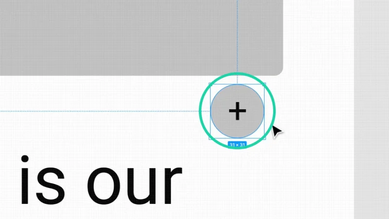
Remember that alignment is vital for a balanced and efficient design!
Timeout #2
Can you guess the UI Design trends for 2025? You don’t have to guess, check out this article on what’s coming in the near future for UX and UI designers!
Cool Bonus! How to Draw a Pac-Man shape in Figma!
Ah, the moment we’ve all been waiting for!
Let’s go back to the Ellipse we’ve created in the previous step. We can’t round its corners, obviously, but we can pick the Move tool (shortcut key V), select the ellipse and find a little white dot to the right of the circle. If we hover the mouse cursor over this dot we’ll see the Arc feature. Click and hold the left mouse button over the Arc handle and drag upward. Look at that! Its mouth has just opened! Awesome!
In a more serious and technical style, as you use the Arc on an ellipse you get two handles to manipulate. As we can see in the image below, the top handle controls the Sweep, or how much we cut away from the shape, and the lower handle controls the Start angle. This can be handy for something like pie charts or progress indicators, explore these as you expand your skills!

Hey, it’s Pac-man! And I’m all out of cheese to scare the little ghosts away! I guess those were cheeses, not sure… but why would ghosts be afraid of cheese…?
And there we have it!
Now this was fun! We’ve learned how to apply rounded corners to frames and buttons, created a cool Add to Cart round button, and even revisited a classic video game hero! That’s it for this post, I bet that you are ready to design your own wireframe version of an app like Spotify! What do you say?
What 's Next?
Go further with Figma by joining BYOL!
As a BYOL member, you will have access to my Figma Essentials course as well as my Figma Advanced course and my 30+ additional courses on After Effects, Photoshop, Illustrator, Lightroom, and more. As a BYOL member you will also enjoy personalized support, earn certificates, and tackle exciting community challenges. Head here to sign-up!
See you in class! – Dan
Popular posts

Adobe MAX 2025 - File Download
Daniel Scott
-1750161634.webp)
Modeling Shortcuts in Blender
Daniel Scott
Plugins in Illustrator
Daniel Scott
-1748277302.webp)
How to Straighten the Horizon in Photoshop
Daniel Scott
Go from zero to design hero with our awesome courses!


- Powered by Marvin
- Terms of use
- Privacy policy
- Cookie policy
-
- © Bring your Own Laptop Ltd 2026