Icon Plugins in Figma

Daniel Scott
@dan
In this post, we are focusing on Icons and Icon plugins in Figma! Iconography and logotypes play a major role in branding and User Interface (UI) design. Icons are visual aids that help users comfortably and instinctively navigate across the user flows we are designing. Logotypes are visual elements that clearly identify a brand or product through unique typography, symbol design, or a combination of both.
Let’s look at how we can add placeholder logos to wireframes of prototypes in just seconds, to speed up our workflow and give our clients an approximate vision of how their digital products will be designed. If you don’t have experience in vector design and illustration, there are plugins that can help you while final logo or icon designs are being created by other members of your team.
This post is based on my Figma Advanced course. When you become a BYOL member, you gain access to this course as well as Figma Essentials course and my 30+ additional courses on After Effects, Photoshop, Illustrator, Lightroom, and more. As a BYOL member you will also enjoy personalized support, earn certificates, and tackle exciting community challenges. Head here to sign-up!
Alright, UI designers, bring your laptops and let’s go!
Why are Icons so Important in UI Design?
Icons are valuable to UI Design and they’ve been around way before graphic design was even a field. I wonder if there is a record for the first time a direction arrow was used on a wall or sign…
Icons make our lives and understanding of our surrounding environments – and interfaces – more instinctive and accessible. Icons have evolved from a form of visual communication to something close to a universal language – think about emojis or how a magnifying lens can be recognized as a search feature almost anywhere in the world.
Specifically in UI design, icons ensure enhanced and accessible usability, save space on small screens, and make layouts cleaner and easier to interpret. Icons can also set a tone, define brand identity, and guide user interaction.
But, if you are not a vector design wizard but are a talented UI Designer?
You carry on doing your job in Figma, because it has a number of plugins that can give you a special lift and streamline your work! Let’s explore!
How to Create a Placeholder Logo Using the IconScout Plugin
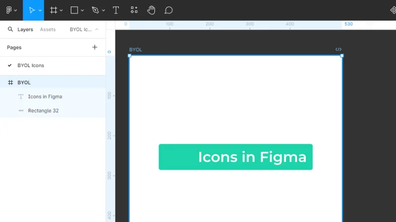
Let’s start with a basic frame in Figma. We will add a placeholder logo to this layout so we can share it with a client or upload it to our portfolio.
Pro tip: Placeholder logos like these, based on icons that we download from the web or from plugins, can’t be trademarked – not even ones with a commercial license.
Let’s add a logo to this awesome I’ve-made-this-in-20-seconds UI object!
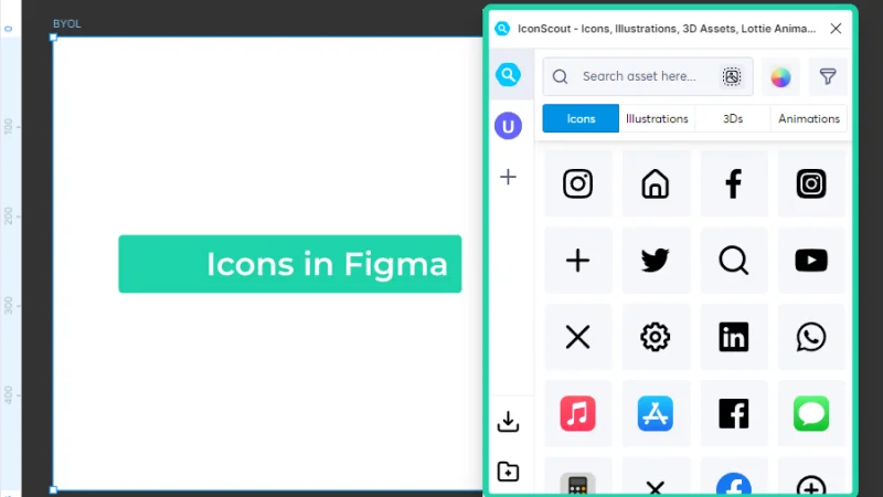
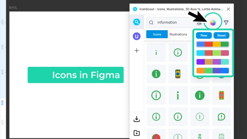
First, we click on the Resources button, located up in the Toolbar, and then click on the Plugins tab inside the drop-down menu. Inside the search field, we type ‘IconScout’ and hit Enter. Click on the IconScout button when it pops up to run the plugin in Figma.
Plugins like IconScout can help you search, sort, and import icons into your project.
Let’s have a quick look at IconScout’s interface. It is quite intuitive, we can learn to work with it in just a few minutes.
We are going to use IconScout for icons but know that we can also import other UI elements, like vector illustrations, 3D objects, and animations for buttons, splash pages, or loading screens.
Intuitive plugins like IconScout are straightforward, easy to learn apps that save you time and resources.
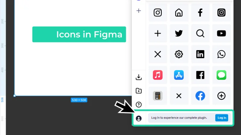
There are some limitations to using IconScout. If you create an account, you can sign up for a Free plan, and there’s also a paid subscription that includes more benefits, like full access to catalogs and unlimited downloads, among others. Check these out and choose what’s best for your business. Let’s move on!
Creating an account doesn’t mean you have to pay for a subscription, it’s just a good way to stay updated.
How to Search for the Perfect Icon in IconScout
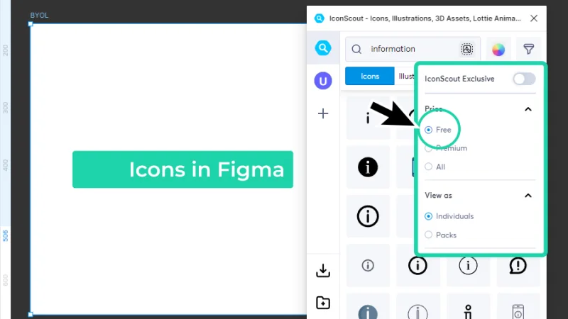
We can use the search field to type in keywords that contextualize our search. We can also use the Filter tool to narrow down the results. These are the available filter options:
IconScout Exclusive: access icons that are not being shared across other platforms.
Price: view Free, Premium, or All icons available. Remember that Premium will require some kind of payment or Subscription plan.
View as: obtain Individual results or Packs. Packs are collections in which the icons we are searching for are included and they are great for consistency, because icons inside a Pack usually share the same design style and attributes.
Use Filters in IconScout to narrow down your search content reply.
Another feature we will have a quick look at is the Color Palette. There are some default options in the Free plan, we can give them a try, and even though they are quite limited, they can give us some ideas on how to add color to our icons. Don’t worry too much about this option if you stick to the Free plan, you can always edit the icon’s attributes after we download it into Figma.
I clicked on these palettes a couple of times and came up with a cool green color that I’ll be keeping for now. You can go ahead and try some variations, if you want to, or just push on!
Color Palettes help you visualize colorized versions of the icons you are searching for.
How to Import the Icon to a Figma project
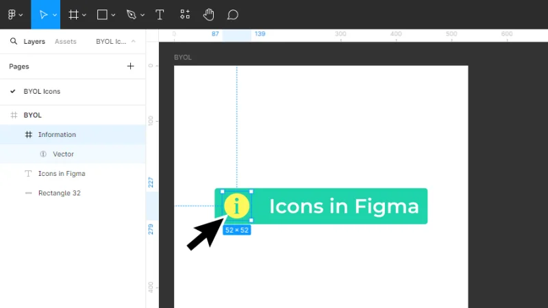
Let’s click and drag one of the ‘information’ icons into our workspace. We may need to resize it and then bring it into our frame so we can arrange it with the other layout elements. Move your mouse to the Layers panel and simply click and drag the Information layer up to the ‘BYOL’ parent frame. Quick and easy!
Keep the Layers panel organized and all layers properly named. This saves time when work gets complex.
How to Edit an Icon’s Appearance in Figma
Remember what I said about color and editing the icon’s attributes? Let’s see how it is done! First, we click on the vector shape inside the ‘Information’ frame – the ellipse with the ‘i’ character inside. then we move our mouse to the Properties panel. Under Fill, we click on the color sample square and pick a new color for our icon using the Color Picker window.
Color picker is great, but if you are searching for a specific brand color, you can use Hex codes, RGB color codes, or the Eyedropper tool.
I’ve picked a yellow color, you can try any other color you prefer, of course. Next, we must align the information icon (the first placeholder logo, for this post’s purpose) with the rectangle and type object placed inside the parent frame. You can reference the image below and see if you’re keeping up with me or adding your own cool style to these elements.
Next step, tidying things up with Auto layout!
Here we have our new icon, all nice and shiny inside our frame!
Timeout #1
We won’t be exploring Auto layout in this post, so check out this BYOL blog post on Auto layouts and learn all the tricks or refresh your UI design skills!
How to Arrange an Icon inside an Auto Layout Frame
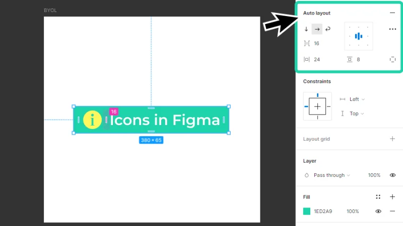
First, let’s select all the elements we want to include inside our Auto layout frame. We can use the Move tool or the Layers panel to select them. Next, we move our mouse to the Properties panel and, under Auto layout, click on the ‘+’ sign, that’s the Add Auto layout button. We can also right-click one of the selected elements and choose Add Auto layout from the pop-up menu. There’s also a shortcut for this and you know how much I love shortcuts: Shift + A on both Mac and PC.
Next, we adjust some settings inside the Auto layout panel:
Pick the Horizontal layout option – that’s the forward arrow button.
Inside the Alignment box, let’s choose the Align center.
For Spacing, (horizontal gap between items), we’ll type ‘16’ (pixels).
Set Horizontal padding to ‘24’ pixels and Vertical padding to ‘8’ pixels.
Auto layouts are responsive UI designers’ best friends forever! Love to love them!
How to Search for the Perfect Icon in Iconify
Let’s have a brief look at another cool plugin in Figma: Iconify.
Once again, open Resources and the Plugins tab, and type ‘Iconify’ in the search field. Hit Enter. Once you have a reply, click on the Iconify button to run the plugin.
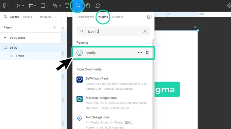
Iconify is another cool solution to bring some icons to our projects.
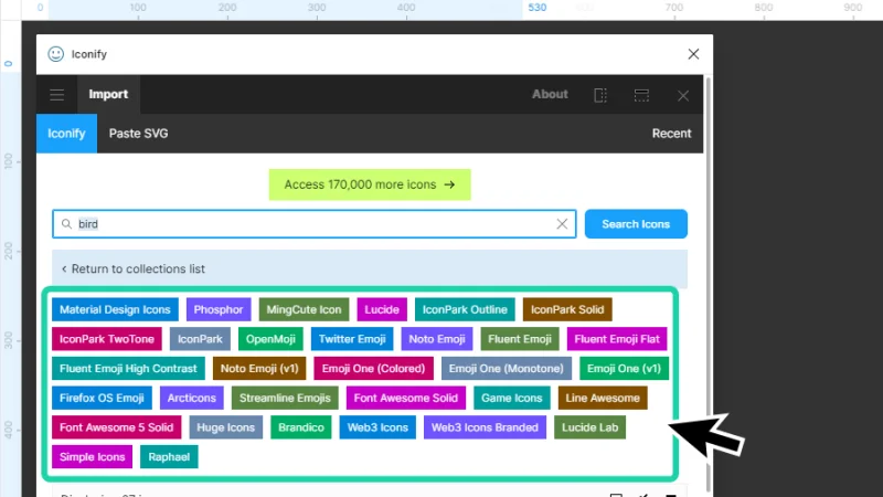
Iconify’s interface looks a bit crowded but it’s a good example to show you that plugins like this will often bring in icons from multiple sources. In that long list we can spot some well-known icon originals, like Google’s Material Design system or a popular website like Phosphor Icons.
Let’s look for a bird icon to create a proper placeholder logo in our Auto layout frame. There’s no complicated science behind this step: let’s simply type the keyword ‘bird’ and hit Enter or click the Search Icons button.
There’s a vast collection of sources used by Iconify to search your icons from.
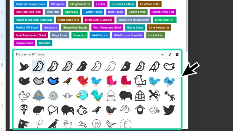
Let’s scroll down a bit and have a look at all the bird icons that Iconify has found for us! Look at that, so many different styles to choose from, we can go from minimalistic line art to detailed and colored vector illustrations.
Choose the icon style that best matches your brand’s identity and design style.
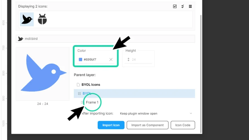
I’ll pick the first black bird icon from the list and make some changes to it before and after importing it to Figma. You can choose any other icon you prefer and just follow along. We scroll down a bit more until we find our icon’s attributes. We can change color and height and set the parent layer into which we want to import the icon (this is a cool feature; we don’t have to drag items into the workspace and have them lost there for a while). Finally, we click the Import Icon button.
Iconify is another awesome Figma plugin for iconography!
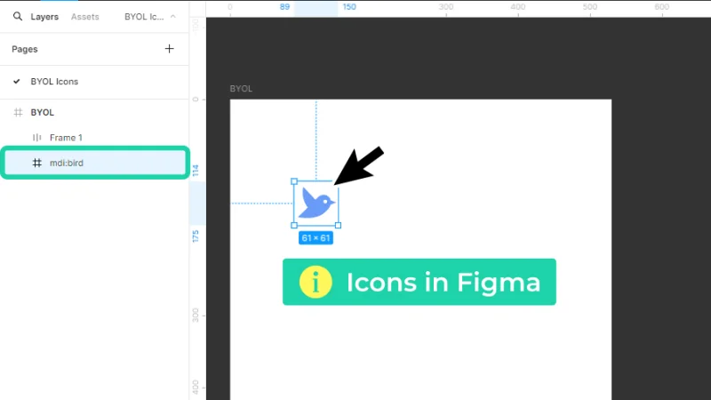
As you can see, the icon was immediately imported into the ‘BYOL’ parent frame! Yay!
Let’s make some changes to our bird and give it a new home, shall we?
Check the Layers panel to make sure that the new icon is properly placed inside your parent frame.
Editing a vector-based icon in Figma
We can change more than color in a vector-based shape in Figma, like the icon we’ve just imported. There are some default vector drawing tools:
Pen tool: allows us to create and manipulate anchor points to draw a new shape or change a previous shape’s path.
Bend tool: allows us to curve lines between anchor points.
Paint Bucket: edits a vector shape’s fill color.
There are also some plugins that can help us with vector drawing, or we can bring in vector designs created in third-party apps like Adobe Illustrator.
Timeout #2
Start learning vector design or update your skills, including an overview of brand-new AI features, by signing up to my Illustrator Essentials and Advanced courses at Bring Your Own Laptop. Bring your UI design portfolio to new heights with your own special vector artworks! How awesome is that?
We won’t be focusing much on vector drawing for this post’s purpose, I just want you to know that these basic tools are included in Figma if you need to do some retouches or fine tune a vector shape. I’ll just use the Bend tool to curve some of the lines and click on the Done button, up in the toolbar, to finish drawing.
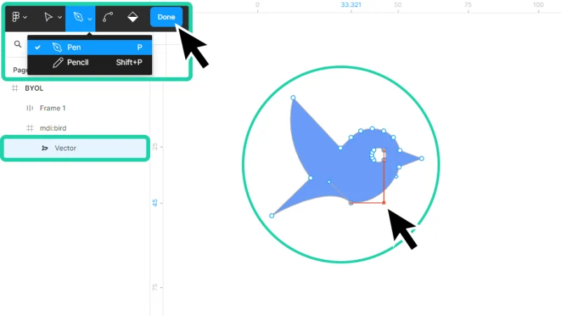
Let’s edit our blue friend and give it a unique look as our placeholder logo.
OK! Let’s wrap things up. I’ve duplicated our first Auto layout frame, changed our bird’s fill color to match a wonderful robin, and nested it inside its new home! So cool!
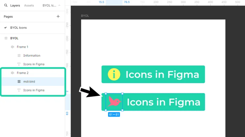
Our placeholder logo looks so wonderfully cute! Good job, everyone!
Some Design System-Based Plugins to Explore in Figma
Google Material design icons: Access a vast collection of icons designed by Google.
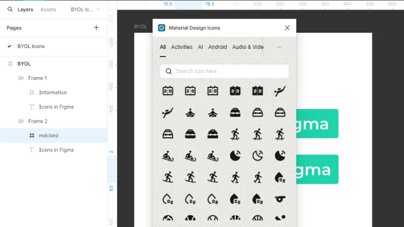
Icons, icons, icons galore!
Microsoft Fluent UI icons by Iconduck: Explore a comprehensive set of icons designed by Microsoft.
Designing for Windows apps? These icons are for you!
And there we have it!
Outstanding! We’ve learned so much about iconography, how to use plugins to streamline our UI design workflow, and how to bring icons into Figma in seconds! Explore all these hidden treasures, bookmark the ones that best fit your daily work, and I’ll be back with more Figma UI and UX content! Stay tuned!
What 's Next?
Go further with Figma by joining BYOL. As a BYOL member, you will gain access to my Figma Essentials and Advanced courses. When you become a BYOL member, you gain access to this course as well as my 30+ additional courses on After Effects, Photoshop, Illustrator, Lightroom, and more. As a BYOL member you will also enjoy personalized support, earn certificates, and tackle exciting community challenges. Head here to sign-up!
See you in class! – Dan
Popular posts

Adobe MAX 2025 - File Download
Daniel Scott
-1750161634.webp)
Modeling Shortcuts in Blender
Daniel Scott
Plugins in Illustrator
Daniel Scott
-1748277302.webp)
How to Straighten the Horizon in Photoshop
Daniel Scott
Go from zero to design hero with our awesome courses!


- Powered by Marvin
- Terms of use
- Privacy policy
- Cookie policy
-
- © Bring your Own Laptop Ltd 2026