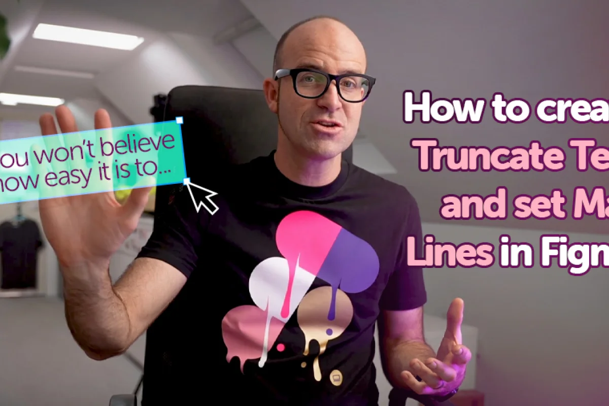
How to Truncate Text and Set Max Lines in Figma

Daniel Scott
@dan
In this post we will focus on how to create type objects that instantly adapt to responsive screen sizes using Truncate Text in Figma. I’ll show you some of the basic rules to properly set up these elements for optimized and non-destructive responsiveness and we will go through every step you need to create your best User Interface (UI) projects ever!
This post is based on my Figma Advanced course. When you become a BYOL member, you gain access to this course as well as my Figma Essentials course and my 30+ additional courses on After Effects, Photoshop, Illustrator, Lightroom, and more. As a BYOL member you will also enjoy personalized support, earn certificates, and tackle exciting community challenges. Head here to sign-up!
User Interface designers of the world, it’s truncating time!
(wow, sounds even weirder than I thought...)
Let 's go!
What is the definition of Truncate in Figma?
Sounds complex but it’s not terribly complicated. Truncate refers to the ability to reduce the amount of visible text in a sentence or paragraph, replacing the hidden characters with an ellipsis. Don’t confuse this with an ellipse, that’s a circular shape. Ellipsis are those three dots “…” that in grammar communicate indecision, trailing off in thought, and omission of words – or truncated text.
Truncated text objects are especially useful for small screen UI design, because they help keep layouts clean, consistent, and readable.
You can find examples of truncated text on:
Navigation Menus
Dashboards and Data Management systems
Forms and Input Fields
Tooltips and Call-to-Actions
Chat and Messaging Apps
We’ll explore how we can use Truncate Text on our UI design work, but first we need to set some ground rules.
Basic Rules
Work inside Auto Layouts as often as possible. Investing a few minutes setting up Auto Layout components will save you long hours and ensure consistency throughout the entire project.
Adjust content size to the project and screens you are designing for. We should never do it, but it’s not difficult to flood a desktop screen with chunky text paragraphs and hero sized images, but as we reduce screen size, content becomes increasingly complicated to manage and it becomes easy to overwhelm our users with too much information.
Test and iterate all the time, the best solutions take time. This is the ultimate safeguard for UI designers. Test, test, and then test some more. Use a diverse user panel to properly identify the strengths and weaknesses of your design. Remember, you are not designing for yourself, you are designing for others!
Truncated text does not get lost or deleted! Yes! If there is anything I love more than shortcuts, it is non-destructive design!
Truncate Text in Figma
Truncate Text is a recent-ish update to Figma. It’s been around since mid-2022 and it means a great deal because up until then, when we wanted to truncate text, we had to do it manually – meaning we add to cut or delete the part of the text we needed to hide and type the three ellipsis dots, one by one. You may be thinking: “Well, that wasn’t much hard work, was it…?” and I can tell you that it was another small predicament among so many other small fixes or things to rethink and update. A grain of sand isn’t much, but a lot of them make a desert, right? The other thing is, when we deleted the text, it was gone – unless you had it backed up somewhere. With Truncate Text we don’t have to cut anything out, and doing it inside an Auto Layout component, everything reshapes automatically to fit the new screen like pure magic!
How to Truncate Text in Figma
Alright! Fire up your laptops, let’s see all of this magic at work!
We’ll start off with a text box with some content inside. I didn’t use lorem ipsum placeholder text for you to keep in mind that non-destructive design is tremendously important. This is still not an Auto Layout frame; we’ll have a look at an example a couple of paragraphs down the road. Ordinary text box, normal text. Moving on!
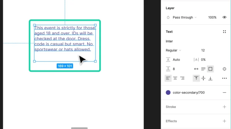
One text box to rule all screens of Man.
Let’s say we are designing a desktop app, but now we’ve come to the responsive design stage, so this text box has to be resized to fit a mobile phone screen. Can we make it smaller without having to edit or remove part of the text, or reduce font size or weight? Will the message still be readable on that small screen?
Now you know the answers to these questions. Let’s go, Truncate text tool!
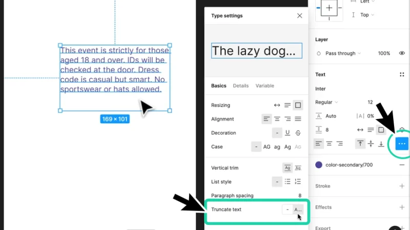
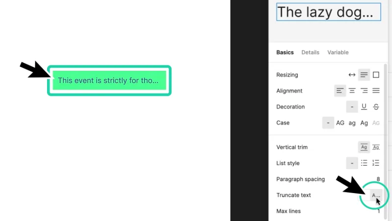
With our text box selected, we move our mouse to the Properties panel on the right of our workspace and, under Text, click on the Type Settings button (coincidentally, the one with the three ellipsis dots). Inside the popup menu, we look for the Truncate text option and click on the A… button to activate it.
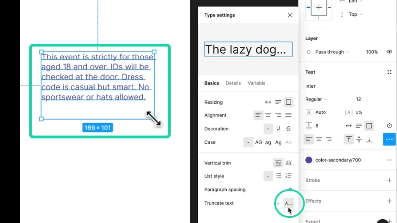
Two mouse clicks and we’re done! Text is now truncated. Or is it…?
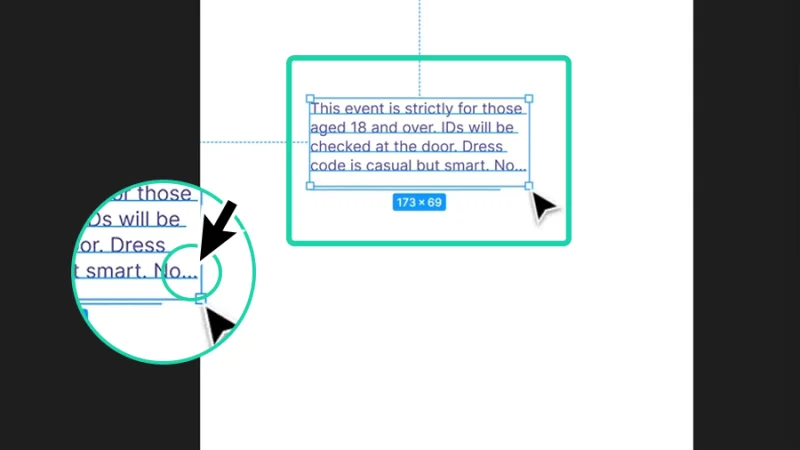
If you look at the image below, it may seem as though nothing happened, but notice that we still haven’t changed the text box’s size, right? After making sure the Truncate text option is active, we move the mouse cursor to one of the corners and click and drag it inward to resize the frame.
Now we need to simulate the text object’s responsive behavior by manually resizing it.
Can you see the difference? Brilliant! As we resize, Figma automatically updates the text and points out that there is more to be read with the dots at the end. Cool, huh?
Our text is now truncated and responsive. Quick and easy!
How to Set Max Lines in Truncate Text in Figma
Ok, let’s shift gears. For us to set Max Lines in Truncate Text in Figma we must change the text resizing options. These options control how the text box responds when text content is added or modified. We have the following settings:
Fixed Size –Text box has locked width and height dimensions.
Auto Height – Text box width is fixed and height adjusts vertically to new or modified content.
Auto Width – Text box height is fixed and width expands horizontally to new or modified content.
To define Max Lines value to Truncate text in Figma, we need to set the text resizing option to Auto Height. By doing this, we make sure that when we add content to the text box, Figma will respect the specified limit of lines it can hold and start truncating from that point. This is awesome for responsive design on a layout with diverse amounts of text objects because all elements remain limited to their needed vertical space.
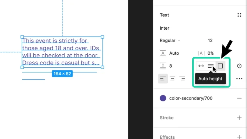
Activate the Auto Height option to allow Max Lines settings.
With this step completed, we can repeat what we’ve learned earlier. With Auto Height active, we click on Type settings and look for the Truncate text option in the menu. Nothing seems to have changed. Where is the Max Lines option?
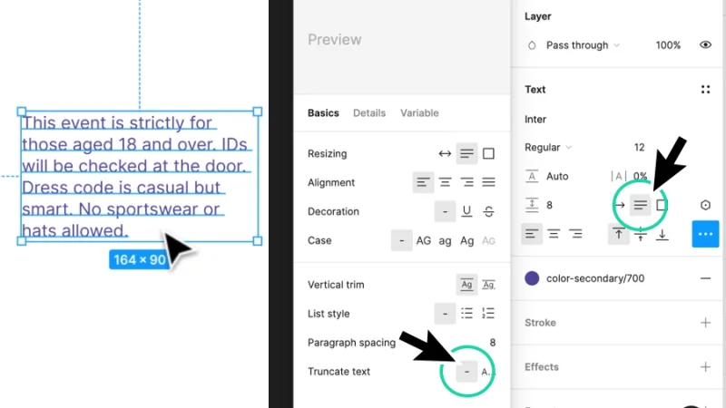
Check if Truncate is active when you open the Type Settings menu.
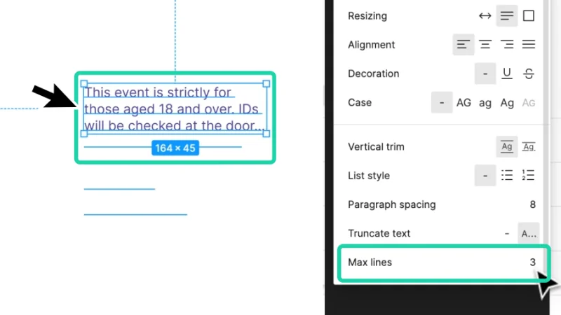
As soon as we activate Truncate text, the Max lines number field pops up below this option. Figma knows that we have an Auto Height text box that adjusts to new or modified content, but we are asking at the same time to Truncate the text we type in. So, Figma’s next question is: “at what number of lines do you want me to start hiding your text and add the ellipsis?” The answer to that question is the number you type into the Max lines input field.
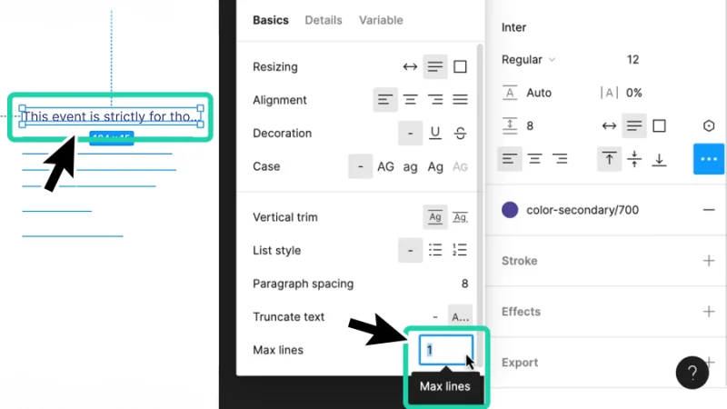
With Max lines value set to 1, Figma won’t vertically expand the text box. Not that awesome? Keep on reading!
If we set the Max line value to, for example, 3 and start typing our message, the box will vertically adjust itself to the text content but only up to a limit of 3 lines. After that point, the text gets truncated and marked with the “more to read” dots. Cool, huh? As cool UI designers, we are sure that the text box dimensions stay within its planned layout boundaries, holding everything else on screen consistent and user-friendly!
Come on, now you have to admit this is awesome!
Timeout #1
We are covering Responsive design, so refresh your Auto Layout knowledge and skills by reading our blog post on this subject.
How to Truncate Text in an Auto Layout frame.
So far, I’ve been demonstrating how the Truncate text works and how text boxes react to resizing in responsive design. Now I’ll quickly show you how to do it like a Pro, inside Auto Layouts!
For this blog post’s purpose, I will not focus on the Auto Layout features. Just take a mental note (or a notebook note, you will know best) that the more efficient way to make a text box efficiently compliant to device and screen size changes is to place it in an Auto Layout frame or component.
Let’s use the same text box example and hit the shortcut keys Shift + A on both Mac and PC to set it inside an Auto Layout.
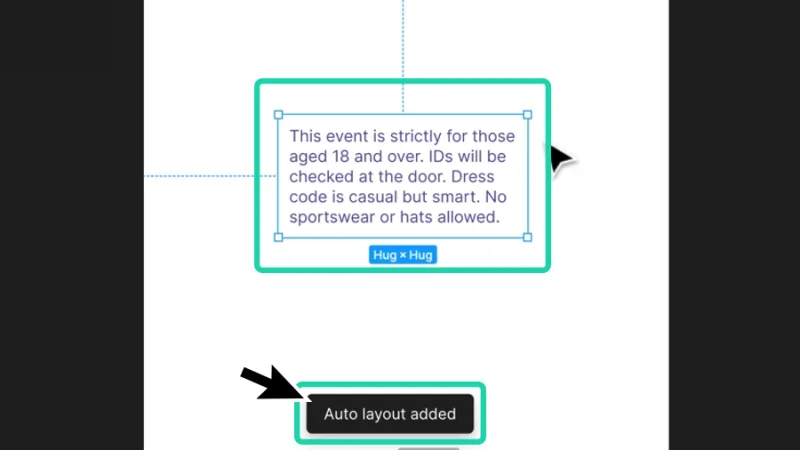
When it comes to responsive design, Auto Layouts are UI designers’ lifesavers!
Let’s customize our Auto Layout text box with a Fill color. You know how to do it, move the mouse cursor to Layer in the Properties panel. Under Fill, I’ll click on the Styles button, the one with four dots shaped as a square, and use one of the Color Styles I’ve set up before I’ve asked you to join me in this guide.
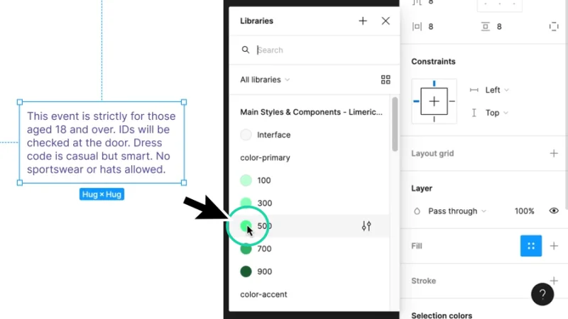
Color Styles will streamline workflow and ensure the color palette remains consistent all across the UI.
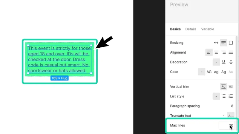
You know what comes next, right? We move the mouse cursor to the Type Settings button and click on it. Next, we pick Truncate text from the menu. Now, as you can see below, Auto Height is the active resizing option, so we can also define the Max lines attribute value.
The default value for Max lines is 1, so the text box is immediately updated with these settings.
Let’s say we have some breathing room to work with on our app’s prototype and a fair amount of text content to bring into our text box. I’ll set the Max lines value to 20, to make sure that Figma will only start truncating text after some time. The text box is now updated to 5 lines, but ready to vertically expand up to a limit of 20.
This is so cool! As we add content to our prototype things begin to adapt and adjust themselves like magic!
Alright, but this is all about responsive design. So, what happens when we resize our frame?
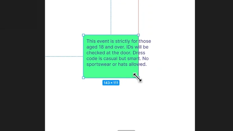
Oops, something is wrong with our Auto Layout. Our text is acting a bit strange.
Those of you who are already experienced with Auto Layouts should know what is wrong and how to fix it, right? I’m sure you do! If you are having any doubts, jump into my Figma Advanced course at Bring Your Own Laptop, refresh your skills, and come back. We can wait!
Timeout #2
Here’s an interesting take not on how, but when to use Auto Layout in UI design and Figma, of course!
Ah, perfect, you are back! Let’s push on, we’re in the final stretch before the finish line! It’s all or nothing, now!
Let’s check the Auto Layout properties panel and adjust the horizontal and vertical resizing settings. Let’s change both to Fill Container. This means that the text box inside the auto layout frame will expand to fill all the available space. This way, when we resize the auto layout frame, text will always dynamically adjust itself to new dimensions! A little advanced, but brilliant responsive design!
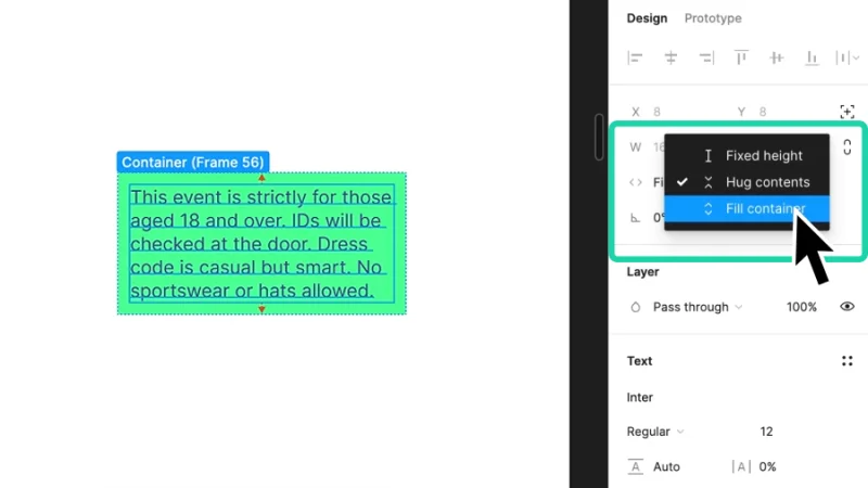
Fill Container ensures that our text always keeps up with the Auto Layout frame’s dimensions.
Closing up, if we reduce the auto layout frame’s size, text will automatically truncate to fit the new dimensions. If we increase its size, Figma will begin truncating the content when the 20 lines limit is reached.
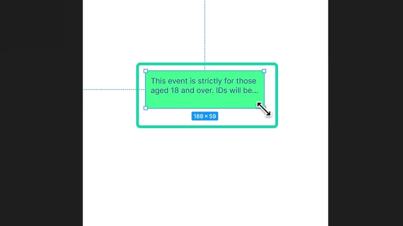
Everything is now perfectly aligned and responsive!
And there we have it!
Amazing! We’ve made it this far and now we know how to truncate text in Figma and take another decisive step into UI design awesomeness! If we turn this final auto layout frame into a component and start creating instances from it, we have saved hours or days of hard work, time best well-spent hanging out with family and friends, resting, going to the movies, or starting a new course with me!
What 's Next?
Go further with Figma by joining BYOL. As a BYOL member, you will gain access to my Figma Essentials and Advanced courses as well as my 30+ additional courses on After Effects, Photoshop, Illustrator, Lightroom, and more. As a BYOL member you will also enjoy personalized support, earn certificates, and tackle exciting community challenges. Head here to sign-up!
See you in class! – Dan
Popular posts

Adobe MAX 2025 - File Download
Daniel Scott
-1750161634.webp)
Modeling Shortcuts in Blender
Daniel Scott
Plugins in Illustrator
Daniel Scott
-1748277302.webp)
How to Straighten the Horizon in Photoshop
Daniel Scott
Go from zero to design hero with our awesome courses!


- Powered by Marvin
- Terms of use
- Privacy policy
- Cookie policy
-
- © Bring your Own Laptop Ltd 2026