Sohayb. El Mourabet
@sohayb.ElMourabet
Modern Music — Event App to Desktop Website
Project Overview
Modern Music is an event app designed for users who want to discover live music events and buy tickets in a simple way. The original version was designed as a mobile app. For this Final Distinction Project, I converted the mobile app into a desktop/laptop website while keeping the same visual identity, colours, style, and user journey.
After creating the first desktop version, I improved it further into a more professional desktop design. The goal was to make the final version feel cleaner, more spacious, and more suitable for a UX portfolio while still keeping the original Modern Music identity.
________________________________________
Initial Brief
The brief for this project was to take an existing mobile event app design and create a desktop website version. The desktop version needed to work better on a larger screen while still feeling connected to the mobile app.
My goal was to keep the same Modern Music style, but improve the layout, navigation, event browsing, search experience, event detail page, checkout page, and confirmation page for desktop users.
________________________________________
Persona
The target user is someone who enjoys discovering live music events and wants a quick and easy way to browse genres, view event details, and buy tickets online.
This user wants the experience to be simple, clear, and easy to understand. They do not want a complicated booking process. They want to quickly find an event, check the price and details, add it to the cart, and complete the purchase.
________________________________________
Design Challenge
The main challenge was to convert a mobile app into a desktop website without losing the original identity. The mobile version used a narrow single-column layout, while the desktop version needed to use more horizontal space.
I had to make sure the desktop version did not look like a stretched mobile app. Instead, it needed to feel like a real desktop website with better spacing, clearer navigation, larger images, grid layouts, and more professional page structures.
________________________________________
Before Starting: Expectations for the Transition
How will the mobile and desktop versions differ?
The mobile version uses a single-column layout because the screen is small. Most content is stacked vertically, and the user scrolls through the app screen by screen.
The desktop version differs because it has more screen space. This allows the design to use wider layouts, larger images, grid sections, visible top navigation, side filters, and two-column page layouts. Users can see more information at the same time and compare events more easily.
________________________________________
What will be consistent?
The main visual identity stays consistent between mobile and desktop. I kept the Modern Music logo, muted green background, cream/off-white cards, orange buttons, rounded corners, music theme, genre content, event images, and friendly visual style.
The user journey also stays consistent. Users can still discover events, browse categories, search, open an event detail page, add a ticket to the cart, complete checkout, and reach a confirmation screen.
________________________________________
How will continuity be maintained?
I maintained continuity by reusing the same colours, typography style, card style, button style, logo, icons, and event content. The layout changed for desktop, but the brand identity stayed connected to the mobile app.
This helps users understand that the mobile app and desktop website belong to the same product.
________________________________________
Research: Mobile vs Desktop Design
Mobile design usually focuses on small screens, touch interaction, single-column layouts, large buttons, bottom navigation, and vertical scrolling. Because the screen is narrow, the user usually sees one main piece of content at a time.
Desktop design has more space, so it can show more information at once. Desktop websites often use top navigation, wider sections, grids, columns, side filters, larger images, and more visible content.
This research influenced my design decisions. I changed the mobile bottom navigation into a desktop top navigation, used event cards in grids, added search and filters, created a larger event detail layout, and made the checkout page clearer with a separate order summary.
________________________________________
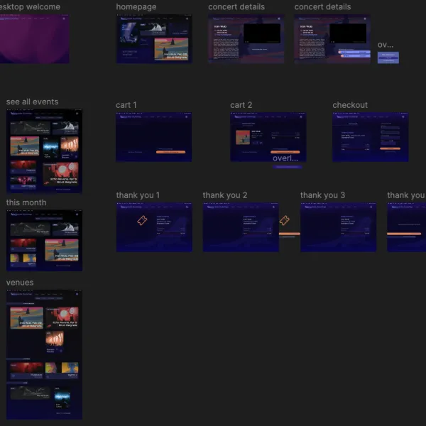
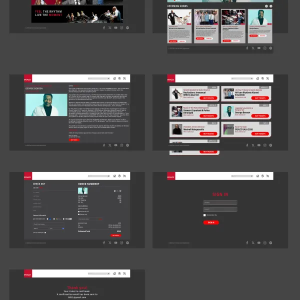
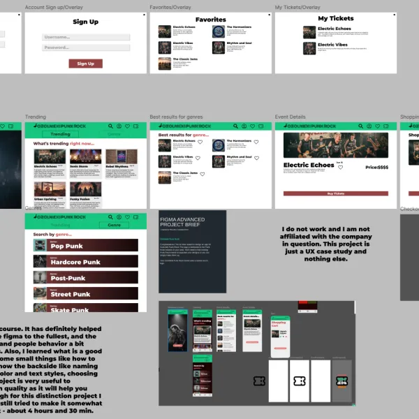
Mobile App Version
The first version of Modern Music was designed as a mobile event app. It included an intro screen, category browsing, trending events, search results, an event detail page, a cart page, and a confirmation screen.
The mobile app used a green background, cream cards, orange buttons, music-themed branding, and rounded corners. The layout was simple and vertical, which worked well for a phone screen.
________________________________________
First Desktop Version
After finishing the mobile app, I created my first desktop version. This version kept the same colours, logo, cards, and user flow, but it was still quite close to the mobile layout.
The first desktop version helped me understand what needed to change. I realised that a desktop website needs more than just a wider frame. It needs a clearer structure, better spacing, larger images, and page layouts that use the available screen space properly.
________________________________________
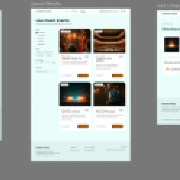
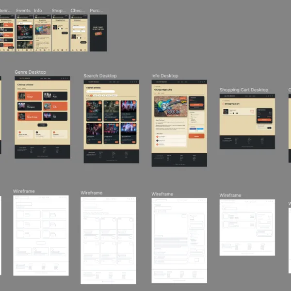
Final Professional Desktop Version
After reviewing the first desktop version, I created an improved and more professional desktop version. This final version was designed to create a stronger UI and a better impression for my Figma Advanced Final Distinction Project.
The final desktop design uses a proper website structure with a top navigation bar, hero section, category grid, search results with filters, a two-column event detail page, a clearer checkout page, and a simple confirmation screen.
This improved version helped me show my UX and Figma skills more clearly because it demonstrates how a mobile experience can be adapted into a professional desktop website.
________________________________________
Desktop Design Decisions
For the desktop version, I made several important design changes.
I replaced the mobile bottom navigation with a desktop top navigation. This makes the website easier to use on a laptop screen.
I used grid layouts for event cards and categories so users can scan multiple options at once.
I made the event detail page more spacious by using a two-column layout. The image is shown clearly on one side, while the event information, price, genre, date, and button are shown on the other side.
I also improved the checkout page by separating the ticket details from the order summary. This makes the buying process easier to understand.
________________________________________
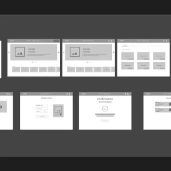
Wireframe Explanation
Before finalising the high-fidelity desktop design, I used wireframes to plan the layout and structure of each page.
The wireframes helped me decide where the navigation, hero section, search bar, event cards, filters, event details, checkout summary, and confirmation message should be placed.
This step was useful because it allowed me to focus on layout and usability before focusing on colours, images, and final visual design.
________________________________________
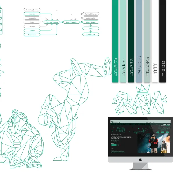
Shared Library / Design System
I used a shared design system for both the mobile app and desktop website. This included the same colours, typography style, button style, cards, icons, logo, and image style.
The benefit of using a shared library was consistency. It helped the mobile and desktop versions feel like one connected product.
A limitation was that some mobile components could not be used exactly the same way on desktop. For example, mobile cards, spacing, and navigation needed to be adjusted because desktop screens have more horizontal space and different user expectations.
________________________________________
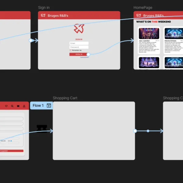
User Flow
The main user flow is:
Splash screen → Home page → Categories or Search → Event detail page → Add to cart → Checkout → Confirmation page
This flow allows the user to discover an event, view more information, add it to the cart, buy a ticket, and receive confirmation.
________________________________________
Prototype Explanation
I created a clickable prototype to show how the user moves through the desktop website. The prototype demonstrates the main journey from discovering an event to completing checkout.
The key interactions include opening the home page, browsing categories, viewing search results, selecting an event, adding it to the cart, buying the ticket, and reaching the confirmation page.
________________________________________
User Testing
I tested the desktop prototype with one user. The task was:
“Find a live music event, open the event detail page, add the event to the cart, and complete the checkout.”
The user was able to understand the main navigation and find the event cards easily. The event detail page was clear, and the checkout button was easy to find.
The main feedback was that the search and filter section should stay clear and easy to scan. The user also said that the desktop version felt more complete and professional than the first desktop draft.
________________________________________
What Went Well
The final desktop version successfully keeps the same Modern Music identity while improving the layout for a larger screen.
The top navigation makes the website easier to understand on desktop. The grid layouts make the event and category pages easier to scan. The event detail page feels clearer because the image and information are separated. The checkout page is also easier to understand because the ticket details and order summary are shown separately.
________________________________________
What Could Be Improved
One thing that could still be improved is adding more detailed event information, such as location, time, ticket type, and availability.
The search filters could also be expanded in the future to make the browsing experience more useful. For example, users could filter by date, price, genre, or location.
Another improvement could be adding hover states for buttons and cards to make the desktop experience feel more interactive.
________________________________________
What I Changed After Feedback
After reviewing the first desktop version, I improved the design by making it more suitable for desktop. I added a clearer website structure, better spacing, larger visual areas, grid layouts, a stronger event detail page, and a more professional checkout layout.
This helped the final version feel less like a stretched mobile app and more like a real desktop website.
________________________________________
Reflection / What I Learned
Through this project, I learned that converting a mobile app into a desktop website is not just about making the screen wider. The layout, navigation, spacing, and structure need to change so the experience feels natural on desktop.
I also learned how important consistency is. Even though the desktop version has a different layout, it still needs to feel connected to the mobile app through colours, typography, buttons, cards, logo, and visual style.
This project helped me improve my Figma and UX design skills because I had to think about responsive design, user flow, visual consistency, and professional presentation.
________________________________________
Credits
Credits:
Some images and icons used in this project were used for educational purposes. Any external photographs, icons, or Figma community resources are credited where applicable.
The layout, design decisions, user flow, mobile-to-desktop adaptation, and final desktop version are my own work.
Als je foto’s van Unsplash/Pexels/Figma Community komen, zet dan dit erbij:
Image sources:
- Unsplash / Pexels / Figma Community resources were used for visual reference and educational design purposes.
________________________________________
Final Submission Description
This project is my Final Distinction Project for the Figma Advanced Course. I started with a mobile event app called Modern Music and converted it into a desktop website.
I first created a desktop model based on the mobile app. After reviewing it, I improved the design into a more professional final version to create a stronger UI and better portfolio presentation.
The final design keeps the same brand identity, colours, cards, buttons, music theme, and user journey, while improving the layout for desktop with top navigation, grids, filters, larger images, two-column pages, and a clearer checkout flow.


