How to make a responsive 12 column grid in Illustrator
Questions


Student Gallery
Course info
Overview

- You'll need a copy of Adobe Illustrator CC 2017 or above. A free trial can be downloaded from Adobe.
- No previous design skills are needed.
- No previous Illustrator skills are needed.
- 45 lectures 4 Hours 7 minutes of content!
- You'll learn to design a website with in Adobe Illustrator.
- User Interface essentials.
- 27 Completed files so you never fall behind.
- Learn how to wireframe at all levels
- How to design for a responsive website.
- Downloadable exercise files & cheat sheet.
- Forum support from me and the rest of the BYOL crew.
- Techniques used by professional website designers.
- Professional workflows and shortcuts.
- A wealth of other resources and websites to help your new career path.
- This course is for beginners. Aimed at people new to the world of web and UI design. While no previous Illustrator experience is necessary.
Course duration 4 hours

Daniel Walter Scott
Founder of Bring Your Own Laptop & Chief Instructor
I discovered the world of design as an art student when I stumbled upon a lab full of green & blue iMac G3’s. My initial curiosity around using the computer to create ‘art’ developed into a full-blown passion, eventually leading me to become a digital designer and founder of Bring Your Own Laptop.
Sharing and teaching are a huge part of who I am. As a certified Adobe instructor, I've had the honor of winning multiple Adobe teaching awards at their annual MAX conference. I see Bring Your Own Laptop as the supportive community I wished for when I was first starting out and intimidated by design. Through teaching, I hope to bring others along for the ride and empower my students to bring their stories, labors of love, and art into the world.
True to my Kiwi roots, I've lived in many places, and currently, I reside in Ireland with my wife and kids.
Downloads & Exercise files
Transcript
Before you do, if you move the Artboard... the grids don't come along for the ride easily. So just get them laid out how you want. Doesn't really matter how you've got your Artboards... but I'm going to align mine up this way. Maybe a little bit closer.
I'm moving it with the Artboard tool... it's this guy down the bottom here, move just your pages around. So, first thing we need to do is grab our rectangle tool. Click on this guy here. You might be stuck on the circles tool or rounded rectangle tool underneath. Grab the rectangle tool for me.
In terms of the sizes, I want either a white fill, or a none fill. So that's the center of the box. And this is the line around the outside. And I'll want this thing to be anything but something... that we can see on a white background, so black works for me. I'm going to click, hold, and drag, and you can see mine's trying to snap.
You can see, it's pretty clever. You can see that little word that says intersect. If yours is not snapping to it, go to 'View'... and turn on this thing called 'Smart Guides'... or 'Command U' on a Mac, or 'Control U' on a PC. It's a really handy one to use, especially at this stage.
I'm going to zoom in a little bit, remember, 'Command -' or 'Control -' And I'm going to draw a box across the whole thing. It's a bit of a faf, a little bit. So we've got one big box, and now what we're going to do is... we're going to split it into columns. We find that under 'Objects', 'Path'... and there's one that says 'Split Into Grid'.
And this fun box appears. We don't want rows, we want columns. The up and downs. So we're going to put it up to '12', and in terms of the width. We're not worried about that, what we're worried about is the 'Gutter'. So the columns you saw at the beginning there...
there's gaps between them. And there's a really common size for them... you might have to check with your developer or the CMS... that you're using most of the time... the 'Gutter' between them, on each side of the column is '15px'. That's either side.
When they're next to each other, they add up to 30. So, there's your 'Gutter', set to '30px', and we're going to click '12'. Make sure you turn on 'Add Guides'. We're watching a preview so you can see what we're talking about. That would have been easier. You can see, I've got 15 pixels...
and then 15 pixels either side of these columns... so together they make 30. Let's click 'OK'. Now what I want to do is, I want to grab my black arrow... my selection tool, and I click these guides that got made. Then I'm going to right click them and go to 'Ungroup'.
So it gets rid of this one, I don't want this horizontal one. I just want the columns, not these rows here. What we can do now is we can go through and-- actually I'm going to select these guys here. If you have used Illustrator before... you're thinking, "Great, they're guides." They're not, they're just like these physical lines... that are on the thing used as guides.
What I need to do now is, I'm going to kind of lower them down. They kind of snap to the top there, so I've popped down the bottom here. What I'll do is I'll extend them down the bottom. So I've got them all selected. The easiest way to select them all. If you are new, black arrow...
select all just the tippy tops of them because we've only grouped them, it's left these guys behind. So I'm going to drag it down to match this up with the top... and down the bottom here, I'm going to scroll down... and I'm going to drag these down quite far... because I have no idea how long this page is going to be... and it's easier to do it here when I drag it down.
I've got all of this down, I've got them still selected. Don't worry about ones that are darker than the others. I clicked that by accident. still going to work, and we're going to go down to 'View'... and we're going to go to 'Guides'. There's one here that says 'Make Guides'.
I know it feels like we've done that already, don't worry. Those are actual proper guides. So now what I can do is I can go to 'View', and I can go to 'Guides'. Yours might be by default, already locked. So if it says 'Unlock Guides' here, don't click it. But yours is probably like mine, it says 'Lock Guides'.
And that means I can't move them now. I was able to select them but now I can't. Now, all those junk that's left behind, there's quite a bit of it, gone. That is how you turn it into a 12-column grid. You might have to rewind and play this thing through a couple of times. It did for me when I first started doing it, so don't sweat it.
That is how you set up your columns. Now what we're also going to do is, I'm actually going to-- I hate designing right to this edge here. So what I do is I grab my Artboard. I extend it out a little bit , just that I get some sort of a play area. It just means that-- it's hard to design within that little box. And you need to back everything up to this edge...
and it just doesn't look right. I'll show you what it looks like here. You can see here, I've got this area here, and it's kind of white space. I know it's not always there, but it's often there. So I kind of expand it here as a designer, so I can see some extra bits. I know that the width is still-- between these two guides, it's 1200, which is perfect.
And a little quick tip for you is that if you drag this out. Say, just going left to right here... if I hold down my 'Option' key on a Mac, or the 'Alt' key on a PC... you can see these both sides. Just gives myself like a little bit of wiggle room. Now, even though I said don't move them, we're going to move them along.
There's no guides on them yet, so we're okay. So it's a staple repeat for the rest of them. So I'm going to do the next one for tablet. We'll do to this one together. I'm going to drag it out. I'll make it a little bit faster.
We're going to go to 'Object', 'Path', 'Split to Grid'. And I'm going to say, let's make '12' of these guys. I kind of talked about it earlier, 12 is just too many. So I cut it down to '6', because it's divisible by 12. You can put 12 in there, I like 6 to cut it down, the gutter. Between these guys is still going to be '30'.
And I'm going to click 'OK'. No, I'm going to select 'Add Guides', click 'OK'. And I've got this. So now what I'm going to do is, I'm going to select him. I'm going to right click him, and say 'Ungroup'. And I'm going to click just the tippy top of these guys.
And I'm going to lower them down, and now I'm going to say 'View'. I'll go to 'Guides', I'm going to say 'Make Guides'. I don't have to go and lock them again, they're all locked by default. It's kind of like an overall-- You don't lock particular guides, you lock all guides on all pages. So if I go to 'Guides' now, you can see, I can unlock them... but I can't lock them because they are already locked.
So I can select all this stuff. Bye bye. Grab the Artboard tool. Hold down your 'Alt' key on a PC, or 'Option' key on a Mac. Drag the sides out just to give myself a little bit of play room. And we're going to do the next one.
Now I want you to go off and do the next one by yourself. You can pause the video and see if you can give it a crack. I'm going to do it here. And you can fast forward to the next video if you've got the idea. So I've got this one selected. Doesn't really need to go to the bottom.
Remember, we're going to go to 'Object', 'Path', 'Split Into Grid'. In this case we're going to use '2'. I could put 4 if you prefer if you're going to do... some kind of cool things in here, a mobile, I'm not. I'm going to put in a Gutter of '30'. I keep clicking OK, you're going to do it as well.
Make sure you click 'Add Guides'; We forget about it every time. Click 'OK'. So we've got our pretend guides. We're going to select them, right click them. I'm using my black arrow. Go to 'Ungroup'.
I'm going to select just just the tippy tops of them, grab one of them... and drag it down, so it aligns with the top. I'm going to make them a little longer, I forgot to do it for these guys. I'm going to pay for that later. Drag these down. Now we go to 'View', 'Guides', 'Make Guides'.
It's already locked, so we can grab all this junk that's left over. Hit 'Delete', and we now have... a 12 column grid across them all that we've kind of snuckily just down 6, and 2 on these ones here. I'm going to use the Artboard tool on this. Stretch out a little bit. We're going to hit 'Save.
Alright guys, that's how to make a 12-column grid in Illustrator. If you are lazy, like me, you would download a template. And it will be this, right here. I'll leave that in the exercise files. I will call it 12-column grid in Illustrator template... or something like that.
It will be in there, you can just open that and go forth with that one.
How do you create a responsive 12-column grid in Illustrator?
Create a rectangle over each artboard, use Object > Path > Split Into Grid, then convert the resulting column lines into proper guides. Use 12 columns for desktop, 6 for tablet, and 2 for mobile, keeping a 30 px gutter between columns.
How to Make a Responsive 12-Column Grid in Adobe Illustrator
Key Takeaways
Set up your artboards before building guides, because guides do not move neatly with repositioned artboards.
Use Illustrator’s Split Into Grid command to create consistent responsive columns quickly.
Set desktop layouts to 12 columns, then simplify the same system to 6 tablet columns and 2 mobile columns.
Use a 30 px gutter, which represents 15 px of spacing on either side of neighbouring columns.
Convert temporary lines into locked Illustrator guides, then delete the leftover shapes.
Get Your Artboards in Position First
Before making any grids, get the artboards roughly where you want them. This matters more than it seems because Illustrator guides do not come along for the ride nicely when you move an artboard afterwards.
Use the Artboard Tool, down near the bottom of the toolbar, to arrange your desktop, tablet, and mobile artboards. They do not need to be perfectly positioned, but it is much easier to build a clean responsive layout once the pages are sitting where you need them.
For this setup, use three artboards:
A wide desktop artboard
A narrower tablet artboard
A slim mobile artboard
Create the Desktop 12-Column Grid
Start with the desktop artboard. Grab the Rectangle Tool. If the toolbar is showing an ellipse or rounded rectangle instead, click and hold that tool to reveal the standard rectangle.
Give the rectangle either a white fill or no fill, then use a visible stroke colour such as black. The rectangle is only a temporary construction tool, so the important thing is being able to see it while setting things up.
Drag a rectangle across the full width of the desktop artboard. Smart Guides make this much easier because Illustrator will snap to the artboard edges and show an intersect indicator.
If snapping is not working, turn on View > Smart Guides. The keyboard shortcut is Command + U on Mac or Control + U on PC. It is a seriously handy setting, especially while laying out web and UI designs.
Split the Rectangle into Columns
With the rectangle selected, go to Object > Path > Split Into Grid. This opens the useful little dialog box that does all the heavy lifting.
Ignore rows. The goal here is vertical columns, so set the number of Columns to 12.
The key setting is the gutter. A common web layout convention is 15 px of space on each side of a column. When two columns sit beside each other, those sides combine to make a 30 px gutter.
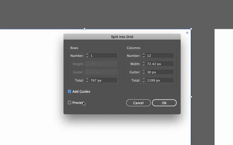
The desktop setup uses 12 columns with a 30 px gutter and turns on Add Guides before creating the grid.
Enter 30 px for the gutter, tick Add Guides, and turn on Preview if you want to see the column spacing before committing. Then click OK.
At this point Illustrator creates the column structure, but there is still a little cleanup to do.
Turn the Column Lines into Proper Guides
Select the new grid using the black arrow, also called the Selection Tool. Right-click and choose Ungroup.
This breaks the generated grid into separate pieces. You do not need the horizontal sections or the leftover rectangle edges. What you want are the vertical lines that define the columns.
Select the little top ends of the vertical lines and drag them downward. Extend them well beyond the bottom of the artboard, especially for a webpage layout where the final page height is not known yet. It is far easier to make the guides long now than to keep extending them later.
Once those vertical lines are selected, go to View > Guides > Make Guides. This is the moment they become actual Illustrator guides rather than ordinary lines pretending to be guides.
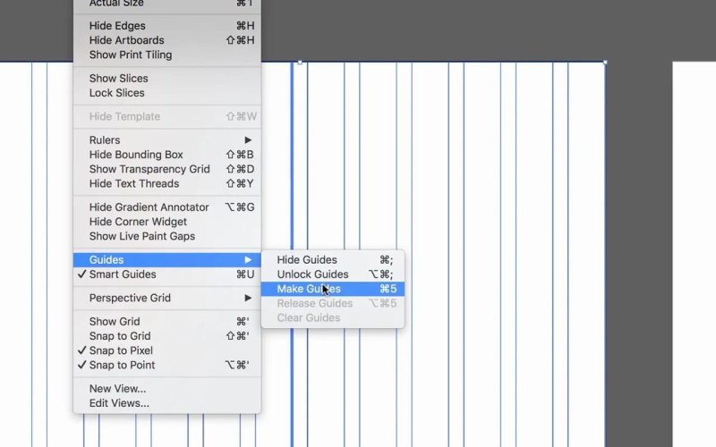
Make Guides converts the temporary column lines into non-printing layout guides.
Now lock them through View > Guides > Lock Guides. If the menu says Unlock Guides, leave it alone because the guides are already locked.
Guide locking is global in Illustrator. You are not locking one individual artboard’s guides, you are locking guides across the document. Once the guides are locked, select all the remaining construction shapes and delete them.
You should now have a tidy 12-column desktop grid that stays out of the way while still giving you a solid layout structure.
Give Yourself Some Breathing Room Around the Artboard
Designing right up against the edge of an artboard can feel a bit cramped. Even though the intended website width sits between the outer grid guides, it helps to create some visual breathing room around the working area.
Select the artboard with the Artboard Tool and drag the sides outward a little. Hold Option on Mac or Alt on PC while dragging to expand both sides evenly.
The actual content width remains the same between the outer guides. You are simply giving yourself a bit of workspace so the design is easier to judge and does not feel like it is pressed against an artificial edge.
Set Up the Tablet Grid with Six Columns
For tablet, repeat the exact same workflow:
Draw a rectangle across the tablet artboard.
Choose Object > Path > Split Into Grid.
Set the gutter to 30 px.
Tick Add Guides.
Ungroup the resulting objects.
Extend the vertical lines downward.
Choose View > Guides > Make Guides.
Delete the leftover objects.
The difference is the number of columns. While it is possible to use all 12 columns on tablet, six is usually enough. It is also nicely divisible by 12, so the tablet layout remains connected to the same responsive grid system without becoming unnecessarily fiddly.
Use 6 columns with the same 30 px gutter. The grid is simpler, but still flexible enough for responsive content, cards, images, and page sections.
Set Up the Mobile Grid with Two Columns
For the mobile artboard, repeat the process one more time, but make it much simpler. Set the grid to 2 columns and keep the gutter at 30 px.
You could use four columns if your mobile design needs more intricate alignment, but a two-column structure is plenty for a straightforward layout. The point is not to cram desktop complexity into a small screen. It is to keep the responsive system useful at the scale where it matters.
Do not forget the easy-to-miss step in the Split Into Grid dialog: tick Add Guides before pressing OK. It is very easy to hit OK automatically and have to undo the whole thing.
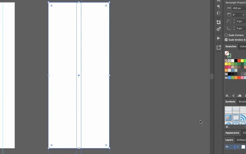
A two-column mobile grid keeps small-screen layouts aligned without making them overly complicated.
Ungroup the generated objects, extend the two vertical lines to the required page length, convert them using View > Guides > Make Guides, and delete the construction leftovers.
Use One Responsive System Across Every Artboard
The finished result is a responsive grid system built from one consistent idea:
Desktop: 12 columns
Tablet: 6 columns
Mobile: 2 columns
Gutters: 30 px throughout
That gives you the flexibility of a 12-column layout on large screens, while tablet and mobile layouts use sensible subdivisions of the same system. It keeps decisions consistent as the design moves between breakpoints.
Before locking in the gutter size for a real project, check with the developer or confirm the conventions of the CMS or framework being used. The 30 px approach is common, but the project’s build system should always win.
A Faster Option: Start with a Template
Once you know how the grid is made, there is absolutely no shame in using a template for future work. A prepared Illustrator file with desktop, tablet, and mobile guides already in place saves time and lets you get straight into the actual design.
The important bit is understanding what the template contains: real locked guides, a consistent gutter, and column counts that scale sensibly from desktop to mobile. Once that is sorted, you can go forth and design.
Key Terms
12-column grid
A layout framework that divides a desktop content area into 12 vertical sections. Because 12 divides cleanly into halves, thirds, quarters, and sixths, it gives web layouts plenty of flexibility.
Gutter
The gap between adjacent columns. In this setup, a 30 px gutter comes from 15 px of spacing on each side of neighbouring columns.
Smart Guides
Illustrator’s alignment assistance that helps objects snap to edges, anchor points, and intersections. Enable it through View or with Command + U on Mac and Control + U on PC.
Make Guides
An Illustrator command that converts selected paths into proper guides. Unlike ordinary lines, guides are intended for alignment and can be locked to avoid accidental movement.
FAQs
What gutter size should I use for an Illustrator web grid?
Use a 30 px gutter for this grid. It represents 15 px of spacing on each side of neighbouring columns, which is a common convention for web layout work.
Why use six columns on tablet instead of twelve?
Six columns keep the tablet layout simpler while still fitting within the same 12-column logic. Since six divides evenly into 12, responsive content can scale down without losing the overall system.
Should mobile layouts use two or four columns?
Two columns are enough for a straightforward mobile layout. Four can work if the design needs more detailed alignment, but a simpler grid is often easier to use on a narrow artboard.
Why do I need to ungroup after Split Into Grid?
Ungrouping separates the generated grid pieces so you can remove unwanted horizontal lines, extend the vertical lines, and turn only the useful column boundaries into guides.
Can I move my artboards after creating the guides?
You can, but it is best to position artboards first. Guides do not reliably move with the artboards, so shifting pages later can make the grid setup messy.
Written by Daniel Walter Scott — Founder of Bring Your Own Laptop & Chief Instructor
