How to add a Connected Stroke Around Multiple Shapes in Illustrator
Questions

Student Gallery
Course info
Overview
- - How to use artificial intelligence to boost your creativity in ideation.
- - The quick way to take hand-drawn sketches and vectorize and color them.
- - The building blocks needed to set you loose on a huge variety of beautiful effects and techniques.
- - To make beautiful charts and graphs for your documents.
- - Color mastery to make quick color adjustments, Pantones, and blend it all together beautifully.
- - How to master images inside of your illustrator workflow.
- - To harness all the secret gems that'll help you level up your typography skills.
- - All the tricks of the trade for drawing complex shapes easily.
- - To double your creativity with the Transform and Distort section.
- - To speed up your personal workflow to get the most out of your creative day.
- The Curvature Tool
- How to master corners with corner widget effects
- How to work with Compound Paths
- The difference between Expand & Expand Appearance
- How to create Graphic Styles
- How to make Symbols
- How to use the Smooth Tool
- Advanced use of Simplify Path
- What Live Shape Effects are for
- How to make Repeating Grids & Concentric Circles
- How to make Random Objects
- Advanced Keyboard Shortcuts in Illustrator
- How to add a Gradient on a Stroke
- How to add a Gradient in Text
- How to use the Freeform Gradient tool
- How to use Advanced Color Swatches
- How to use Global Color Swatches
- What is the difference between RGB vs CMYK color modes?
- How to proof colors
- How to use Pantone Spot Colors
- Recolor Artwork & Changing all colors at once
- How to use Blending Modes
- How to work with Images & Blending Modes
- How to make Black & White Images
- Learn Advanced Workflow Tricks
- All the Super Selection Mastery
- How to use the History Panel
- Advanced Fonts Tricks & Tips
- Use Retype to know what Font is being used
- How to put Text Inside a Letter or Shape
- How to use the Touch Type Tool
- How to add a Connected Stroke Around Multiple Shapes
- How to Offset a Stroke with Text
- How to make a Bar Chart in Illustrator
- How to make a Pie Chart in Illustrator
- Layer Power Moves
- Advanced Artboard & Pages Tricks
- How to Unlink vs Embedded Images
- How to Crop Images Rather than Mask
- How to Mask Inside Text & Multiple Shapes
- How to you use the Puppet Warp Tool
- How to use the Distort Envelope Shape & Type
- How to use the Envelope Mesh
- How to blend lines together
- How to make a Linocut Effect
- How to make 3D Gradient Lettering Blends
- How to spin text into a ring
- How to turn text into a 3D donut shape
- How to make a Duotone image effect
- How to make a Roughen Stamp Vector Effect
- How to make a Neon Sign Glow Effect
- How to use a Halftone Effect using Plugins
- Advanced Exporting Assets Tricks in Illustrator
- How to use the Dimension Tool
So what're you waiting for? Let's start the course now!

Daniel Scott
Founder of Bring Your Own Laptop & Chief Instructor
instructorI discovered the world of design as an art student when I stumbled upon a lab full of green & blue iMac G3’s. My initial curiosity around using the computer to create ‘art’ developed into a full-blown passion, eventually leading me to become a digital designer and founder of Bring Your Own Laptop.
Sharing and teaching are a huge part of who I am. As a certified Adobe instructor, I've had the honor of winning multiple Adobe teaching awards at their annual MAX conference. I see Bring Your Own Laptop as the supportive community I wished for when I was first starting out and intimidated by design. Through teaching, I hope to bring others along for the ride and empower my students to bring their stories, labors of love, and art into the world.
True to my Kiwi roots, I've lived in many places, and currently, I reside in Ireland with my wife and kids.
Certificates
We’re awarding certificates for this course!
Check out the How to earn your certificate video for instructions on how to earn yours and click the available certificate levels below for more information.
Downloads & Exercise files
How do you add one editable stroke around multiple shapes in Illustrator?
Group the shapes, then add the stroke in the Appearance panel and move that stroke below Contents. That makes Illustrator treat the grouped artwork like one styled object, so the outer stroke stays live and updates as you move the shapes inside.
Illustrator Advanced: Strokes Around Multiple Shapes
One of the nicest tricks in Adobe Illustrator is getting a single stroke to run around a collection of shapes without flattening everything into a dead, uneditable mess.
If you have a badge, icon, logo mark, or little illustration made from several objects, you can use the Appearance panel to build an outer stroke that behaves like a live style. Move the pieces around, and the outline reshapes itself automatically. That is the good stuff.
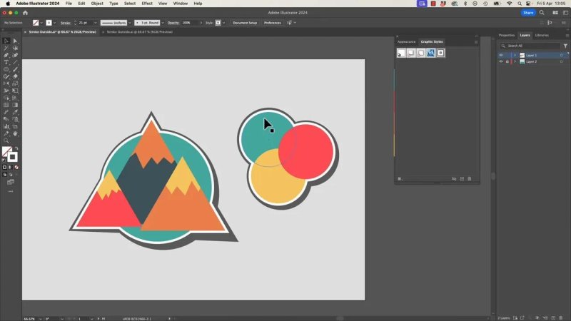
This is the effect: one outer stroke wrapping around multiple shapes as if they belong together.
Why this technique is so useful
Normally, adding a stroke to several separate objects gives you a stroke on each object. Useful sometimes, but not when you want one border around the whole cluster.
The Appearance panel gives you a smarter option:
You can style a grouped set of shapes like one object.
The stroke can sit behind the artwork instead of on top of every path.
The whole thing stays editable.
You can stack extra strokes and effects for more character.
You can save the result as a reusable Graphic Style.
That makes it perfect for icon systems, illustrated labels, stickers, badges, and any design where several shapes need a unified outline.
The key rule before you start
If Illustrator says it cannot add a stroke because the selection has mixed appearances, that usually means the artwork is still a bunch of separate objects.
The fix is simple: group it first.
Once the shapes are grouped, Illustrator can apply one appearance to the group itself.
How to create a stroke around multiple shapes
Select all the shapes that should share the outer border.
Group them using Cmd + G on Mac or Ctrl + G on Windows.
Open the Appearance panel.
Add a new stroke to the group.
Increase the stroke weight so the effect becomes obvious.
Drag that stroke below Contents in the Appearance panel.
That last step is the whole trick.
If the stroke sits above the contents, it behaves more like a normal stroke on visible edges. If it sits below the contents, the artwork covers the middle of the stroke and leaves only the outer edge showing. That creates the illusion of one clean outline around the entire grouped illustration.
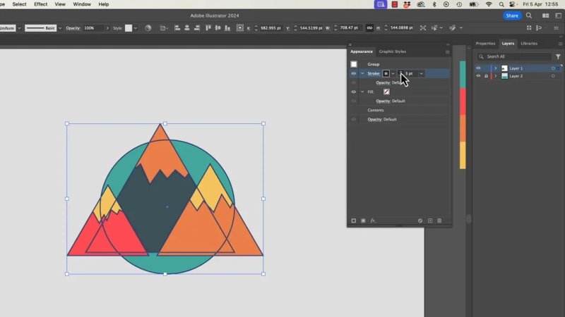
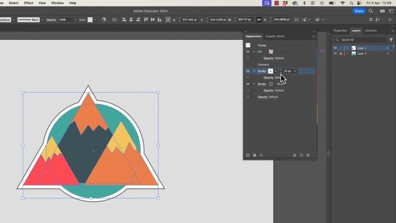
The order inside the Appearance panel is what makes the outer border work.
Pick the stroke colour and weight
Once the stroke is in the right place, you can style it like any other stroke.
In the example here, a muted grey works really well because it frames the artwork without overpowering it. A thicker weight makes the grouped shape feel more like a sticker or badge.
There is no perfect number for stroke size. It depends on:
how large the artwork is
how tightly the shapes overlap
how bold you want the outline to feel
whether you plan to add more stacked strokes later
The best part: it stays editable
This is where the technique really earns its keep.
You can double click to isolate the group, grab one of the inner shapes, and move it around. The outer stroke updates with it. You are not outlining strokes, expanding shapes, or manually redrawing anything.
So if your mountain peak shifts, or one circle in an icon set needs nudging, the border follows along automatically.
That is a massive improvement over destructive workflows. Instead of locking yourself into a final shape too early, you keep the illustration flexible right to the end.
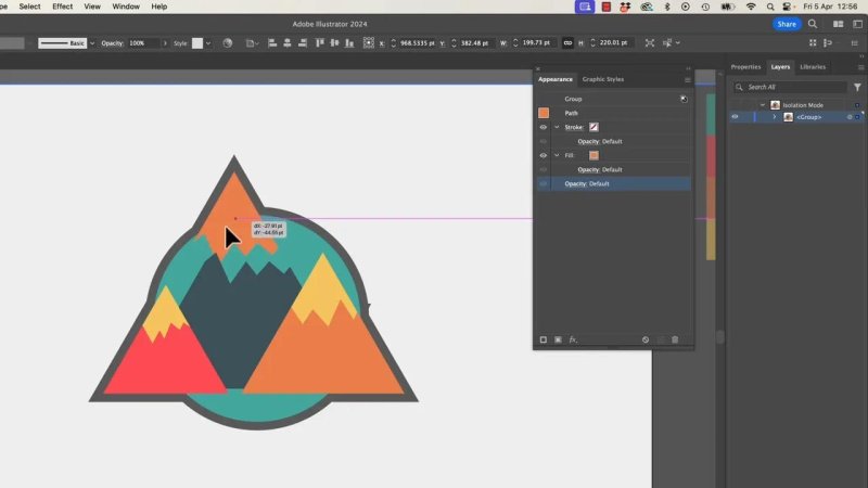
Move an inner shape and the outer stroke simply adapts. No rebuilding required.
A common oddity you might run into
This approach is clever, but it is not magic in the perfect, flawless sense. Sometimes the stroke catches little internal details you forgot were there.
For example, a small hidden zigzag or line inside the group can push the outer stroke outward in a weird bump. You might look at the edge and think, what is that little lump doing there?
Usually the cause is one of these:
a stray path inside the group
a tiny decorative line too close to the edge
sharp corners interacting with a thick stroke
If that happens, switch to Outline mode and inspect the actual paths. You will often spot the culprit straight away.
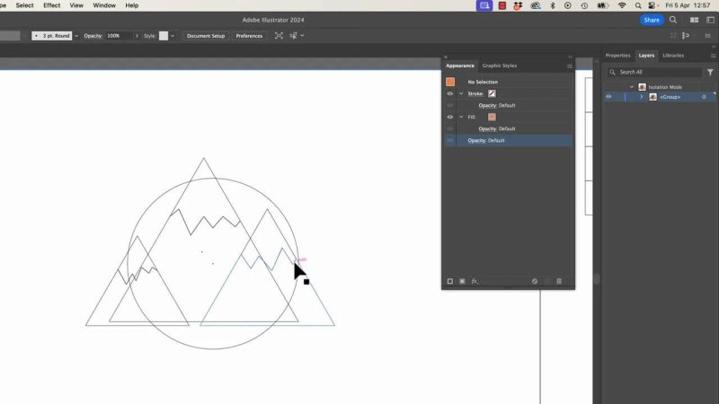
Outline mode makes it much easier to find the little path causing an awkward bulge.
Use the Stroke panel to refine messy edges
If the outer outline looks too sharp or creates odd spikes, open the Stroke panel and try different corner or join settings.
That can help smooth out the border, especially when thick strokes wrap around lots of angles.
Sometimes, though, the issue is simply a side effect of the technique. If an inner edge gets too close to the outside, the stroke can react in ways that need a bit of manual judgement. That is normal. You are still miles ahead compared with outlining everything and losing editability.
Build a second stroke for a layered border effect
Once you have one outer stroke working, you can stack another one for more depth.
This is where Illustrator starts getting properly fun.
Add a second stroke in the Appearance panel and place it in the right position in the stack. In the mountain badge example, a white stroke placed over the grey one creates a layered edge that feels a bit like a cut paper border or a comic-style sticker.
Because the white stroke is smaller and sits above the darker one, you get a neat two-tier outline without drawing anything by hand.
Stacking strokes gives the artwork a more polished badge-style edge.
Apply effects to a specific stroke
Here is where the Appearance panel becomes even more powerful.
You are not limited to changing the group as a whole. You can target a single stroke inside the appearance stack and apply an effect to just that stroke.
That means you can keep the main artwork clean while pushing one stroke into a stylised shape.
To do that:
Select the grouped artwork.
In the Appearance panel, click the specific stroke you want to affect.
Go to Effect.
Choose Distort & Transform, then Free Distort.
Now you can pull the corners of that stroke independently. The artwork itself stays put, but the selected stroke shifts into a slightly offset shape.
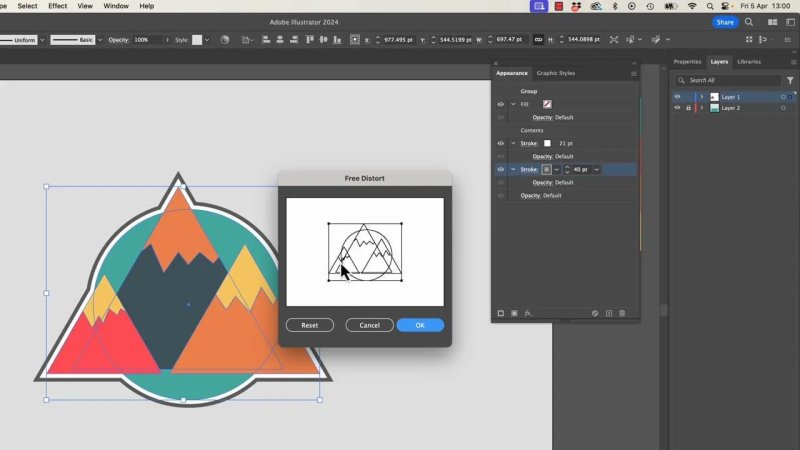
Applying Free Distort to one stroke creates an offset effect without altering the artwork itself.
Fake an offset look without rebuilding the art
By nudging that selected stroke with Free Distort, you can make it lean to one side and show a shadow-like or printed offset edge.
If you push it too far, bits underneath will show in a clumsy way, so it is worth easing it back until it suits the stroke width and the scale of the illustration.
The result has a nice mix of qualities:
still crisp and vector based
a little imperfect in a good way
more organic than a mathematically perfect border
great for comic, hand-drawn, or badge-style design
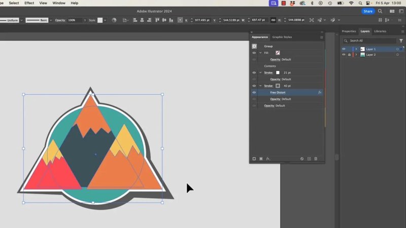
A slight distortion gives the border more personality and avoids a too-perfect digital feel.
Why keeping everything live matters
This workflow is especially good when you are building families of icons or illustrations.
As long as the effect lives in the Appearance panel, you can keep editing the actual shapes inside the group. You are not locked into outlined strokes or expanded objects.
That means:
faster revisions
cleaner source files
easier style consistency across multiple graphics
less manual cleanup later
It is one of those small Illustrator habits that pays off over and over again.
Save it as a Graphic Style
Once the grouped artwork looks right, save the whole appearance as a Graphic Style.
Select the finished group while you are at the top level, not drilling around inside the isolated artwork, then add it to the Graphic Styles panel.
Now you have a reusable style you can apply elsewhere.
Applying the same style to another set of shapes
The same rule applies to new artwork: if you want one outer appearance around several shapes, they need to be grouped first.
In the example with the overlapping circles, the process is:
draw the separate coloured circles
select them all
group them
apply the saved Graphic Style
Once that style lands on the grouped circles, Illustrator wraps the cluster in the same layered border treatment. And because it is still a live grouped object, you can move the circles around and the outline keeps up.
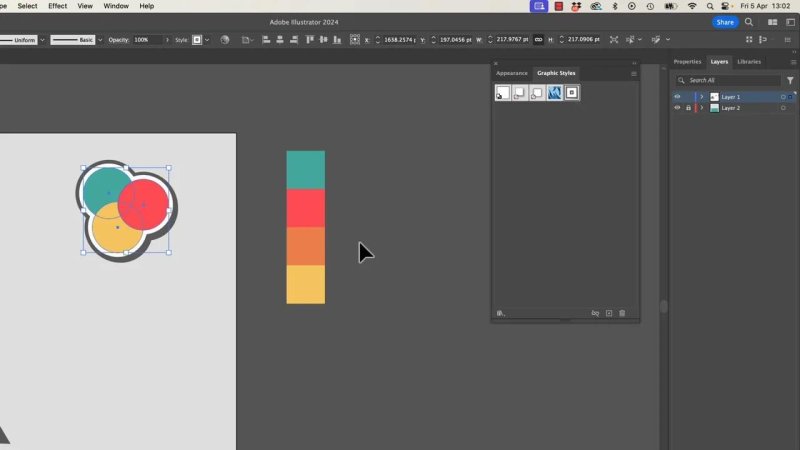
Save the effect once, then reuse it on another grouped illustration in a couple of clicks.
Practical tips to avoid frustration
A few things are easy to forget when you are working with advanced appearances.
Make sure the correct object is actually selected
This catches nearly everyone. You think you are editing the group, but nothing changes because the group itself is not selected. If Illustrator seems to ignore you, check the selection first.
Pay attention to the Appearance panel order
If the stroke is in the wrong place in the stack, the effect falls apart. Most of the magic here is just ordering appearance attributes correctly.
Group first, style second
If you try to apply the graphic style to a loose collection of objects, it will not behave the same way. Treat the collection as one grouped unit.
Do not outline too early
Outlining can be useful at the very end for special cases, but it removes the flexibility that makes this technique so powerful in the first place.
Where this works best
This Illustrator stroke technique is particularly handy for:
icon sets
logo experiments
badge illustrations
sticker-style artwork
comic-inspired vector graphics
shape collections that need a unified silhouette
If the artwork is built from several simple forms and you want it to feel like one cohesive object, this is a very solid approach.
FAQ
Why can’t I add a stroke to multiple selected objects in Illustrator?
If the objects have mixed appearances, Illustrator will not apply one shared stroke the way you want. Group the objects first so the stroke is applied to the group rather than each separate shape.
Why does the stroke need to go below Contents in the Appearance panel?
Placing the stroke below Contents lets the artwork sit on top of it. That hides the inner part of the stroke and leaves a clean outer edge, which makes it look like one border around the full shape collection.
Will the outer stroke update if I move shapes inside the group?
Yes. That is one of the main advantages of this method. As long as the effect is still live in the Appearance panel, the border updates when you edit the shapes inside the group.
Can I use more than one stroke for this effect?
Yes. You can stack multiple strokes in the Appearance panel, give them different colours and weights, and even apply effects to just one of them for a more stylised result.
Can I save this as a reusable Illustrator Graphic Style?
Absolutely. Once the appearance looks right, save it to the Graphic Styles panel. Then apply it to other grouped artwork to get the same editable border treatment much faster.
- Powered by Marvin
- Terms of use
- Privacy policy
- Cookie policy
-
- © Bring your Own Laptop Ltd 2026