How to add a Gradient on a Stroke in Illustrator
Questions

Student Gallery
Course info
Overview
- - How to use artificial intelligence to boost your creativity in ideation.
- - The quick way to take hand-drawn sketches and vectorize and color them.
- - The building blocks needed to set you loose on a huge variety of beautiful effects and techniques.
- - To make beautiful charts and graphs for your documents.
- - Color mastery to make quick color adjustments, Pantones, and blend it all together beautifully.
- - How to master images inside of your illustrator workflow.
- - To harness all the secret gems that'll help you level up your typography skills.
- - All the tricks of the trade for drawing complex shapes easily.
- - To double your creativity with the Transform and Distort section.
- - To speed up your personal workflow to get the most out of your creative day.
- The Curvature Tool
- How to master corners with corner widget effects
- How to work with Compound Paths
- The difference between Expand & Expand Appearance
- How to create Graphic Styles
- How to make Symbols
- How to use the Smooth Tool
- Advanced use of Simplify Path
- What Live Shape Effects are for
- How to make Repeating Grids & Concentric Circles
- How to make Random Objects
- Advanced Keyboard Shortcuts in Illustrator
- How to add a Gradient on a Stroke
- How to add a Gradient in Text
- How to use the Freeform Gradient tool
- How to use Advanced Color Swatches
- How to use Global Color Swatches
- What is the difference between RGB vs CMYK color modes?
- How to proof colors
- How to use Pantone Spot Colors
- Recolor Artwork & Changing all colors at once
- How to use Blending Modes
- How to work with Images & Blending Modes
- How to make Black & White Images
- Learn Advanced Workflow Tricks
- All the Super Selection Mastery
- How to use the History Panel
- Advanced Fonts Tricks & Tips
- Use Retype to know what Font is being used
- How to put Text Inside a Letter or Shape
- How to use the Touch Type Tool
- How to add a Connected Stroke Around Multiple Shapes
- How to Offset a Stroke with Text
- How to make a Bar Chart in Illustrator
- How to make a Pie Chart in Illustrator
- Layer Power Moves
- Advanced Artboard & Pages Tricks
- How to Unlink vs Embedded Images
- How to Crop Images Rather than Mask
- How to Mask Inside Text & Multiple Shapes
- How to you use the Puppet Warp Tool
- How to use the Distort Envelope Shape & Type
- How to use the Envelope Mesh
- How to blend lines together
- How to make a Linocut Effect
- How to make 3D Gradient Lettering Blends
- How to spin text into a ring
- How to turn text into a 3D donut shape
- How to make a Duotone image effect
- How to make a Roughen Stamp Vector Effect
- How to make a Neon Sign Glow Effect
- How to use a Halftone Effect using Plugins
- Advanced Exporting Assets Tricks in Illustrator
- How to use the Dimension Tool
So what're you waiting for? Let's start the course now!

Daniel Walter Scott
Founder of Bring Your Own Laptop & Chief Instructor
I discovered the world of design as an art student when I stumbled upon a lab full of green & blue iMac G3’s. My initial curiosity around using the computer to create ‘art’ developed into a full-blown passion, eventually leading me to become a digital designer and founder of Bring Your Own Laptop.
Sharing and teaching are a huge part of who I am. As a certified Adobe instructor, I've had the honor of winning multiple Adobe teaching awards at their annual MAX conference. I see Bring Your Own Laptop as the supportive community I wished for when I was first starting out and intimidated by design. Through teaching, I hope to bring others along for the ride and empower my students to bring their stories, labors of love, and art into the world.
True to my Kiwi roots, I've lived in many places, and currently, I reside in Ireland with my wife and kids.
Certificates
We’re awarding certificates for this course!
Check out the How to earn your certificate video for instructions on how to earn yours and click the available certificate levels below for more information.
Downloads & Exercise files
How do you apply a gradient to a stroke in Adobe Illustrator?
Select an object with a stroke, make sure the stroke is active instead of the fill, then apply a gradient and adjust it in the Gradient panel. The key difference is that stroke gradients need a couple of extra settings if you want the colour to run cleanly around the edge rather than simply across the shape.
How to Add a Gradient to a Stroke in Adobe Illustrator
Adding a gradient to a fill in Illustrator is easy. Adding a gradient to a stroke is where things get a bit more interesting.
If you want colour to travel nicely around the edge of a shape, there are a couple of small tricks that make all the difference. Once you know where the controls live, it is actually pretty straightforward.
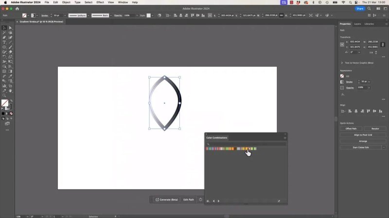
The default result works, but it is not yet flowing the way we want around the edge.
Start with the right object setup
The cleanest way to begin is with a shape that has no fill and a visible stroke. In the example here, the shape is a simple pointed petal or leaf.
Before applying anything, make sure the stroke is the active attribute. In Illustrator, the fill and stroke can swap front and back. If the wrong one is active, the gradient will end up in the fill instead.
A quick shortcut helps here:
Press X to toggle between fill and stroke
Bring the stroke to the front
Keep the fill set to None
That one little check saves a lot of undoing.
Apply a gradient to the stroke
With the shape selected and the stroke active, click a gradient swatch. Illustrator will immediately place a gradient on the stroke.
At this point, the effect often looks a bit odd. It can feel like the gradient is filling the thickness of the stroke instead of wrapping naturally around the path. That is normal. The real control comes from the Gradient panel.
Using built in gradient presets
If you want a quick starting point, open the preset gradient libraries:
Window to open panels if needed
Swatch Libraries
Gradients
Try Color Harmonies or Color Combinations
The built in sets are actually pretty decent, especially when you just need a solid colour pairing to start experimenting with.
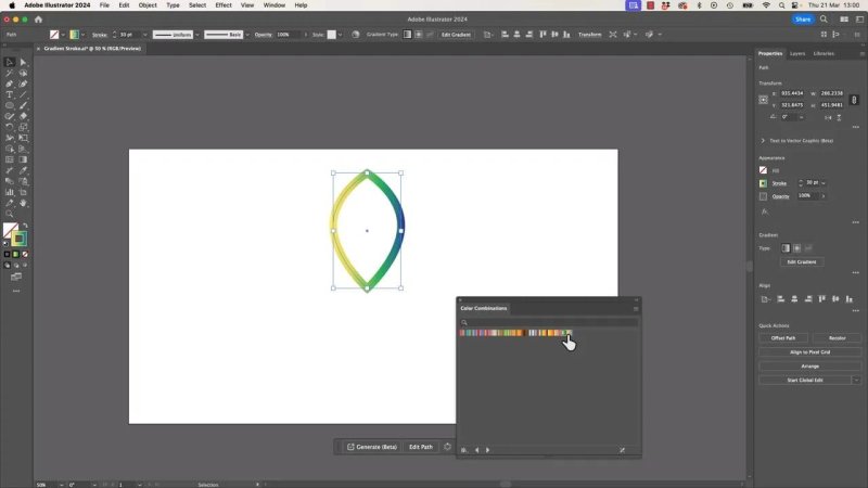
Preset gradient libraries are a quick way to find something usable without building every blend from scratch.
Use the Gradient panel, not the Gradient tool
For fill gradients, the Gradient tool often does the job. For stroke gradients, the better route is the Gradient panel.
Open it from Window > Gradient, or use the gradient editing controls if they are already visible.
Once the stroke is selected, Illustrator gives you a few ways to map the gradient onto that stroke. This is the part that matters most.
The three stroke gradient behaviours
Illustrator lets you control how the gradient sits on the stroke. These options can completely change the look.
1. Gradient within the stroke
This maps the gradient across the stroke thickness itself. Instead of running around the path, it transitions across the width of the stroke.
This can be useful, but it is not usually the effect people mean when they say they want a gradient stroke.
2. Gradient along the stroke
This is the one most people are after. The colour travels from the beginning of the path to the end of the path, following the edge all the way around.
On open paths, that is often perfect. On closed shapes, there is one small catch: the start and end of the path meet, so you can sometimes see a slightly awkward seam where the gradient loops back.
3. Gradient across the stroke
This applies the colour across the inside and outside edges of the stroke. It creates a more striped effect, because the gradient shifts from one side of the stroke to the other.
It is a valid stylistic choice, but it gives a very different result.
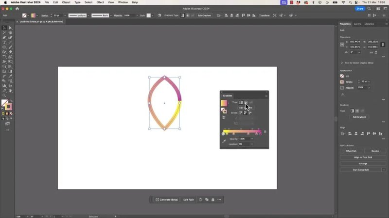
These stroke mapping options are the whole game. Pick the wrong one and the gradient feels off instantly.
How to fix the visible start and end point on a closed shape
If you use gradient along the stroke on a closed path, the point where the path begins and ends can stand out. There is a simple workaround.
You can fake a smoother loop by making the first and last colours match.
The manual fix
Double click the first gradient stop
Copy its colour value, such as the hexadecimal value
Add another stop near the opposite end of the gradient slider
Paste the same colour into that stop
That gives the gradient a more convincing wraparound feel because the path is meeting the same colour where it closes.
If you accidentally create an extra stop while experimenting, just drag it off the gradient slider to remove it.
An easier alternative: switch to a radial gradient
There is another way to soften that join without manually matching the end colour. Try changing the gradient type from Linear to Radial.
On a stroke, a radial blend can sometimes hide the seam more gracefully. Instead of feeling like a hard beginning and end wrapped around the path, the blend spreads more naturally.
It is not automatically better every time, but it often looks smoother on closed decorative shapes.
In the example here, the softer blend gives the stroke a cleaner, more polished look.
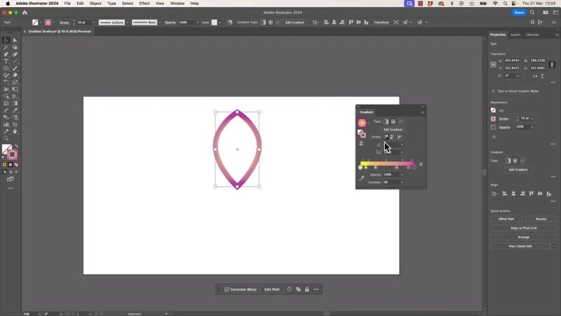
Switching the gradient type can soften the join and make the stroke feel less forced.
Which stroke gradient option looks best?
There is no single correct answer, but there is a practical one.
If you want the gradient to feel like it is travelling around the edge, start with:
Gradient along stroke for directional colour flow
Use matching end colours if the seam is obvious
Try Radial if the linear version feels too abrupt
If you want a more graphic, stripe-like effect, then the across stroke option can be great.
It really depends on whether you want the stroke to feel like a path with motion, or a border with surface shading.
Bonus: use the Rotate tool with a custom centre point
Once the gradient stroke is looking good, there is a really handy extra trick worth knowing. Instead of relying only on repeat commands or standard transform options, use the Rotate tool.
The shortcut is R.
What makes it useful is that you can change the centre of rotation before rotating.
How to move the centre of rotation
With the object selected and the Rotate tool active, look for the small target point that represents the rotation centre.
You can click it once, then drag it to a new location. If Smart Guides are on, it should snap nicely to anchor points.
If snapping is not happening, turn Smart Guides on with:
Command + U on Mac
Control + U on Windows
Once that rotation centre is moved, the shape will rotate around the new point instead of its own middle.
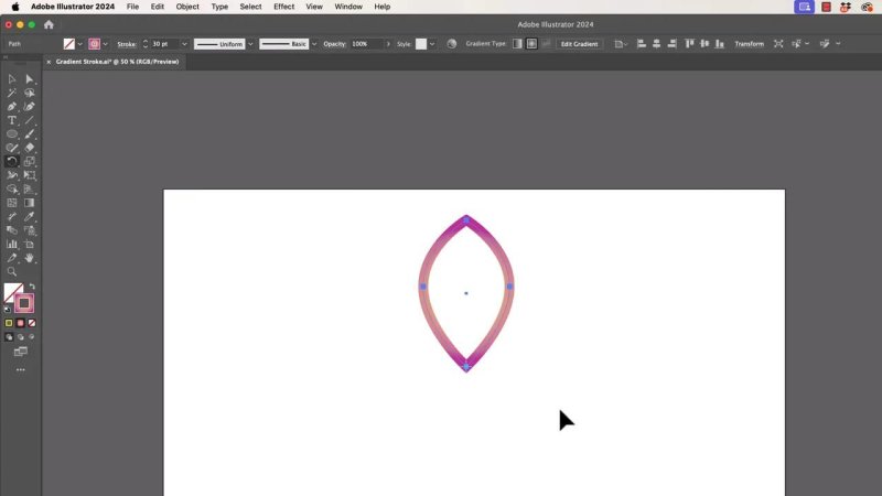
Moving the rotation target gives you proper control over where copies pivot from.
Rotate and duplicate at the same time
This is where it gets fun.
Click and drag with the Rotate tool to begin rotating. While dragging:
Hold Option on Mac or Alt on Windows to create a duplicate
Add Shift to constrain the rotation to 90 degree angles
The order matters a bit. Start dragging first, then hold the modifier keys. It takes a touch of practice, but once it clicks, it is ridiculously useful.
That makes it easy to build repeated petal shapes from one gradient-stroked path.
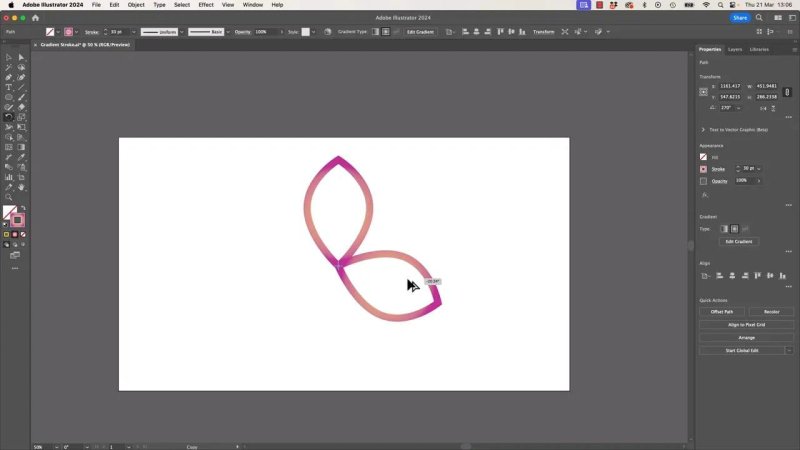
One shape plus Rotate, Alt or Option, and Shift gets you to a clean repeating motif very quickly.
Building the final floral shape
Using that custom rotation point and duplicate trick, you can spin copies of the original petal into place and create a symmetrical flower-like design.
The nice part is that the gradient stroke stays intact on every copy, so the finished piece still feels lively rather than flat.
The result is a simple decorative form made from one path, a well-behaved stroke gradient, and a smarter way to rotate.
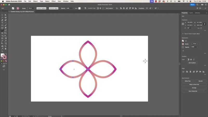
This is the payoff: one petal, a gradient stroke, and a few smart rotations turn into a polished little motif.
Quick recap
Start with a shape that has no fill and an active stroke
Press X if you need to bring the stroke to the front
Apply a gradient swatch to the stroke
Open the Gradient panel to control how the gradient maps onto the stroke
Use gradient along stroke if you want colour to run around the edge
Fix a visible seam by matching the first and last colours, or try a radial gradient
Use the Rotate tool with a moved centre point for faster patterned duplication
Hold Option or Alt to duplicate while rotating, and add Shift to constrain the angle
FAQ
Why is my gradient going into the fill instead of the stroke in Illustrator?
The fill is probably active instead of the stroke. Press X to toggle between them and make sure the stroke is in front before applying the gradient.
Can I use the Gradient tool on a stroke?
For stroke gradients, the Gradient panel is the more reliable control. That is where Illustrator exposes the stroke-specific mapping options.
How do I make a gradient wrap smoothly around a closed path?
Use the option that sends the gradient along the stroke, then make the starting and ending colours match so the join is less obvious. In some cases, switching from a linear gradient to a radial one also gives a smoother result.
How do I duplicate an object while rotating it in Illustrator?
Use the Rotate tool, start dragging, then hold Option on Mac or Alt on Windows. Add Shift if you want the rotation constrained to fixed angles.
How do I change the centre of rotation?
With the Rotate tool active, drag the small target point to a new location. If Smart Guides are enabled, it can snap neatly to anchor points for more accurate placement.
Written by Daniel Walter Scott — Founder of Bring Your Own Laptop & Chief Instructor
