How to make a Linocut Effect in Illustrator?
Questions


Student Gallery
Course info
Overview
- - How to use artificial intelligence to boost your creativity in ideation.
- - The quick way to take hand-drawn sketches and vectorize and color them.
- - The building blocks needed to set you loose on a huge variety of beautiful effects and techniques.
- - To make beautiful charts and graphs for your documents.
- - Color mastery to make quick color adjustments, Pantones, and blend it all together beautifully.
- - How to master images inside of your illustrator workflow.
- - To harness all the secret gems that'll help you level up your typography skills.
- - All the tricks of the trade for drawing complex shapes easily.
- - To double your creativity with the Transform and Distort section.
- - To speed up your personal workflow to get the most out of your creative day.
- The Curvature Tool
- How to master corners with corner widget effects
- How to work with Compound Paths
- The difference between Expand & Expand Appearance
- How to create Graphic Styles
- How to make Symbols
- How to use the Smooth Tool
- Advanced use of Simplify Path
- What Live Shape Effects are for
- How to make Repeating Grids & Concentric Circles
- How to make Random Objects
- Advanced Keyboard Shortcuts in Illustrator
- How to add a Gradient on a Stroke
- How to add a Gradient in Text
- How to use the Freeform Gradient tool
- How to use Advanced Color Swatches
- How to use Global Color Swatches
- What is the difference between RGB vs CMYK color modes?
- How to proof colors
- How to use Pantone Spot Colors
- Recolor Artwork & Changing all colors at once
- How to use Blending Modes
- How to work with Images & Blending Modes
- How to make Black & White Images
- Learn Advanced Workflow Tricks
- All the Super Selection Mastery
- How to use the History Panel
- Advanced Fonts Tricks & Tips
- Use Retype to know what Font is being used
- How to put Text Inside a Letter or Shape
- How to use the Touch Type Tool
- How to add a Connected Stroke Around Multiple Shapes
- How to Offset a Stroke with Text
- How to make a Bar Chart in Illustrator
- How to make a Pie Chart in Illustrator
- Layer Power Moves
- Advanced Artboard & Pages Tricks
- How to Unlink vs Embedded Images
- How to Crop Images Rather than Mask
- How to Mask Inside Text & Multiple Shapes
- How to you use the Puppet Warp Tool
- How to use the Distort Envelope Shape & Type
- How to use the Envelope Mesh
- How to blend lines together
- How to make a Linocut Effect
- How to make 3D Gradient Lettering Blends
- How to spin text into a ring
- How to turn text into a 3D donut shape
- How to make a Duotone image effect
- How to make a Roughen Stamp Vector Effect
- How to make a Neon Sign Glow Effect
- How to use a Halftone Effect using Plugins
- Advanced Exporting Assets Tricks in Illustrator
- How to use the Dimension Tool
So what're you waiting for? Let's start the course now!

Daniel Walter Scott
Founder of Bring Your Own Laptop & Chief Instructor
I discovered the world of design as an art student when I stumbled upon a lab full of green & blue iMac G3’s. My initial curiosity around using the computer to create ‘art’ developed into a full-blown passion, eventually leading me to become a digital designer and founder of Bring Your Own Laptop.
Sharing and teaching are a huge part of who I am. As a certified Adobe instructor, I've had the honor of winning multiple Adobe teaching awards at their annual MAX conference. I see Bring Your Own Laptop as the supportive community I wished for when I was first starting out and intimidated by design. Through teaching, I hope to bring others along for the ride and empower my students to bring their stories, labors of love, and art into the world.
True to my Kiwi roots, I've lived in many places, and currently, I reside in Ireland with my wife and kids.
Certificates
We’re awarding certificates for this course!
Check out the How to earn your certificate video for instructions on how to earn yours and click the available certificate levels below for more information.
Downloads & Exercise files
How do you make a linocut effect in Illustrator?
Draw two separate open paths, give them a tapered stroke profile, then blend them with specific steps. Once the blend looks right, expand it before editing or trimming so you can shape the result without Illustrator getting weird about it.
How to Create a Linocut Effect in Adobe Illustrator
This effect is one of those lovely little Illustrator tricks that looks far more complicated than it really is. You end up with these elegant carved lines that feel a bit like linocut printmaking, a bit like a flower bud, and if we are being honest, occasionally a cactus, a watermelon, or some mysterious mountain seed thing.
The whole trick comes down to blending two separate lines, then knowing when to stop editing the live blend and expand it. If you get those two ideas right, the rest gets a lot easier.
Start with two separate paths, not one closed shape
The first shape is the foundation for everything. Use the Pen tool if you want more control, or the Curvature or Pencil tool if you prefer a looser hand drawn feel.
Draw one side of a leaf or teardrop shape first. Then draw the other side as a separate path. This part matters more than it looks. A live blend will not behave the same way if you simply make one complete closed outline.
The two lines can sit so close together that they appear joined, but they must remain independent objects. If the anchor points snap together, back off a touch and adjust them with the Direct Selection tool until they visually meet without actually becoming one path.
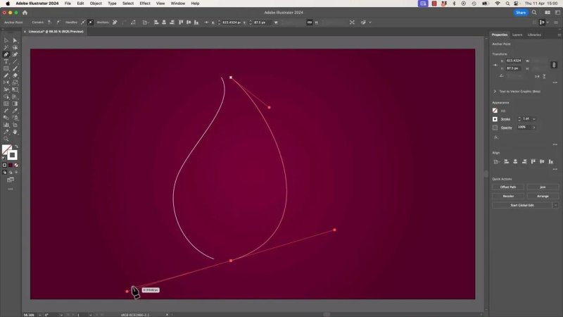
The lines can look connected, but the effect works best when they stay as two separate paths.
Apply stroke styling before you blend
Before making the blend, give the paths some character with the stroke settings.
You can use the Width tool if you want custom thick and thin variation, but there is a catch. Width tool edits can sometimes make blends unreliable or messy. If you do go that route, it is safer to convert the strokes first using Expand Appearance so Illustrator is blending shapes rather than live variable strokes.
The simpler option is to use a built in stroke profile. Pick one of the tapered profiles from the Stroke panel and adjust the stroke weight until the lines feel right. This gives you the same carved, pointed energy without introducing extra drama.
Use a tapered stroke profile for a pointed linocut feel.
Increase the stroke weight until the outer edges feel substantial.
If you used the Width tool, expand appearance before blending.
Blend the two lines
Select both paths and create the blend with Object > Blend > Make, or use the shortcut Command + Option + B on Mac or Ctrl + Alt + B on Windows.
Then open Blend Options and switch the spacing to Specified Steps. A value around 15 is a great starting point. More steps create a denser effect, fewer steps make the carved stripes bolder and more graphic.
This is the sweet spot where you can still tweak things. Because the blend is live, you can go back and adjust stroke width or nudge the original paths until the interior lines feel balanced.
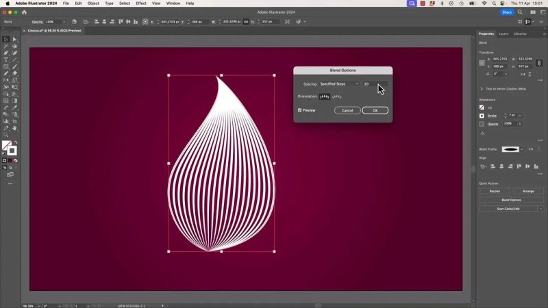
Once the blend is live, a pair of strokes turns into a whole stack of carved lines.
Know when to stop editing the live blend
Live blends are brilliant right up until they are not. Once you start doing heavier edits, trimming, or combining pieces, they can become awkward fast.
My habit is simple. Before I do anything destructive, I drag out a copy. One version stays live in case I need to go back. The other becomes the sacrificial version that I am about to lovingly wreck.
To convert the blend into editable pieces, go to Object > Blend > Expand. At that point, it is no longer one clever live effect. It is a collection of individual shapes or strokes that you can move, trim, and modify directly.
This is one of the biggest takeaways in the whole process. Use live blends while you are designing. Expand them when you are building.
Duplicate and flip the form to build the outer shell
With the first expanded blend done, duplicate it and flip the copy to create the opposite side of the flower bud.
Then resize and rotate until the two forms overlap the way you want. This overlap gives the design its nice layered structure. You can keep it airy and open, or push the sides together for a tighter, denser centre.
At this stage you may get a cool lattice look where the lines cross over each other. That can be interesting on its own, but for this piece the aim is a cleaner outer shell with a trimmed lower edge.
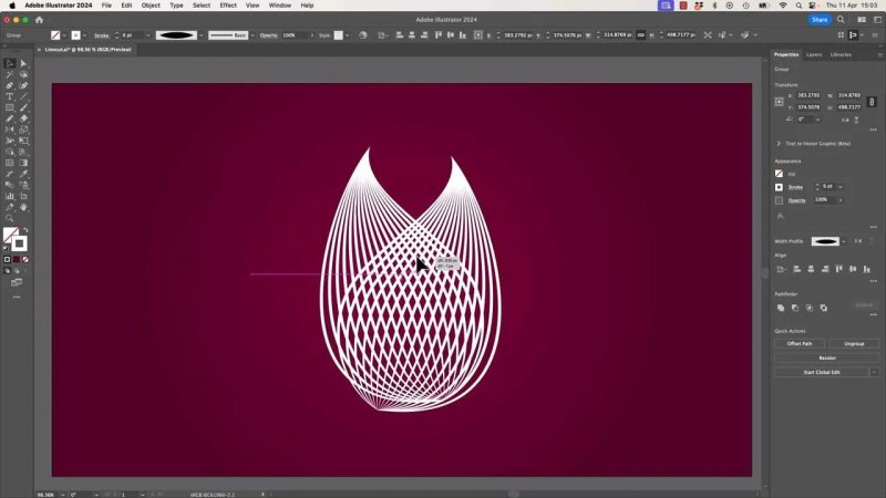
Duplicating and flipping the first blend quickly builds the body of the bud.
Trim the lower area with a cutting shape
To carve off the parts you do not want, borrow one of the existing curves as a cutting blade.
Copy a path from inside the shape, paste it in place, pull it out so it is independent, and use that copied curve as your trim boundary. Changing its colour temporarily can help you see what is happening.
Then select everything and reach for the Shape Builder tool with Shift + M. Hold Option on Mac or Alt on Windows to subtract, then drag across the unwanted sections. It does feel a bit like playing the harp, which is apparently the official technical term.
Once the excess is gone, delete the temporary cutting path. What you are left with is a much cleaner pointed section, and because the tapered profile is still doing its thing, the ends stay nice and sharp.
Build the inner middle section the same way
The centre of the piece is really the same recipe again. Draw two separate paths, style them, blend them, and then shape the result.
This time the Pencil tool is handy if you want more organic curves. If you are drawing with a mouse or trackpad, crank up the smoothing or fidelity settings so Illustrator helps calm down the wobble. A tablet is nice for this sort of work, but smoothing does a lot of heavy lifting if you do not feel like plugging one in.
After drawing, use the Direct Selection tool to align the path ends so they look joined while remaining separate objects.
If the blend twists, check path direction
This is the sneaky problem that catches a lot of people. If the blend suddenly flips or crosses in a weird way, the issue is usually path direction.
Illustrator remembers where each path starts and ends. If one line was drawn from top to bottom and the other from bottom to top, the blend tries to match the wrong ends together. That is when you get the strange inside out twist.
The fix is either:
Redraw the second path so both paths start from the same relative point
Or reverse one path using Path > Reverse Path Direction
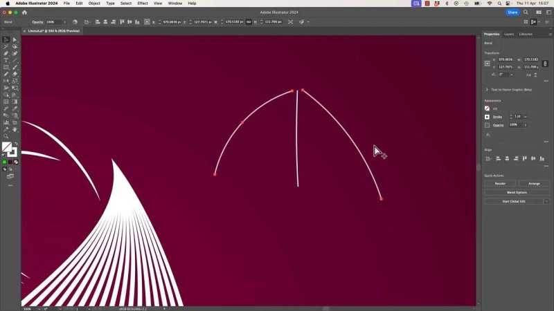
When the ends do not match properly, the blend tries to connect the wrong points and everything goes a bit feral.
Once the path direction is corrected, the blend behaves properly and the lines flow naturally from one side to the other.
Trim only after expanding
This is the other big rule worth repeating. If you try to use Shape Builder on a live blend, Illustrator will often refuse to cooperate.
So if you are about to trim, subtract, or otherwise do surgery on the form, expand it first. Keep an untouched duplicate nearby if you want a fallback version, then expand the working copy and trim that one.
That single habit saves a lot of confusion.
Use manual trimming when it is faster
Not every cut has to come from an existing path. Sometimes it is quicker to draw a quick trimming shape with the Pen tool, break the handles if needed with Option or Alt, and just make the cutting contour yourself.
If it looks right, it is right. Nobody is awarding extra points for suffering.
Finish the top bud piece
The rounded top section is built with the same logic as the lower forms. Draw an outer arc, create a second separate line inside it, make sure the path direction matches, then blend the pair with specified steps.
After that, position the top piece so it tucks into the opening between the two side forms. Scale and nudge it until the overlap feels natural.
The beauty of building the artwork from repeated blends is consistency. Even though the shapes vary, they all share the same stroke language and spacing, so the final illustration feels cohesive.
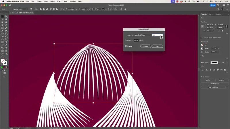
The top section is just another two-path blend, adjusted to sit neatly inside the opening.
Adjust proportions until the shape feels right
Once all the pieces are in place, spend a bit of time nudging things around. Resize a section. Rotate it a touch. Thin a stroke. Make one part taller. Pull another slightly wider.
This is where the illustration stops looking like a technical demo and starts looking intentional.
Even in this example, the shape wanders cheerfully between flower bud, acorn, walnut, and hard little seed pod. That is fine. The real win is getting that linocut style depth and flow.
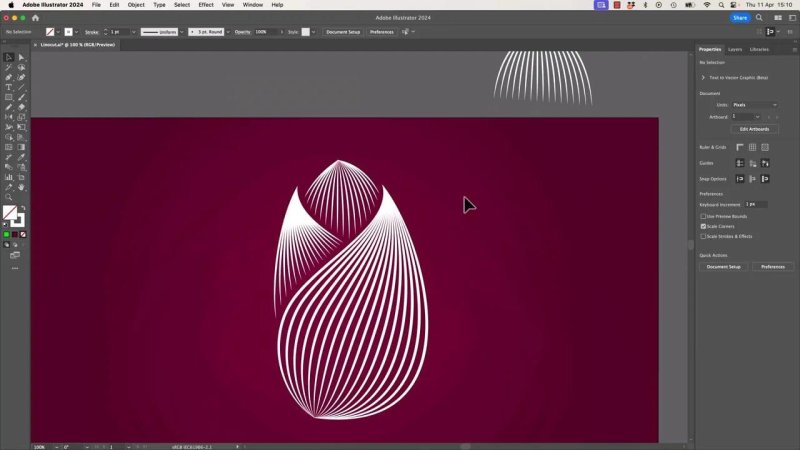
Once the pieces are balanced, the whole thing comes together into a clean, layered linocut illustration.
The two biggest takeaways
Use two separate lines for each linocut section. They can appear connected, but they should remain independent paths.
Expand the blend before heavy editing. Live blends are great for setup, not so great for trimming and rebuilding.
Those two ideas do most of the heavy lifting. Once they click, you can use the same method for petals, leaves, shells, abstract shapes, or anything else that benefits from carved linework.
FAQ
Why does my Illustrator blend twist or cross over strangely?
The two paths were likely drawn in opposite directions. Illustrator blends from start point to start point and end point to end point, so reverse one path or redraw it so both paths begin from the same side.
Do I need closed shapes to create a linocut effect?
No. Open paths work better for this technique. The effect relies on blending two separate lines that visually define the edges of the form.
Should I use the Width tool or a stroke profile?
A stroke profile is the safer, quicker option. The Width tool can work, but if you use it, expanding appearance before blending usually prevents problems.
Why will Shape Builder not trim my blend?
Because the blend is still live. Expand it first with Object, Blend, Expand, then use Shape Builder on the resulting shapes.
How many blend steps should I use for a linocut look?
About 15 steps is a strong starting point. Increase the number for a smoother, denser effect or reduce it for bolder, more graphic stripes.
Written by Daniel Walter Scott — Founder of Bring Your Own Laptop & Chief Instructor
