How to make Black & White Images in Illustrator?
Questions


Student Gallery
Course info
Overview
- - How to use artificial intelligence to boost your creativity in ideation.
- - The quick way to take hand-drawn sketches and vectorize and color them.
- - The building blocks needed to set you loose on a huge variety of beautiful effects and techniques.
- - To make beautiful charts and graphs for your documents.
- - Color mastery to make quick color adjustments, Pantones, and blend it all together beautifully.
- - How to master images inside of your illustrator workflow.
- - To harness all the secret gems that'll help you level up your typography skills.
- - All the tricks of the trade for drawing complex shapes easily.
- - To double your creativity with the Transform and Distort section.
- - To speed up your personal workflow to get the most out of your creative day.
- The Curvature Tool
- How to master corners with corner widget effects
- How to work with Compound Paths
- The difference between Expand & Expand Appearance
- How to create Graphic Styles
- How to make Symbols
- How to use the Smooth Tool
- Advanced use of Simplify Path
- What Live Shape Effects are for
- How to make Repeating Grids & Concentric Circles
- How to make Random Objects
- Advanced Keyboard Shortcuts in Illustrator
- How to add a Gradient on a Stroke
- How to add a Gradient in Text
- How to use the Freeform Gradient tool
- How to use Advanced Color Swatches
- How to use Global Color Swatches
- What is the difference between RGB vs CMYK color modes?
- How to proof colors
- How to use Pantone Spot Colors
- Recolor Artwork & Changing all colors at once
- How to use Blending Modes
- How to work with Images & Blending Modes
- How to make Black & White Images
- Learn Advanced Workflow Tricks
- All the Super Selection Mastery
- How to use the History Panel
- Advanced Fonts Tricks & Tips
- Use Retype to know what Font is being used
- How to put Text Inside a Letter or Shape
- How to use the Touch Type Tool
- How to add a Connected Stroke Around Multiple Shapes
- How to Offset a Stroke with Text
- How to make a Bar Chart in Illustrator
- How to make a Pie Chart in Illustrator
- Layer Power Moves
- Advanced Artboard & Pages Tricks
- How to Unlink vs Embedded Images
- How to Crop Images Rather than Mask
- How to Mask Inside Text & Multiple Shapes
- How to you use the Puppet Warp Tool
- How to use the Distort Envelope Shape & Type
- How to use the Envelope Mesh
- How to blend lines together
- How to make a Linocut Effect
- How to make 3D Gradient Lettering Blends
- How to spin text into a ring
- How to turn text into a 3D donut shape
- How to make a Duotone image effect
- How to make a Roughen Stamp Vector Effect
- How to make a Neon Sign Glow Effect
- How to use a Halftone Effect using Plugins
- Advanced Exporting Assets Tricks in Illustrator
- How to use the Dimension Tool
So what're you waiting for? Let's start the course now!

Daniel Walter Scott
Founder of Bring Your Own Laptop & Chief Instructor
I discovered the world of design as an art student when I stumbled upon a lab full of green & blue iMac G3’s. My initial curiosity around using the computer to create ‘art’ developed into a full-blown passion, eventually leading me to become a digital designer and founder of Bring Your Own Laptop.
Sharing and teaching are a huge part of who I am. As a certified Adobe instructor, I've had the honor of winning multiple Adobe teaching awards at their annual MAX conference. I see Bring Your Own Laptop as the supportive community I wished for when I was first starting out and intimidated by design. Through teaching, I hope to bring others along for the ride and empower my students to bring their stories, labors of love, and art into the world.
True to my Kiwi roots, I've lived in many places, and currently, I reside in Ireland with my wife and kids.
Certificates
We’re awarding certificates for this course!
Check out the How to earn your certificate video for instructions on how to earn yours and click the available certificate levels below for more information.
Downloads & Exercise files
How do you turn an image black and white in Illustrator?
Select the image, then go to Edit > Edit Colors > Convert to Grayscale. If that option is unavailable, the image is probably linked rather than embedded, so you will need to embed it first before Illustrator will let you convert it.
How to Make Black and White Images in Illustrator
Turning a photo black and white in Illustrator is easy once you know the one little catch that trips most people up.
The actual conversion only takes a couple of clicks. The part that matters is understanding whether your image is linked or embedded, because that decides whether Illustrator will let you edit the image colours at all.
Once the photo is in grayscale, things get a lot more interesting. A monochrome image gives you a really solid base for blending coloured shapes over the top, adding tints, and pushing the artwork into something much more stylised.
The quickest way to convert an image to grayscale in Illustrator
If the image is ready to go, the conversion itself is straightforward:
Select the image.
Go to Edit.
Choose Edit Colors.
Click Convert to Grayscale.
That is the main Illustrator method. Illustrator will analyse the image and create the black and white version automatically.
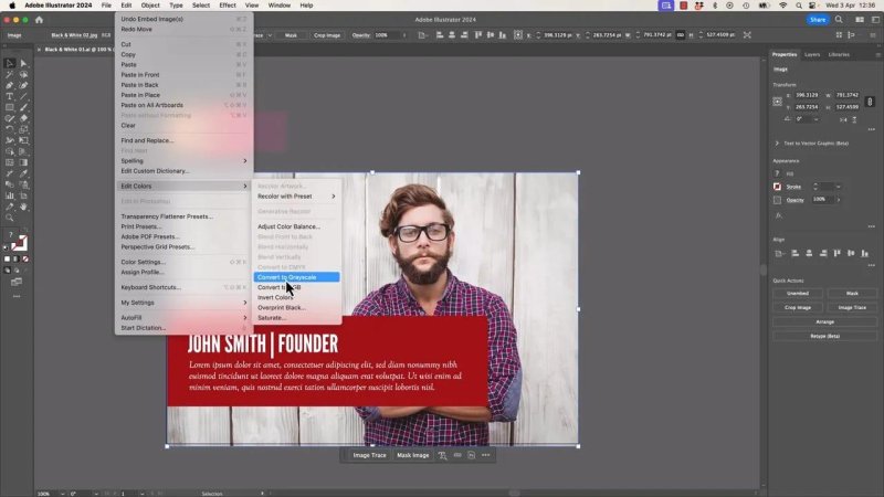
This is the setting that does the actual black and white conversion in Illustrator.
In many cases, the result is perfectly usable right away. If all you need is a fast black and white treatment inside Illustrator, this is often enough.
Why Convert to Grayscale might be greyed out
If that menu option is disabled, Illustrator is usually telling you one thing: the image is linked.
A linked image is still referencing the original file from outside your Illustrator document. Illustrator can place it, scale it, and display it, but some colour editing options will not be available because the image is not fully part of the file yet.
An embedded image is different. Once embedded, the image becomes part of the Illustrator document itself, and Illustrator can apply edits like grayscale conversion.
So if you click into Edit > Edit Colors and the useful options are unavailable, check the image status first.
Linked vs embedded images in Illustrator
This is the bit to be mindful of when placing photos into your layout.
When you import an image into Illustrator, it can come in as a linked file. That is fine for many workflows, but not for this one. To convert the image to black and white directly inside Illustrator, it needs to be embedded.
You can usually tell in one of two ways:
The control area shows an option to embed the selected image.
The Links panel shows which images are linked and which are not.
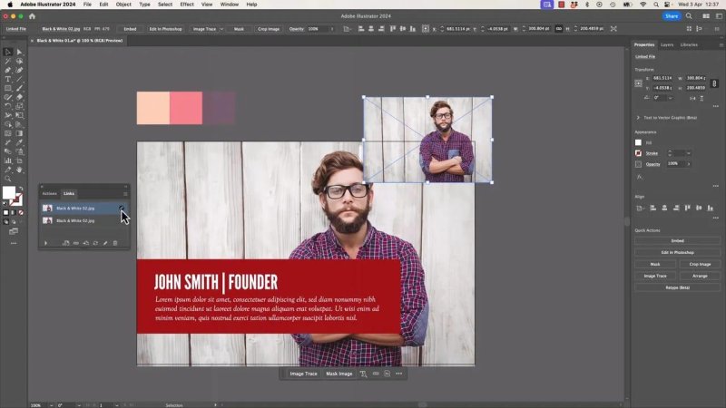
If the image is still linked, Illustrator treats it more like a reference than an editable grayscale source.
How to embed a linked image
If the image is already in your document and it is linked, do this:
Select the image.
Click Embed from the control bar, or use the Links panel.
Once embedded, return to Edit > Edit Colors > Convert to Grayscale.
That one step usually fixes the problem immediately.
What Illustrator does well, and where Photoshop gives more control
Illustrator is good at making a quick grayscale version. You click the command and get a solid result.
But if you want a more crafted black and white image, Photoshop gives you much finer control over how each original colour translates into light or dark tones.
In Photoshop, the black and white adjustment lets you change the brightness of colour groups individually, such as:
reds
yellows
greens
cyans
blues
magentas
That means skin tones, clothing, background elements, and small colour details can all be adjusted separately. Instead of accepting a single automatic conversion, you can steer the image toward the exact mood you want.
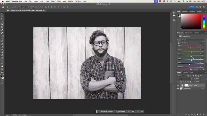
Photoshop gives you much more say over which parts go darker or lighter in the grayscale image.
There is also a really handy on-image adjustment tool in Photoshop. Rather than guessing which slider controls a part of the photo, you can click directly on an area of the image and drag left or right. Photoshop then adjusts the relevant colour channel behind the scenes.
So if you want cheeks darker, the fence lighter, or clothing more contrasty, you can work almost by feel.
Another bonus in Photoshop is tinting. You can switch on a tint and choose a colour for an instant toned monochrome look.
None of that is required for the Illustrator workflow, but it is worth knowing when you need more control than Illustrator offers.
Why black and white photos work so well with blending modes
This is where the fun starts.
A black and white image is a brilliant base for colour overlays because it keeps the tonal structure of the photo while letting the overlay colour do more of the visual storytelling.
Instead of competing with lots of existing photo colours, your design elements sit on top of a neutral foundation. The result often feels cleaner, punchier, and more deliberate.
For example, a bold red panel over a grayscale portrait can suddenly feel much more dramatic than the same panel over a full-colour image.
The reason it works is tonal range. Even though the photo is no longer colourful, it still contains light greys, dark greys, shadows, highlights, and everything in between. Those values give blending modes something to react to.
If the background were just flat black or flat white, the effect would be much weaker.
Trying blending modes over a grayscale image
Once the image is black and white, select the coloured object sitting on top of it and start testing blend modes from the Opacity panel.
Good candidates often include:
Darken
Multiply
Color Burn
Overlay
The exact winner depends on your image and colour choice, but strong reds over grayscale often produce really nice results, especially with Color Burn.
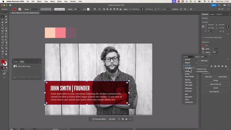
A grayscale photo underneath gives blend modes enough tonal information to create a much richer overlay.
Cycle through the options and watch how the red interacts with the portrait and wood background. Some modes will flatten everything, while others pull detail through beautifully.
This is one of those places where experimenting pays off. The menu is quick to test, and the right mode can instantly lift the whole design.
A simple rule for better overlays
Earlier design advice about avoiding pure black and pure white still applies, but with a small twist here.
Your photo can absolutely be grayscale. That is fine, because grayscale still contains a range of values.
What tends not to work well is building the effect with completely flat, solid black or solid white blocks only. At least one of the elements involved should have some colour or tonal richness, otherwise the blend has nothing interesting to do.
That is why a grayscale image plus coloured shapes works so well. You get structure from the photo and atmosphere from the overlays.
Creating a second variation with coloured stripes
After the basic black and white version is working, a nice next step is to build a second composition and push the styling a bit further.
One easy way to do that is to duplicate the artboard and experiment on the copy.
Duplicate the artboard
Use the Artboard tool, then duplicate the artboard by dragging while holding Option on Mac or Alt on Windows. Give yourself a bit of space between the two artboards so there is room to work.
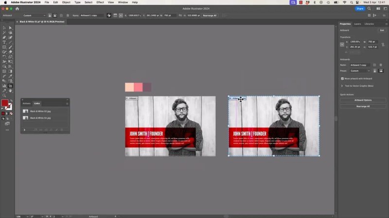
Duplicating the artboard is the easiest way to explore a second look without risking the original.
This makes it easy to compare versions side by side and decide which direction feels stronger.
Add large coloured rectangles
Create a few oversized rectangles using your colour swatches. Make them tall, wide, and a bit rough. Then rotate them so they become angled stripes crossing behind the content.
You are not aiming for precision here. Big graphic shapes usually work better than fiddly little ones.
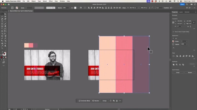
Big angled stripes add energy fast, especially when the photo underneath is kept monochrome.
Get the layer order right
The stripes need to sit behind the text panel but still in front of the grayscale image.
That middle position is important. If they sit too high, they cover the text. If they sit too low, they disappear behind the image and do nothing.
Move them backward through the stack one level at a time until they land in the right spot.
Apply blend modes to the stripes
With the stripes selected, go back to the Opacity panel and test blend modes again. This is where those background tones really start earning their keep.
A mode like Color Burn can give the stripes a much richer relationship with the photo underneath, turning flat blocks into something that feels integrated with the design.
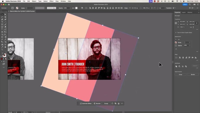
Blending the stripes instead of leaving them flat helps them feel part of the image rather than pasted on top.
Masking everything neatly to the final layout
Once the image, text panel, and stripes are all in place, the edges can get messy. The easiest fix is to mask the whole composition to a clean rectangle.
Draw a rectangle over the final crop area, then select:
the grayscale image
the coloured overlay shapes
any other objects that should be clipped
If tiny items are hard to grab, a drag selection can help. Sweep across only the objects you want, then add anything missing with Shift-click.
Before committing, give the selection a little nudge just to confirm you have the right pieces selected. It is a small habit, but it saves a lot of confusion.
Then create the clipping mask with Command + 7 on Mac or Control + 7 on Windows.
After that, send the masked group backward if needed so the overall stacking order still makes sense.
Why this approach works so well for design layouts
Black and white images are not just a stylistic choice. They are useful because they simplify a layout while still preserving depth and texture.
When you combine grayscale photography with blending modes, tinted panels, and geometric overlays, you get a design that feels more intentional and less like a stock photo with text dumped on top.
It is especially effective for:
profile cards
social graphics
posters
editorial layouts
brand presentations
The overall effect can make ordinary content feel much more designed.
FAQ
Why is Convert to Grayscale unavailable in Illustrator?
The image is usually linked instead of embedded. Embed the image first, then try the grayscale command again.
Can Illustrator make a proper black and white photo?
Yes, Illustrator can create a quick grayscale version that works well for many layouts. If you need precise control over how individual colours convert, Photoshop is the better tool.
What is the difference between linked and embedded images in Illustrator?
A linked image references an external file, while an embedded image becomes part of the Illustrator document. For this grayscale workflow, the image needs to be embedded.
Which blend mode works well on a black and white image?
Color Burn can work especially well with bold reds over grayscale photos, but it depends on the image. Darken, Multiply, and Overlay are also worth testing.
Why do grayscale images work better with overlays than flat black or white backgrounds?
Grayscale images still contain a full range of light and dark values, so blend modes have something to respond to. Flat black or white gives far less tonal information, which usually makes the effect less interesting.
Written by Daniel Walter Scott — Founder of Bring Your Own Laptop & Chief Instructor
