How to use the Envelope Mesh to make a Ribbon in Illustrator?
Questions


Student Gallery
Course info
Overview
- - How to use artificial intelligence to boost your creativity in ideation.
- - The quick way to take hand-drawn sketches and vectorize and color them.
- - The building blocks needed to set you loose on a huge variety of beautiful effects and techniques.
- - To make beautiful charts and graphs for your documents.
- - Color mastery to make quick color adjustments, Pantones, and blend it all together beautifully.
- - How to master images inside of your illustrator workflow.
- - To harness all the secret gems that'll help you level up your typography skills.
- - All the tricks of the trade for drawing complex shapes easily.
- - To double your creativity with the Transform and Distort section.
- - To speed up your personal workflow to get the most out of your creative day.
- The Curvature Tool
- How to master corners with corner widget effects
- How to work with Compound Paths
- The difference between Expand & Expand Appearance
- How to create Graphic Styles
- How to make Symbols
- How to use the Smooth Tool
- Advanced use of Simplify Path
- What Live Shape Effects are for
- How to make Repeating Grids & Concentric Circles
- How to make Random Objects
- Advanced Keyboard Shortcuts in Illustrator
- How to add a Gradient on a Stroke
- How to add a Gradient in Text
- How to use the Freeform Gradient tool
- How to use Advanced Color Swatches
- How to use Global Color Swatches
- What is the difference between RGB vs CMYK color modes?
- How to proof colors
- How to use Pantone Spot Colors
- Recolor Artwork & Changing all colors at once
- How to use Blending Modes
- How to work with Images & Blending Modes
- How to make Black & White Images
- Learn Advanced Workflow Tricks
- All the Super Selection Mastery
- How to use the History Panel
- Advanced Fonts Tricks & Tips
- Use Retype to know what Font is being used
- How to put Text Inside a Letter or Shape
- How to use the Touch Type Tool
- How to add a Connected Stroke Around Multiple Shapes
- How to Offset a Stroke with Text
- How to make a Bar Chart in Illustrator
- How to make a Pie Chart in Illustrator
- Layer Power Moves
- Advanced Artboard & Pages Tricks
- How to Unlink vs Embedded Images
- How to Crop Images Rather than Mask
- How to Mask Inside Text & Multiple Shapes
- How to you use the Puppet Warp Tool
- How to use the Distort Envelope Shape & Type
- How to use the Envelope Mesh
- How to blend lines together
- How to make a Linocut Effect
- How to make 3D Gradient Lettering Blends
- How to spin text into a ring
- How to turn text into a 3D donut shape
- How to make a Duotone image effect
- How to make a Roughen Stamp Vector Effect
- How to make a Neon Sign Glow Effect
- How to use a Halftone Effect using Plugins
- Advanced Exporting Assets Tricks in Illustrator
- How to use the Dimension Tool
So what're you waiting for? Let's start the course now!

Daniel Walter Scott
Founder of Bring Your Own Laptop & Chief Instructor
I discovered the world of design as an art student when I stumbled upon a lab full of green & blue iMac G3’s. My initial curiosity around using the computer to create ‘art’ developed into a full-blown passion, eventually leading me to become a digital designer and founder of Bring Your Own Laptop.
Sharing and teaching are a huge part of who I am. As a certified Adobe instructor, I've had the honor of winning multiple Adobe teaching awards at their annual MAX conference. I see Bring Your Own Laptop as the supportive community I wished for when I was first starting out and intimidated by design. Through teaching, I hope to bring others along for the ride and empower my students to bring their stories, labors of love, and art into the world.
True to my Kiwi roots, I've lived in many places, and currently, I reside in Ireland with my wife and kids.
Certificates
We’re awarding certificates for this course!
Check out the How to earn your certificate video for instructions on how to earn yours and click the available certificate levels below for more information.
Downloads & Exercise files
How do you make a custom ribbon with Envelope Mesh in Illustrator?
You group your artwork, go to Object > Envelope Distort > Make with Mesh, then reshape it with the Direct Selection tool. For a ribbon effect, a simple 1 by 1 mesh often gives smoother, easier control than a dense grid, especially when you want that bendy, wind-whipped look.
Illustrator Envelope Mesh Ribbon: How to Turn Stripes Into a Custom 3D Ribbon
Envelope Mesh in Illustrator is one of those tools that feels a bit magical and a bit weird at the same time.
It is not the same as a standard Envelope Distort warp. Warp gives you preset styles. Envelope Mesh gives you custom control, which is why it is brilliant when you want to turn plain stripes into something that feels more like a dimensional ribbon.
The catch is that it can feel strange to use. Even if you know Illustrator well, this tool can make you feel like you are starting all over again for a minute. That is normal. The trick is to keep things simple, be deliberate with your adjustments, and use a few supporting tools to finish the effect properly.
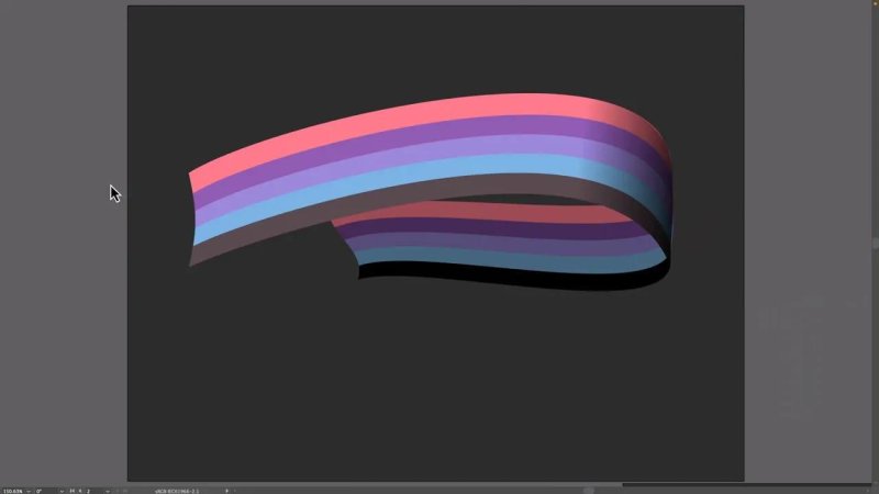
This is the kind of result Envelope Mesh is great at: a flat stripe stack turned into something with motion and form.
Envelope Mesh vs Warp in Illustrator
When you choose Object > Envelope Distort, Illustrator gives you different ways to reshape artwork.
Warp uses predefined distortion styles.
Make with Mesh gives you a grid you can manipulate point by point.
That mesh grid is what makes this tool far more flexible. Instead of choosing a canned arc or bulge, you can push and pull the artwork into exactly the shape you want.
That makes it perfect for:
ribbons
flowing banners
custom type distortion
organic bends and curves
Start with grouped artwork
Before doing anything else, make sure the stripes or shapes you want to distort are grouped.
Once they are grouped:
Select the artwork.
Go to Object > Envelope Distort > Make with Mesh.
Choose your mesh settings.
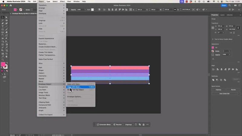
This is the command that switches you from preset warps into proper custom mesh control.
Illustrator defaults to something like 4 by 4, and yes, that works, but it also creates a much denser grid than you may actually need.
Why a 4 by 4 mesh can be too much
A dense mesh gives you lots of control, but it also gives you lots of places to make a mess.
With a 4 by 4 mesh, you are dealing with:
multiple anchor points inside the artwork
corner points
Bezier handles affecting surrounding areas
a shape that can quickly become lumpy and overworked
When you use the Direct Selection tool, you can click individual mesh points and move them around. Those points directly force the artwork into shape. The handles then influence how smoothly the artwork flows in and out of those positions, a bit like the Pen tool, except somehow stranger.
That weirdness is part of the deal. If it feels odd, it is odd.
The easier option: reset and use a 1 by 1 mesh
For this ribbon effect, a 1 by 1 mesh is often the better choice.
If your first attempt gets messy, click away from the object, select it again, and reset it. Illustrator gives you options such as:
Reset Envelope Shape
Reset with Mesh
Then remake the mesh as 1 row by 1 column.
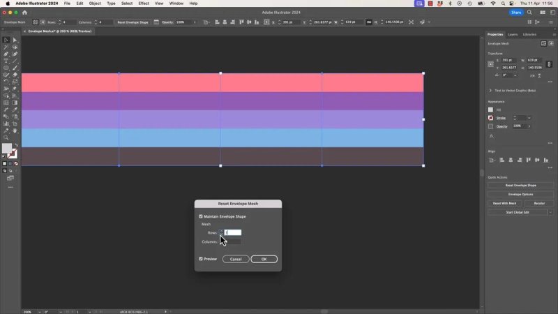
A simple mesh is usually the sweet spot for a ribbon because it stays smooth without getting fussy.
With a 1 by 1 mesh, you mainly get corner anchors and large handles. That limited control is actually useful here. It keeps the shape smooth and flowing, which is exactly what you want for a ribbon.
Shaping the ribbon with the Direct Selection tool
Once the mesh is applied, switch to the Direct Selection tool and start moving the anchor points and handles.
The goal is not precision engineering. The goal is to coax the stripes into something that looks like it is moving through space.
A few good principles:
pull one side upward to create the main arc
tuck the ends inward slightly to create tension
use the handles to smooth the bends
avoid tiny fussy nudges because the mesh does not always respond nicely
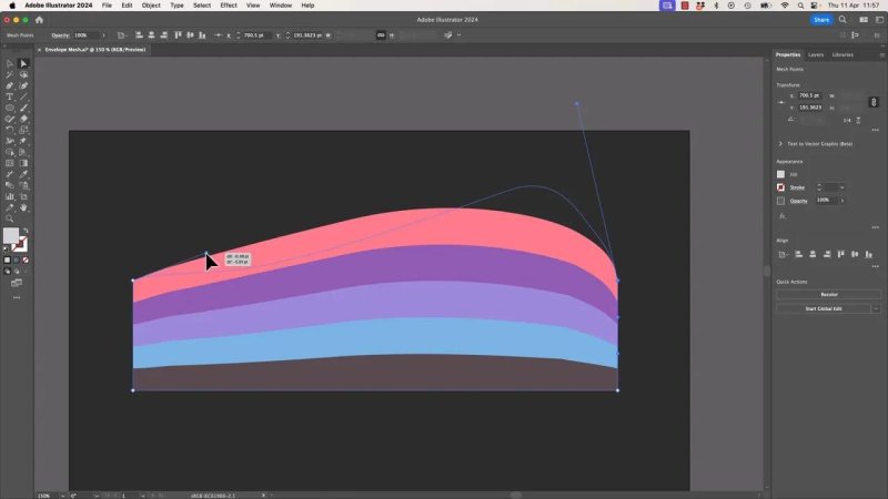
Big, confident handle moves work better here than lots of tiny corrections.
This is one of those tools where being too delicate can actually make things worse. Broad, deliberate moves usually produce cleaner results.
If it starts fighting you, reset and go again. That is not failure. That is just using Envelope Mesh.
Building the 3D effect with a second ribbon
Once the top ribbon shape looks good, duplicate it. The duplicate becomes the underside or back layer.
Then make that duplicate darker so it reads as the part sitting behind the main ribbon.
A quick way to do that is with Recolor. Grab all the colours and drag the hue or saturation down until the copy looks noticeably darker.
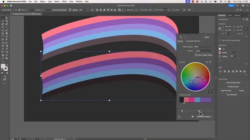
Darkening the duplicate instantly sells the idea that one ribbon layer is sitting behind the other.
After darkening it, align the duplicate behind the original. If Smart Guides are on, snapping helps a lot here.
Then use the Direct Selection tool on the lower ribbon and move its anchor points to create the overlap. You want it to peek out in a believable way, not just sit as a copy directly underneath.
That little offset is what begins to create the illusion of a folded, dimensional form.
Fixing the corner with a gradient shadow
At this stage, the ribbon may still look a bit off around the bend. Usually that is because the overlap needs a shadow where the top section curls over the back section.
That shadow is what ties the form together.
The approach is simple:
Duplicate the ribbon again so you have a version to work on safely.
Expand it.
Turn it into a shape suitable for a gradient overlay.
Use a black to transparent gradient as the shadow.
Why expanding the mesh helps
Envelope Mesh objects can be a bit temperamental. To use some of Illustrator's other shape tools more cleanly, it helps to convert the distorted object into regular editable artwork.
Go to Object > Expand.
After expanding, you may see little oddities, like a line through the middle or some strange leftover bits. That is fairly normal with this kind of distortion. If the issue does not affect the result you are building, you can often ignore it.
You can also try combining pieces with the Shape Builder tool if needed.
Be careful with Simplify
After expanding, it is tempting to clean up the shape with Object > Path > Simplify.
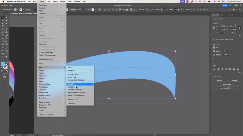
Simplify can clean up anchor points, but it is not always your friend when a shape needs to match another one exactly.
And yes, Simplify can reduce unnecessary anchor points, which sounds great.
But here is the catch: if your shadow shape needs to match the ribbon precisely, Simplify can remove too much control. It smooths the shape, which can create tiny gaps and mismatches along the edge.
That is exactly the sort of thing that causes weird spacing where the shadow should sit flush against the ribbon.
So the rule here is simple:
Use Simplify only if exact matching does not matter.
Do not use it on a shadow overlay that must hug the ribbon edge perfectly.
Adding the black to transparent gradient
With the shadow shape selected, apply a gradient to the fill.
If you like shortcuts:
X brings the fill to the front if needed
Period applies a gradient
Forward slash removes the fill
Then edit the gradient so one side is black and the other fades to transparent by lowering its opacity.
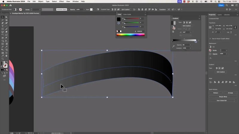
A black-to-transparent gradient creates the little fold shadow that makes the ribbon feel like it wraps around itself.
Use the Gradient tool with the G key to drag the gradient into the right direction and scale. Make it narrower and angle it so the darkest area sits where the ribbon folds around the corner.
You can also experiment with:
overall object opacity
gradient stop opacity
blending modes
Sometimes Normal mode works just fine. Sometimes lowering opacity is enough. The point is to make the shadow believable, not dramatic for the sake of it.
Getting the overlap to feel right
Once the shadow is in place, the ribbon starts looking much more convincing.
You can push it further by:
adding another subtle dark gradient near one end
adjusting the thickness of the bottom ribbon section
nudging the back layer so the overlap reads more clearly
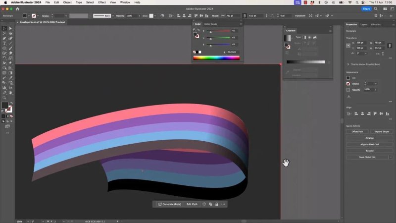
Once the underside is darker and the fold has a shadow, the flat stripes start reading like a proper dimensional ribbon.
Sometimes the lower section looks too chunky. If that happens, thin it down a bit. A small cheat is absolutely acceptable if it improves the shape. This is illustration, not a moral test.
A useful trick when editing layers behind other layers
One annoying part of this process is trying to edit the shape underneath while the top ribbon keeps getting selected instead.
The quick fix is to lock what you do not want to touch.
Select the foreground pieces and press:
Command + 2 on Mac
Control + 2 on Windows
Now you can work on the layer behind without constantly grabbing the wrong object.
To unlock, right-click and choose the relevant Unlock option. That lets you unlock only what you need, such as the gradient overlay or the envelope object, while leaving the background alone.
Why Envelope Mesh gets better when combined with other Illustrator tools
This is where the fun starts.
Envelope Mesh on its own is useful, but the really strong results happen when you combine it with everything else you already know:
Recolor for value shifts
Expand for converting effects into shapes
Shape Builder for cleanup
Gradient fills for shadows
Opacity adjustments for subtle depth
Locking objects to edit more cleanly
That combination is what turns a basic distortion into something polished.
Key takeaways for using Envelope Mesh well
Keep the mesh simple unless you truly need more detail.
1 by 1 is often perfect for flowing ribbon shapes.
Use broad moves instead of lots of tiny adjustments.
Reset freely if the shape gets awkward.
Duplicate and darken artwork to build an underside.
Add a gradient shadow to sell the fold.
Avoid Simplify when a shadow shape must match exactly.
Lock foreground objects when editing behind them.
FAQ
What is the difference between Envelope Mesh and Envelope Distort Warp in Illustrator?
Warp uses preset distortion styles, while Envelope Mesh gives you a custom grid you can edit manually. If you need a very specific shape, Mesh gives you much more control.
Why does Envelope Mesh feel so awkward to use?
Because it behaves differently from normal path editing. The anchor points and handles influence the artwork in a less predictable way, so it often takes a bit of experimenting and resetting before the shape starts behaving.
What mesh settings are best for a ribbon effect?
For a smooth ribbon, a 1 by 1 mesh is often the easiest option. It gives you just enough control to bend the shape without introducing loads of extra points that make the result lumpy.
Can I use Envelope Mesh on text?
Yes. Envelope Mesh works on more than just stripe artwork. You can use it on type and other grouped objects when you want a custom distortion.
Should I use Simplify after expanding an Envelope Mesh?
Only if exact edge matching is not important. Simplify can remove anchor points and smooth a shape, but it may also create gaps or alignment problems when a shadow or duplicate shape needs to line up perfectly.
How do I add a realistic fold shadow to the ribbon?
Duplicate the relevant shape, apply a black gradient to the fill, and reduce one side to transparent. Then use the Gradient tool to angle and scale the shadow so it sits naturally where the ribbon turns over itself.
Written by Daniel Walter Scott — Founder of Bring Your Own Laptop & Chief Instructor
