How to use the Touch Type Tool in Illustrator?
Questions



Student Gallery
Course info
Overview
- - How to use artificial intelligence to boost your creativity in ideation.
- - The quick way to take hand-drawn sketches and vectorize and color them.
- - The building blocks needed to set you loose on a huge variety of beautiful effects and techniques.
- - To make beautiful charts and graphs for your documents.
- - Color mastery to make quick color adjustments, Pantones, and blend it all together beautifully.
- - How to master images inside of your illustrator workflow.
- - To harness all the secret gems that'll help you level up your typography skills.
- - All the tricks of the trade for drawing complex shapes easily.
- - To double your creativity with the Transform and Distort section.
- - To speed up your personal workflow to get the most out of your creative day.
- The Curvature Tool
- How to master corners with corner widget effects
- How to work with Compound Paths
- The difference between Expand & Expand Appearance
- How to create Graphic Styles
- How to make Symbols
- How to use the Smooth Tool
- Advanced use of Simplify Path
- What Live Shape Effects are for
- How to make Repeating Grids & Concentric Circles
- How to make Random Objects
- Advanced Keyboard Shortcuts in Illustrator
- How to add a Gradient on a Stroke
- How to add a Gradient in Text
- How to use the Freeform Gradient tool
- How to use Advanced Color Swatches
- How to use Global Color Swatches
- What is the difference between RGB vs CMYK color modes?
- How to proof colors
- How to use Pantone Spot Colors
- Recolor Artwork & Changing all colors at once
- How to use Blending Modes
- How to work with Images & Blending Modes
- How to make Black & White Images
- Learn Advanced Workflow Tricks
- All the Super Selection Mastery
- How to use the History Panel
- Advanced Fonts Tricks & Tips
- Use Retype to know what Font is being used
- How to put Text Inside a Letter or Shape
- How to use the Touch Type Tool
- How to add a Connected Stroke Around Multiple Shapes
- How to Offset a Stroke with Text
- How to make a Bar Chart in Illustrator
- How to make a Pie Chart in Illustrator
- Layer Power Moves
- Advanced Artboard & Pages Tricks
- How to Unlink vs Embedded Images
- How to Crop Images Rather than Mask
- How to Mask Inside Text & Multiple Shapes
- How to you use the Puppet Warp Tool
- How to use the Distort Envelope Shape & Type
- How to use the Envelope Mesh
- How to blend lines together
- How to make a Linocut Effect
- How to make 3D Gradient Lettering Blends
- How to spin text into a ring
- How to turn text into a 3D donut shape
- How to make a Duotone image effect
- How to make a Roughen Stamp Vector Effect
- How to make a Neon Sign Glow Effect
- How to use a Halftone Effect using Plugins
- Advanced Exporting Assets Tricks in Illustrator
- How to use the Dimension Tool
So what're you waiting for? Let's start the course now!

Daniel Walter Scott
Founder of Bring Your Own Laptop & Chief Instructor
I discovered the world of design as an art student when I stumbled upon a lab full of green & blue iMac G3’s. My initial curiosity around using the computer to create ‘art’ developed into a full-blown passion, eventually leading me to become a digital designer and founder of Bring Your Own Laptop.
Sharing and teaching are a huge part of who I am. As a certified Adobe instructor, I've had the honor of winning multiple Adobe teaching awards at their annual MAX conference. I see Bring Your Own Laptop as the supportive community I wished for when I was first starting out and intimidated by design. Through teaching, I hope to bring others along for the ride and empower my students to bring their stories, labors of love, and art into the world.
True to my Kiwi roots, I've lived in many places, and currently, I reside in Ireland with my wife and kids.
Certificates
We’re awarding certificates for this course!
Check out the How to earn your certificate video for instructions on how to earn yours and click the available certificate levels below for more information.
Downloads & Exercise files
How do you distort individual letters in Adobe Illustrator without converting text to outlines?
Use the Touch Type Tool. It lets you resize, rotate, stretch, and reposition individual characters while keeping the text fully editable, so you can still change the wording later instead of locking yourself into outlines.
Illustrator Touch Type Tool: Customise Text Without Losing Editability
The Touch Type Tool is one of those features that feels a bit magical the first time you use it. You grab a single letter, shove it around, twist it, squash it, give it a bit of personality, and somehow the text still behaves like text.
That is the big win here. You get custom-looking typography without the usual destructive workflow of outlining everything and regretting it ten minutes later when the copy changes.
What the Touch Type Tool actually does
In Illustrator, the Touch Type Tool lets you manipulate individual characters inside live text. That means you can:
Make one letter bigger or smaller
Stretch a letter taller
Squash or widen a letter
Move a character away from its original position
Rotate a single character for a more hand-made look
And the lovely part is that the type remains editable. If that carefully styled letter needs to become a different character later, you can still switch it without rebuilding the whole thing.
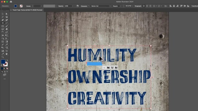
This is the whole point: I can grab one character and style it on its own without turning the text into shapes.
Why this is better than outlining text
The old-school workaround was to convert text to outlines, turning each letter into a shape. That works, but it is destructive. Once you go down that route, editing copy later becomes a pain.
With the Touch Type Tool, you can keep your options open. Need to swap an M for a D? No drama. Need to rewrite the line entirely? Still fine. You get the freedom of custom typography with a much safer workflow.
That makes it especially useful for:
Hand-drawn type treatments
Posters and title graphics
Playful headlines
Ransom note style lettering
Layouts where text needs a little imperfection and character
Fonts that work especially well
This effect can work on plenty of fonts, but it really shines with typefaces that already have a bit of personality. Hand-drawn, brush, marker, and imperfect display fonts respond especially well because the distortions feel intentional rather than awkward.
Two fonts used for this style were Marker Aid and Filmotype Honey. You do not need those exact ones, but they are a good example of the sort of font that benefits from a little extra nudging.
If the font already looks too geometric or rigid, stretching and rotating single letters can start to feel a bit criminal. Sometimes that is fine, sometimes it is not. Use your judgement.
Where to find the Touch Type Tool in Illustrator
The Touch Type Tool lives under the regular Type Tool in the toolbar.
Click and hold the Type Tool in the toolbar.
Choose Touch Type Tool.
Click the specific letter you want to adjust.
Once a character is selected, Illustrator gives you a set of control points around it. Those handles are what make the tool so handy.
How to manipulate individual letters
After selecting a character, you will see several control points. Each one does something slightly different.
Resize a character
The top right handle changes the overall size of the selected letter. Drag it to make the character bigger or smaller while keeping the effect local to that one character.
Change the height
The top left handle adjusts height. This is useful when you want a letter to feel taller, more exaggerated, or slightly uneven in a deliberate way.
Change the width
The bottom right handle adjusts width. Yes, stretching type horizontally is the sort of thing that makes typographers wince, but every now and then it is exactly what the design needs.
Move the character
The bottom left handle lets you reposition the letter. You can also drag the character more directly from the middle, which often feels quicker.
Rotate the character
The control point at the top rotates the selected letter. This is one of the best ways to make lettering feel less rigid and more custom.
Used lightly, these controls can turn plain text into something far more expressive. Used heavily, they can create intentionally messy, collage-like, or hand-built typography.
The best part: the text is still editable
This is where the tool earns its keep.
After styling a character, switch back to the regular Type Tool, place the text cursor in the word, and edit the text normally. If the selected letter needs to become another letter, it still can.
That means you are not forced into a final copy decision too early. For design work where wording changes often, that is gold.
How to fix awkward gaps after moving letters
Once you start nudging characters around, you will often get ugly spacing gaps. Some fonts handle this better than others, but eventually you will run into a letter that drifts too far from its neighbours.
When that happens, use kerning.
You can do it in the Character controls panel by entering a negative or positive kerning value, but the quicker, more tactile way is this:
Place the text cursor between the letters
Hold Option on Mac or Alt on PC
Tap the left or right arrow keys
That is still kerning, it just feels far more visual. Instead of typing numbers and guessing, you can gently jostle the spacing until it feels right.
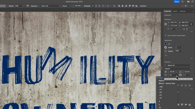
As soon as a letter gets pushed out of place, kerning is what brings the word back together.
Using glyph alternatives while styling letters
Some fonts come with alternate versions of individual characters. When you select a letter with the Touch Type Tool, Illustrator may show Glyph Alternatives near the bottom.
These alternatives can be brilliant for giving a word even more variation. A different T, a different flourish, a slightly different terminal, all of that helps sell the custom-lettered look.
That said, the floating alternatives panel can sometimes get in the way. If it starts annoying you, you can toggle it off in Illustrator's type preferences.
On Mac, go through Illustrator settings to Type. On PC, look under the equivalent type settings. Then turn off Show Character Alternatives.
Personally, I would not ditch it forever unless it is really doing your head in. It is useful. It just occasionally parks itself exactly where you do not want it.
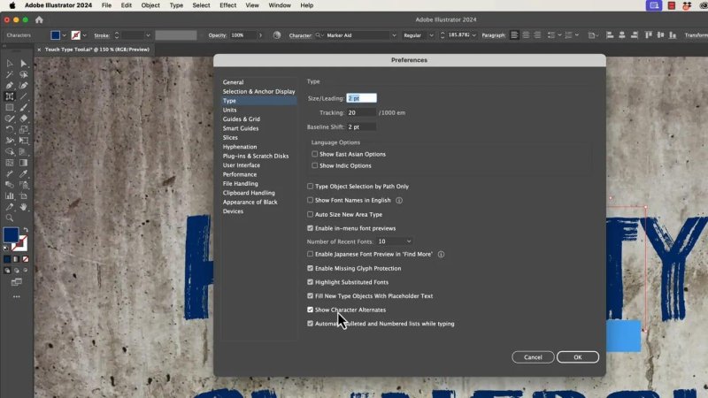
If the glyph pop-up keeps getting in the way, this is the setting that controls it.
A simple workflow for making text feel custom
If you want a reliable way to use the Touch Type Tool without making a complete typographic mess, this workflow works nicely:
Start with a font that already has character.
Adjust only a few letters first, not every single one.
Use rotation and position before aggressive width changes.
Fix spacing with kerning as you go.
Step back often and look at the whole word, not just the selected letter.
The goal is not random chaos. It is controlled imperfection. You want it to feel intentionally loose, not accidentally broken.
Adding texture with blending modes
There is another trick that pairs beautifully with hand-drawn fonts, especially when the text sits on textured paper or rough backgrounds.
After you have styled the text, select it with the black arrow, then explore the Opacity settings and try different blending modes.
For textured backgrounds, Multiply is often the winner. Instead of the type sitting as a flat block of colour on top of the page, some of the texture comes through. The lettering feels more connected to the surface underneath.
Not every blending mode will help. Some will do basically nothing. Others will make the type look washed out or weird. The trick is simply to click through a few and see what the background wants.
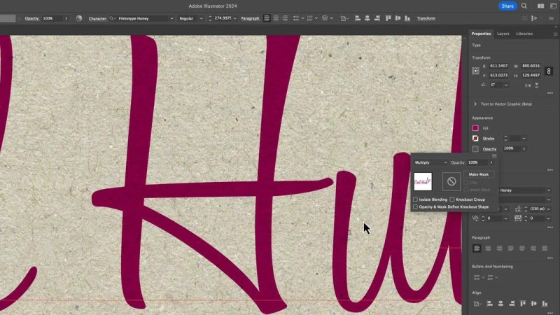
A subtle blend mode can make the lettering feel printed into the paper instead of pasted on top.
Examples of where this works really well
The Touch Type Tool is especially good when you want text to feel less like a font and more like a designed object.
Good use cases include:
Hand-drawn headlines where you want letters to overlap or lean into each other
Poster typography that needs more attitude
Informal notes or signatures where perfect alignment looks too sterile
Ransom note effects where mismatched letters are the whole point
Even tiny adjustments can make standard text look far more bespoke.
One practical caution
Just because you can stretch, rotate, and shove every letter about does not mean you should.
The best results usually come from restraint. Nudge a few characters, tighten the spacing, maybe rotate one or two letters, and stop before the whole word starts looking like it has had a rough morning.
If the effect is meant to feel natural, less is often more. If the effect is meant to feel chaotic, then by all means, go full ransom note.
FAQ
Does the Touch Type Tool keep text editable?
Yes. That is the main advantage. You can style individual letters and still return to the Type Tool to change the wording later.
Where is the Touch Type Tool in Illustrator?
It is nested under the regular Type Tool in the toolbar. Click and hold the Type Tool to reveal it.
Can I use the Touch Type Tool with any font?
Yes, but it tends to look best with fonts that already have a hand-made or expressive feel. Marker, brush, and hand-drawn styles are especially forgiving.
How do I fix gaps between letters after moving one?
Use kerning. Place the text cursor between letters and use Option or Alt with the left and right arrow keys to tighten or loosen the spacing quickly.
What are Glyph Alternatives in Illustrator?
They are alternate versions of a character included in some fonts. They can help you vary individual letters for a more custom look.
Can I hide the Character Alternatives pop-up?
Yes. In Illustrator's type preferences, turn off the option called Show Character Alternatives if you do not want that panel appearing while you work.
The Touch Type Tool is one of those Illustrator features that quietly solves a very old problem. You no longer have to choose between editable text and custom-looking lettering. You can have both, which is frankly very cool huh?
Written by Daniel Walter Scott — Founder of Bring Your Own Laptop & Chief Instructor
