How to Offset a Stroke with Text in Illustrator
Questions


Student Gallery
Course info
Overview
- - How to use artificial intelligence to boost your creativity in ideation.
- - The quick way to take hand-drawn sketches and vectorize and color them.
- - The building blocks needed to set you loose on a huge variety of beautiful effects and techniques.
- - To make beautiful charts and graphs for your documents.
- - Color mastery to make quick color adjustments, Pantones, and blend it all together beautifully.
- - How to master images inside of your illustrator workflow.
- - To harness all the secret gems that'll help you level up your typography skills.
- - All the tricks of the trade for drawing complex shapes easily.
- - To double your creativity with the Transform and Distort section.
- - To speed up your personal workflow to get the most out of your creative day.
- The Curvature Tool
- How to master corners with corner widget effects
- How to work with Compound Paths
- The difference between Expand & Expand Appearance
- How to create Graphic Styles
- How to make Symbols
- How to use the Smooth Tool
- Advanced use of Simplify Path
- What Live Shape Effects are for
- How to make Repeating Grids & Concentric Circles
- How to make Random Objects
- Advanced Keyboard Shortcuts in Illustrator
- How to add a Gradient on a Stroke
- How to add a Gradient in Text
- How to use the Freeform Gradient tool
- How to use Advanced Color Swatches
- How to use Global Color Swatches
- What is the difference between RGB vs CMYK color modes?
- How to proof colors
- How to use Pantone Spot Colors
- Recolor Artwork & Changing all colors at once
- How to use Blending Modes
- How to work with Images & Blending Modes
- How to make Black & White Images
- Learn Advanced Workflow Tricks
- All the Super Selection Mastery
- How to use the History Panel
- Advanced Fonts Tricks & Tips
- Use Retype to know what Font is being used
- How to put Text Inside a Letter or Shape
- How to use the Touch Type Tool
- How to add a Connected Stroke Around Multiple Shapes
- How to Offset a Stroke with Text
- How to make a Bar Chart in Illustrator
- How to make a Pie Chart in Illustrator
- Layer Power Moves
- Advanced Artboard & Pages Tricks
- How to Unlink vs Embedded Images
- How to Crop Images Rather than Mask
- How to Mask Inside Text & Multiple Shapes
- How to you use the Puppet Warp Tool
- How to use the Distort Envelope Shape & Type
- How to use the Envelope Mesh
- How to blend lines together
- How to make a Linocut Effect
- How to make 3D Gradient Lettering Blends
- How to spin text into a ring
- How to turn text into a 3D donut shape
- How to make a Duotone image effect
- How to make a Roughen Stamp Vector Effect
- How to make a Neon Sign Glow Effect
- How to use a Halftone Effect using Plugins
- Advanced Exporting Assets Tricks in Illustrator
- How to use the Dimension Tool
So what're you waiting for? Let's start the course now!

Daniel Scott
Founder of Bring Your Own Laptop & Chief Instructor
instructorI discovered the world of design as an art student when I stumbled upon a lab full of green & blue iMac G3’s. My initial curiosity around using the computer to create ‘art’ developed into a full-blown passion, eventually leading me to become a digital designer and founder of Bring Your Own Laptop.
Sharing and teaching are a huge part of who I am. As a certified Adobe instructor, I've had the honor of winning multiple Adobe teaching awards at their annual MAX conference. I see Bring Your Own Laptop as the supportive community I wished for when I was first starting out and intimidated by design. Through teaching, I hope to bring others along for the ride and empower my students to bring their stories, labors of love, and art into the world.
True to my Kiwi roots, I've lived in many places, and currently, I reside in Ireland with my wife and kids.
Certificates
We’re awarding certificates for this course!
Check out the How to earn your certificate video for instructions on how to earn yours and click the available certificate levels below for more information.
Downloads & Exercise files
How do you add an offset stroke to editable text in Illustrator without outlining it?
Use the Appearance panel, add a stroke, then apply Effect > Path > Offset Path to that stroke instead of converting the text to outlines. If the letter shapes overlap awkwardly, add a Pathfinder Add effect to the same stroke so the outer shape becomes one clean outline.
How to Create an Offset Stroke With Editable Text in Illustrator
If you have ever added a stroke to text in Illustrator and immediately run into that ugly overlap problem, this is the fix. Better still, the text stays fully editable, so there is no need to convert anything to outlines just to get that clean separated border effect.
The goal here is simple. We want text with a visible gap between the letters and the outer stroke. That outer edge should sit nicely around the word, not crash through counters and curves, and it should still be live type that you can edit at any point.
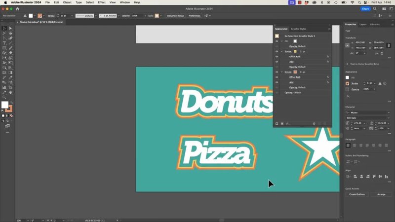
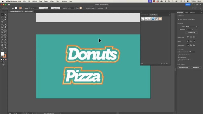
This is the look we are after, a proper gap between the text and the outside stroke.
Why a normal stroke is not enough
Start with some text on the page. In the example here, the word is set in Museo Italic 900, with the tracking tightened a little to bring the letters closer together.
If you want to tweak spacing quickly, select the text with the black arrow and use:
Option + left or right arrow on Mac
Alt + left or right arrow on PC
That changes tracking, which affects spacing across all the letters. It is different from kerning, which adjusts the space between individual letter pairs.
Now add a stroke to the text and make it fairly thick. At first glance it can look fine, especially if the stroke is aligned behind the letters. But once the spacing tightens, the stroke starts to bunch up, overlap, and generally behave like it owns the place.
That is because a standard stroke hugs the letterforms directly. What we actually want is an outer contour with breathing room around the text.
The trick: build the effect in the Appearance panel
This is where the Appearance panel does the heavy lifting.
Instead of using Object > Path > Offset Path, which would force you down the outline route for text, apply the offset as an effect to the stroke itself.
Select the text.
Add a stroke and choose its colour and weight.
Open the Appearance panel.
Click on the stroke entry so you are targeting the stroke specifically, not the whole object.
Go to Effect > Path > Offset Path.
Increase the offset until you get a visible gap around the letters.
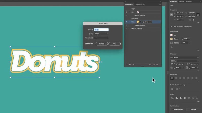
Applying Offset Path to the stroke creates the gap without touching the live text itself.
Once the offset is applied, Illustrator does create space around the type, but you will often notice another issue. Some parts of the outer stroke can still intersect or form little internal overlaps, especially in tighter shapes and counters.
So yes, it is half working. We need one more move.
Clean up overlapping outer shapes with Pathfinder Add
The fix is to combine those offset stroke pieces into one continuous shape using another live effect.
In the Appearance panel, click the same stroke again.
Choose Add New Effect.
Go to Pathfinder > Add.
That merges the outer stroke shapes together so the outline becomes one cleaner form instead of a bunch of overlapping little bits pretending to cooperate.
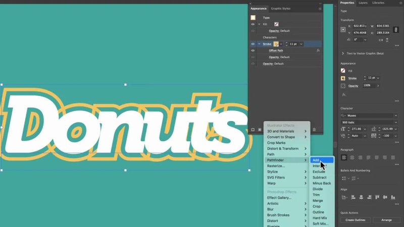
Pathfinder Add is what turns the messy overlaps into one solid outer contour.
If the result still dips too far into an inner shape, like the hole of an O or the inside of a U, go back to the Offset Path entry in the Appearance panel and increase the value. The exact number depends on your font, point size, and layout.
In the example, nudging the offset higher helped clear the internal spaces properly. The point is not to copy an exact number. The point is to push it until the outer shape looks intentional.
The best part: the text is still editable
This is the bit that makes the whole method worth using.
Because the offset and pathfinder operations are applied as live appearance effects, the text remains text. You can grab the Type tool, change the wording, and the effect updates with it.
Change Donuts to Pizza, and the offset stroke rebuilds around the new letters automatically. No outlines. No starting over. No swearing at Illustrator more than usual.
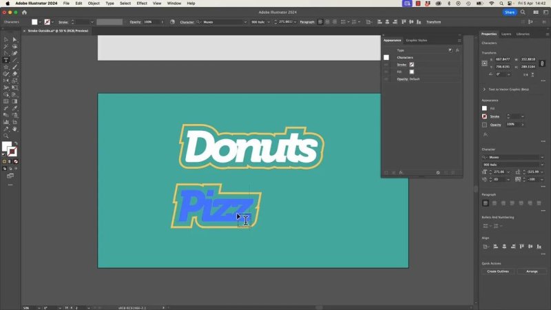
The effect follows the new word, which is exactly why keeping the type live matters.
How to add a second outer stroke for more depth
Once the first offset stroke is working, you can stack another stroke underneath it for a layered look.
Here is the basic idea:
Add a second stroke in the Appearance panel.
Move it below the first stroke.
Change its colour to something darker.
Adjust its Offset Path so it sits farther out than the first stroke.
A neat little Illustrator trick here is that you can do maths right in the field. If your current offset is, say, 11 and you want the next one to sit 11 points farther out, type +11 and hit Enter. Illustrator does the calculation for you.
That gives you a nice double-border treatment without rebuilding anything manually.
Turn the effect into a Graphic Style
Once you have the text looking right, save yourself future effort and convert it into a Graphic Style.
Select the object and add it to the Graphic Styles panel. That gives you a reusable style you can apply with one click.
There is one small gotcha here. If the fill colour is only coming from the text object itself and not represented properly inside the appearance stack, the style may not carry everything across the way you expect.
The fix is simple:
Add a fill inside the Appearance panel as part of the style
Then save the style again
Once that is done, the style behaves much better and brings the full effect with it.
Once the fill is part of the appearance, the style becomes properly reusable.
Apply the same offset stroke style to shapes
This is not just a text trick.
Because the effect is built in the Appearance panel and saved as a Graphic Style, you can apply it to shapes as well. In the example, a star gets the same clean offset treatment and picks up that nice separated outer edge straight away.
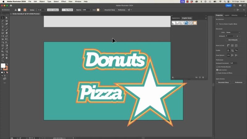
The same style works on shapes too, which makes it much more useful than a one-off text effect.
This is where the method starts to feel properly powerful. You are not making one decorative word. You are building a reusable visual system.
The big idea to remember about the Appearance panel
The real lesson is not only how to make offset stroke text. It is how to think in the Appearance panel.
You can target specific parts of an object, like:
a fill
a stroke
an individual stacked stroke
Then you can apply effects only to that part.
That means you can say:
this fill gets an effect
this stroke gets an offset
this other stroke gets a different colour and distance
this specific appearance item gets a Pathfinder operation
That is a very different mindset from editing the object itself. It is more flexible, more reusable, and far less destructive.
How this relates to Pathfinder
If the Pathfinder Add effect feels familiar, that is because it is basically the live, non-destructive version of the normal Pathfinder command.
In the standard Pathfinder panel, you can merge shapes directly. When you use the effect through the Appearance panel, you are getting that same result as part of the appearance stack instead of permanently rewriting the paths.
That is the reason this technique stays editable. You are styling the object, not flattening it.
Quick step-by-step recap
Type your text.
Tighten tracking if needed.
Add a thick stroke.
In the Appearance panel, target the stroke.
Apply Effect > Path > Offset Path.
Apply Effect > Pathfinder > Add to that same stroke.
Adjust the offset until the gap looks right.
Optionally add a second stroke for extra depth.
Add a fill in the Appearance panel.
Save the whole thing as a Graphic Style.
Reuse it on other text and shapes.
FAQ
Can I create an offset stroke on live text without using Create Outlines?
Yes. That is exactly what this method does. The offset is applied as a live effect to the stroke in the Appearance panel, so the text stays editable.
Why does my stroke overlap inside the letters?
A plain stroke follows the letter edges too closely, and the offset effect can still leave overlapping shapes. Adding Pathfinder Add to the stroke merges those overlapping pieces into one cleaner outer form.
Should I use Object Path Offset Path for this?
Not if you want to keep the type live. Applying Offset Path as an effect through the Appearance panel is the better approach for editable text.
Can I reuse the effect on other objects?
Yes. Save the finished appearance as a Graphic Style, then apply it to other text or shapes such as stars, rectangles, or icons.
Why did my Graphic Style not include the fill correctly?
If the fill is only coming from the object and not from the Appearance panel, the style may not carry it properly. Add a fill inside the Appearance panel before saving the style again.
Can I stack more than one stroke in the Appearance panel?
Absolutely. You can add multiple strokes, give each one its own colour, weight, and offset, and build much richer text effects without damaging the original type.
- Powered by Marvin
- Terms of use
- Privacy policy
- Cookie policy
-
- © Bring your Own Laptop Ltd 2026