How to use the Freeform Gradient in Illustrator
Questions

Student Gallery
Course info
Overview
- - How to use artificial intelligence to boost your creativity in ideation.
- - The quick way to take hand-drawn sketches and vectorize and color them.
- - The building blocks needed to set you loose on a huge variety of beautiful effects and techniques.
- - To make beautiful charts and graphs for your documents.
- - Color mastery to make quick color adjustments, Pantones, and blend it all together beautifully.
- - How to master images inside of your illustrator workflow.
- - To harness all the secret gems that'll help you level up your typography skills.
- - All the tricks of the trade for drawing complex shapes easily.
- - To double your creativity with the Transform and Distort section.
- - To speed up your personal workflow to get the most out of your creative day.
- The Curvature Tool
- How to master corners with corner widget effects
- How to work with Compound Paths
- The difference between Expand & Expand Appearance
- How to create Graphic Styles
- How to make Symbols
- How to use the Smooth Tool
- Advanced use of Simplify Path
- What Live Shape Effects are for
- How to make Repeating Grids & Concentric Circles
- How to make Random Objects
- Advanced Keyboard Shortcuts in Illustrator
- How to add a Gradient on a Stroke
- How to add a Gradient in Text
- How to use the Freeform Gradient tool
- How to use Advanced Color Swatches
- How to use Global Color Swatches
- What is the difference between RGB vs CMYK color modes?
- How to proof colors
- How to use Pantone Spot Colors
- Recolor Artwork & Changing all colors at once
- How to use Blending Modes
- How to work with Images & Blending Modes
- How to make Black & White Images
- Learn Advanced Workflow Tricks
- All the Super Selection Mastery
- How to use the History Panel
- Advanced Fonts Tricks & Tips
- Use Retype to know what Font is being used
- How to put Text Inside a Letter or Shape
- How to use the Touch Type Tool
- How to add a Connected Stroke Around Multiple Shapes
- How to Offset a Stroke with Text
- How to make a Bar Chart in Illustrator
- How to make a Pie Chart in Illustrator
- Layer Power Moves
- Advanced Artboard & Pages Tricks
- How to Unlink vs Embedded Images
- How to Crop Images Rather than Mask
- How to Mask Inside Text & Multiple Shapes
- How to you use the Puppet Warp Tool
- How to use the Distort Envelope Shape & Type
- How to use the Envelope Mesh
- How to blend lines together
- How to make a Linocut Effect
- How to make 3D Gradient Lettering Blends
- How to spin text into a ring
- How to turn text into a 3D donut shape
- How to make a Duotone image effect
- How to make a Roughen Stamp Vector Effect
- How to make a Neon Sign Glow Effect
- How to use a Halftone Effect using Plugins
- Advanced Exporting Assets Tricks in Illustrator
- How to use the Dimension Tool
So what're you waiting for? Let's start the course now!

Daniel Scott
Founder of Bring Your Own Laptop & Chief Instructor
instructorI discovered the world of design as an art student when I stumbled upon a lab full of green & blue iMac G3’s. My initial curiosity around using the computer to create ‘art’ developed into a full-blown passion, eventually leading me to become a digital designer and founder of Bring Your Own Laptop.
Sharing and teaching are a huge part of who I am. As a certified Adobe instructor, I've had the honor of winning multiple Adobe teaching awards at their annual MAX conference. I see Bring Your Own Laptop as the supportive community I wished for when I was first starting out and intimidated by design. Through teaching, I hope to bring others along for the ride and empower my students to bring their stories, labors of love, and art into the world.
True to my Kiwi roots, I've lived in many places, and currently, I reside in Ireland with my wife and kids.
Certificates
We’re awarding certificates for this course!
Check out the How to earn your certificate video for instructions on how to earn yours and click the available certificate levels below for more information.
Downloads & Exercise files
How do you use Freeform Gradient in Illustrator?
Apply a gradient to a single shape, switch the gradient type to Freeform, then add and move colour points with the Gradient tool. Each point influences the surrounding area, which gives you far more organic and interesting blends than a standard linear or radial gradient.
Illustrator Freeform Gradient: How to Create Rich, Organic Colour Blends
Freeform Gradient in Illustrator is one of those features that feels a bit magical the first time you use it. Instead of forcing colour into a straight line or a perfect circle, you get little points inside a shape that each push colour into the artwork around them.
That means softer transitions, more natural lighting, and much more control over where colour lives inside an object. If you have ever looked at an illustration and wondered how it got that lush, dimensional, slightly glowy look, this is often part of the answer.
Why Freeform Gradient is so useful
A normal gradient usually asks you to think in one direction. Linear goes from one side to another. Radial spreads from a centre point outward.
Freeform Gradient works differently. It lets you place multiple colour points anywhere inside a shape, and each one affects the colours around it. The result feels more fluid and painterly, but still stays fully editable as vector artwork.
This is especially handy when you want to:
Create more depth inside a flat vector shape
Blend several colours together without obvious gradient bands
Fake light, shadow, and reflected colour
Add visual energy to illustrations
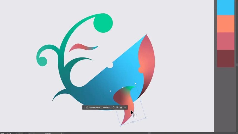
This is where Freeform Gradient really shines, soft colour movement inside a simple vector shape.
How to apply a Freeform Gradient
Start by selecting a single object. In the example, a small fin shape is used first because it is a nice, simple area to experiment with.
If your swatches panel does not already contain a gradient preset, that is fine. You do not need one to get started.
The easiest route is:
Select the shape.
Open the Gradient panel from Window > Gradient.
Apply any gradient if needed.
Change the gradient type to Freeform.
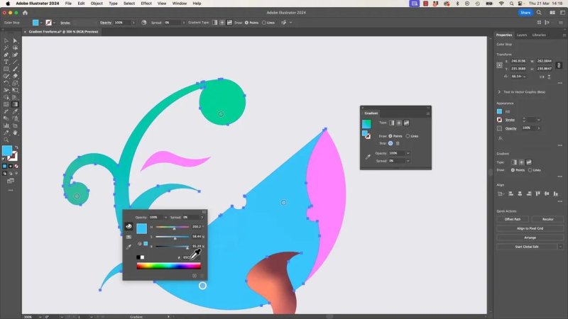
Once Freeform Gradient is active, Illustrator drops colour points into the shape automatically. Their starting positions can feel a bit random, but that is not a problem because you can move them wherever you like.
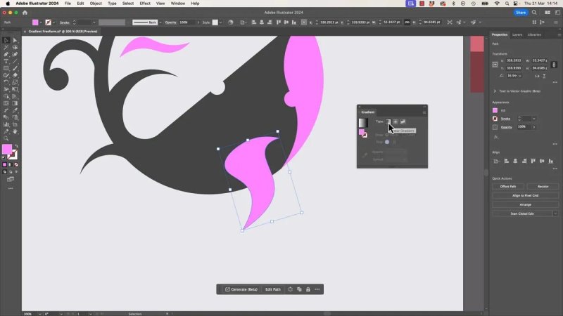
Once the Gradient panel is set to Freeform, the shape becomes a playground of editable colour points.
What those dots actually do
Each dot is a colour point. Think of it as a local source of colour influence inside the object.
With only two points, the effect can still feel a bit like a regular gradient. The blend simply moves between them. The fun starts when you add a third point, then a fourth, then a few more.
That is when the shape stops feeling mechanical and starts feeling alive.
Changing the colour of a point
Double click a point to change its colour. You can choose from:
Swatches if you already have colours prepared
Color Mixer if you want to build colours manually
Color Picker if you need more precise control
In the demo, the first points are assigned bold pink tones, then additional colours are introduced to create a more dynamic result.
Adding more points
Keep the Gradient tool active, then simply click inside the selected shape to add another point.
You can add quite a few. There is no need to be precious about it. Drop in new points, test combinations, then move them around until the colour flow feels right.
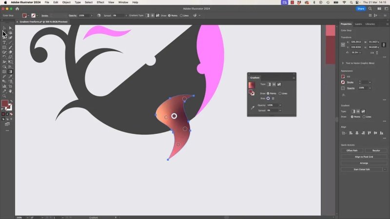
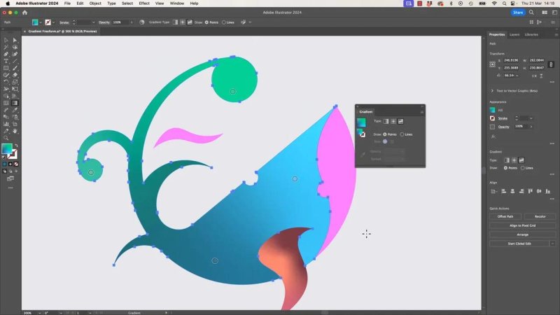
A few well-placed points can turn a flat shape into something much more dimensional.
How to shape the blend
Placing colour points is only half the job. The real control comes from moving them and adjusting how strongly each one affects the shape.
Move points to steer the colour
Drag any point to reposition it. This changes where that colour sits and how it mixes with nearby points.
If you cluster points together, the transitions become tighter and more dramatic. If you spread them apart, the blends become broader and smoother.
When points sit close together, they almost compete for territory. That can create some really interesting edges and colour tension.
Adjust the extent of each point
Every point has an influence area, sometimes described as its extent. This controls how far its colour reaches into the surrounding shape.
Make the extent smaller and the point affects a tighter area. Make it larger and that colour spreads much further.
This matters a lot because strong extents can push against neighbouring colours and create more noticeable dividing lines. If you exaggerate the setting, you can get some surprisingly sharp and dramatic transitions. If you lower it, the effect becomes gentler.
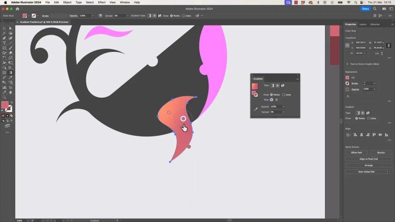
The extent controls are what take this from random colour blobs to deliberate lighting and depth.
Removing points when things get messy
Not every point deserves to stay.
If one is creating a muddy blend or pulling the shape in the wrong direction, click it and press Delete. That removes the point and lets the remaining colours rebalance.
This makes experimenting much easier because nothing is permanent. Add, test, remove, repeat.
A few quirks to expect
Freeform Gradient is powerful, but it can also be a little odd.
Sometimes when you add a new point, Illustrator gives it a colour that seems to come out of nowhere. In practice, it often appears to be borrowing from nearby colours or generating an in-between value.
That means you cannot always trust a newly created point to be the colour you actually want. The fix is simple: double click it and assign the exact colour yourself.
So if the tool feels slightly quirky, that is normal. The best approach is to be deliberate. Add the point, inspect it, then set the colour intentionally.
Using swatches versus the Color Picker
Prepared swatches are fast and tidy, especially if you are working from a planned palette.
But there are times when you want a darker, lighter, or slightly shifted version of one of those colours. In that case, go beyond the preset swatch and open the Color Picker or switch colour modes such as HSB or RGB.
That gives you room to nudge the colour value instead of being locked into the original swatch.
In the example artwork, this is used to create darker blue tones and more nuanced shading, which helps the shape feel less flat and more sculpted.
The Color Picker is useful when a swatch is close, but not quite the shade the blend needs.
One important limitation
Freeform Gradients work on a single object at a time. If you are hoping to spread one continuous Freeform Gradient across multiple separate shapes, Illustrator does not really play nicely with that in this workflow.
So if you want the effect across several parts of an illustration, apply and tune it on each object individually.
A practical way to build a better result
If you are trying this for the first time, do not aim for perfection straight away. A much better process is:
Pick one simple shape.
Add two or three points.
Set clear colours for each point.
Drag the points into more useful positions.
Adjust the extent of the strongest points.
Remove any point that muddies the blend.
Repeat on the next shape.
That step by step approach keeps things from becoming chaotic too quickly.
What makes Freeform Gradient look good
The best results usually come from restraint, not from filling every corner with random points.
A few habits help a lot:
Use a small palette. Two to four related colours often look better than too many unrelated ones.
Think about light. Put brighter points where light would naturally hit, and darker points where form turns away.
Vary the extents. If every point has the same reach, the blend can feel flat.
Group points with intention. Closely placed points create energy and contrast.
Click away occasionally. Looking at the shape without all the controls helps you judge the actual result.
Even a simple illustration gains depth quickly once each shape gets its own carefully tuned colour flow.
FAQ
Where is Freeform Gradient in Illustrator?
Select a shape, open the Gradient panel from Window > Gradient, and switch the gradient type to Freeform.
Can I add more than two colours to a gradient in Illustrator?
Yes. That is one of the main reasons to use Freeform Gradient. You can click inside the shape to add multiple colour points and blend several colours together.
Why does a new Freeform Gradient point sometimes get a strange colour?
Illustrator can assign a colour automatically based on the surrounding blend, which can feel unpredictable. If that happens, double click the point and choose the exact colour you want.
How do I delete a Freeform Gradient point?
Click the point to select it, then press Delete on the keyboard.
Can Freeform Gradient work across multiple objects?
Not in a straightforward way here. It works best on one object at a time, so separate shapes usually need separate Freeform Gradients.
Is Freeform Gradient better than linear or radial gradients?
It is not always better, but it is far more flexible for organic colour transitions, custom highlights, and illustration work where a standard directional blend feels too rigid.
- Powered by Marvin
- Terms of use
- Privacy policy
- Cookie policy
-
- © Bring your Own Laptop Ltd 2026