How to proof colors in Illustrator?
Questions
Student Gallery
Be the first to share something.
Course info
Overview
- - How to use artificial intelligence to boost your creativity in ideation.
- - The quick way to take hand-drawn sketches and vectorize and color them.
- - The building blocks needed to set you loose on a huge variety of beautiful effects and techniques.
- - To make beautiful charts and graphs for your documents.
- - Color mastery to make quick color adjustments, Pantones, and blend it all together beautifully.
- - How to master images inside of your illustrator workflow.
- - To harness all the secret gems that'll help you level up your typography skills.
- - All the tricks of the trade for drawing complex shapes easily.
- - To double your creativity with the Transform and Distort section.
- - To speed up your personal workflow to get the most out of your creative day.
- The Curvature Tool
- How to master corners with corner widget effects
- How to work with Compound Paths
- The difference between Expand & Expand Appearance
- How to create Graphic Styles
- How to make Symbols
- How to use the Smooth Tool
- Advanced use of Simplify Path
- What Live Shape Effects are for
- How to make Repeating Grids & Concentric Circles
- How to make Random Objects
- Advanced Keyboard Shortcuts in Illustrator
- How to add a Gradient on a Stroke
- How to add a Gradient in Text
- How to use the Freeform Gradient tool
- How to use Advanced Color Swatches
- How to use Global Color Swatches
- What is the difference between RGB vs CMYK color modes?
- How to proof colors
- How to use Pantone Spot Colors
- Recolor Artwork & Changing all colors at once
- How to use Blending Modes
- How to work with Images & Blending Modes
- How to make Black & White Images
- Learn Advanced Workflow Tricks
- All the Super Selection Mastery
- How to use the History Panel
- Advanced Fonts Tricks & Tips
- Use Retype to know what Font is being used
- How to put Text Inside a Letter or Shape
- How to use the Touch Type Tool
- How to add a Connected Stroke Around Multiple Shapes
- How to Offset a Stroke with Text
- How to make a Bar Chart in Illustrator
- How to make a Pie Chart in Illustrator
- Layer Power Moves
- Advanced Artboard & Pages Tricks
- How to Unlink vs Embedded Images
- How to Crop Images Rather than Mask
- How to Mask Inside Text & Multiple Shapes
- How to you use the Puppet Warp Tool
- How to use the Distort Envelope Shape & Type
- How to use the Envelope Mesh
- How to blend lines together
- How to make a Linocut Effect
- How to make 3D Gradient Lettering Blends
- How to spin text into a ring
- How to turn text into a 3D donut shape
- How to make a Duotone image effect
- How to make a Roughen Stamp Vector Effect
- How to make a Neon Sign Glow Effect
- How to use a Halftone Effect using Plugins
- Advanced Exporting Assets Tricks in Illustrator
- How to use the Dimension Tool
So what're you waiting for? Let's start the course now!

Daniel Walter Scott
Founder of Bring Your Own Laptop & Chief Instructor
I discovered the world of design as an art student when I stumbled upon a lab full of green & blue iMac G3’s. My initial curiosity around using the computer to create ‘art’ developed into a full-blown passion, eventually leading me to become a digital designer and founder of Bring Your Own Laptop.
Sharing and teaching are a huge part of who I am. As a certified Adobe instructor, I've had the honor of winning multiple Adobe teaching awards at their annual MAX conference. I see Bring Your Own Laptop as the supportive community I wished for when I was first starting out and intimidated by design. Through teaching, I hope to bring others along for the ride and empower my students to bring their stories, labors of love, and art into the world.
True to my Kiwi roots, I've lived in many places, and currently, I reside in Ireland with my wife and kids.
Certificates
We’re awarding certificates for this course!
Check out the How to earn your certificate video for instructions on how to earn yours and click the available certificate levels below for more information.
Downloads & Exercise files
How do you preview CMYK in Illustrator without converting your RGB file?
You use View > Proof Colors. That lets you keep the document in RGB while previewing how the artwork is likely to look when printed in CMYK, which is exactly what you want if the same design is going to digital and print.
How to Use Proof Colours in Illustrator to Preview CMYK Without Converting
Proof Colours is one of those slightly nerdy Illustrator features that ends up being ridiculously useful.
The basic idea is simple. You want to keep your artwork in RGB, but you also want to see what it will look like when it is printed in CMYK. Instead of converting the file and risking colour shifts you cannot cleanly undo, you can just preview the print version.
If you are designing something that needs to work on the web, on social, and in print, this is the safe way to check whether your colours are going to behave themselves.
Why not just switch the document to CMYK?
Because that changes the file itself.
In Illustrator, going to File > Document Color Mode > CMYK Color is not just a harmless preview. It converts the document. That means your colours are actually being remapped into the CMYK colour space.
And yes, switching back to RGB afterwards can still leave you with colour loss or shifts. Some colours simply do not survive the round trip nicely. So if the goal is only to check how print might affect the artwork, converting the whole document is overkill and a bit destructive.
What you really want is a preview only.
The quick way to preview CMYK in Illustrator
Here is the fast version:
Open your RGB document in Illustrator.
Go to View.
Click Proof Colors.
That is it.
Illustrator will keep the file in RGB, but it will show you a CMYK proof on screen. So you can judge whether your colours still work before anything goes to print.
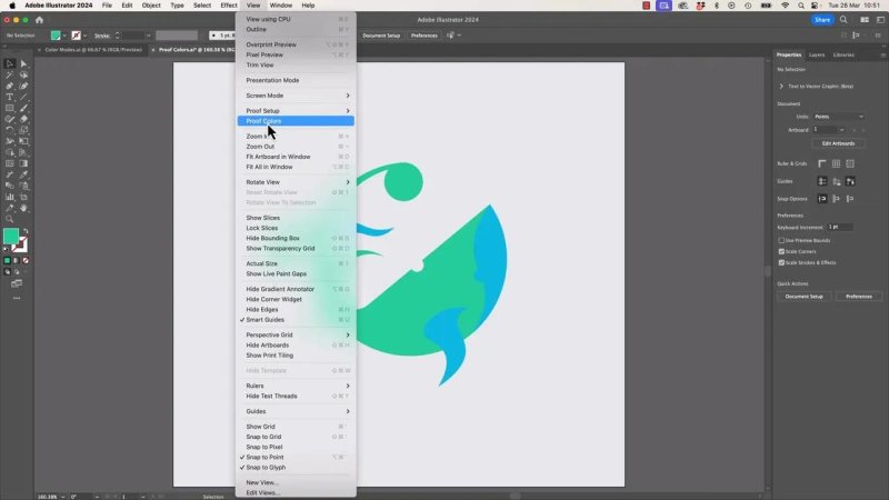
This is the switch that gives you a CMYK preview while leaving the actual document in RGB.
In the example artwork, the file is a bright whale illustration built in RGB. Once Proof Colours is turned on, the change is not dramatic across every colour, but some areas shift more than others. The blues hold up fairly well, while the greens change more noticeably.
That kind of shift matters. If the digital version and the printed version need to feel consistent, you may need to tweak the original RGB colours so the print proof lands in a better place.
What Proof Colours is actually doing
Proof Colours does not convert your artwork. It changes the way Illustrator is displaying it.
That distinction matters.
You are still in an RGB document, but Illustrator is using a CMYK proof profile to simulate print output on screen. So when you toggle Proof Colours on and off, you are comparing two different previews of the same underlying artwork:
RGB preview for screen use
CMYK proof preview for print simulation
This is why Undo does not help here. There is nothing to undo in the normal sense, because you have not edited the artwork. You have only changed the preview mode.
If you want to compare versions, just toggle View > Proof Colors on and off.
How to tell which proof profile Illustrator is using
At the top of the document window, Illustrator will show that the document is still RGB, but it may also indicate the proof setup being used. In the example shown here, the CMYK preview uses U.S. Web Coated SWOP.
That is simply the CMYK profile being used for the simulation.
If yours says something different, do not panic. That is completely normal.
If Proof Colours does not seem to work
Sometimes you click Proof Colours and either nothing obvious happens or the setup is not what you expected. In that case, manually set the proof profile.
Go to View.
Choose Proof Setup.
Select CMYK.
Then make sure Proof Colors is turned on.
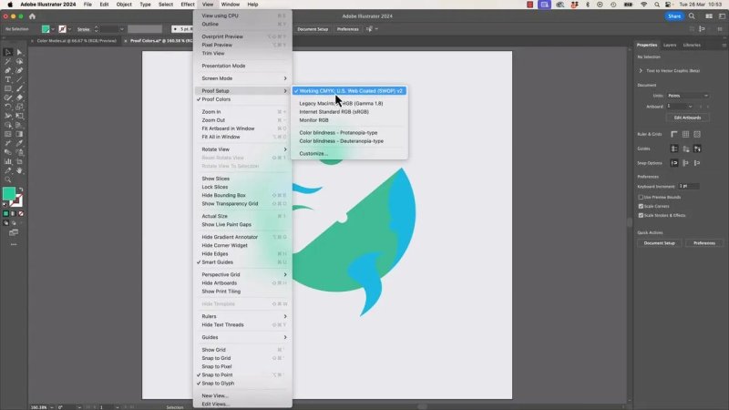
If the preview is not behaving, explicitly setting the proof setup to CMYK usually sorts it out.
That forces Illustrator to preview using a CMYK setup rather than some other proof profile.
Once it is on, you can decide whether the result is acceptable or whether your palette needs adjustment before print.
How to use the preview to make better colour decisions
This is the practical part.
Proofing is not just about ticking a box and saying, “Yep, that prints.” It is about spotting where RGB colours are too optimistic for print.
Common things to look for include:
Bright greens that become duller in CMYK
Very vivid blues that lose punch
Colour combinations that looked balanced on screen but feel mismatched in print
Contrast shifts that make elements less distinct
If the CMYK proof reveals a problem, the fix is usually not to convert the file immediately. Instead, adjust the original RGB colours so both outputs feel closer to each other.
That way you preserve a strong digital version while steering the print version into safer territory.
Why your CMYK profile may be different from someone else's
This is where things get a little more colour-nerdy.
The CMYK profile used for proofing can vary by country, region, workflow, and print standard. So if your Illustrator window shows something other than U.S. Web Coated SWOP, that does not mean anything is broken.
It usually just means your system is set up for a different regional or industry standard.
For example, different parts of the world may use different CMYK assumptions. Illustrator reflects that. So if your setup is already aligned to where you work, the best move is often to leave it alone.
Should you change the proof setup to match another country?
Usually, no.
If you are working locally, stick with the setup your environment is already using unless you have a specific reason not to. The main exception is when the job is being printed in another region and the print provider has a particular standard they expect.
In that situation, it can make sense to check which profile is appropriate for that destination.
But for most everyday jobs, especially smaller print jobs, this level of precision is often more technical than the print shop requires from you.
Should you ask the printer which CMYK proof profile they use?
You can ask, but the answer may not always be useful.
Plenty of local print shops are perfectly capable of producing good work without discussing colour profiles in deep pre-press detail. If the printer has a highly managed workflow, they will normally tell you what they need, or they will take care of the conversion handling themselves.
If they are the sort of print provider who really cares about the intricacies of pre-press and ICC profiles, they will usually guide you through it or specify the requirements upfront.
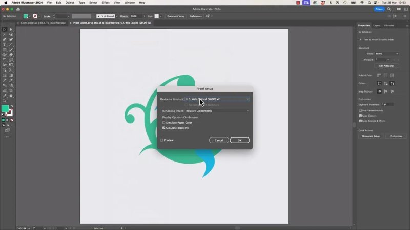
You can customise proof profiles, but unless a printer has given you a clear spec, this is usually deeper than most jobs need.
If not, do not overcomplicate it. Use Proof Colours, sense-check the artwork, and let a competent printer handle the final production details.
How to switch back to normal RGB preview
When you are finished checking the print simulation:
Go to View.
Click Proof Colors again to turn it off.
You are back to the normal RGB display, still with the same RGB document underneath.
That is the beauty of this feature. You get the insight of a print preview without actually committing your artwork to CMYK.
When Proof Colours is most useful
This feature earns its keep whenever a single Illustrator file needs to serve more than one output.
It is especially handy when:
You are designing for both digital and print
You want to protect your RGB colours
You need a quick print reality check before export
You suspect a colour will not reproduce nicely in CMYK
You want to compare on-screen vibrancy against likely printed results
It is not flashy, but it is exactly the kind of practical Illustrator skill that saves you from nasty surprises later.
FAQ
What does Proof Colours do in Illustrator?
It previews how your RGB artwork is likely to appear in CMYK without actually converting the document. You keep the original colour mode but get a print-style simulation on screen.
Does Proof Colours change my file permanently?
No. It only changes the preview. The artwork remains in its original colour mode unless you deliberately convert the document through the Document Color Mode settings.
Why can I not undo Proof Colours?
Because nothing in the artwork has actually been edited. Proof Colours is just a display toggle, so you turn it on and off rather than undoing it.
What if my proof profile is not U.S. Web Coated SWOP?
That is normal. Different regions and workflows use different CMYK standards. If your setup reflects your local environment, it is usually best to leave it as it is unless a printer gives you a specific requirement.
How do I set Proof Colours to CMYK manually?
Go to View > Proof Setup > CMYK, then make sure View > Proof Colors is enabled. That explicitly tells Illustrator to use a CMYK proof preview.
Should I convert my Illustrator file to CMYK before printing?
Not just for a quick check. If you only want to see how the artwork might print, use Proof Colours first. Conversion is for when you intentionally want the file itself in CMYK, not when you are only previewing.
Written by Daniel Walter Scott — Founder of Bring Your Own Laptop & Chief Instructor
