How to put Text Inside a Letter or Shape in Illustrator
Questions


Student Gallery
Course info
Overview
- - How to use artificial intelligence to boost your creativity in ideation.
- - The quick way to take hand-drawn sketches and vectorize and color them.
- - The building blocks needed to set you loose on a huge variety of beautiful effects and techniques.
- - To make beautiful charts and graphs for your documents.
- - Color mastery to make quick color adjustments, Pantones, and blend it all together beautifully.
- - How to master images inside of your illustrator workflow.
- - To harness all the secret gems that'll help you level up your typography skills.
- - All the tricks of the trade for drawing complex shapes easily.
- - To double your creativity with the Transform and Distort section.
- - To speed up your personal workflow to get the most out of your creative day.
- The Curvature Tool
- How to master corners with corner widget effects
- How to work with Compound Paths
- The difference between Expand & Expand Appearance
- How to create Graphic Styles
- How to make Symbols
- How to use the Smooth Tool
- Advanced use of Simplify Path
- What Live Shape Effects are for
- How to make Repeating Grids & Concentric Circles
- How to make Random Objects
- Advanced Keyboard Shortcuts in Illustrator
- How to add a Gradient on a Stroke
- How to add a Gradient in Text
- How to use the Freeform Gradient tool
- How to use Advanced Color Swatches
- How to use Global Color Swatches
- What is the difference between RGB vs CMYK color modes?
- How to proof colors
- How to use Pantone Spot Colors
- Recolor Artwork & Changing all colors at once
- How to use Blending Modes
- How to work with Images & Blending Modes
- How to make Black & White Images
- Learn Advanced Workflow Tricks
- All the Super Selection Mastery
- How to use the History Panel
- Advanced Fonts Tricks & Tips
- Use Retype to know what Font is being used
- How to put Text Inside a Letter or Shape
- How to use the Touch Type Tool
- How to add a Connected Stroke Around Multiple Shapes
- How to Offset a Stroke with Text
- How to make a Bar Chart in Illustrator
- How to make a Pie Chart in Illustrator
- Layer Power Moves
- Advanced Artboard & Pages Tricks
- How to Unlink vs Embedded Images
- How to Crop Images Rather than Mask
- How to Mask Inside Text & Multiple Shapes
- How to you use the Puppet Warp Tool
- How to use the Distort Envelope Shape & Type
- How to use the Envelope Mesh
- How to blend lines together
- How to make a Linocut Effect
- How to make 3D Gradient Lettering Blends
- How to spin text into a ring
- How to turn text into a 3D donut shape
- How to make a Duotone image effect
- How to make a Roughen Stamp Vector Effect
- How to make a Neon Sign Glow Effect
- How to use a Halftone Effect using Plugins
- Advanced Exporting Assets Tricks in Illustrator
- How to use the Dimension Tool
So what're you waiting for? Let's start the course now!

Daniel Scott
Founder of Bring Your Own Laptop & Chief Instructor
instructorI discovered the world of design as an art student when I stumbled upon a lab full of green & blue iMac G3’s. My initial curiosity around using the computer to create ‘art’ developed into a full-blown passion, eventually leading me to become a digital designer and founder of Bring Your Own Laptop.
Sharing and teaching are a huge part of who I am. As a certified Adobe instructor, I've had the honor of winning multiple Adobe teaching awards at their annual MAX conference. I see Bring Your Own Laptop as the supportive community I wished for when I was first starting out and intimidated by design. Through teaching, I hope to bring others along for the ride and empower my students to bring their stories, labors of love, and art into the world.
True to my Kiwi roots, I've lived in many places, and currently, I reside in Ireland with my wife and kids.
Certificates
We’re awarding certificates for this course!
Check out the How to earn your certificate video for instructions on how to earn yours and click the available certificate levels below for more information.
Downloads & Exercise files
How do you put text inside outlined text in Illustrator?
Turn your large letter into outlines, release its compound path if Illustrator complains, then use Area Type inside the shape. If the letter has a hole in it, such as D, A, R, or O, place that inner shape back on top and use text wrap so the smaller text flows around it properly.
How to Put Text Inside Text in Adobe Illustrator
Putting text inside text in Illustrator looks complicated the first time you see it, but it is actually a handful of tricks stacked together.
The basic version is simple enough. You create a big letter, convert it to a shape, and pour smaller text into it. The slightly weird version is what happens when the letter has a cut-out in the middle. Then the extra weird, very cool version is adding an image inside that text-filled letter as well.
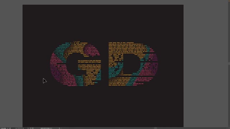
This is the finished effect when the inner text also reveals an image.
Start with a bold letter shape
Begin with a large letter or initials on your artboard. A plain background is fine. A gradient works especially well because the text shape stands out nicely against it.
The important choice here is the font. Pick something with a heavy weight so there is enough room for the smaller text to sit inside it. Thin fonts do not give you much space to work with, and the effect falls apart pretty quickly.
If you want a safe direction, go with:
A bold sans serif
Wide letterforms
Large, chunky counters and interiors
Also, make a duplicate of the original text before doing anything destructive. Once you convert live type into outlines, you lose editability on that large letter.
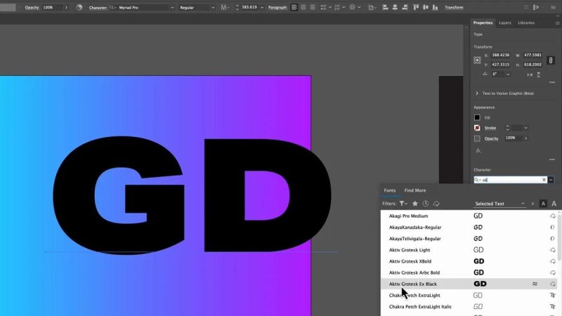
A thick, heavy font gives the smaller text enough space to read as a texture.
Convert the letter to outlines
You cannot place area text inside editable type directly, so the big letter needs to become a shape.
Create outlines from the big text. At that point, Illustrator treats it as vector artwork instead of live type. That is the key move that makes the rest possible.
Once outlined, this technique is not limited to letters. You could use any custom shape, including stars, icons, or drawn forms. The same principle still applies.
Ungroup the letters before working on them
If you outlined more than one character, Illustrator will usually leave them grouped. Ungroup them so each letter can be handled on its own.
That matters because one letter may be straightforward, while another may have an interior hole that needs extra work.
Use Area Type inside the shape
Now for the actual trick. Select the large outlined letter and use the Area Type behaviour by clicking inside the shape with the Type tool.
Here is the odd part. Illustrator may throw up a warning saying the object cannot be used because it is a compound path. Sometimes that happens even when it does not look like one should be there.
If that happens, release the compound path first. After that, clicking inside the shape should work properly and the cursor changes to the version Illustrator uses for text areas.
Once that works, type or paste your content into the letter.
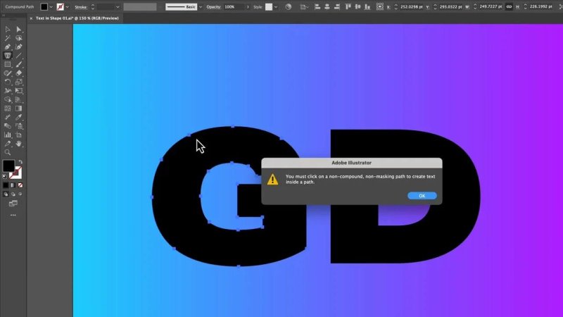
If Illustrator complains here, release the compound path first and try again.
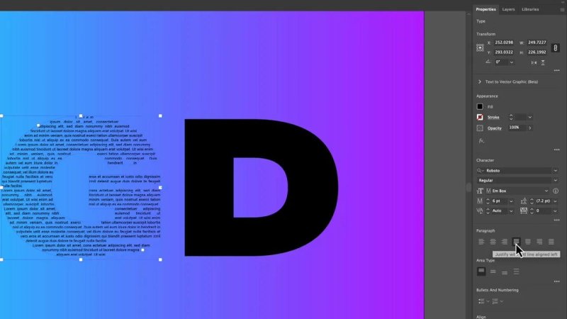
Choose a smaller font that fills the shape well
The inner text needs very different settings from the large outer letter.
Use a font that is:
Small enough to fit comfortably
Clean and simple
Dense enough to create texture
A neutral sans serif works well for this. Fill the text box with placeholder text if you just want to test the effect quickly. If the letter is not filling enough of the shape, reduce the font size and add more text.
What you are aiming for is not perfect readability. This is mostly a visual effect. The text becomes part content, part texture.
Fix awkward gaps with paragraph settings
One of the first issues you will notice is that the ends of lines can create strange little gaps or partial shapes. In some letters, that makes the form look slightly broken.
You can improve that by trying different paragraph alignments:
Left align for a more natural text texture
Justify with last line aligned left to push lines further into the edges
Justify all lines if you want every line forced across the full width
Justification can help fill the shape, but it can also create ugly vertical gaps, sometimes called rivers. Whether that is acceptable depends on the effect you want.
For this style, a few imperfections are fine. It is not meant to be an article layout. It is meant to look good.
Tweaking alignment helps the text reach the edges without destroying the letterform.
Style the inner text
Once the text is sitting nicely inside the first letter, style it to suit the background.
A white fill often looks great over a colourful gradient. Bumping the weight up slightly can also help the smaller text read more clearly as a design element.
At this stage, the inner text is still editable, which is ideal. You can still change the wording, size, colour, and paragraph settings without rebuilding the whole thing.
How to handle letters with holes in them
This is where things get a bit more interesting.
Letters like D, A, R, O and similar characters have an inner cut-out. If you simply pour text into the full outer shape, that hole disappears. The result no longer looks like the original letter.
The fix is:
Release the compound path on the outlined letter.
Keep a copy of the inner cut-out shape.
Fill the outer form with area text as normal.
Paste the inner cut-out back in its original position.
Apply text wrap to that inner shape so the smaller text flows around it.
That inner shape acts like an invisible obstacle. The text avoids it, which recreates the hole in the letter.
The inner counter has to come back so the smaller text can wrap around it and preserve the letter.
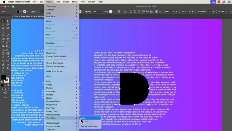
Use text wrap on the inner shape
This is one of those features people often expect under the Type menu, but it lives under Object.
Apply text wrap to the inner cut-out shape, then reduce the wrap offset to zero if Illustrator adds a visible buffer around it. That gives you a cleaner result and keeps the text snug against the inner form.
You can also remove the fill and stroke from that helper shape so it does not show. The object is still there, still controlling the flow of the text, but it becomes visually invisible.
That is the trick that makes hole-based letters work without faking it.
Keeping the editable version versus making the image version
At this point, you have the clean text-inside-text effect and the inner text is still editable.
If that is all you need, stop there. It looks great already.
If you want an image inside the text inside the text, you need to go one step further. That version is more destructive, because the smaller text also has to become outlines.
How to put an image inside the text-filled letters
Bring in your image and place it behind the text-filled letters. Scale it until the interesting parts of the artwork sit roughly where you want them inside the letterforms.
Images with obvious depth, shape changes, or colour contrast tend to work especially well. Flat images can still work, but layered or abstract artwork often gives a more dramatic result.
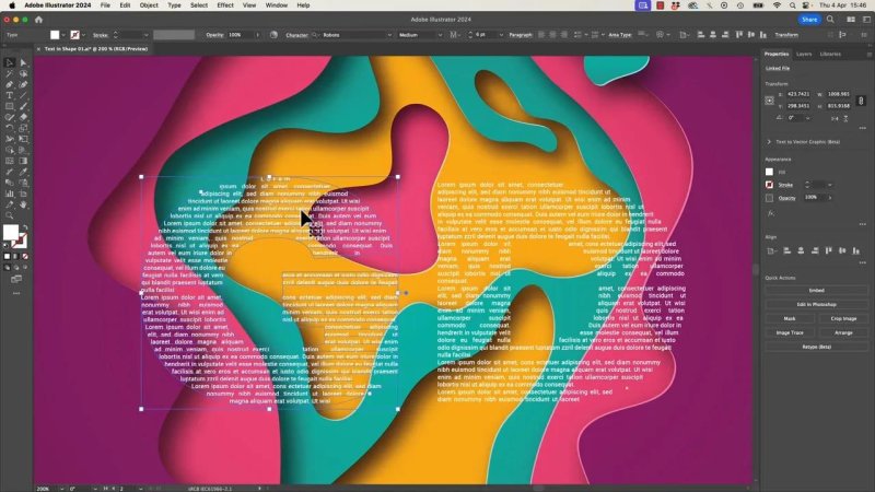
The stronger the colour and depth in the image, the better this effect tends to look.
Outline the inner text before masking
Here is the part that saves a lot of frustration.
Trying to combine live area text, text wrap, and clipping masks can get messy fast. The more reliable method is to outline the small text as well, so all of the text inside the letters becomes vector shapes.
Before doing that, keep a copy of the editable version somewhere safe. That way you can still go back and change the wording if needed.
Once the inner text is outlined, the effect becomes easier to mask with an image.
Turn the text shapes into a compound path first
Masking the image directly with all those outlined text shapes can fail or behave oddly. Illustrator may complain about the complexity, or the result may not clip properly.
The workaround is simple:
Select the outlined inner text shapes that form the letters.
Convert them into a compound path.
Make sure that compound path sits above the image.
Create the clipping mask.
For some reason, Illustrator is much happier once everything is combined that way.
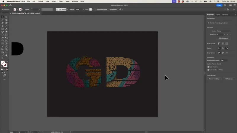
Once the outlined text becomes a compound path, the image mask finally behaves.
What makes this effect work well
The best results usually come from a few smart choices:
Use bold outer letters so there is enough interior space.
Keep the inner text small so it behaves more like texture.
Accept a little messiness because perfect readability is not the goal.
Use text wrap for interior holes instead of trying to fake them manually.
Convert the final text to outlines only when you are ready for the image-masking stage.
Build a compound path before masking if Illustrator starts acting strange.
Good content ideas for the inner text
Placeholder text is fine for testing, but this effect gets better when the words actually connect to the project.
Some useful options include:
Brand descriptions
Menu copy
Annual report text
Poetry or lyric-inspired lines you have rights to use
Taglines and product messaging
AI-generated draft copy that you have edited for the piece
When the content is relevant, the effect feels less like a gimmick and more like intentional design.
The two big Illustrator gotchas to remember
If you only remember two things from this whole process, make them these:
When Illustrator says you cannot place text because of a compound path, release it and try again, even if it does not seem obvious why.
When masking an image into the final text-filled letters, combine the outlined text into a compound path first.
Those two little workarounds solve most of the confusion.
FAQ
Can I keep the text editable in Illustrator?
Yes, up to a point. The smaller text inside the letter can stay editable while you are building the plain text effect. For the image-filled version, converting that inner text to outlines makes the masking process much more reliable.
Why does Illustrator say the shape is a compound path when it does not look like one?
Outlined type often carries compound path behaviour in the background. Releasing the compound path usually clears the issue and allows Area Type to work inside the shape.
Which letters are hardest to use for text inside text?
Letters with counters or interior holes are trickier, especially D, A, R, and O. They need the inner shape restored and used as a text wrap object so the smaller text avoids that area.
What kind of image works best for the final masked effect?
Images with strong contrast, layered colour, and visible depth tend to produce the most interesting result. Abstract artwork is especially effective because it gives the letterforms plenty of variation inside a small space.
Can I use shapes other than letters?
Yes. Once the original type is outlined, the same method works with any vector shape. The process is really about putting area text inside a shape, then optionally using that result as a mask.
- Powered by Marvin
- Terms of use
- Privacy policy
- Cookie policy
-
- © Bring your Own Laptop Ltd 2026