Adjust your stroke corners profile and mitres
Questions





Student Gallery
Course info
Overview
Join Adobe Certified Professional and Adobe MAX Master Award winner Dan Scott on an incredible journey into Adobe Illustrator! This course is tailor-made for anyone new to Illustrator and the world of design. Dan starts from scratch and unravels the secrets and techniques that let you create anything your creative heart desires, from icons, logos, and postcards to beautifully hand-drawn illustrations.
It's a relaxed, well-paced introduction, and Dan's approach is simple: start with shapes. A surprising amount of professional vector work begins as a few basic shapes combined and subtracted with the Shape Builder. Once that clicks, you'll be ready to conquer the Pen, Pencil, and Curvature tools like a pro and dive into the wonderful world of fonts.
Together with Dan, you'll learn how to:
- Master the art of drawing with simple shapes and lines
- Combine and subtract shapes to build custom logos and graphics
- Draw with confidence using the Pen, Pencil, and Curvature tools
- Pair fonts and style type that suits your design
- Choose color combinations with a designer's eye
- Export your creations for print, web, social media, and more
You'll practice on real-world projects from icons and logos to postcards and hand-drawn illustrations, then bring everything together in a complete Farmers' Market brand built from your own mini-brief. You'll gather inspiration with a mood board, design the logo and graphics, and present it all in realistic mockups. Dan also walks through Illustrator's hidden gems, including the mind-blowing Generative AI and AI Assist features. Turn rough sketches into polished vectors with Concept to Vector, generate artwork from a text prompt, get AI feedback before you share your designs, and keep your layers tidy. Dan shows you where these tools save you time, and where they're not worth the effort.
Plus, you'll get a handy printable PDF cheat sheet, forum support from the BYOL Teaching Assistant team, and a treasure trove of additional resources and websites to supercharge your career. Whether you've never even opened Illustrator or you've struggled with it in the past, Dan is here to show you the easy way to create breathtaking artwork and portfolio projects you'll be proud of. Let's go from Illustrator zero to Illustrator hero!
Requirements
- Adobe Illustrator installed (sign up for a free trial here)
- No prior Illustrator, design, or drawing experience required
- Basic computer skills (if you can send an email and browse the web, you're ready)
Who this course is for
- Absolutely no previous Adobe Illustrator experience is required
- This course is designed for newcomers to Illustrator and design in general, so no prior design, drawing, or illustration experience is necessary
- This is a relaxed, well-paced introduction, perfect for producing a wide range of drawings, illustrations, logos, and portfolio projects
- Only basic computer skills are necessary; if you can send emails and surf the internet, you're more than capable of mastering this course!
What you'll learn
- Drawing with shapes and lines
- Combining and subtracting shapes with the Shape Builder tool
- Designing custom logos and vector graphics
- Mastering the Pen, Pencil, and Curvature tools
- Working with brushes, strokes, and the Width tool
- Working confidently with type and fonts
- Curving and warping text
- Picking fonts faster with AI Assist
- Choosing effective color combinations
- Embedding and masking images and graphics
- Removing image backgrounds with one click
- Tracing images and converting hand-drawn artwork into vectors
- Creating stencil-style artwork from real drawings
- Creating overlapping artwork with Intertwine
- Distorting, bending, warping, and liquefying artwork
- Creating simple 3D illustrations
- Viewing 2D artwork from new angles with Turntable
- Designing seamless repeating patterns
- Turning rough sketches into polished vectors with Concept to Vector
- Generating vector artwork from a text prompt with Generate Vector
- Getting AI feedback on your designs before you share them
- Organizing layers automatically with AI Assist
- Gathering inspiration with mood boards
- Building a complete Farmers' Market brand from your own mini-brief
- Presenting your work with realistic mockups
- Exporting artwork for print, web, social media, and clients
- Multiple hands-on class projects you can add straight to your portfolio
- Practical workflows, shortcuts, and techniques used by professional graphic designers

Daniel Walter Scott
Founder of Bring Your Own Laptop & Chief Instructor
I discovered the world of design as an art student when I stumbled upon a lab full of green & blue iMac G3’s. My initial curiosity around using the computer to create ‘art’ developed into a full-blown passion, eventually leading me to become a digital designer and founder of Bring Your Own Laptop.
Sharing and teaching are a huge part of who I am. As a certified Adobe instructor, I've had the honor of winning multiple Adobe teaching awards at their annual MAX conference. I see Bring Your Own Laptop as the supportive community I wished for when I was first starting out and intimidated by design. Through teaching, I hope to bring others along for the ride and empower my students to bring their stories, labors of love, and art into the world.
True to my Kiwi roots, I've lived in many places, and currently, I reside in Ireland with my wife and kids.
Certificates
We’re awarding certificates for this course!
Check out the How to earn your certificate video for instructions on how to earn yours and click the available certificate levels below for more information.
Downloads & Exercise files
How do you make strokes pointy or tapered in Illustrator?
Select your path and open Window > Stroke. Use a miter join for pointed corners, adjust the miter limit if sharp corners look cut off, and choose a tapered width profile for pointed stroke ends. Caps control how open paths finish, while profiles change thickness along the whole path.
Illustrator Corner Profiles: Better Strokes, Caps and Miter Joins
Key takeaways
Choose caps for stroke ends and joins for corners.
Fix clipped points with the miter limit, then tidy awkward geometry with Direct Selection.
Use width profiles to turn uniform lines into expressive, tapered strokes.
Understand why one continuous path behaves differently from several separate paths.
Control whether stroke weight changes when you resize your artwork.
Plain strokes do the job, but sometimes those stubby ends need a little help. A few changes in Illustrator’s Stroke panel can turn a basic outline into something much more interesting: sharp flame tips, soft rounded ends, or lines that swell and taper.
We’ll use a little mint-green flame as our example. It might become a slightly questionable flame. Possibly a sea monster. Either way, the stroke controls work exactly the same.
Draw the same shape two different ways
The important part of this exercise is not drawing a perfect flame. It is drawing a similar shape with two different path structures, because that changes how Illustrator applies the stroke settings.
For the exercise, I’m using the Pencil Tool 02 Illustrator file, which has a background photograph already locked in place. The flame sits above the raised finger in the photograph. If you are setting up your own document, keep the background locked so you can select the lines without moving the image.
Zoom in using Command + plus on a Mac or Control + plus on Windows.
Choose a mint-green stroke colour using the colour mixer.
Set the stroke weight to 6 pt, thick enough to make the changes easy to see.
Use the Brush tool, found in the same tool group as the Pencil tool in this setup, to draw a flame as one continuous path.
Move that version aside, then use the Pencil tool to build another flame from several short, separate paths.
Drawing the whole thing in one go can take a few attempts. Drawing it in pieces may feel much easier. That is not cheating; it is a different way of building the illustration.
Keep both versions. The continuous flame has connected corners where its path changes direction. The segmented flame has lots of individual endpoints. That distinction is about to do quite a lot of work.
Open the full Stroke panel
Select both flame drawings. Clicking the word Stroke in the Properties panel opens more than the basic colour and weight controls. That is useful for a quick change, but the pop-up closes when you move on.
For repeated adjustments, choose Window > Stroke. This opens a panel you can leave on screen while you experiment.
If the panel looks disappointingly small, double-click its tab at the top. Illustrator cycles through different panel display states. Keep double-clicking until the full set of stroke options is visible.
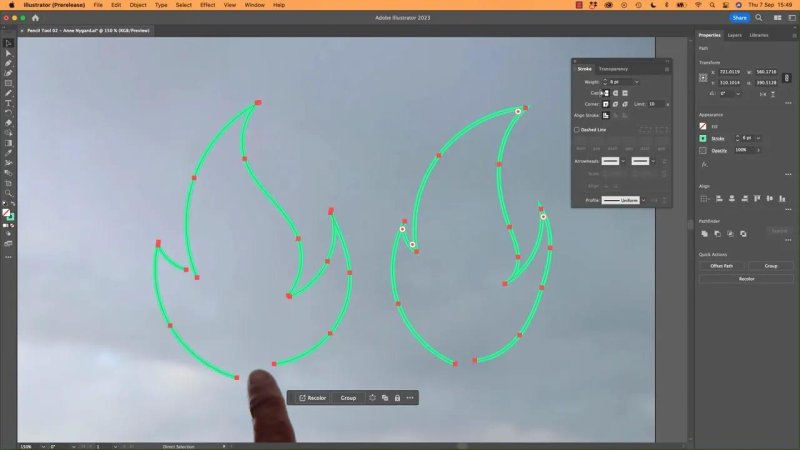
Keep the full Stroke panel open while comparing the two ways of drawing the flame.
The controls we need are:
Weight: the thickness of the stroke.
Cap: the treatment at the ends of an open path.
Corner or join: the treatment where connected path segments meet.
Miter limit: how far a pointed join can extend before it is cut off.
Profile: how the stroke’s width varies along the path.
Use caps to change open stroke ends
Zoom into the gap at the bottom of a flame so you can inspect the ends. Illustrator gives you three cap options:
Butt Cap: a flat, abrupt finish at the endpoint. An unfortunate name, but a useful setting.
Round Cap: a rounded finish that softens the end of the line.
Projecting Cap: a squared finish that extends beyond the endpoint.
Switch between Butt Cap and Round Cap. The rounded version gives the separate lines a softer, more natural finish. Butt Cap keeps them crisp and flat. I tend to use those two much more than Projecting Cap, but the choice depends on the illustration.
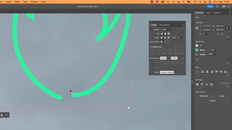
Round caps soften the exposed ends of an open path.
Now inspect the rest of the segmented flame. Every separate path has its own ends, so changing the cap affects multiple places around the drawing.
Caps affect endpoints, not connected corners. If you want a sharp bend to become rounded, you need the join controls instead.
Choose pointed, rounded or bevelled corners
The corner settings control how the stroke behaves where connected segments change direction.
Miter Join: extends the edges into a pointed corner.
Round Join: rounds off the outside of the corner.
Bevel Join: cuts the corner off with a flat edge.
Apply these to the continuous flame. Miter Join gives it those sharp, flame-like tips. Round Join softens them. Bevel Join lops the points off.
For this drawing, I want the pointy version. For a softer illustration style, rounded joins might be exactly right.
Notice that the same setting may do very little to the segmented flame. In this example, its apparent corners are made from separate line ends rather than connected bends. Illustrator has no join to change at those locations.
That is why two drawings that look similar can respond differently to the same setting. Before deciding that a control is not working, check how the paths were built.
Fix a point that looks cut off
Sometimes Miter Join makes most corners pointed, but leaves one looking blunt. That is usually where the miter limit comes in.
A very sharp change in direction can create a long spike. The miter limit controls when Illustrator stops extending that join and cuts it off instead. In the flame example, increasing the limit to 20 allows a previously clipped corner to become pointed.
There is a catch. The newly revealed point may stick out much farther than you want. Increasing the limit permits the point; it does not guarantee a lovely point.
If it looks odd:
Choose the Direct Selection tool.
Select the anchor point at the troublesome corner.
Adjust the point or its handles to make the change in direction less extreme.
Check the result at both a close zoom and the intended artwork size.
Sometimes a corner just needs a little love. Use the miter limit to allow the join, then edit the path to make it look right.
Use width profiles for tapered strokes
A Uniform profile keeps the stroke the same thickness along its length. With our starting settings, that means a 6 pt line all the way around.
Open the Profile menu and choose the tapered profile beneath Uniform. This profile starts narrow and pointed, grows thicker in the middle, then narrows to a point again at the end.
It is a small change with quite a big visual effect. More importantly, it makes the difference between our two drawing methods obvious.
One continuous path gets one continuous profile
On the continuous flame, Illustrator distributes the profile across the entire path. It begins thin at one endpoint, reaches its broadest part halfway along the path, and tapers back down towards the other endpoint.
It does not restart at each flame tip or corner. The whole outline shares one width progression.
That can look really good, although it may expose a lumpy bit of drawing. Use Direct Selection to refine awkward curves, or remove an unnecessary anchor point with the Pen tool’s delete-anchor function if it is causing trouble.
Separate paths each get their own profile
On the segmented flame, every short path receives a complete copy of the profile. Each piece starts thin, becomes thicker, and ends thin again.
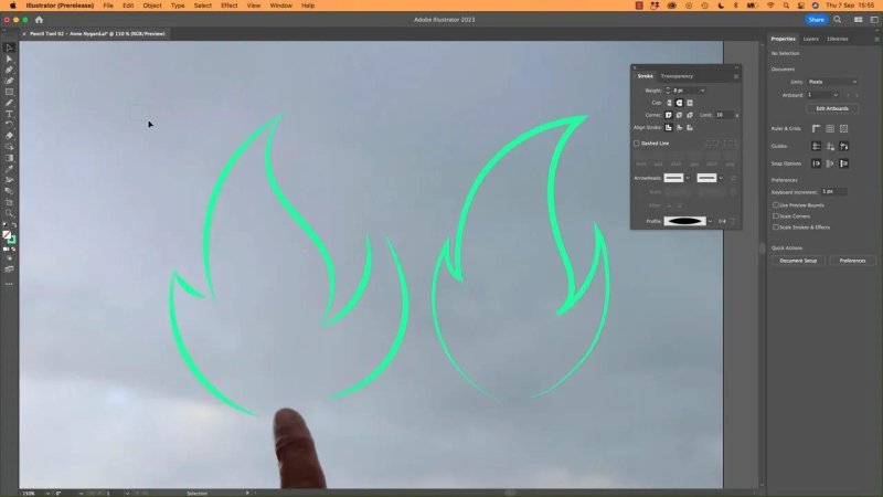
The same width profile produces different results when it runs once around an outline or repeats on separate paths.
Neither approach is better. They simply create different styles:
A continuous path gives one flowing change in thickness across the whole drawing.
Separate paths give repeated tapers, with each line behaving independently.
The same principle applies to a complete shape. Draw a rectangle and apply the tapered profile: the width variation follows the whole closed path, rather than restarting on each side. If the result seems unexpected, think about the complete route the path takes.
Experiment with profiles, caps and Flip
Try a few other profiles. There are not masses of presets, but there is enough variety to make a stroke much more interesting than a plain line. Brushes offer more possibilities beyond this, but profiles are a useful place to start.
Keep testing the caps as well. A profile combined with Round Cap can look different from the same profile combined with Butt Cap. These settings work together.
The Flip control becomes useful with an asymmetrical profile. If a profile is heavier towards one end, flipping it reverses that arrangement along the path.
With a symmetrical profile, the flipped result looks the same. The control is still reversing it; there is just no visible difference because both ends match.
Refine the path after applying the style
You do not have to perfect every anchor before choosing a profile. Applying the stroke treatment can help you see where the drawing needs adjusting.
Use Direct Selection to move anchors and reshape handles until the tapered points arrive where you want them. On the flame, a little adjustment around an inward-facing tip helps it look deliberate rather than tangled.
You can also mix the two approaches: use a longer path where you want a flowing outline, and separate strokes where individual tapers look better. The path structure is part of the design, not just a technical detail.
Decide whether strokes should scale with the artwork
Once the flame looks good, try making a smaller version. This is where Scale Strokes & Effects matters.
Disabled: resizing changes the path’s size but keeps its stroke weight unchanged.
Enabled: resizing also scales the stroke weight.
For example, if the stroke is 8 pt at this stage, shrinking the artwork with the option disabled keeps it at 8 pt. The profile still varies the width along the path, but the stroke’s weight setting remains unchanged.
Enable Scale Strokes & Effects and shrink it again, and the stroke becomes thinner too.
For this example, I prefer keeping the stroke weight as it is while reducing the flame. In another illustration, proportional scaling might be the right choice. Check the setting rather than relying on a remembered default.
Stack these techniques with the Pen tool and rounded corners
These stroke principles are not limited to Pencil or Brush drawings. Draw a similar path with the Pen tool, and the same caps, joins, miter limits and profiles apply.
You can also use Direct Selection to adjust the path’s rounded corners. This is another layer of control alongside the stroke settings: change the underlying corner shape, then see how the styled stroke follows it.
So experiment. Make a flame, soften a corner, sharpen a join, try a different taper. If your flame starts looking suspiciously like the Loch Ness monster, at least it will have some excellent strokes.
Key terms
Stroke weight
The thickness setting for a path’s stroke, measured here in points. A width profile varies that thickness along the path.
Cap
The finish applied to an open path’s endpoints. Butt, round and projecting caps give different end treatments.
Join
The treatment where connected path segments meet at a corner. Miter, round and bevel joins produce pointed, curved and clipped finishes.
Miter limit
The setting that restricts how far a mitered corner can extend. Raising it can reveal a sharp point that was previously cut off.
Width profile
A pattern of thickness changes applied along a path. Each separate path receives its own instance of that pattern.
Scale Strokes & Effects
The option that determines whether stroke weight scales when artwork is resized.
FAQs
Why are some miter joins still blunt?
The corner may exceed the current miter limit. Increase the limit to allow a longer point, then refine the anchor point if the resulting spike extends too far.
Why does a width profile look different on separate lines?
Illustrator applies the full profile to each path independently. Several short paths repeat the taper, while one continuous path spreads it across its entire length.
How do I resize a shape without making its stroke thinner?
Disable Scale Strokes & Effects before resizing. The path becomes smaller, but its stroke weight remains unchanged.
Written by Daniel Walter Scott — Founder of Bring Your Own Laptop & Chief Instructor
