How To Create Pie Charts & Bar Graphs In Adobe InDesign CC
Questions


Student Gallery
Be the first to share something.
Course info
Overview
- You will need a copy of Adobe InDesign 2018 or above. But you find that 95% of all the features in this course will work with earlier version of InDesign (e.g. CS6). A free trial can be downloaded from Adobe.
What am I going to get from this course?
- 70 lectures 5+ hours of well structured content.
- Create PDF Forms
- Master Long Documents.
- Advanced Fonts
- Master Styles
- Shortcut Sheet
- Create Charts & Infographics
- Create Interactive Documents
- Workflow Tactics
- Shortcuts & Speed Tips
- Advanced Creative Cloud Features
- Tips for working with Photoshop & Illustrator
- Using Scripts
- Exporting, Prepress & Printing tricks
- You will get the finished files so you never fall behind.
- Downloadable exercise files & cheat sheet.
- Forum support from me and the rest of the BYOL crew.
- Techniques used by professional graphic designers.
- Professional workflows and shortcuts.
- A wealth of other resources and websites to help your accelerate your career.
What is the target audience?
- This course is for people who already know InDesign and want to take their skills and speed to the maximum level.
- This is an advanced InDesign course, so you’ll need basic InDesign skills to find this course useful.
- This course is perfect for anyone that already knows how to insert images & add text.
- If you a completely new to InDesign try my InDesign Essentials course before starting this one.
- This course is perfect for anyone that has completed my InDesign Essentials course.
Course duration 7 hours 45 mins + your study.

Daniel Walter Scott
Founder of Bring Your Own Laptop & Chief Instructor
I discovered the world of design as an art student when I stumbled upon a lab full of green & blue iMac G3’s. My initial curiosity around using the computer to create ‘art’ developed into a full-blown passion, eventually leading me to become a digital designer and founder of Bring Your Own Laptop.
Sharing and teaching are a huge part of who I am. As a certified Adobe instructor, I've had the honor of winning multiple Adobe teaching awards at their annual MAX conference. I see Bring Your Own Laptop as the supportive community I wished for when I was first starting out and intimidated by design. Through teaching, I hope to bring others along for the ride and empower my students to bring their stories, labors of love, and art into the world.
True to my Kiwi roots, I've lived in many places, and currently, I reside in Ireland with my wife and kids.
Downloads & Exercise files
Transcript
Hi there, in this video we're going to learn how to do Pie charts, Line charts, and Bar graphs, and all sorts of awesome charting type things, well, kind of. You can't really do them in InDesign so I'm going to show you all the tricks and techniques to create them, and bring them into these. All right, let's get on with it.
So the bad news is that InDesign doesn't make graphs itself so we have to use something else, and there's kind of three main ways of doing it. One is with Illustrator, one is with Excel, and one of them is using a font, like Chart work. Now this is not going to be a detailed explanation of how to use all of them because I guess Illustrator is a separate program, so is Excel, but I want to show you how quick and easy it can be to use those options.
So I'm going to make a new page, page 5 here. Let's look at Illustrator. Illustrator has a Graphing tool, it's down here on the left. And you got all the different kinds of graphs. Potentially, we're going to do our Column graph. And all you do is drag out the size you want it to be. Then you fill this data sheet in, it's kind of like using Excel. So in here I might say, '40' is the first one. You can copy and paste this from Excel. I'm just making a random chart here. And when you've got the bits you want click on that little tick, and you've got a Column chart. You can grab your White Arrow, and click on just this first part and say, I want to pick you, so we select on our White Arrow here. Click on this first option, go to 'Properties' and in here, the Fill is going to be 'Maynooth Green'. I can go through and just color out, change the fonts, change the colors in here. Get ready. And all I need to do is copy and paste it.
Now if I copy it with this little data sheet open, if I copy and try paste it into InDesign, it just doesn't come. Doesn’t work, so you close him down, then just select it, go to 'Edit', 'Copy', then 'Edit', 'Paste' in here, and you get it. Cool thing about doing it from Illustrator is that I can go to my 'Object', and I can 'Ungroup' them. And they all become like separate pieces and I can go through here, and change the font and make some adjustments, and kind of work over there. It's nice and editable in InDesign. Now we're not going to go through every feature in Illustrator. I've got an Illustrator course, go check that out. It will go through all the different Illustrator parts.
So say Illustrator is not your thing, and you've been sent stuff in Excel. So let's look at that. I've got a sheet you can open up here, called 'Chart Data', and I've made a little graph in here. Now this is not going to work unless it's in Excel. Google Sheets doesn't work this way. So I've made a little chart in here. Basically all you do is, select all the data you want in your sheet, go to 'Insert', and then here, there's options for different graphs. I've picked, in this case, this first 'Line' graph. It just generates it. Now, it's not going to be editable in InDesign. So what you need to do is, in here I'm going to go and pick 'Home', and I'm going to pick the 'Font' in here. So I've got to do this stuff-- what did I pick? Arial Hebrew, it's probably not what I want. I'll just pick 'Regular Arial'. So you can click on here, double click the 'Line', you can go and choose 'Format'.
Again, this is not going to be like a full, how to use Graphing Tool in Excel. I've got a course on that. So I've got a full on Excel course if you want to jump into that one. Now you can do some basic formating in here, probably without any help. Now just click the outside, copy it, paste it into InDesign. The nice thing about it is that it is Vector. So when I scale it up, it's not going to pixelate. You see, if I zoom in, it's all still lovely Vector Graphics. So whichever way you'd like to use, out of those two, either Excel, or Illustrator, those are great ways. I'm going to show you this third option, because it's quite useful. I'm just going to drag him off to the side here.
So, this is a font based way. So this actually can be done in InDesign. You don't have to go to any other product, but you do need a paid font. And the fonts are about US $25. Where do you get them from? You can buy them from lots of places. Currently TypeKit doesn't sell them so you're going to have to go to somewhere else. I use myfonts.com quite often. And what you're looking for is one called Chartwell. So I found Chartwell here, it's got a big gallery of kinds of things you can do with it. It's pretty impressive, some really nice graphs. Now, you can buy, under 'Buying Choices' you can buy the entire font family. And that's seven different fonts, it's Bar charts, Line charts, the works for about 120, I think it's about the same in US dollars, mine's in Euros.
What I wanted though, just underneath, you can buy 'Individual Styles'. So I've just purchased 'Pie charts', and I bought it. There are added VAT for me, so it added up to about €30, I think it's still an okay price for what it does. So, in InDesign now, you download it, and install it, like any other font. Now the way this works, is it works on Ligatures. If I draw out a Type box-- zoom in. So where it works is, you need to have numbers that add up to 100. Let's say I've got this, this, plus this. As long as they equal 100, it's going to work.
The other thing you need to do is, every font, wherever your number group needs to be a different color, so I'm going to pick a bit of green, I'll use pink and I'll use yellow, so I've got three different colors. Now what we need to do is change the Stylistic set. So with the Black Arrow, down the bottom, I've got this little O down the bottom. Now I get to switch it from-- actually it's not going to work at all. First of all we need to select the font, and make it 'Chartwell', not Roboto. 'Chartwell Pies', there it is there. Yours might already be downloaded as a Pie chart but if yours is like mine, and it hasn't, now I can click on this O down the bottom and click on 'Stylistic Set 1'. Ready, steady…
I'm amazed. I love that it just works that easily. If you can't see any of this down the bottom here you can turn this on by default by going to 'InDesign', 'Preferences', 'Advanced Type'. If you're on a PC, it's under 'Edit', Preferences', 'Advanced Type'. And you can turn on both of these two options down the bottom. That will give you this little ribbon type icon down the bottom ,or you can go to 'Command T' on a Mac, or 'Control T' on a PC, and in here is the option, under 'OpenType', and you can go to 'Stylistic Sets', and turn it on there. Up to you.
So with it on, it's made up a chart and you can see, these slices are made out of the colors. Now it's a bit small. So I can grab my font tool-- it's based on the font size. So I'm going to hold down 'Shift', and just raise it up a bit. So that is how to use the chart. I want to turn that off and show you a couple of options. I think it's pretty clever though. You can obviously, let's say I want another slice, and this one's going to go down to 40. Then I'm going to add another slice that's 10. This one's going to be purple. So it's easy to add slices. There he is there. Another thing you can do is you can add a letter to the end. Now the letters adds a little disc to the middle. So if I type in a lower case 'a' and I'm just going to make it black in this instance. It should be white, but I want it black so you can see it. Now I'll turn it back on. You can see, it's made a little black disc in the middle. So that's what the letter does.
Basically the letter, the lower case a is the smallest dot, and the capital Z is the biggest dot you can make. So it goes, lower case a-z, that gives you half the way and then, upper case A-Z gets you the rest of the way. If that doesn't make sense, let's put in an upper case M, and I'm going to make it white or 'Paper'. Turn it on, so that's going to give me probably the thing I want, see that disc here? So sizing wise, lower case a-z gets you that half way, and then upper case A, all the way through to Z gives you the rest of the space, getting bigger. I picked M, which is kind of in the middle there. So that is the CC Chart. It works just as easy with the Line and Bar graph, and the Rows chart. There's some awesome things if you want to get the whole library.
Now two last things I want to show you, is that turning this Stylistic set on and off is not bad, not a big drama. You can use the Story Editor. I rarely use the Story Editor. It's under 'Edit', and there's one called the 'Story Editor'. Basically this is for people-- it's kind of like InCopy. It just means that I see the text without any of the formating. It's just plain text editing. The cool thing about it is that I can switch this one out, let's say this one has to be 15 now, and I'll add those other 15 here, 55, you can see, it's just maybe an easier way to work using this option up the top here. Let's say I get rid of this center here. I'm going to close that down now. Let's say I want kind of a Pie chart pushed out. By default I can't do that, so what I'm going to do is I'm going to select it with my Black Arrow, then go up to 'Type' there's one in there called 'Create Outlines'. So it's no longer editable, so you might want a copy of this somewhere.
So I can't go back into my Story Editor now, and adjust it. What I can do is I can ungroup it. Now I've got lots of little pieces here I can work with, so I might want some sort of like slice, kind of pushing out like this, then, some labels to it to say what this exciting slice does. So the rule is you can't do graphs in InDesign, so you need something else to create them. You can either use Illustrator, Excel, or one of these Chartwell fonts, it's up to you. They all have their pros and cons, and I guess, just use the one you find you've got the most skills in. Either Excel, Illustrator, or you can learn how to use this Chartwell font.
All right, let's get on to the next video tutorial.
Can you create charts directly in Adobe InDesign?
Not really. InDesign does not have native graph-making tools for pie charts, line charts, or bar graphs. The good news is that there are three practical ways to get great charts into an InDesign layout: create them in Illustrator, build them in Excel, or use a clever font family called Chartwell.
Each method has its pros and cons. The best one is usually the option that suits the data you have, the amount of editing you need to do, and the software you are most comfortable using.
How to Create Charts and Graphs in Adobe InDesign
The Three Ways to Make Charts for InDesign
Adobe Illustrator: Great for designing and styling charts, with useful editability once pasted into InDesign.
Microsoft Excel: Excellent when the data already lives in a spreadsheet and needs to become a chart quickly.
Chartwell fonts: A font based solution that makes charts directly inside InDesign using typed numbers and OpenType features.
Create an Editable Graph with Illustrator
Illustrator includes a Graph tool, making it a solid option for building column charts, bar charts, pie charts, and other infographic elements. Start by choosing the Graph tool from the toolbar, then select the graph type you need. For a basic column graph, drag out the area where the chart should sit.
Illustrator opens a small data sheet where you can enter your values. It works much like a stripped back spreadsheet, and data can be copied from Excel and pasted into the chart data window. Once the numbers are in place, confirm the data and Illustrator generates the graph.
From there, style the chart before moving it into your layout. Use the Direct Selection tool, the white arrow, to select individual bars or chart elements. You can change fills, alter type, and apply your document colours so the chart feels like part of the publication rather than a chart dropped in from somewhere else.
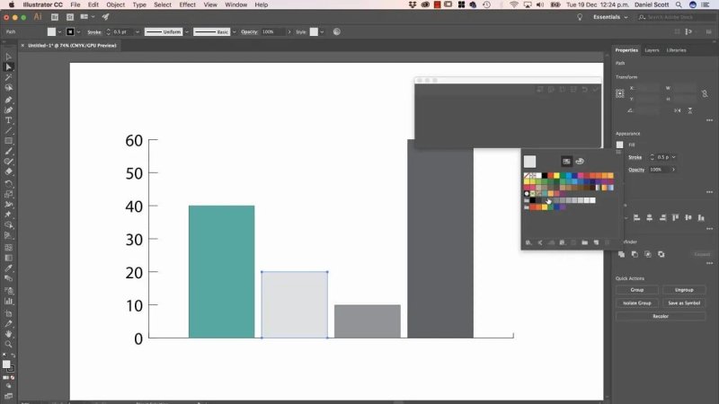
Illustrator makes it straightforward to style individual graph bars with a publication colour palette.
Paste the Illustrator Chart into InDesign
Before copying, close the graph data sheet. If that data window is open, copying and pasting into InDesign will not work properly. Once it is closed, select the chart, choose Edit > Copy, then paste it into InDesign.
This is the really nice part: the pasted chart can be ungrouped in InDesign. Its elements become separate pieces that can be adjusted further, including type and individual graphic elements. That makes Illustrator a strong choice when the chart needs to be tailored heavily as part of the editorial layout.
Build a Chart in Excel and Paste It into InDesign
If somebody has supplied the data in Excel, it often makes sense to create the chart there. This workflow requires Microsoft Excel, not Google Sheets.
First, select the data range in the worksheet. Go to Insert and choose the chart type you need. Excel can generate a line chart, column chart, pie chart, and plenty of other formats very quickly.
Before bringing it into InDesign, tidy up the appearance in Excel. Set the font you want, edit the chart title, adjust line colours, and make any necessary formatting changes. Unlike an Illustrator graph, this chart will not be editable as individual chart parts after pasting into InDesign, so do the data and styling work first.
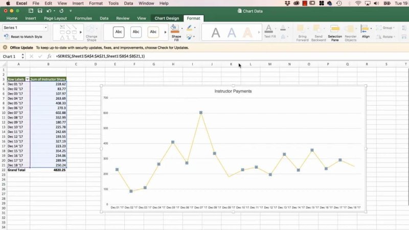
Format the chart in Excel first, because its individual elements will not be editable after it is pasted into InDesign.
Copy the chart by clicking its outside edge, then paste it into InDesign. The useful thing here is that the pasted chart remains vector artwork. You can scale it up without it becoming pixelated, which is exactly what you want for print layouts.
Use Excel when your chart is data driven, already lives in a spreadsheet, or needs to be built rapidly from rows and columns of numbers. Use Illustrator instead when visual customisation and layout-level editing matter most.
Create Pie Charts Directly in InDesign with Chartwell
Chartwell is a paid font family that turns typed numbers into charts. It is one of those clever little tricks that feels slightly magical the first time it works.
The font family includes styles for bar charts, line charts, pie charts, and more. Individual styles can be purchased separately, or the complete family can be bought if you need a broader set of chart types. After purchasing, download and install the font just as you would any other font.
For pie charts, choose Chartwell Pies as the font in an InDesign text frame. The chart is driven by ligatures and OpenType settings.
Set Up the Numbers and Colours
Type the values for each pie slice, separated by plus signs. The values must total 100. For example:
30+50+20
Each number needs its own colour, because those colours become the pie slices. In this example, 30 could be green, 50 pink, and 20 yellow. The plus signs can remain in the text while you are setting up the chart.
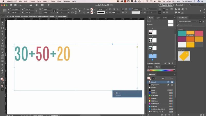
Chartwell pie charts begin as simple colour coded values that add up to 100.
Turn On the Chartwell Pie Chart
Select the text and make sure the font is set to Chartwell Pies. Then enable Stylistic Set 1 through the OpenType controls. The typed values are immediately converted into a pie chart made from the colours assigned to each number.
If the OpenType icon is not visible in the Control panel, turn on the relevant options in:
InDesign > Preferences > Advanced Type on Mac
Edit > Preferences > Advanced Type on Windows
You can also open the Character panel with Command + T on Mac or Ctrl + T on Windows, then use the OpenType menu to turn on Stylistic Sets.
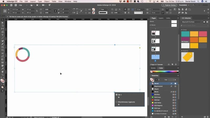
Once Stylistic Set 1 is enabled, the colour coded values become a clean Chartwell pie chart.
Chart size is controlled by the font size. Increase the point size and the chart grows, just as normal text would.
Add More Pie Slices
Adding another segment is easy. Adjust the values so the total is still 100, then add a new value and give it a different colour. For example, changing the values to 30+40+20+10 creates a four-slice pie chart.
The key rule is simple: every segment needs a unique colour, and all the values together need to equal 100.
Add a Centre Circle to Make a Doughnut Chart
Chartwell Pies also lets you add a central circle, turning a standard pie chart into a doughnut chart. Add a letter at the end of your number string and give that letter the colour you want for the centre.
The letter controls the size of the central disk:
Lowercase a through z creates progressively larger centre circles, up to roughly halfway.
Uppercase A through Z continues increasing the size for the rest of the range.
A lowercase a produces the smallest centre dot. An uppercase Z produces the largest. A letter around the middle, such as uppercase M, gives a useful mid-sized centre hole.
Edit Chartwell Data More Easily with Story Editor
Turning Stylistic Set 1 on and off is perfectly workable, but the Story Editor can make the data easier to edit. Open it from Edit > Edit in Story Editor.
The Story Editor strips away much of the formatting and lets you focus on the plain text. That is handy when values need changing, particularly when the chart has several slices. Update one number, compensate elsewhere so the total remains 100, then return to the layout and the chart updates.
This only works while the chart remains live text. Keep an editable version somewhere safe before converting it into shapes.
How to Create an Exploded Pie Slice in InDesign
Chartwell can produce the pie chart, but it cannot push one pie segment outward while it is still editable text. To create that effect, convert the chart to outlines.
Select the live Chartwell chart with the Selection tool.
Choose Type > Create Outlines.
Ungroup the outlined result.
Select the slice you want to highlight and move it away from the rest of the pie.
Add labels or callouts to explain what that slice represents.
Once outlines are created, the chart is no longer editable as text. You cannot return to Story Editor and change the numbers, so keep a duplicate of the original live chart before taking this step.
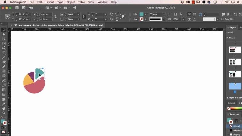
After outlining and ungrouping, an individual pie slice can be pulled out to emphasise the important data point.
Which Chart Method Should You Use?
There is no single best method. Choose the option that fits the job.
Use Illustrator when you need graph-building tools and want the flexibility to ungroup and refine the artwork in InDesign.
Use Excel when the data is already in a spreadsheet and you need a fast, scalable vector chart.
Use Chartwell when you want to make simple charts directly inside InDesign and are happy to work with a paid font family.
InDesign is the place where the page comes together, but it is not a full graphing application. Bring in the strengths of Illustrator or Excel when needed, or use Chartwell for quick, smart typographic charts that stay right inside the document.
FAQ's
Can InDesign make bar graphs and line charts?
InDesign does not include native graphing tools. Create bar graphs and line charts in Illustrator or Excel, then copy and paste them into InDesign as vector artwork. Chartwell also offers separate font styles for bar and line chart designs.
Are Excel charts pixelated when pasted into InDesign?
No. A chart copied from Excel into InDesign remains vector based, so it can be enlarged without becoming pixelated.
Do Chartwell pie chart values have to equal 100?
Yes. For Chartwell Pies to build a correct pie chart, the values in the text string must add up to 100, and each value needs its own colour.
Can I edit a Chartwell pie chart after creating outlines?
No. Creating outlines converts the live text chart into separate vector shapes. Keep a copy of the original editable chart before outlining it.
Written by Daniel Walter Scott — Founder of Bring Your Own Laptop & Chief Instructor
