How To Pick Beautiful Font Pairings In Adobe InDesign CC
Questions
Student Gallery
Be the first to share something.
Course info
Overview
- You will need a copy of Adobe InDesign 2018 or above. But you find that 95% of all the features in this course will work with earlier version of InDesign (e.g. CS6). A free trial can be downloaded from Adobe.
What am I going to get from this course?
- 70 lectures 5+ hours of well structured content.
- Create PDF Forms
- Master Long Documents.
- Advanced Fonts
- Master Styles
- Shortcut Sheet
- Create Charts & Infographics
- Create Interactive Documents
- Workflow Tactics
- Shortcuts & Speed Tips
- Advanced Creative Cloud Features
- Tips for working with Photoshop & Illustrator
- Using Scripts
- Exporting, Prepress & Printing tricks
- You will get the finished files so you never fall behind.
- Downloadable exercise files & cheat sheet.
- Forum support from me and the rest of the BYOL crew.
- Techniques used by professional graphic designers.
- Professional workflows and shortcuts.
- A wealth of other resources and websites to help your accelerate your career.
What is the target audience?
- This course is for people who already know InDesign and want to take their skills and speed to the maximum level.
- This is an advanced InDesign course, so you’ll need basic InDesign skills to find this course useful.
- This course is perfect for anyone that already knows how to insert images & add text.
- If you a completely new to InDesign try my InDesign Essentials course before starting this one.
- This course is perfect for anyone that has completed my InDesign Essentials course.
Course duration 7 hours 45 mins + your study.

Daniel Walter Scott
Founder of Bring Your Own Laptop & Chief Instructor
I discovered the world of design as an art student when I stumbled upon a lab full of green & blue iMac G3’s. My initial curiosity around using the computer to create ‘art’ developed into a full-blown passion, eventually leading me to become a digital designer and founder of Bring Your Own Laptop.
Sharing and teaching are a huge part of who I am. As a certified Adobe instructor, I've had the honor of winning multiple Adobe teaching awards at their annual MAX conference. I see Bring Your Own Laptop as the supportive community I wished for when I was first starting out and intimidated by design. Through teaching, I hope to bring others along for the ride and empower my students to bring their stories, labors of love, and art into the world.
True to my Kiwi roots, I've lived in many places, and currently, I reside in Ireland with my wife and kids.
Downloads & Exercise files
How do I choose fonts that work well together?
A simple way to choose fonts is to use a proven font pairing: one font for headings and another for body copy. Search for Typekit or Google Font pairings, find a combination you genuinely like, then use those exact fonts rather than defaulting to the same old choices.
Font Pairing: How to Find Better Heading and Body Copy Combinations
Font pairing is simply the process of choosing two different fonts that work nicely together: a heading font and a body-copy font. It is one of the easiest ways to make a layout feel more considered without having to become a typography expert overnight.
If you keep reaching for the same fonts on every project, you are not alone. It is very easy to get stuck using a familiar combination such as Museo, Roboto, or Lust repeatedly. Font pairings give you a quick route out of that rut because somebody has already done the initial visual exploration for you.
Use Font Pairings Instead of Guessing
The goal is not to pick two random fonts and hope they behave. A good pairing gives the heading and paragraph text different jobs, while making them feel as though they belong on the same page.
Rather than trying to identify a font from a finished design, start with combinations that have already been presented together. You can judge the relationship immediately: the contrast, the personality, and whether the body copy still feels comfortable to read.
Find Typekit Font Pairings with Google Images
A very straightforward method is to search Google for Typekit font pairings, then switch to the Images results. This gives you a quick visual library of heading and body-copy combinations to browse.
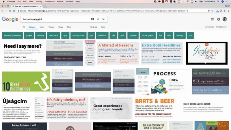
Image search makes it quick to compare a wide range of ready-made Typekit pairings.
This is particularly useful when you already work with Typekit fonts, because the examples use fonts you can access. There is no need to fall in love with a type treatment and then spend ages trying to work out what the fonts are or where to get them.
Search for Typekit font pairings.
Open the Images tab.
Scan the examples until a combination jumps out.
Open an example to see the fonts used.
Go to Typekit, get the two fonts, and test them in your own layout.
For example, if you find a combination that feels right, such as Gibson paired with another complementary face, you can go directly to Typekit and start using it in your designs. The important bit is that you are selecting a pairing based on how it works together, rather than choosing each font in isolation.
Do the Same with Google Font Pairings
The same approach works for Google Font pairings. Search for the term, browse the image results, and look for something that suits the tone of the work.
One pairing worth noting is Open Sans Condensed for headings with Lora for body copy. The condensed sans serif brings a clear, compact structure to the heading, while Lora provides a different feel for longer text. That contrast is exactly what makes a heading and body pairing useful.
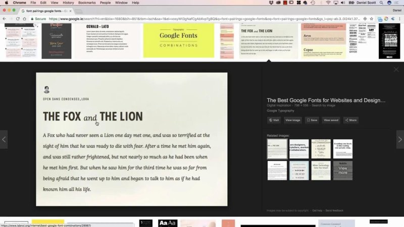
A useful pairing lets the headline stand apart while keeping the body copy easy to read.
When browsing, do not overthink the theory at first. If you look at a pairing and think, “Yep, I like that combination,” it is a perfectly good starting point. Put it into a real page and see whether it works with your content.
Browse Curated Combinations on Just My Type
Another very useful resource is JustMyType.co. It presents curated font combinations in full page-like samples, so you can see a headline, text blocks, and the overall character of each pairing rather than just two font names listed side by side.
Choose the Typekit pairings section and browse through the options. It is similar to looking through image results, but with a major advantage: the site provides direct links to the relevant Typekit fonts.
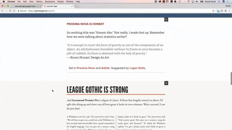
Full text samples reveal how a font pairing holds together beyond a single headline.
There is one small catch. Pages with lots of web fonts can take a while to load. Give Just My Type time, potentially one to five minutes. Until the fonts download, the page may display a fallback such as Times New Roman, which will make the examples look rather unimpressive.
Once everything has loaded, though, it becomes a genuinely handy place to explore. You can compare the type treatments, spot the combinations you like, and follow the direct font links when you are ready to use one.
A Simple Workflow for Better Typography
Keep this process practical. You do not need to reinvent typography for every document.
Decide whether you need Typekit fonts or Google Fonts.
Search specifically for pairings from that library.
Browse visual examples rather than font lists alone.
Choose one heading font and one body-copy font that you like together.
Use the pairing in your design and assess it with your actual copy.
That is really the point of font pairing. It gives you a reliable way to break free from familiar choices, find fresh combinations, and make type decisions faster. Instead of using Museo, Roboto, and Lust over and over again, you have a simple set of places to find something new that already works.
FAQs
What is a font pairing?
A font pairing is a combination of two fonts, usually one for headings and one for body copy, chosen because they work well together visually.
Where can I find Typekit font pairings?
Search Google for Typekit font pairings and browse the Images results. JustMyType.co also provides curated Typekit pairings with direct font links.
Can I find font pairings for Google Fonts?
Yes. Search for Google Font pairings and browse visual examples. Open Sans Condensed with Lora is one example of a heading and body-copy combination.
Why does Just My Type take time to load?
The site loads many fonts, which can take one to five minutes. A fallback font may appear first, so wait until the intended fonts have finished loading before judging a pairing.
Written by Daniel Walter Scott — Founder of Bring Your Own Laptop & Chief Instructor
