Using Color Modes In Adobe InDesign CC
Questions
Student Gallery
Be the first to share something.
Course info
Overview
- You will need a copy of Adobe InDesign 2018 or above. But you find that 95% of all the features in this course will work with earlier version of InDesign (e.g. CS6). A free trial can be downloaded from Adobe.
What am I going to get from this course?
- 70 lectures 5+ hours of well structured content.
- Create PDF Forms
- Master Long Documents.
- Advanced Fonts
- Master Styles
- Shortcut Sheet
- Create Charts & Infographics
- Create Interactive Documents
- Workflow Tactics
- Shortcuts & Speed Tips
- Advanced Creative Cloud Features
- Tips for working with Photoshop & Illustrator
- Using Scripts
- Exporting, Prepress & Printing tricks
- You will get the finished files so you never fall behind.
- Downloadable exercise files & cheat sheet.
- Forum support from me and the rest of the BYOL crew.
- Techniques used by professional graphic designers.
- Professional workflows and shortcuts.
- A wealth of other resources and websites to help your accelerate your career.
What is the target audience?
- This course is for people who already know InDesign and want to take their skills and speed to the maximum level.
- This is an advanced InDesign course, so you’ll need basic InDesign skills to find this course useful.
- This course is perfect for anyone that already knows how to insert images & add text.
- If you a completely new to InDesign try my InDesign Essentials course before starting this one.
- This course is perfect for anyone that has completed my InDesign Essentials course.
Course duration 7 hours 45 mins + your study.

Daniel Walter Scott
Founder of Bring Your Own Laptop & Chief Instructor
I discovered the world of design as an art student when I stumbled upon a lab full of green & blue iMac G3’s. My initial curiosity around using the computer to create ‘art’ developed into a full-blown passion, eventually leading me to become a digital designer and founder of Bring Your Own Laptop.
Sharing and teaching are a huge part of who I am. As a certified Adobe instructor, I've had the honor of winning multiple Adobe teaching awards at their annual MAX conference. I see Bring Your Own Laptop as the supportive community I wished for when I was first starting out and intimidated by design. Through teaching, I hope to bring others along for the ride and empower my students to bring their stories, labors of love, and art into the world.
True to my Kiwi roots, I've lived in many places, and currently, I reside in Ireland with my wife and kids.
Downloads & Exercise files
Transcript
Hey there, in this video we're going to look at Color Modes in InDesign. What are Color Modes? Basically it's how these colors interact with the background colors. So this black here isn't just transparent. It's doing something a little nice with the background. You can see, this orange box here, or this orange circle has a nice kind of interaction with the background as well. These are called Color Modes. Let's go and look at how to make those now.
Color Modes are kind of an advanced thing. Mostly done in Photoshop, but you can do it here in InDesign, and I'll show you what they do. Let's grab the Ellipse tool. I'm going to click, hold, and drag out a big Ellipse. If you hold 'Shift' while you're dragging it, it makes a perfect circle. If you hold down the 'Option' key on a Mac, as well, so 'Shift Option', or if you're on a PC, it's 'Shift Alt'. You can drag from the center, that can be kind of handy. I'm going to drag this up here, and I'm going to put it-- I'm just making kind of a background thing. I'm going to send it all the way to the back. And then move it in so it's just above my image there.
Now I'm going to pick one of the colors, I'll pick this orange here. And Color Modes are in 'fx'. I want to go to 'Transparency', that's the one I use the most. You can go to 'Object', 'Effects', a long way, and go to 'Transparency', it doesn't matter. You get to the same place, and what we're looking for is this one here called 'Blending Modes'. 'Normal' is what it is by default. We'll just go look at some of the other options in here. 'Multiply' often gives us kind of the thing we're looking for. And that's what I'm looking for, just some sort of connection with the background because if you just go to 'Normal', and lower the opacity, it's kind of like washed out kind of color. Whereas if you use one of these Blending Modes you can get some more interesting connections with that background color.
Now, 'Multiply' is not the only one. Go through the range and see what you might want to do. You can see, there's some interesting effects. I'm just doing it because I want a different effect. And we got a 'Hard Light', let's go crazy. So that is Blending Modes. We'll use it quite a bit in this course.
The other thing I want to do is this thing here, maybe this image is just a bit too bright. So I'm going to grab the Rectangle tool, and I'm going to use another Color Mode. The one I use the most is 'Multiply', so I'm going to put a big rectangle over the top of this. I'm going to fill it with Black through the top here, click on 'Black'. And I'm going to send it to the back again, bring it forward one. So it's just above my image, and I'm going to go back to that Transparency mode. We're going to use 'Multiply'. I'm going to lower the Opacity down a little bit, so we get this kind of like, nice, I don't know-- darkening the background, that's all I'm doing.
That's it for Color Modes, let's look at the next color trick.
How do you use colour modes in InDesign?
In InDesign, colour modes are applied through Transparency using the Blending Modes menu. Place a coloured shape over an image or background, choose a mode such as Multiply or Hard Light, then adjust opacity if needed to create a more natural, integrated effect.
How to Make Colour Modes in InDesign
Colour modes are all about how one colour interacts with the colours beneath it. Rather than simply placing a solid shape on top of an image, blending modes let that shape react to the background. It is a handy way to make layouts feel more connected, add colour treatment to an image, or darken a photograph without leaving InDesign.
These effects are commonly associated with Photoshop, but InDesign has useful blending controls built right in. The key is knowing where to find them and understanding why a blending mode often looks much better than just reducing opacity.
What Colour Modes Do in InDesign
A shape set to the default Normal blending mode sits over whatever is underneath it. If the shape is solid, it completely covers the content below. Reducing its opacity makes it transparent, but the result can look pale and washed out.
A blending mode works differently. It calculates how the shape's colour and the underlying colours combine. This can preserve a stronger colour while still allowing the image, texture, and tonal detail beneath to influence the result.
That makes blending modes particularly useful for:
Adding an integrated coloured circle, rectangle, or graphic shape over a photograph.
Creating a more interesting connection between overlapping colours.
Adding a coloured tint to part of an image.
Darkening an image behind type or other design elements.
Create a Blended Colour Shape
Start by creating a shape. For a circular background element, select the Ellipse Tool, click and drag, and hold Shift while dragging to constrain it to a perfect circle.
If you want to draw the circle outward from its centre rather than from a corner, hold Shift + Option on a Mac or Shift + Alt on a PC. This is a small shortcut, but it is genuinely useful when positioning circles behind other elements.
Place the shape where it needs to go, then arrange its stacking order. In this case, the circle belongs behind the foreground sale tag and text, but above the image. Send it towards the back, then bring it forward until it sits immediately above the image layer.
Choose a fill colour for the shape, such as orange. At this point, it may still look like a flat block of colour, which is exactly where blending modes come in.
Find the Blending Modes Menu
With the shape selected, open the Effects controls and choose Transparency. You can also reach the same controls through Object > Effects > Transparency.
Within the Transparency dialogue box, look for the Blending Mode menu. It is set to Normal by default, and this is where you can experiment with the other options.
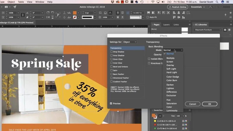
The Transparency dialogue is where a flat shape starts interacting with the artwork beneath it.
Try Multiply First
Multiply is one of the most useful blending modes for this kind of work. It makes the applied colour blend into the image beneath it, usually producing a richer, more connected result than lowering the opacity in Normal mode.
For an orange shape over a photograph, Multiply can create a warm overlay while retaining the image detail and shadows underneath. It is often a great first option when you want the new colour to feel like it belongs in the composition.
Experiment with Other Effects
Multiply is not the only option. Work through the menu and see what suits the design. Different background colours and images produce very different results, so this is one of those areas where trying options is part of the process.
For a more dramatic treatment, Hard Light can produce a much stronger effect. It is a more energetic choice when a subtle colour connection is not enough and you want the overlap to become a deliberate feature of the layout.
The important thing is not to treat blending modes as a one-size-fits-all setting. Select the object, test a few modes, and keep the one that gives the visual effect you are after.
Why Opacity Alone Can Look Washed Out
It is tempting to leave a shape on Normal and simply lower the opacity. Sometimes that is fine, but it often gives you a faded version of the original fill colour. The colour becomes weaker rather than more integrated.
Blending modes give you a different outcome. They retain more personality in the colour while using the existing image to shape the final appearance. This is why an orange overlay using a blending mode can feel more intentional than a semi-transparent orange rectangle.
Darken an Image with a Black Multiply Overlay
Another practical use for colour modes is darkening a background image. If the image is a little too bright, you do not need to edit it externally. Add a black rectangle above the image and use Multiply.
Select the Rectangle Tool and draw a rectangle over the part of the image you want to darken.
Fill the rectangle with black.
Arrange the rectangle so it is directly above the image but below the foreground content.
Open Effects > Transparency.
Set the blending mode to Multiply.
Lower the opacity until the darkening feels right.
This gives you a simple, controllable darkening effect. The image remains visible, but its brightness is reduced enough for the surrounding layout to feel more balanced.
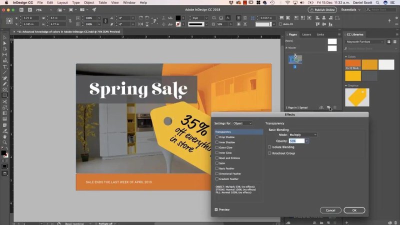
A black rectangle set to Multiply provides a quick way to bring a bright image under control.
Keep the Layer Order Right
Blending modes can only affect the artwork beneath the selected object, so layer order matters. A coloured shape positioned behind an image will not tint that image. A black overlay placed above all your text will darken the text too.
For the usual image-overlay effect, the stack should look like this:
Foreground text, tags, and key graphic elements at the top.
The colour or black overlay directly beneath those elements.
The image beneath the overlay.
Any background elements at the bottom.
Get that order right first, then adjust the blending mode and opacity. It makes the process much less confusing.
A Simple Rule for Using Blending Modes
Use Normal when you want a shape to remain a flat, independent object. Use a blending mode when you want that shape to interact with the image or colours below it.
Start with Multiply for darkening and richer overlays. Try Hard Light when you want something bolder. Then keep experimenting, because the most useful part of blending modes is seeing how each one changes the relationship between the colours already in your design.
FAQs
Where are blending modes in InDesign?
Select an object, then open Effects > Transparency. The Blending Mode menu appears in the Transparency dialogue box. You can also access it through Object > Effects > Transparency.
What is the best blending mode for darkening an image in InDesign?
Multiply is a useful choice for darkening an image. Place a black rectangle above the image, set it to Multiply, and lower the opacity until the image has the level of darkness you need.
Why should I use a blending mode instead of lowering opacity?
Lowering opacity in Normal mode can make a colour look weak or washed out. A blending mode lets the colour interact with the image below it, often producing a stronger and more integrated result.
How do I make a perfect circle in InDesign?
Use the Ellipse Tool and hold Shift while dragging. To draw the circle from its centre, hold Shift and Option on a Mac, or Shift and Alt on a PC.
Written by Daniel Walter Scott — Founder of Bring Your Own Laptop & Chief Instructor
