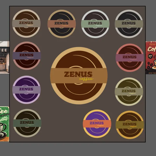
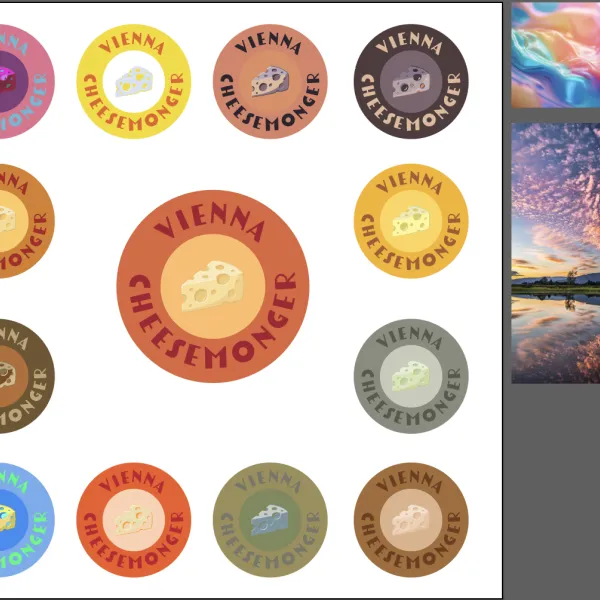
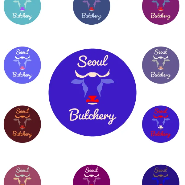
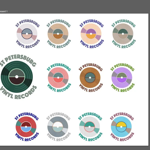
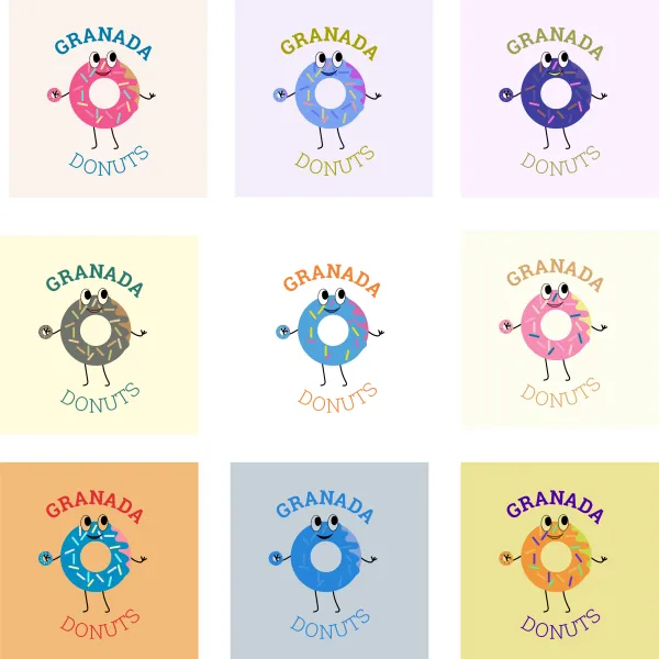
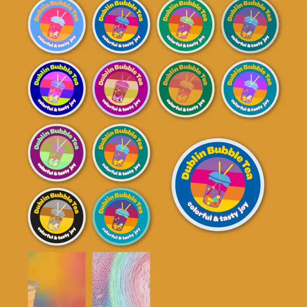
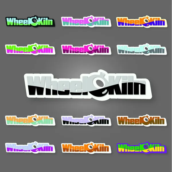
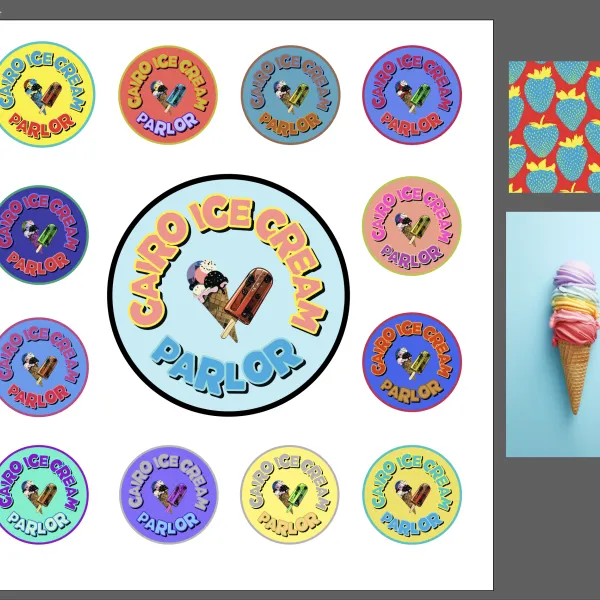
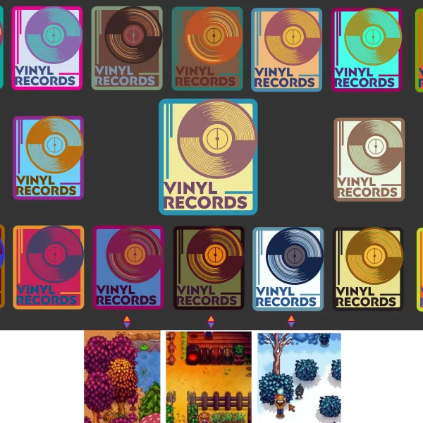
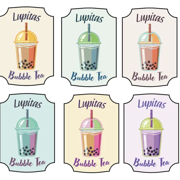
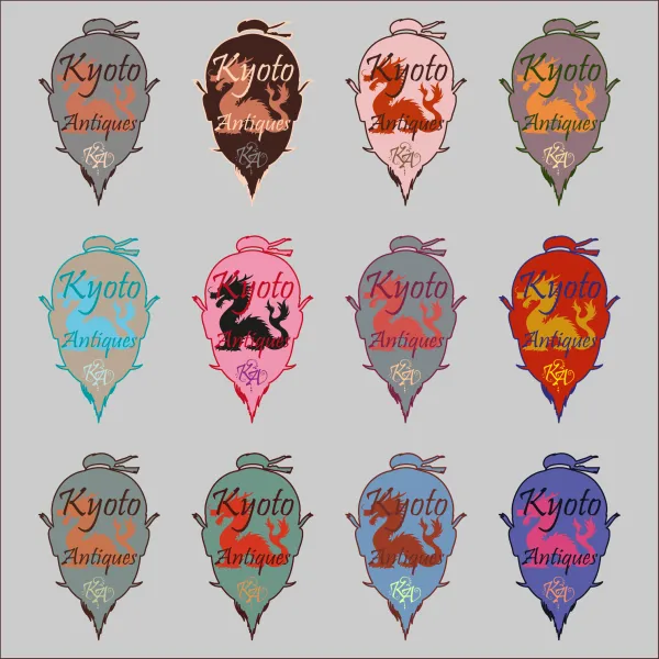
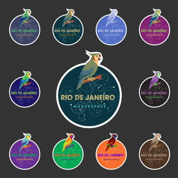
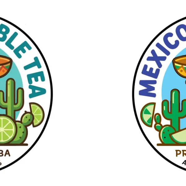
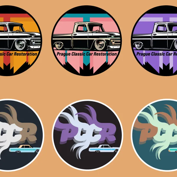
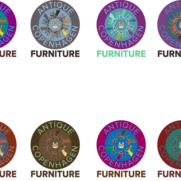
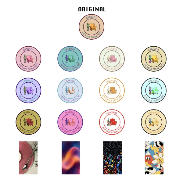
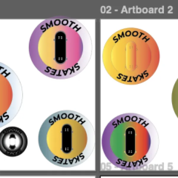
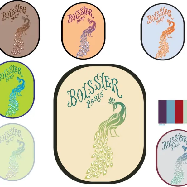
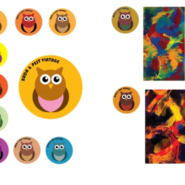
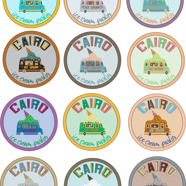
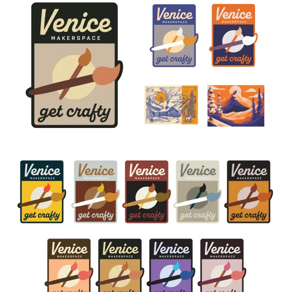
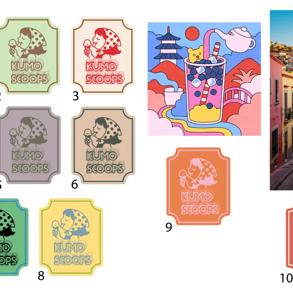
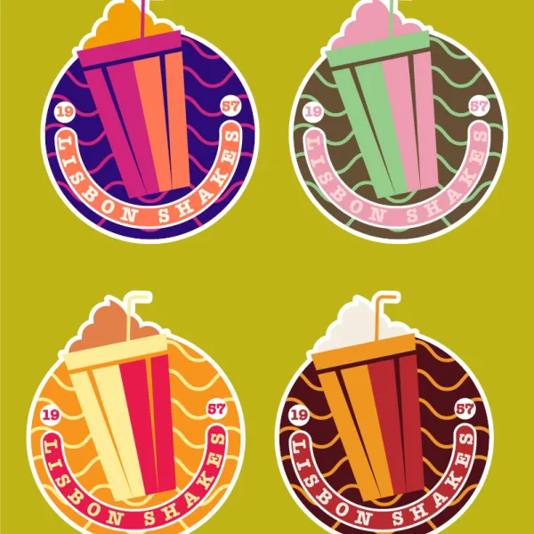
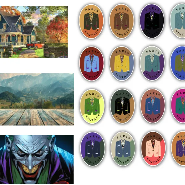
Class Project 10 - Sticker
Questions


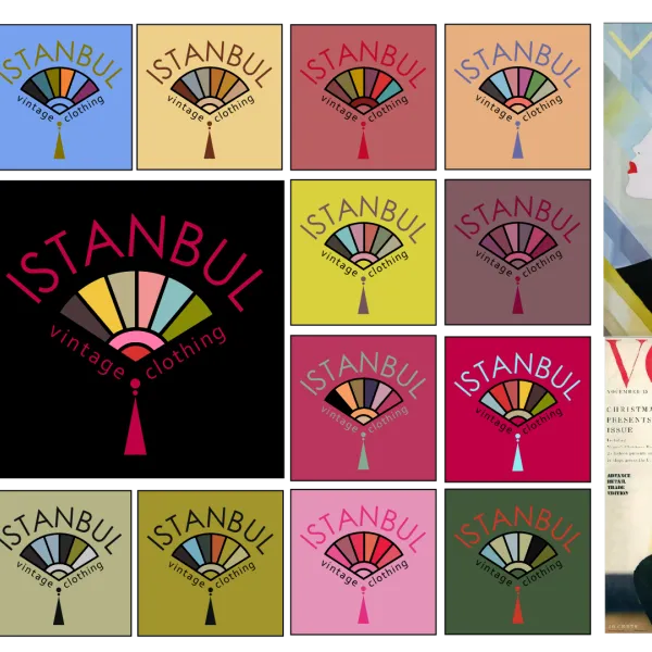
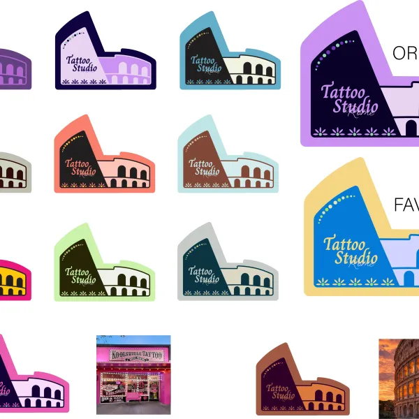
Student class projects


Course info
Overview
- - How to use artificial intelligence to boost your creativity in ideation.
- - The quick way to take hand-drawn sketches and vectorize and color them.
- - The building blocks needed to set you loose on a huge variety of beautiful effects and techniques.
- - To make beautiful charts and graphs for your documents.
- - Color mastery to make quick color adjustments, Pantones, and blend it all together beautifully.
- - How to master images inside of your illustrator workflow.
- - To harness all the secret gems that'll help you level up your typography skills.
- - All the tricks of the trade for drawing complex shapes easily.
- - To double your creativity with the Transform and Distort section.
- - To speed up your personal workflow to get the most out of your creative day.
- The Curvature Tool
- How to master corners with corner widget effects
- How to work with Compound Paths
- The difference between Expand & Expand Appearance
- How to create Graphic Styles
- How to make Symbols
- How to use the Smooth Tool
- Advanced use of Simplify Path
- What Live Shape Effects are for
- How to make Repeating Grids & Concentric Circles
- How to make Random Objects
- Advanced Keyboard Shortcuts in Illustrator
- How to add a Gradient on a Stroke
- How to add a Gradient in Text
- How to use the Freeform Gradient tool
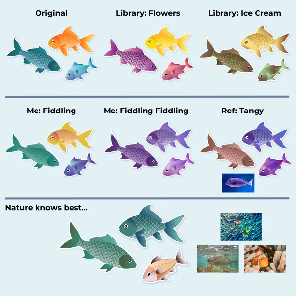
- How to use Advanced Color Swatches
- How to use Global Color Swatches
- What is the difference between RGB vs CMYK color modes?
- How to proof colors
- How to use Pantone Spot Colors
- Recolor Artwork & Changing all colors at once
- How to use Blending Modes
- How to work with Images & Blending Modes
- How to make Black & White Images
- Learn Advanced Workflow Tricks
- All the Super Selection Mastery
- How to use the History Panel
- Advanced Fonts Tricks & Tips
- Use Retype to know what Font is being used
- How to put Text Inside a Letter or Shape
- How to use the Touch Type Tool
- How to add a Connected Stroke Around Multiple Shapes
- How to Offset a Stroke with Text
- How to make a Bar Chart in Illustrator
- How to make a Pie Chart in Illustrator
- Layer Power Moves
- Advanced Artboard & Pages Tricks
- How to Unlink vs Embedded Images
- How to Crop Images Rather than Mask
- How to Mask Inside Text & Multiple Shapes
- How to you use the Puppet Warp Tool
- How to use the Distort Envelope Shape & Type
- How to use the Envelope Mesh
- How to blend lines together
- How to make a Linocut Effect
- How to make 3D Gradient Lettering Blends
- How to spin text into a ring
- How to turn text into a 3D donut shape
- How to make a Duotone image effect
- How to make a Roughen Stamp Vector Effect
- How to make a Neon Sign Glow Effect
- How to use a Halftone Effect using Plugins
- Advanced Exporting Assets Tricks in Illustrator
- How to use the Dimension Tool
So what're you waiting for? Let's start the course now!

Daniel Scott
Founder of Bring Your Own Laptop & Chief Instructor
instructorI discovered the world of design as an art student when I stumbled upon a lab full of green & blue iMac G3’s. My initial curiosity around using the computer to create ‘art’ developed into a full-blown passion, eventually leading me to become a digital designer and founder of Bring Your Own Laptop.
Sharing and teaching are a huge part of who I am. As a certified Adobe instructor, I've had the honor of winning multiple Adobe teaching awards at their annual MAX conference. I see Bring Your Own Laptop as the supportive community I wished for when I was first starting out and intimidated by design. Through teaching, I hope to bring others along for the ride and empower my students to bring their stories, labors of love, and art into the world.
True to my Kiwi roots, I've lived in many places, and currently, I reside in Ireland with my wife and kids.
Downloads & Exercise files
- Powered by Marvin
- Terms of use
- Privacy policy
- Cookie policy
-
- © Bring your Own Laptop Ltd 2026