How to use a Halftone Effect using Plugins in Illustrator?
Questions


Student Gallery
Course info
Overview
- - How to use artificial intelligence to boost your creativity in ideation.
- - The quick way to take hand-drawn sketches and vectorize and color them.
- - The building blocks needed to set you loose on a huge variety of beautiful effects and techniques.
- - To make beautiful charts and graphs for your documents.
- - Color mastery to make quick color adjustments, Pantones, and blend it all together beautifully.
- - How to master images inside of your illustrator workflow.
- - To harness all the secret gems that'll help you level up your typography skills.
- - All the tricks of the trade for drawing complex shapes easily.
- - To double your creativity with the Transform and Distort section.
- - To speed up your personal workflow to get the most out of your creative day.
- The Curvature Tool
- How to master corners with corner widget effects
- How to work with Compound Paths
- The difference between Expand & Expand Appearance
- How to create Graphic Styles
- How to make Symbols
- How to use the Smooth Tool
- Advanced use of Simplify Path
- What Live Shape Effects are for
- How to make Repeating Grids & Concentric Circles
- How to make Random Objects
- Advanced Keyboard Shortcuts in Illustrator
- How to add a Gradient on a Stroke
- How to add a Gradient in Text
- How to use the Freeform Gradient tool
- How to use Advanced Color Swatches
- How to use Global Color Swatches
- What is the difference between RGB vs CMYK color modes?
- How to proof colors
- How to use Pantone Spot Colors
- Recolor Artwork & Changing all colors at once
- How to use Blending Modes
- How to work with Images & Blending Modes
- How to make Black & White Images
- Learn Advanced Workflow Tricks
- All the Super Selection Mastery
- How to use the History Panel
- Advanced Fonts Tricks & Tips
- Use Retype to know what Font is being used
- How to put Text Inside a Letter or Shape
- How to use the Touch Type Tool
- How to add a Connected Stroke Around Multiple Shapes
- How to Offset a Stroke with Text
- How to make a Bar Chart in Illustrator
- How to make a Pie Chart in Illustrator
- Layer Power Moves
- Advanced Artboard & Pages Tricks
- How to Unlink vs Embedded Images
- How to Crop Images Rather than Mask
- How to Mask Inside Text & Multiple Shapes
- How to you use the Puppet Warp Tool
- How to use the Distort Envelope Shape & Type
- How to use the Envelope Mesh
- How to blend lines together
- How to make a Linocut Effect
- How to make 3D Gradient Lettering Blends
- How to spin text into a ring
- How to turn text into a 3D donut shape
- How to make a Duotone image effect
- How to make a Roughen Stamp Vector Effect
- How to make a Neon Sign Glow Effect
- How to use a Halftone Effect using Plugins
- Advanced Exporting Assets Tricks in Illustrator
- How to use the Dimension Tool
So what're you waiting for? Let's start the course now!

Daniel Walter Scott
Founder of Bring Your Own Laptop & Chief Instructor
I discovered the world of design as an art student when I stumbled upon a lab full of green & blue iMac G3’s. My initial curiosity around using the computer to create ‘art’ developed into a full-blown passion, eventually leading me to become a digital designer and founder of Bring Your Own Laptop.
Sharing and teaching are a huge part of who I am. As a certified Adobe instructor, I've had the honor of winning multiple Adobe teaching awards at their annual MAX conference. I see Bring Your Own Laptop as the supportive community I wished for when I was first starting out and intimidated by design. Through teaching, I hope to bring others along for the ride and empower my students to bring their stories, labors of love, and art into the world.
True to my Kiwi roots, I've lived in many places, and currently, I reside in Ireland with my wife and kids.
Certificates
We’re awarding certificates for this course!
Check out the How to earn your certificate video for instructions on how to earn yours and click the available certificate levels below for more information.
Downloads & Exercise files
Transcript
I'm gonna show you my favorite one. It's from a company called Astute Graphics. They make cool plugins and there are cool people over there. Shout out, uh, Kim Callen. They do many plugins. The one I'm gonna show you is doing this kind of like half tone effect, makes things really cool, adds dots to stuff.
Also give you a quick demo of another one here. We'll use the graphic and the stipple effect. It's very cool. Alright, let's jump in now to find plugins in general. Okay? The best place is probably the exchange, so exchange adobe.com.
Okay. I went to Creative Cloud plugins. I went to Illustrator and there is a lot to have a look at. Um, the one I'm gonna demo today is from Astute Graphics. Okay? So Stute Graphics make a bunch of different plugins.
Uh, the ones I'm gonna show you today are paid. Um, there is a free trial if you do wanna follow along, you can use the link here on screen. They all install relatively the same. Okay? Any of the plugins, you kind of click them, download them, restart, illustrator, and they magically appear. Now to get started, if you are following along, open up uh, plugins from your exercise files and creepy, Dans waiting for you like the effects I'm gonna show you in this one man.
But it's just an example of what plugins, uh, you know, what a powerful plugin can do for you in terms of time saving and the effects that you just can't do inside of Illustrator. Okay? The one I'm gonna show you is both good for images and vector. So we'll do a bit of both and yeah, let's get started. I'll show you some cool half tone effects. So with this image selected, I think you have to have the image embedded, but we know how to do that, okay?
And we're gonna go to effects. And down the bottom here, I'm gonna show you this one here called Phantasm and it's got lots of different options and I'm just gonna show you one 'cause I'm like I can't do this would be super long video. It's already, I know gonna be too long. But let's have a little run through of say half tone. I love the half tone effect. How cool is that?
Now the one thing you will find is some of the effects. There is a half tone under. Let's click okay, let's go to effects. There is a half tone under Photoshop and there's one under pixelate. The only problem is this color half tone. There's not a lot of control.
Let's give it a demo. You effect, um, pixelate and half tone is that there's not a lot of control here, okay? You can kind of bump it around a little bit. And the output unfortunately is pixels. So not vector. Can you see the little um, pixels?
Okay, it's a rust image. So okay but not great plus not the cool effect that I was looking for. So that's the kind of standard uh, half tone effect. Let's have a look at this one here. Let's go back to effect. Let's go to fm.
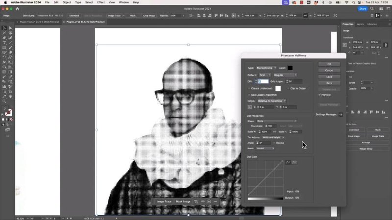
Let's go to half tone. And now the main things in this particular um, plugin I find is nice work around monochrome and sampled. Sampled is from the actual image. It's using sampled colors from the image or kind of monochrome depending on what you're looking to do. Um, the other one is what kind of pattern it is. Okay?
Is it a grid, FM or radial? Okay. Or give you different looks. Okay? And the DPI, how many these dots are in an inch, okay? And the higher, the more dense it is, the lower the kind of simpler it is.
And you might find, okay, mine's kind of keeping up. You see a low DPI makes the computer run a bit faster and if you crank it right up to something high 20, it's gonna say, Hey, it's gonna take a long time. I'm gonna say proceed. It's cool. A let's click okay, zoom in. A couple of things with this particular uh, plugin that I like is with it selected can go to object and expand appearance to kind of get rid of any effects.
Okay? And it's all, if I go command y, CTRL YA pc, look at that. It's all glorious vector. I do like it. Uh, I'm gonna undo. So my effect comes back.
And the other thing to know about this uh, plugin is with it selected, can you see it's over here, it's kind of editable afterwards. You can click on it and it will reopen up the um, dialogue box. So you can go and make changes to it. And what I find really useful is, let's clear account this one. Let's do this guy. Um, I'm not sure which is more creepy.
Probably this guy. My serious face. Okay, with it selected, we are gonna go to effects. We're gonna go to fm. Let's go to Halftone again is there's a lot of control in here. I'm not gonna go through it all, but I do like playing around with it.
What a good starting point is. Can you see this like a little thing over here? Okay, under sittings manager, there's one's kind of built into it. So I like abstract check how cool that is. Let's crank it up a little bit. Oh, DAF punk Dan.
Okay, I'm gonna click okay, let's look at just a couple of the other presets just 'cause I'm excitable. Uh, let's go to Fantasm. Let's go half tone. I'm just gonna actually jump through these. Let's have a look. So dot metrics.
Anybody have that printer back in the day made the big grinding noise printer. We had one at our house, it was awesome. What else have we got? Actually I'm gonna close this and reopen it on a few different images. You wait there and I'll just do some jump cuts. This is another interesting one that is inside the uh, half tone is I use this one here called quick brown fox and basically it switches the dots out for text.
See the dot characteristics instead of being like round, okay, you can pick character and under options I can say BYOL. Okay? And I can click okay and it's using the sampled color from my image. Okay? 'cause monochrome doesn't quite work. Um, but, and it's sampling the color and mixing with the text.
You can see what's going on. It's very cool. I do love me a good plugin, especially when it does a lot of the heavy work of something or an idea that I have. I do like doing that kind of half tone effect to just chunks of the drawing. So I've got this chunk here. I'm gonna ungroup this, grab that bit and I'm gonna copy it and paste it in front.
So remember copy and then command F on a Mac, control F on a pc. So I've got two versions on top. The top one here. I'm gonna change the color. I'm gonna say just make it a bit uh, brighter and less saturated. Okay?
Just so it's kind of like on the top. So get what I've done just on the top. Then I can go effect and just do that half tone to just part of it just to enhance it, you know, just kind of like whoa, even black is cool. Okay? But remember type we can go sample. So it's gonna use the color that we had selected as the dots and then you can just play around with how much DPI you want to use.
I actually wanna go less. Do love that effect. I love how the dots kind of wash out near the edges there. The other thing you can do with half tone is you can start with a gradient. We did a flat color, so what we can do is on the whale here we can say I'm gonna copy and paste in front again. So I've got two versions of it.
Uh, the top one here, I'm going to add a gradient to G key on my keyboard. Click and drag. Click once actually and then decide. We can decide afterwards which way the gradients gonna go. Let's start with I know something like that. And then with it selected with the black arrow go up to effect, go to half tone and go on.
Now I'm gonna mess around with mine and say actually I want a color and I'm gonna pick, I know some sort of dark green thoughts, I'm gonna lower it down a bit. And then the cool thing about it, 'cause it's an active effect, you can go to your GK again and just go, actually I'm gonna drag this bit further along or around different way and get it kinda sense of it. Oh that is cool. Okay, once you kind of got it, you're like awesome. Actually no actually probably a bit further out like that. Do the same thing down here again.
Go copy and paste in front. Then I'm gonna use my eyedropper tool to steal the graphic from there to steal the style and color from that one. And I guess that's where the power of any old plugin is useful. You know, it's that kind of like be able to do something repetitively, consistently, quickly. Lemme show you just one more, uh, useful one from Astute. Let's go to effects.
Um, this is our donut plane from earlier. It has a very text effect look, right? So what I'm gonna do is click just the background and I'm gonna go to effects. I'm gonna go to this one called Text reno. Got one called texture and I really like it for, yeah, adding a bit of like Photoshop ness. Grunge ness is typically a flat vector but retaining the victimness of it, that's the key.
And it's a good example of how different this one works. Okay, so this one here, we are allowed to say, alright, I want to add noise, I want to add a second texture of, I don't know, fine specs. And you can hit plus and add it to it. I'm gonna undo that. So I've got noise applied and you've got this like little triangle thing here and you can kind of slide it in to kind of lower, like shrink the texture and you can play around with different blending modes. I've kind of built it into this little app here, rather than using opacity like we did earlier.
It's gonna find one I like overlay. Looks cool. You can see with just a couple of clicks we've gone and I'm gonna close down texture. We've gone and removed or gone and changed. You know what is quite a, it's got, you know, it's got that noisy kind of stipple look to it now, but it's still uh, vector. Actually there is a stipple one actually let's do it to the plane.
Let's go to effect. There is one called STI bullism. Okay? And go to stipple. Stipple is kind of like half tone except that it doesn't have the kind of faded dots. It's just kind of like, looks like somebody attacked it with a ballpoint pin.
So let's turn preview on and you know, sometimes you're like, huh, but when you end up playing with it for a little while, I'm gonna go up to what? 80% I do like it when it's sampling the object. Oh, instantly look how cool that is. Play around with the dot size. There's lots you can do in all. Actually let's go down to four.
That's The one, the one I played around with and click okay. You can see how quickly it goes from being quite the um, vector AI generated image to something quite, I don't know, special. We call it special. I do like it. So if you do wanna play around with the Astute Graphics one, uh, use the link on the screen here. I'm an affiliate for them.
So if you do end up moving on to a paid account, I get a small cut of that. But I wanted to show you a kind of a plugins video mainly to show you there's, there's just other things illustrator can do when you bolt on other people's plugins. You saw how quickly, like especially this donut plane here, how we got from kind of something to something quite special quite quickly. So don't feel constrained about following some online tutorial where there's like one bazillion effects to go through and you add 10 of them to it and you get something quite different from the tutorial creator. 'cause their image was different, the size was different. Okay?
Uh, sometimes there might be a plugin that'll just super duper help. Alright, that's it. We're all gonna pretend we never saw this guy or that guy. Okay, and move on to the next video by creepy Dans.
Can you add plugins to Adobe Illustrator?
Yes. Illustrator supports third party plugins that add tools, effects, and workflows you do not get out of the box. In many cases they save a huge amount of time and can produce editable vector results that would be awkward, slow, or impossible to build manually.
Using Plugins in Adobe Illustrator to Create Halftone, Texture, and Stipple Effects
Plugins are add-ons for Illustrator, usually made by companies outside Adobe, that bolt extra tools onto the app. Some are tiny and focused. Others are absolute powerhouses.
The real appeal is not just getting a flashy effect. It is speed, repeatability, and control. A good plugin can take an idea that would normally become a messy chain of workarounds and turn it into something fast, editable, and genuinely useful.
A great example is Astute Graphics. Their tools can push Illustrator into areas that feel much more experimental while still keeping the artwork vector based. That is where things get fun.
Where to find Illustrator plugins
If you want a starting point, the Adobe Exchange is one of the easiest places to browse Illustrator plugins. Head to the Creative Cloud plugin area, filter for Illustrator, and you will find a long list of options.
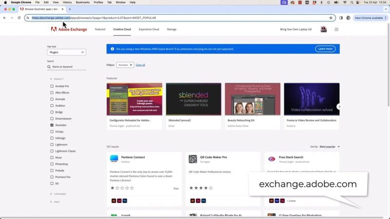
The Adobe Exchange is a solid first stop when you want to see what Illustrator can do beyond the default toolset.
Installation is usually straightforward:
Choose the plugin you want
Download or install it
Restart Illustrator
Look for the new menu items inside Effect or related panels
Some plugins are paid, though many offer a free trial. That makes it easy to test whether a tool actually earns a place in your workflow before spending money on it.
Why plugins are worth bothering with
The point is not simply to collect more effects. The best plugins do two things really well:
They save time on repetitive or fiddly tasks
They open up looks and techniques Illustrator cannot do well on its own
That second point matters. Illustrator does have some built-in effects that sound similar to what plugins offer, but the plugin version often gives you more control and cleaner output.
Built-in halftone versus a plugin halftone
Illustrator includes halftone-style effects under the standard effect menus, including pixel based options borrowed from Photoshop. They can be useful in a pinch, but they come with trade-offs.
The biggest limitation is control. You get only a small set of settings, and the result is raster based rather than vector based. If you zoom in, the output is made of pixels.
That can be fine for certain jobs, but if you want crisp, scalable artwork, it is not ideal.
A plugin-driven halftone effect is a different beast. Instead of flattening the look into pixels, it can build the result as editable vector shapes. That means better scaling, more flexibility, and a much cleaner handoff if you want to keep developing the artwork.
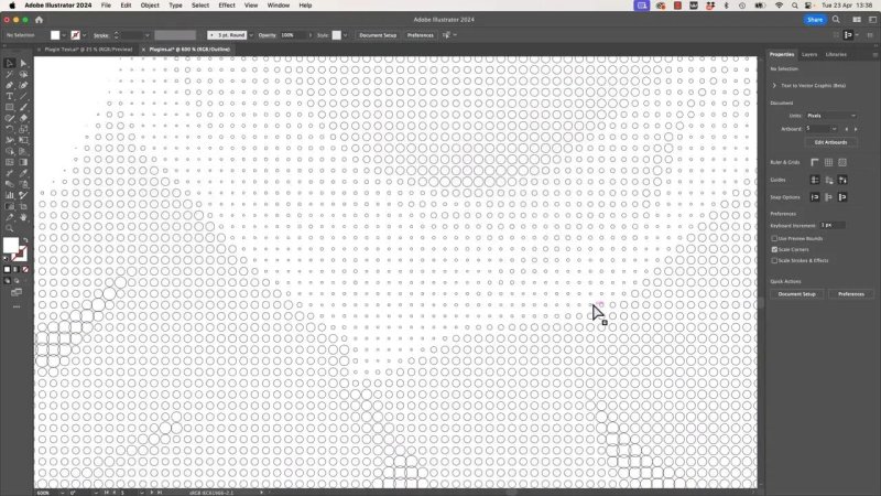
This is the bit that makes the plugin feel special. The halftone is not just a visual trick. It is built as real vector detail.
Creating a vector halftone effect with Phantasm
One of the standout tools here is Phantasm from Astute Graphics. Applied to an embedded image, its halftone effect gives you a lot more control than Illustrator's built-in alternative.
After selecting an image, go to Effect and choose the plugin halftone effect. From there, a proper control panel opens up with settings that meaningfully change the result.
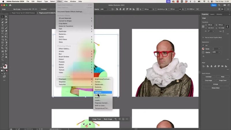
A proper halftone panel gives you room to shape the look instead of settling for a one-size-fits-all filter.
The main halftone settings that matter
You do not need to tweak every option to get good results. A few controls do most of the heavy lifting.
Monochrome or sampled colour: Monochrome gives you a single colour style. Sampled colour pulls colour information from the artwork itself.
Pattern type: Grid, FM, and radial patterns each produce a different character.
DPI: This controls dot density. Higher values produce tighter, denser detail. Lower values feel bolder and simpler.
There is a practical performance angle too. Low DPI settings preview faster. Push the density too high and Illustrator may warn you that the effect is going to take longer to generate.
One of the best parts: it stays editable
This is where a strong plugin really earns its keep. Once the halftone is applied, it is still live. You can select the object again, reopen the effect settings, and adjust the look without rebuilding everything from scratch.
If you eventually want to lock it in as artwork, you can expand the appearance and convert the effect into actual vector paths.
That gives you two very useful phases:
Exploration mode: Keep the effect live while you experiment
Production mode: Expand it when you need fully resolved vector output
Using presets to find a look quickly
Not every project starts with a crystal clear visual plan. Sometimes the fastest route is simply trying presets until something clicks.
Phantasm includes preset styles that make this easy. Rather than adjusting every control manually from zero, you can choose a built-in starting point and then fine tune from there.
Some presets lean abstract. Some push a more retro print feel. Others create oddball results that might not suit every project but can easily spark an idea.
That is one of the nice things about plugins in general. They can help with execution, but they can also help with discovery.
Swapping halftone dots for text
One especially interesting variation replaces the normal dot shapes with characters. Instead of building the image from circular halftone marks, the plugin can use custom text as the building block.
Because the effect can sample colour from the original image, the text based result still carries the colour structure of the artwork. It is a very different look from a standard halftone and can feel much more graphic, playful, or editorial.
If you are after something more experimental than plain dots, this kind of feature is exactly why plugins are worth exploring.
Applying halftone to only part of a vector illustration
Halftone is not just for photos. It can also work beautifully on vector shapes.
A simple way to do it is:
Ungroup the artwork if needed
Select the part you want to treat separately
Copy it and paste it in front
Change the top copy to a lighter or less saturated version
Apply the halftone effect only to that top layer
This creates a layered look where the original shape stays underneath and the halftone version sits above it as a stylistic enhancement.
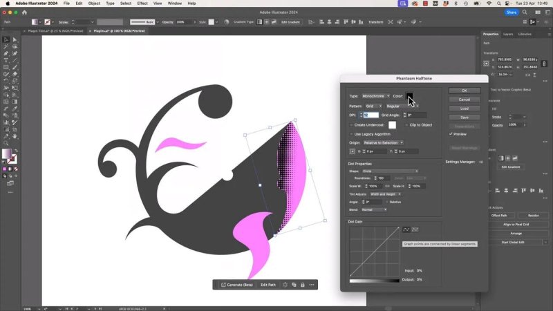
Applying the effect to just one duplicated shape gives you a lot more control than halftoning the whole illustration.
If you switch to sampled colour, the dots inherit the selected colour treatment rather than defaulting to black. That is handy when you want the effect to feel integrated rather than pasted on.
It also lets you keep the rest of the illustration clean while only adding texture where it helps.
Combining gradients with halftone
This is one of the nicest tricks in the whole workflow.
Instead of applying the halftone over a flat fill, start with a gradient on a duplicated vector shape. Then apply the halftone to that gradient filled copy.
Because the effect remains live, you can still grab the Gradient tool and adjust the gradient direction, length, and position after the halftone has been applied. That gives you a much more dynamic fade and lets the dots naturally thin out toward the edges.
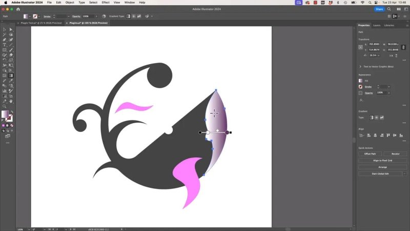
A gradient under the halftone creates that lovely fade where the dots seem to dissolve instead of ending abruptly.
This approach is especially good for:
Adding depth to flat vector art
Creating soft transitions without losing the print-like texture
Reusing the same effect across multiple shapes for consistency
Once you get one version looking right, you can duplicate another area and use the Eyedropper to borrow the same styling.
That is the broader strength of plugin based effects. They make it easier to repeat something consistently and quickly across a design.
Adding vector texture with Texturino
Another useful Astute Graphics tool is Texturino. This one is great when artwork feels a bit too clean, too flat, or too obviously vector.
Instead of moving the piece into Photoshop just to rough it up, you can add noise and texture while staying in Illustrator and keeping a vector friendly workflow.
Using a texture effect like this, you can:
Add grain or speckling
Layer multiple textures together
Adjust scale and strength
Experiment with blend modes inside the effect settings
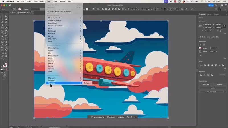
A bit of texture can take artwork from very digital and tidy to something with much more personality.
The nice thing here is subtlety. Even a light pass of noise can break up large flat areas and make the whole illustration feel richer.
On a piece that already looks polished but slightly sterile, this can be the difference between decent and memorable.
Creating a stippled look with Stipplism
If halftone feels too smooth or too regular, a stipple effect can push the artwork in a more organic direction.
Stipplism creates a field of marks that feels more like ink, pen, or stippled illustration. Unlike halftone, which often fades by changing dot size or density in a more ordered way, stippling feels rougher and more hand worked.
Applied to an image, it can look as if someone built the tones using countless tiny marks from a pen.
Stipple is brilliant when you want something less mechanical than halftone and a bit more drawn by hand.
There is plenty of room to experiment with density and mark size, but even a quick adjustment can completely transform the tone of the piece. A very clean source image can suddenly feel textured, moody, and much less synthetic.
That matters a lot with AI-looking or ultra-smooth vector art. The right effect can pull it away from that default polished look and give it a more distinctive surface.
Why this matters more than following long effect recipes
A lot of Illustrator tutorials rely on stacking heaps of effects in a very exact sequence. Sometimes that works. Sometimes it becomes a frustrating game of trying to match someone else's settings on a different image at a different size.
That is where plugins can be a better answer.
Rather than forcing your artwork through ten separate steps just to mimic a style, a single well-made plugin can often get you most of the way there with better control and less guesswork.
That does not mean plugins replace craft. You still need judgement. You still need to know when the effect helps and when it is too much. But they can remove a lot of unnecessary friction.
What makes a good Illustrator plugin worth keeping
Not every plugin deserves a permanent place in your setup. The good ones usually share a few traits:
They solve a real workflow problem
They give you controls that are actually useful
They stay editable for as long as possible
They produce clean, reliable output
They help you work faster without boxing you into one look
That last point is important. The goal is not to make every project look like a plugin preset. The goal is to give yourself stronger options.
FAQ
What is a plugin in Adobe Illustrator?
A plugin is an extra tool or set of features added to Illustrator, usually from a third party developer. It extends what Illustrator can do without replacing the app itself.
Where can I download Illustrator plugins?
A good place to start is the Adobe Exchange, where you can browse plugins by app and category. Many developers also sell or distribute them directly through their own websites.
Are Illustrator plugins free?
Some are free, but many advanced plugins are paid tools. Quite a few offer free trials, which is useful when you want to test the workflow before committing.
Can plugins create vector halftone effects in Illustrator?
Yes. That is one of the big advantages of specialised plugins. Instead of giving you a pixel based filter, they can generate editable vector based halftone results with much more control.
Why use a plugin instead of Illustrator's built-in effects?
Built-in effects are handy, but plugins often provide deeper controls, faster workflows, and better output. In cases like halftone, texture, and stipple, they can produce results that feel more refined and more editable.
Do plugin effects stay editable after you apply them?
Often, yes. Many good plugins apply live effects that can be reopened and changed later. If needed, you can then expand the appearance to convert the result into fixed vector artwork.
If Illustrator has ever felt a bit limited for a particular style, it is worth remembering that the default toolset is not the whole story. Sometimes the fastest route to something genuinely interesting is simply adding the right plugin and letting it do the heavy lifting.
Written by Daniel Walter Scott — Founder of Bring Your Own Laptop & Chief Instructor
