Add text & lower thirds to Premiere Pro
Questions





Student Gallery
Course info
Overview
I am here to help you learn Adobe Premiere Pro and to show you the tools you need to become a successful video editor. Premiere Pro is the industry standard used by professional designers to create stunning, high class videos and, after completing this course, you too can become a confident, skillful and efficient creator of stunning videos.
This course is aimed at people who are completely new to Premiere Pro.
If you are self taught using Premiere, this course will show you techniques you never dreamed were necessary or possible and will show you efficiencies to help speed up your workflow.
The course covers many topics - all of them on a step-by-step basis. We will use real world video editing examples to work through:
- An interview
- A wedding video
- A short commercial
- A documentary
- Social media advertising videos
- YouTube ‘how to’ videos
- Talking head footage mixed with screencasts and voiceovers
We will work with text, animation, motion gfx, special effects and we will add music to our video.
We will learn how to do colour correction, colour balancing and also how to create amazing video transitions within our movie. Technical ‘guru’ topics such as HD v 4K, frames per second, exporting work, fixing up bad audio, balancing and synching audio will all become manageable tasks for you. Best of all...I will show you amazing shortcuts and techniques to speed up your workflow.
Throughout the course we will work on mini projects and I will be suggesting assignments which will add value to your portfolio.
Start your Premiere Pro training now and fast track your career as a video editor.
* Please note, you have full permission to transform and upload any work using footage of Daniel as a part of this course.

Daniel Walter Scott
Founder of Bring Your Own Laptop & Chief Instructor
I discovered the world of design as an art student when I stumbled upon a lab full of green & blue iMac G3’s. My initial curiosity around using the computer to create ‘art’ developed into a full-blown passion, eventually leading me to become a digital designer and founder of Bring Your Own Laptop.
Sharing and teaching are a huge part of who I am. As a certified Adobe instructor, I've had the honor of winning multiple Adobe teaching awards at their annual MAX conference. I see Bring Your Own Laptop as the supportive community I wished for when I was first starting out and intimidated by design. Through teaching, I hope to bring others along for the ride and empower my students to bring their stories, labors of love, and art into the world.
True to my Kiwi roots, I've lived in many places, and currently, I reside in Ireland with my wife and kids.
Certificates
We’re awarding certificates for this course!
Check out the How to earn your certificate video for instructions on how to earn yours and click the available certificate levels below for more information.
Downloads & Exercise files
Transcript
So let's have a look, news bulletin, and watch, this guy, stuff appear here. Where is it? Wait for a second, and then gives you, at the bottom, a little Lower Third that says, this guy's name is Robin Brant, and he's a China correspondent. Same thing for this one here. Let's look at another one. So that's like a traditional Lower Third, but you can use it for anything, it's the same term. I use it quite a bit for - let's have a look. - for social media stuff, so when I start talking, you've probably seen at the beginning of this course, just gives you, like still a Lower Third, it's in that position, lower third of the screen. It could be a logo, or text, typically not an image. Yeah, let's work out how to actually do that Lower Third now in Premiere Pro.
All right, to create our Lower Third's text, we are going to use the Text Tool, there he is there. The bottom of this little tool bar, click on it once, and then click where you want it to get started. I'm going to kind of start it about here, because I know it's going to type off to the right, click once, start typing stuff. Your Type might look different from mine, I'm Daniel Walter Scott. To adjust the text we're going to open up a panel. So we're going to work on 'Window', we're going to go to one called 'Essential Graphics', click on that. Opens with this gang over here.
So a lot of your time in Premiere Pro, is going to be using Lumetri Color, Essential Sound, and Essential Graphics. So what we want to do is, with our Move Tool have this selected, and just make sure our Playhead's kind of in the middle here. Have it selected and click on this one that says Edit. This is the best way of editing text in Premiere Pro. If you use the old titling thing-- we're not going to use that anymore, just so you know, this is the replacement for titling if you have used it before. So we have that selected, we can change the text up here.
So let's look at a couple of things, let's change, we won't go through all the text features, because Centered, Left Align, Right Align, you can work out, there's a lot of just basic text features. Pick a font, we're going to pick anything. I'm going to pick one that I'm using lots of, Museo Sans. Museo. That's been way too long, picking font, I'm going to use this one. Size wise, drag it up, drag it down, to, mine feels appropriate about that sort of size. Obviously you want to design for the longest name you've got. If you've got a series of interviews, and it's with, Dan Scott, it's very short. So you can do some stuff, but if you've got, a really long name, I can't even guess a really long name, but Danielle Wallen Tarantino, you know, big long names, you're going to actually have to, make sure that it kind of like starts over here.
So we're going to get it to about there, and we are-- how am I moving it, that's one question, is back to this Arrow Tool, or the Selection Tool, so Type Tool for editing, Arrow tool, and you can click anywhere on the word and just move it around. So get it to where you want, and pick a font, pick a size. Done that, what else we want to do? Let's look at some of the more unique text features for Premiere Pro. It's down here in this Appearance Panel. Let's have a little look at Shadow. It adds a Drop Shadow, actually let's turn that one off, let's look at Background first, so let's click on 'Background'.
You notice it puts a background behind my text, just to kind of help pull it out. So let's say that I want to do background, but I'm going to do a black background. So it's got a background behind it. Let's change the color of it, by clicking in this, like little square here, and let's open up on my other monitor. I want black, so black is, see this little circle, you can kind of drag it around to pick your color. If you want to change the hue, see this little slider here, say that I want pink, I slide it down to here, and then I move this around to decide on the shade of pink that I want. In my case I want it to be black, so I'm going to drag it all the way up here, and instead of just kind of like getting it close just drag it past. So I've-- I keep my finger on my mouse, I'm dragging, dragging, dragging, and I'm dragging way past where it needs to go, just so it gets really jammed up in that corner, never let go of my mouse, and I've clicked 'OK'.
So I've got a black box in the background here. I'm going to change this one here, the size around it. We're going to drag it up, click, hold, drag, drag, drag. I'm going to drag it right up, can you see where it is? So it adds a box around it, and I like the opacity. Say you don't, you want it to be solid, you can play with this slider here. Drag the opacity right up. So have a play around with these, get your name in there, it's probably weird having your name, type it in, put my name. Get the opacity how you want it. Get the size how you want it, and we will look at Drop Shadow.
How do I show you the Drop Shadow really well? Let's turn Background off, let's look at Shadow. I'm going to do the same thing, for some reason the default is like yucky gray, and then it's transparent out, I don't know why. It's the default anyway, it is at the moment, so I'm going to make it full black, and I'm going to leave the opacity probably. I'm just going to kind of show you the basics for a Drop shadow. You probably know how to do a Drop Shadow, but I'm going to extend it out.
Let's move it up here to make it easier to see, you can see it there. There it is there. So you've got-- we're not going to cover this too much but you got distance, and you've got how fuzzy it is, it's this last one. Can you see, it kind of gets more blurry, and now if I ring it right in, it's nice and sharp. It's up to you what you want to do. You can expand it around the outside of it. Basically this is what I do, this is the direction.
Can you see, if I grab the size, and I drag this, you can kind of drag it around. Click it, just move it around, you'll get a feel for it. Can you see it changing up the top here? So what I do is often, straight up and down, oh, I've spun mine around twice. So I'm going to set mine back to 0. So straight up and down, I might go to actually 80°, so it's pointing straight down. I'm going to lower it right down, and I want the blurry right down. What am I doing now, Dan? Just a real simple Drop Shadow, probably the opacity straight up, and probably put that down to maybe something like 2, just a real subtle, maybe 3. Subtle Drop Shadow. There's no right or wrong, the Drop Shadow, but that's my Drop Shadow, anyway. So I'm going to actually leave the Drop Shadow on, and turn the Background on in one go, just because.
Now a couple of other things I want to show you, is where it appears in the Timeline, I just randomly put it wherever my cursor was. So it's at the wrong time. So what we're going to do is we're going to zoom out, so I'm going to hit minus, ' - ', ' - ', so I can see it. I'm going to zoom a little bit, because what you want to do is grab your Selection Tool, and drag the center of it, trying to grab the ends of it, grab the center of it to kind of move the core of it along. I'm going to kind of move it over here, move my Playhead, and hit ' + ', because remember, you zoom in to wherever this thing is, so if you zoom in over here, zooming in the wrong bit, just get your Playhead where you want it, zoom in a bit.
And how long do you want it? So the duration is in there by default. You can change the duration of this, how long it appears on screen, in your Preferences, but for the moment, let's just say I want to shorten it up. I could just grab the side and just drag it in. It just gets shorter, just on the screen for a short amount of time. Let's have a look. It's up to you. It's a bit of pacing to see how much information is there, how long does it need to be read. Mine's pretty short, so I'm going to, maybe, I want it to kind of finish at the cut, at the transition here.Could be a Cross Dissolve, and it's going to start here.
Now a couple of other things when you're working in here, how do you change the text? Grab the Type Tool, and you can kind of just click on it in here, and start working on it. Change the spelling, or you can do it up in here, you can double click it, and just start typing over the top, depends on how much text you have. You might have lots of different parts of text, for the moment I've only got single. So you can just kind of like double click it up here, and start typing over the top. Typing over the top. I'm going to undo. And that is it, position it.
The one thing when you are positioning text, now when it's going-- it depends on its end format. So if it's going out to television, you need to be a bit more specific about how far away from the edges it is. So if I put it down here, and I'm on a TV that doesn't quite suit my Aspect Ratio, or the shape of my video, it is going to get cut off. So it's very common to have something called Title Safe. Where is it, Dimension In and Out. I'll show you that later on, a bit more detail, but just be wary that it's probably, probably good design as well, just to kind of not have it right at the edges, but know that some screens--
Say you're doing this and it's going to be shown in a-- on a TV inside of a showroom, and go be on loop, you make like some sort of, I don't know, property developer, and it's just going through lots of videos, and it's going to be on loop, it's going to be on a physical TV, and it's going to maybe get cut off, so just keep it away from the edge.
One last thing before we actually move on is, we-- it just kind of appears, like, ta-ta. What we might do is actually get it to fade in and fade out a bit more nicely. Now there is animation, which we're going to do later but to be honest, to do this we're just going to use a technique we've already used. It's cheap, it's quick, and it works. We're going to go to our Effects Panel. We're going to find, under Video Transitions we're going to find our Dissolve, and we are going to find Dip to Black, no, sorry, Cross Dissolve. Click it, drag it, and dump it on the front here, and we'll dump it on the back as well.
So we're using transitions normally to transition between two shots, but you can use it just like this, watch. Just fades in, and fades out. Nice, you can obviously extend it like we did before, to have it long fade in or a long fade out, then just kind of time it. Can I read it before it disappears? Probably. Maybe a bit longer.
All right, that is Lower Thirds, or just text on the screen, in the bottom right hand corner. Yeah, let's get onto the next video.
How do I create a lower third in Premiere Pro?
Use the Type tool to add text, then select the text clip and edit its font, size, background, and shadow in the Essential Graphics panel. Position the graphic in the lower part of the frame, adjust its duration in the timeline, and add Cross Dissolve transitions for a simple fade in and fade out.
How to Create a Lower Third in Adobe Premiere Pro
A lower third is simply text or a graphic placed in the lower third of the screen. It does not have to sit on one specific side, either. Lower left and lower right are both completely normal places for it.
The traditional example comes from news broadcasts. A reporter appears on screen, then a small graphic identifies their name and role, such as a correspondent title. But lower thirds are useful for far more than news. They can introduce a presenter, show a social media handle, display a logo, or provide a short piece of supporting information.
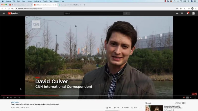
A traditional lower third identifies a person and their role without getting in the way of the shot.
Basically, it is text on screen, usually kept low enough that it supports the footage rather than competes with it.
Create the Text with the Type Tool
Start in Premiere Pro by choosing the Type tool from the toolbar. Click once in the Program Monitor where the text should begin, then type the name, title, handle, or whatever information is needed.
If the text is going to run towards the right, begin far enough to the left to leave room for it. This is particularly important when making lower thirds for several people. A short name might look fine at a large size, but the design needs to accommodate the longest name in the group.
Do not design only for “Dan Scott” if a much longer name has to fit later. Get that longest possible name working first, then the shorter ones will be easy.
Edit Lower Third Text in Essential Graphics
With the text graphic selected, open Window > Essential Graphics. In the Essential Graphics panel, choose the Edit tab. This is the main place to work with text in Premiere Pro and replaces the older titling workflow.
From here, the standard text controls are available:
Choose a font.
Change the type size.
Set left, centre, or right alignment.
Adjust the text itself when needed.
Pick a font that feels appropriate for the project, then set a readable size that fits the longest name without pushing into the edge of the frame.
To reposition the finished text, switch back to the Selection tool, the arrow tool. Click the text in the Program Monitor and drag it into place. The Type tool is for writing and editing text. The Selection tool is for moving it around.
Make the Text Easier to Read
Footage is rarely a nice, calm background for text. A lower third needs enough contrast to remain readable, especially when the video behind it changes. The Appearance section in Essential Graphics gives you two straightforward options: a background and a shadow.
Add a Background Box
Enable Background to place a box behind the text. Click the colour swatch and choose a colour. A black background is a simple, reliable choice when the text is white.
Then adjust the controls for the size of the box around the text and its opacity. More padding gives the type room to breathe. Lower opacity lets some of the footage show through, while full opacity creates a solid graphic.
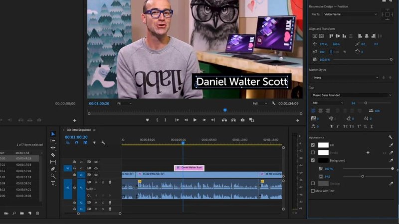
A dark background box gives white text enough contrast to stay clear over detailed footage.
There is no magic setting here. Adjust the padding and transparency until the lower third is legible and looks right for the footage.
Add a Subtle Drop Shadow
A drop shadow is another way to separate text from the image. Enable Shadow in the Appearance controls, set it to black, and use the settings to control its direction, distance, size, and softness.
For a clean, understated shadow, keep it close to the text. Set the direction downwards, use a small distance, and avoid making the blur too large. The goal is not a big, obvious shadow. It is just enough separation to help the text read.
You can use a background, a shadow, or both together. A black background with a small shadow is a perfectly workable combination when you need the text to stand out clearly.
Place and Time the Lower Third in the Timeline
When text is created, Premiere Pro places its graphic clip at the current playhead position. That may not be where it belongs, so move it in the timeline with the Selection tool.
Zoom out if needed, then drag the centre of the graphic clip to move the entire lower third earlier or later. Avoid dragging either end if the goal is to move it, because the ends control its duration.
To change how long it remains on screen, drag the beginning or end of the graphic clip. The right duration depends on pacing and the amount of information on screen. A short name can disappear fairly quickly, but a longer name or job title needs enough time to be read comfortably.
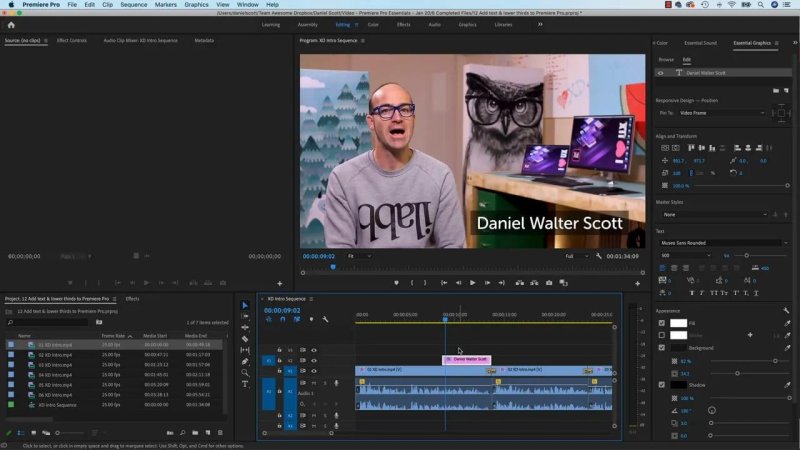
Move the graphic by dragging its centre, then drag either edge when the timing needs to be shorter or longer.
It can also be useful to time the end of a lower third with a cut or a transition in the footage. That gives the graphic a natural exit point instead of having it hang around for no reason.
Edit the Words Later
Changing the text is easy. Select the Type tool and click the text in the Program Monitor to edit it directly. You can also double click the text and type over it.
For a single name or a small amount of text, editing directly in the monitor is quick. If the graphic contains several separate pieces of text, use the Essential Graphics controls to select and update the specific part that needs changing.
Keep Text Away From the Edges
Do not put lower thirds right against the bottom or side edges of the frame. It is generally better design to give text some breathing room, but it matters even more for video that may appear on physical televisions.
Some screens can crop the edges of an image, particularly when the display does not match the video aspect ratio exactly. A lower third that sits too low or too far to the side may be cut off.
For television work, use title-safe positioning as part of the delivery workflow. More generally, keeping the graphic comfortably inside the frame is a sensible habit for any lower third.
Fade the Lower Third In and Out
A lower third that just suddenly appears works, but a quick fade is often nicer. There are more advanced animation options available later, but this is a fast, cheap technique that does the job well.
Go to the Effects panel and find Video Transitions > Dissolve > Cross Dissolve. Drag a Cross Dissolve onto the beginning of the lower-third graphic clip, then add another one to the end.
The result is a gentle fade in and fade out. Extend either transition if the fade needs to be slower. Then check the timing: the text must be fully visible for long enough to be read before it fades away.
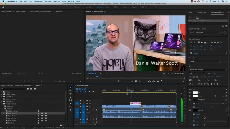
Cross Dissolve on both ends of the graphics clip gives a simple lower third a much smoother entrance and exit.
A Simple Lower Third Checklist
Use the Type tool to create the text.
Edit font, size, and appearance in Essential Graphics.
Allow for the longest name or line of text.
Use a background or subtle shadow when the footage is busy.
Position the graphic in the lower part of the frame, away from the edges.
Move the clip by dragging its centre in the timeline.
Set the duration by dragging either end of the clip.
Add Cross Dissolve transitions if a soft fade suits the edit.
FAQs
Why is it called a lower third?
It is called a lower third because the text or graphic is positioned in the lower third area of the screen. It can sit on the left or right side.
Where do I edit text in Premiere Pro?
Select the text graphic, then open Window and choose Essential Graphics. Use the Edit tab to change the font, size, appearance, and other text settings.
How do I make a lower third fade in and out?
Apply a Cross Dissolve transition to the beginning of the lower-third graphics clip and another to its end. Drag the transition edges to make either fade longer or shorter.
How long should a lower third stay on screen?
Keep it visible long enough for the information to be read comfortably. The right duration depends on the amount of text and the pacing of the edit.
Written by Daniel Walter Scott — Founder of Bring Your Own Laptop & Chief Instructor
